Create and Share Reports
Gainsight NXT
This article explains how non-admin users can use Self-Service Analytic to create reports.
Overview
Self Service Analytics enables you to create, edit and share reports. You can create reports only on the objects that have been assigned to you by the admin. While creating a report, you can choose from the list of visualization-types to make your reports more insightful and easy to consume. You can also apply filters on fields to streamline the data in your report.
Create Report
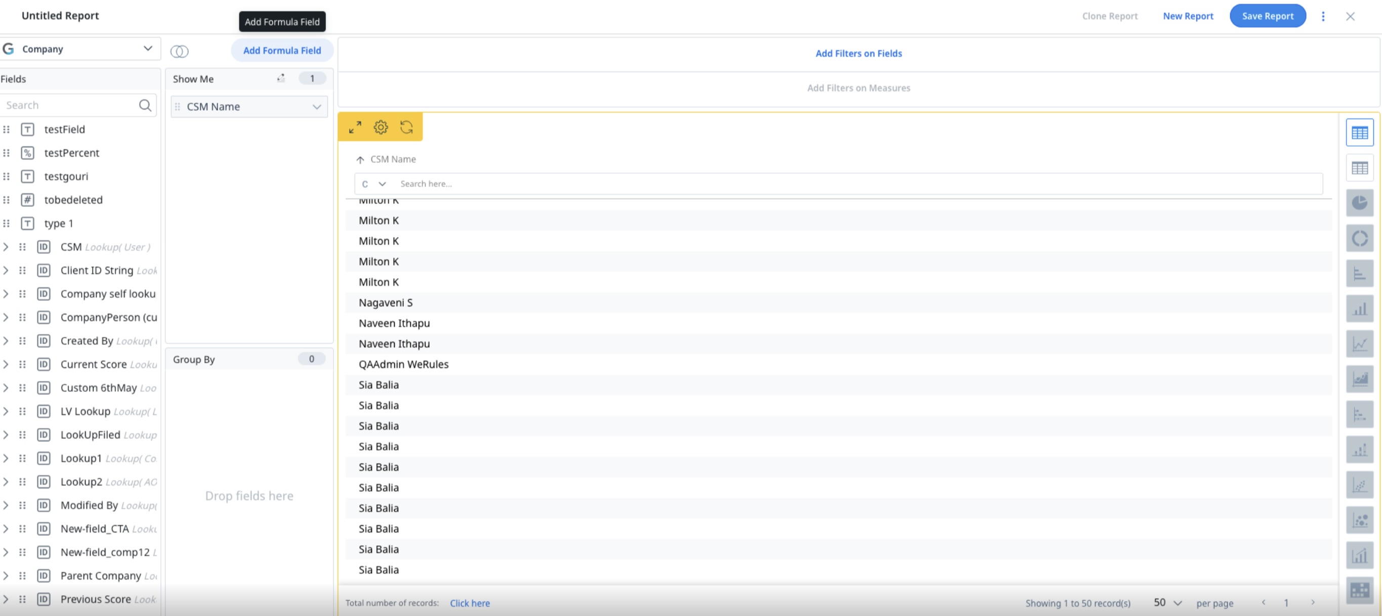
You can create reports by selecting the required Show Me and Group By fields.
- Show Me: It is necessary to add one or more Show Me fields to create a report. Your report is created based on the fields added under this section.
- Group By: It helps you segment or slice the data added by the Show me fields. Group By fields should only be added after the Show me fields have been added. A maximum of 10 fields can be added to Group By.
To create a new report:
- Navigate to Insights > Reports.
- Click Create Report.
- From the Select Object dropdown, select the object that you want to create report on.
Note: Select Matrix Data to view Gainsight objects. - A list of fields associated with the selected object are displayed.
- Drag and drop the required fields to the Show Me section. To know more refer to the Show Me section.
- (Optional) Drag and drop the required fields to the Group By section. To know more refer to the Group By section.
- Select a visualization type for your report. To know more about the visualization types, refer to the Visualization section.
- (Optional) You can add filters. To know more about adding filters, refer to the Filter section.
- Click Run Report to run the report. To know about more options, refer to the Run Report section.
- Click Save Report.
- Provide a Name for the report. This is the name that appears in the Repository, as well as in any menus or screens where the report is displayed.
Limitation: To create multiple reports with the same report name, use an additional prefix or suffix and then save the report. - Select the folder if the folder is already created in the Reports Listing page. Otherwise, the report is saved in the Uncategorized folder.
- Provide a description.
- Click Save.
- Provide a Name for the report. This is the name that appears in the Repository, as well as in any menus or screens where the report is displayed.
Show me
The following options are available for the fields added to Show Me:
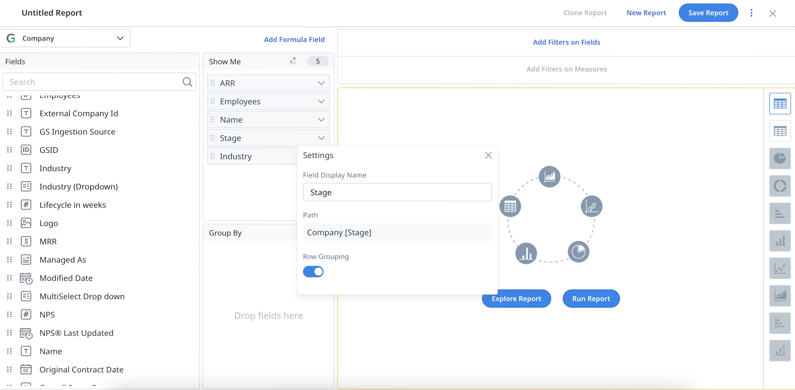
- Click the Settings/Gear icon next to the field label to update Field Display Name, Decimal Places, Column Calculations and Numeric Summarization.
- Hover on the field to see the changes made on the field.
- For Aggregated Reports, select the required Aggregation by clicking the Aggregation type dropdown list.
- Click X, to remove a field from Show Me.
Notes:
- Based on object selection, you will see all of the fields and lookup fields associated with that object.
- Fields added to Show Me can be reordered by dragging and dropping.

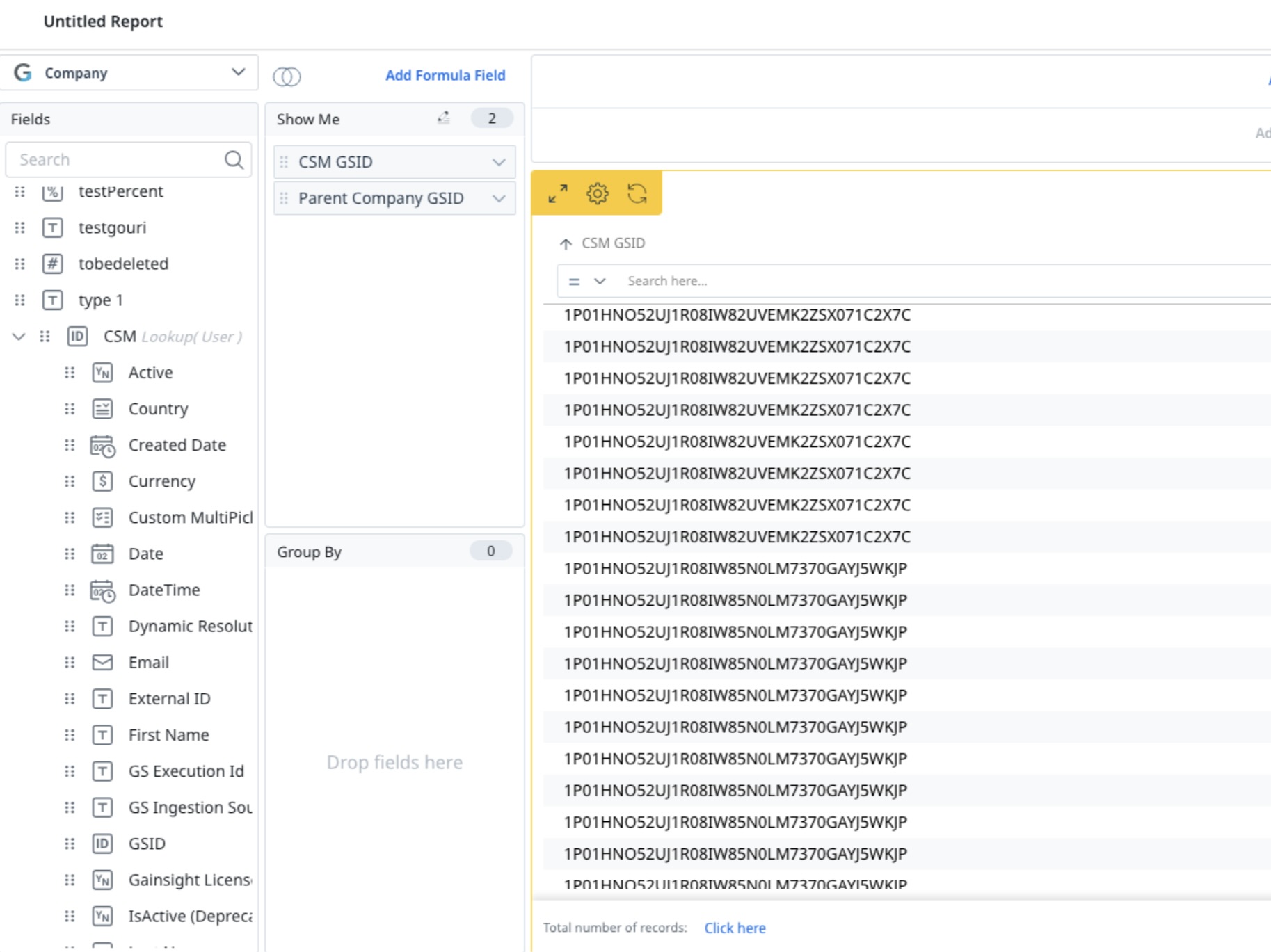
Lookup Fields
A lookup relationship is used to combine the fields from multiple objects based on a common field. For instance, in order to build a report on the Activity Timeline object to contain the ARR of the company, click + on GS Company Id and select the ARR.
Here, the objects Activity Timeline and Company are joined via the GS Company Id field which looks up to Company.
When users type in the Field name, the search functionality fetches the fields from the base object. To further extend your search on lookup objects, ensure that you expand the lookup object before you make a search.
Notes:
-
The ID lookup field in an object displays the name field assigned to it in Data Management. It helps users to easily identify individuals by their names.
The Enable Named Fields Additions toggle switch must be ON for the ID lookup fields to display their name fields. To access the toggle switch, users can navigate to Reports > Settings > General Settings.
-
When dragged to the Show Me section in Report Builder, the child fields of an ID lookup field take the name of their parent fields as a prefix. It helps users to differentiate between child fields with similar names from unique ID lookup fields.
Additionally, If both the child field and parent field names include the term ID, the parent's field name is modified by removing the term ID and it is added as a prefix to the child field's name. For example, GSID (child field) in Company ID (parent field) is displayed as Company GSID.
Row Grouping
For dimension type fields added to Show Me, you can see an additional option called Row Grouping. Row Grouping in Reporting allows to visually group the rows/records in a report by a dimension type field without aggregating all of the other fields. For more information, refer to the Row Grouping section of Group By.
Inline Editing
Inline editing enhances the efficiency of CSMs by allowing them to edit data directly on the Report page by eliminating the need for separate editing screens. It offers a user-friendly experience like working in a spreadsheet, which not only accelerates the process but also streamlines data handling.
Enable Inline Editing
To enable inline editing in Reports:
- Navigate to Insights > Reports.
- In the Reports page, click Settings. The Settings page appears.
- In the General Settings page, turn on the Enable Inline Editing toggle.
- Click Save.

Configure Inline Editing
To configure inline editing in Reports:
- Navigate to Insights > Reports.
- Click Create Report.
- From the Select Object dropdown list, search for:
Low-volume custom objects
Case objects
GS opportunity
Standard objects include Company, Relationship, Person, Relationship person, and Company person.

Note
- By default the Inline Editing icon is disabled.
- Inline editing supports named/lookup fields that are lookup only to GSID.
- To use inline editing on GS opportunities, you must enable the Renewal Center.
- Inline editing does not support system fields and formula fields.
- For Cockpit and Success Plan objects, dependent picklist and second and higher-order lookup fields are not supported. Direct lookup fields can be updated.
-
Drag the fields to the Show Me section to enable the Inline Editing icon.
-
Click the Inline Editing icon. Two sections are displayed: Eligible fields and Non-Eligible fields.
Note: Only fields listed under Eligible fields can be configured for editing. -
From the Eligible Fields list, select the fields you wish to make editable.
-
Click Apply.
![]()
Note:
-
The Report module Admin decides which fields can be or cannot be editable in reports and whether to enable inline editing for the organization or CSMs.
-
Inline editing is not supported when the field(s) is included in the Group By section.
-
The fields configured for inline editing in a report are only applicable to that specific report.
-
The inline edit icon is enabled as soon as any fields are moved to the Show Me section, irrespective of whether the specific object or field type supports inline editing.
Inline Edits in Reports for Cockpit and Success Plan Fields
You can edit Cockpit and Success Plan fields directly from a report, without opening the record details. Changes are automatically reflected in the corresponding Cockpit or Success Plan record.
- Only eligible fields are editable inline. The following fields are not supported for inline editing: system fields, formula fields, currency ISO code fields, standard GSID fields, controller and dependent picklist fields, read-only fields, and second and higher-order lookup fields. Direct lookup fields can be updated. Non-editable fields continue to appear as read-only.
- When building a report on the Success Plan object, you can add standard, custom, and system fields from the Success Plan object, as well as fields from Company and Relationship objects using the column picker.

Group By
To slice and dice or segment the data in a report, add a field to Group By. A maximum of 10 fields can be added to Group By. A field will have to be considered Groupable by Salesforce and in MDA in order to use it in the Group By section. If a field is not added to the Group By section, you can only view the data in a table.
You can click the Settings/Gear icon next to the field label, to perform the following operations:
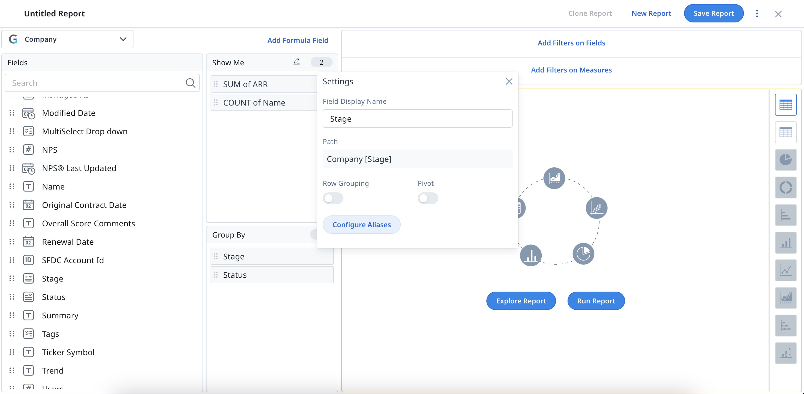
- Change the Field Display Name by providing a new name in the textbox. The Field Display Name is the label that appears on your report.
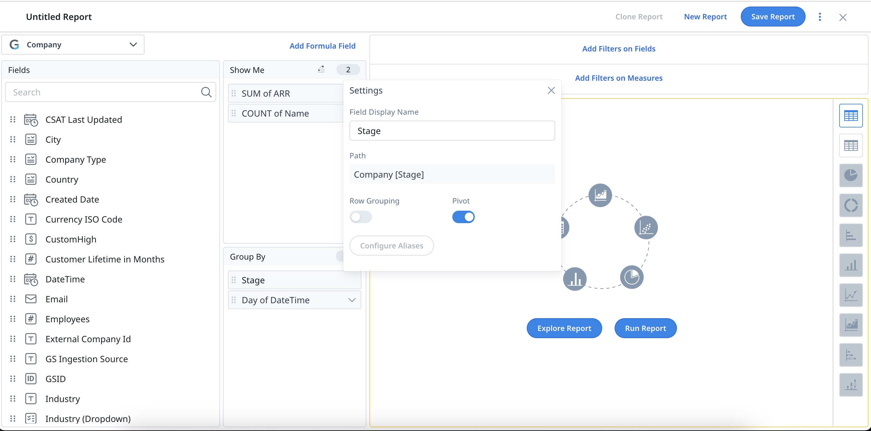
- Activate Pivot reports by turning on the toggle. This toggle is only displayed if there are two or more fields under the Group By section. To know more about Pivot reports, refer to the Pivot section.
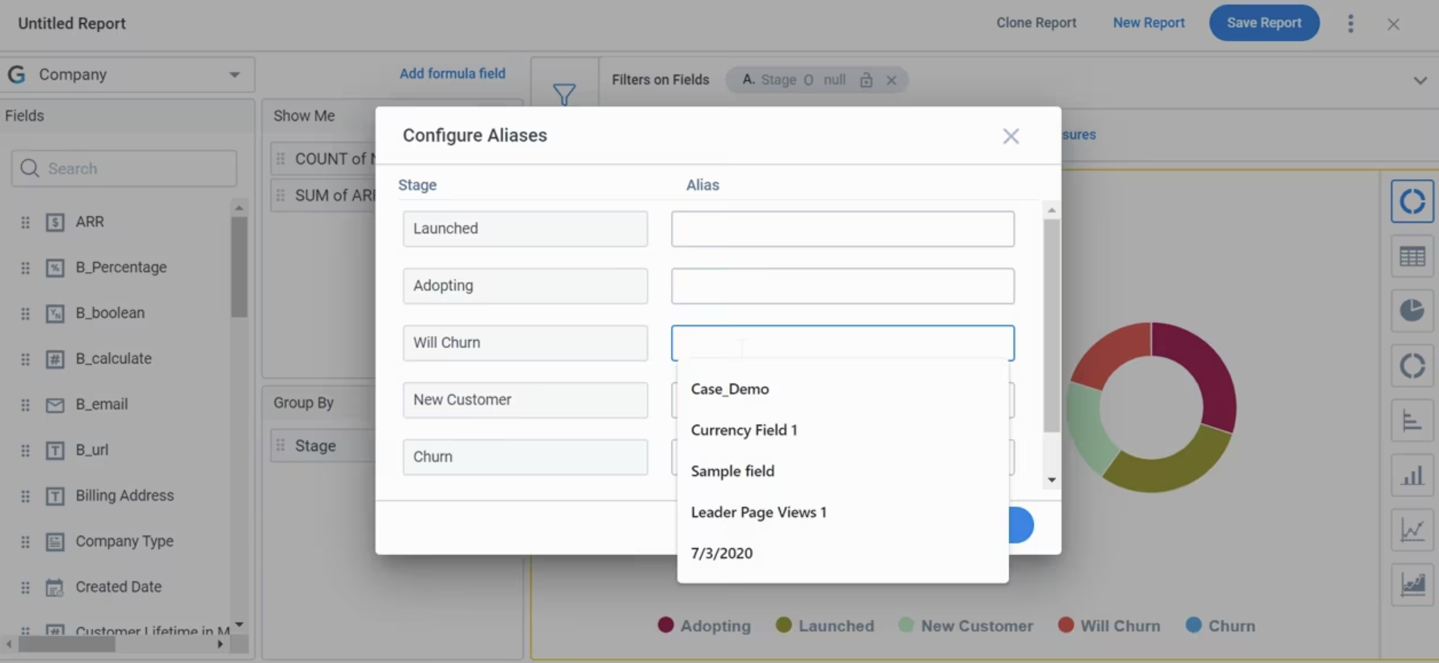
- Rename the chart labels in your reports using the Configure Aliases option. To know more about creating aliases, refer to the Configure Aliases section.
- Activate the Row Grouping option. To know more about Row Grouping, refer to the Row grouping section.
- Summarize your data by date ranges. To know more about this option, refer to the Summarize By section.
Notes:
- Once you add a field to the Group By section, all the fields in Show Me will get aggregated.
- Drag and drop the fields from Show Me to Group By.
- Hover on the field to view the details.
- The following data types cannot be added to the Group By section:
- Rich Text Area
- Multipicklist
- Measures (Number, Currency, and Percentage, etc.)
- Address
- URL
Multi-select Picklist Data Type
You can use multi-select picklist data type fields in Group By to view report results based on all the values selected in that field. When you add a multi-select picklist to Group By, you can control how the system groups these values so your aggregated data appears in reports the way you expect.
To choose a grouping style, follow these steps:
- In Group By, find the multi-select picklist field.
- Click the Settings icon next to the field label.
- In the Settings dialog, go to Group Multi-Select values as.
- Select the grouping option you want.

You can group multi-select picklist fields in two ways, depending on how you want records to roll up in the report: Value combinations and Individual values.
- Value combinations: Groups records by the exact set of values selected on a record.
For example, if one record contains A and B and another contains only A, they are grouped separately. Each unique combination of values is treated as a distinct group.

- Individual values: Groups records by each selected value individually. For example, if one record contains A and B and another contains only A, the first record appears once under A and once under B.
Aggregated metrics such as Count or Sum are applied in full to every occurrence, so the overall totals can exceed the count of unique records.
For example, if a record has A and B and its Sum of ARR is 100,000, both A and B display 100,000, resulting in a combined total of 200,000.

- The setting applies to any multi-select picklist field and lets you choose how you group and analyze data in reports.
- This functionality is not supported in reports built on Salesforce (SFDC) objects.
Pivot and Multi-Level Row Grouping
You can apply pivot and multi-level row grouping within the same report to analyze data across multiple dimensions.

To configure grouping behavior, follow these steps:
- In Group By, click the Settings icon next to the field label. The Settings dialog box appears.
- Turn on the Row Grouping or Pivot toggle based on how you want to group the data.

Row Grouping Rules
- You can apply row grouping on multiple Group By fields.
- Row grouping is not supported on Show Me fields when pivot is applied.
For more information on row grouping behavior, refer to the Row Grouping section in this article.
Pivot Rules
- Pivot can be applied to only one Group By field.
- Pivot and row grouping cannot be applied on the same field.
For more information on how to configure pivot, refer to the Pivot section in this article.
Combined Rules for Pivot and Row Grouping
To use pivot and row grouping in the same report, ensure the following conditions are met:
- Add at least three fields to Group By.
- Apply pivot to one Group By field.
- Apply row grouping to one or more other Group By fields.
- Leave one Group By field without pivot or row grouping to anchor the dataset.

If these conditions are not met, the Gainsight application displays an error message and prevents applying the configuration.
Pivot
Pivot Report helps you quickly summarize large amounts of data. The pivot option is seen only when you have a minimum of two fields in the Group By section. And, you can apply pivot only on one field at a time. For more information on how to apply Pivot, refer to the Pivot section in the Advanced Report Settings article.
Configure Aliases
Aliases allows the renaming or customizing of your labels in the chart visualizations. For example, when you are sharing a report with your director, and your director may not be aware of the jargon used in the report. To make the charts/reports more contextual, you can rename labels in the reports. For more information on how to Configure Aliases in Reports, refer to the Configure Aliases in Reports article.
Row Grouping
Row Grouping allows you to visually group the rows/records in a report by a dimension type field, without aggregating all the other fields. Enable row grouping on the String, Boolean, Picklist and Date data types. For more information on Row Grouping, refer to the Row Grouping section in the Advanced Report Settings article.
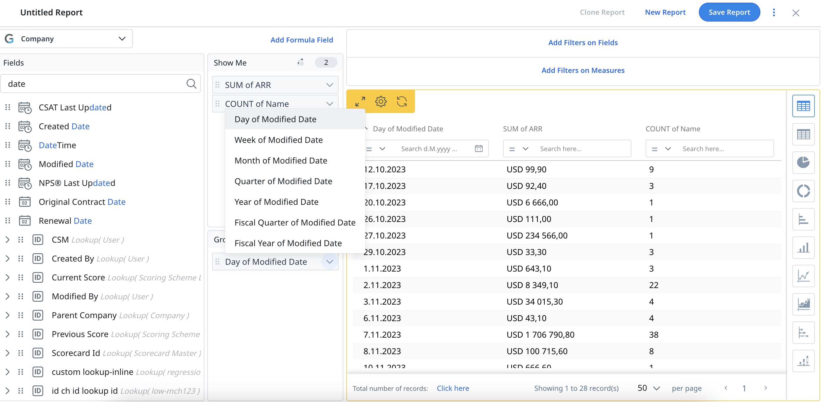
Summarize By
If a Date or Date Time field is added under the Group By section, an additional icon appears next to the Settings icon. This is the Summarize By icon that lets you summarize your data by Day, Week, Month, Quarter, Year and Fiscal Year/Fiscal Quarter.
Apart from the objects listed below, you can summarize the date fields by Day, Week, Month, Quarter, Year and Fiscal Year/Fiscal Quarter across all of the Gainsight application areas.
- Email Logs
- Email Raw Events
- Unsubscribed Emails
Fiscal Year: Filter the date field/time series data by Fiscal Year/Fiscal Quarter and summarize this data by Fiscal Year/Fiscal Quarter. The Fiscal Year label on the report displays either the Starting Year or Ending Year, based on the settings defined by your admin in the Application Settings page. For more information on Fiscal Year settings, refer to the Application Settings article.
IMPORTANT: While building reports on Gainsight objects, Gainsight honors the Standard Fiscal Year Settings defined in Application Settings.
When a date or datetime field with Fiscal Quarter or Fiscal Year aggregation is used in Group By, the report runs in the tenant's timezone, as configured in the Application Settings page. This ensures consistent fiscal period calculations across all users, regardless of their individual timezone settings. An info icon is displayed beside the date or datetime field name in the report to indicate that the tenant's timezone is in use.
Limitation: When downloading data from a chart drill-down report, the downloaded data runs in the user's timezone instead of the tenant's timezone. This may result in data variation near fiscal quarter or fiscal year start and end dates, where a record may appear in a different quarter in the downloaded file compared to what is displayed in the report. Additionally, when you click Analyze Report from the drill-down view, the report opens in Report Builder and runs in the user's timezone, which may also result in data variation.
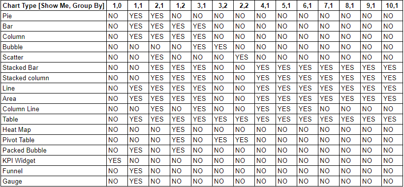
Visualization Types
Visualization types are dependent on the number of fields added to Show Me and Group By. To select a visualization, hover to the right of the screen and select the required visualization type from the following options.
- Table
- Pie
- Bar
- Column
- Line
- Area
- Stacked Bar
- Stacked Column
- Scatter
- Bubble
- Column Line
Note: For more information refer to Column Line - Heat Map
- Packed Bubble
- KPI Widget
Note: For more information refer to KPI Widget - Donut:
- Funnel
- Gauge
Notes:
-
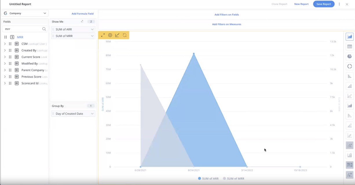
The visualization types: Column Line, Line, and Area chart are consistently presented in ascending order to improve chart readability. Even if the user applies the DESC (Descending) filter in Chart Settings, causing the system to sort the underlying data in descending order, the chart continues to visually display the data in ascending order, when the data is grouped by a Date or Date time field.
For example, consider the dataset with records 6/28/2021, 8/24/2021, 3/14/2022, and 10/18/2023. When applying the DESC filter, the underlying data is sorted in descending order as 10/18/2023, 3/14/2022, 8/24/2021, 6/28/2021. However, despite the descending sorting, the chart visually displays the data as 6/28/2021, 8/24/2021, 3/14/2022, 10/18/2023. In terms of appearance, the data seems to progress from left to right, creating a visual impression of ascending order.
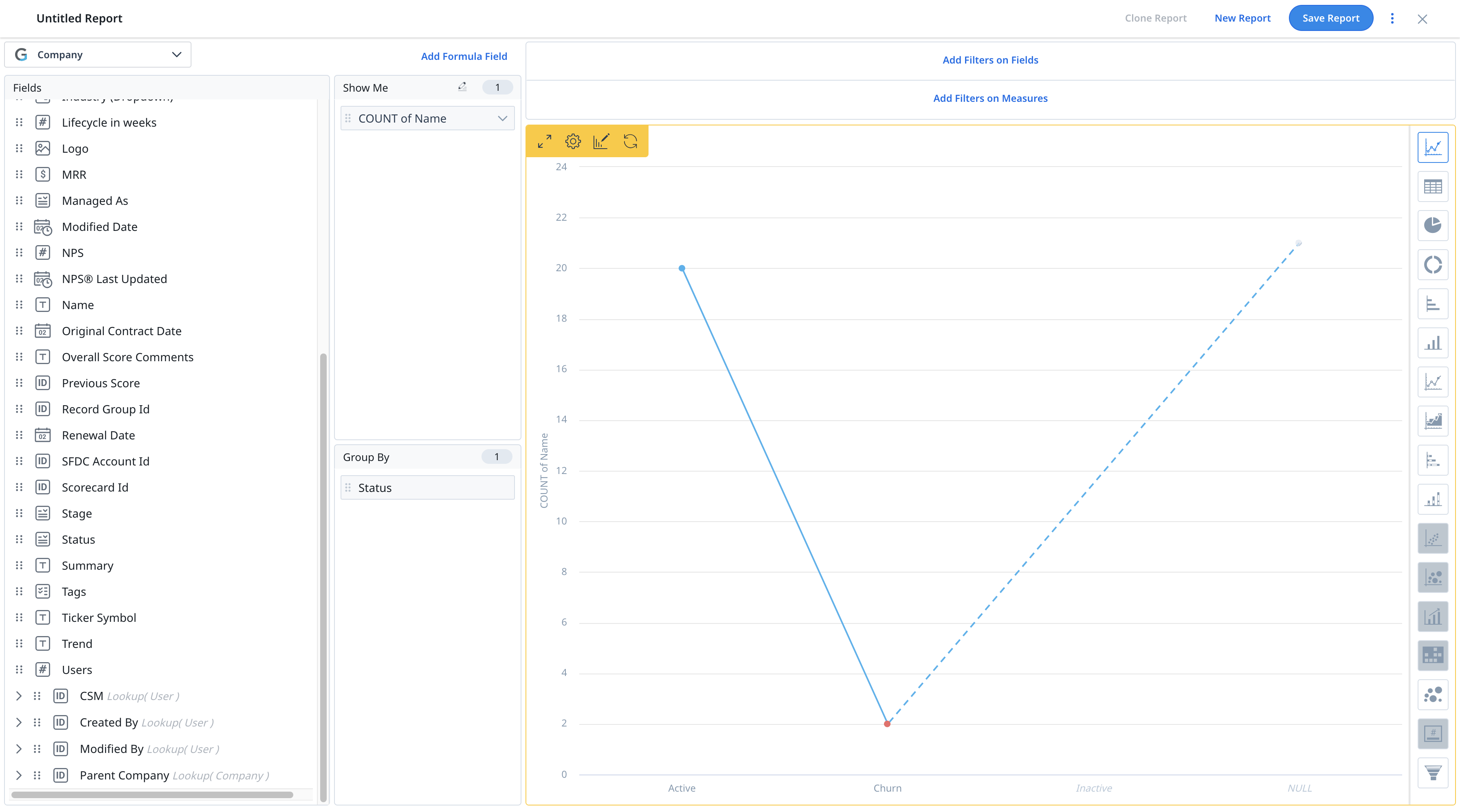
- The visualization types: Bar Chart, Column Chart, Line Chart, Area Chart, Column Line Chart, and Stack Chart show any unavailable data in the object as Data Not Available. It helps users to identify gaps in the report due to a lack of data availability and take the necessary actions.
-
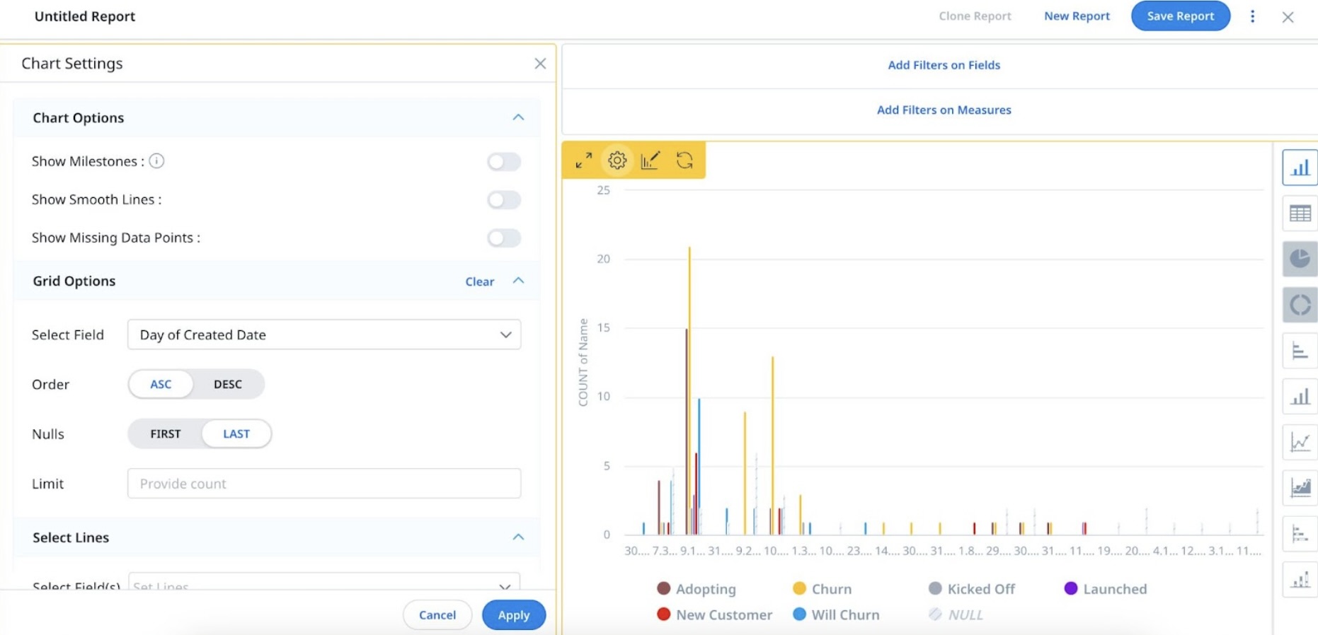
Reports support missing data points for the picklist data type. To use this Missing Data Points functionality, turn on the Enable Missing Data Points toggle in the Chart Settings.
- Apart from Table type visualization, you can see the Chart Editor option for all types of visualizations. Chart Settings differ from one type of visualization to another. For more information on Chart Editor and Chart Settings, refer to the Chart Settings and Chart Editor article.
- Users can drill down and analyze data for all the gauge widgets in a Gauge report. Any changes made to one of the widgets will reflect in all other gauge widgets in the report. For example, if new fields are added to one gauge widget, the same fields are also added to all other gauge widgets in the report.
- The following image describes the combination of Show Me and Group By fields required in a report, to generate each of the above mentioned visualizations.
Note: Graphical reports honor the custom colors, colors configured on Gainsight picklist items, and scorecard colors.
Add Filters
There are two types of filters available in Reports:
- Filters on Fields
- Filters on Measures
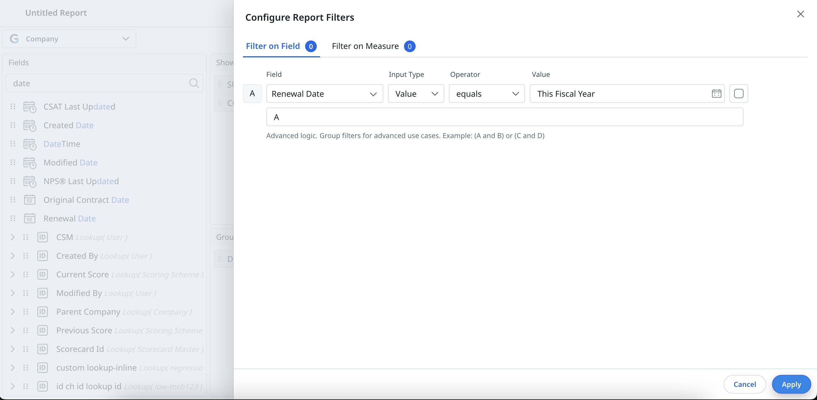
Filters on Fields
Filters on Measures
Allows you to filter the data on aggregated fields (fields in Show Me).
To apply filters on measures:
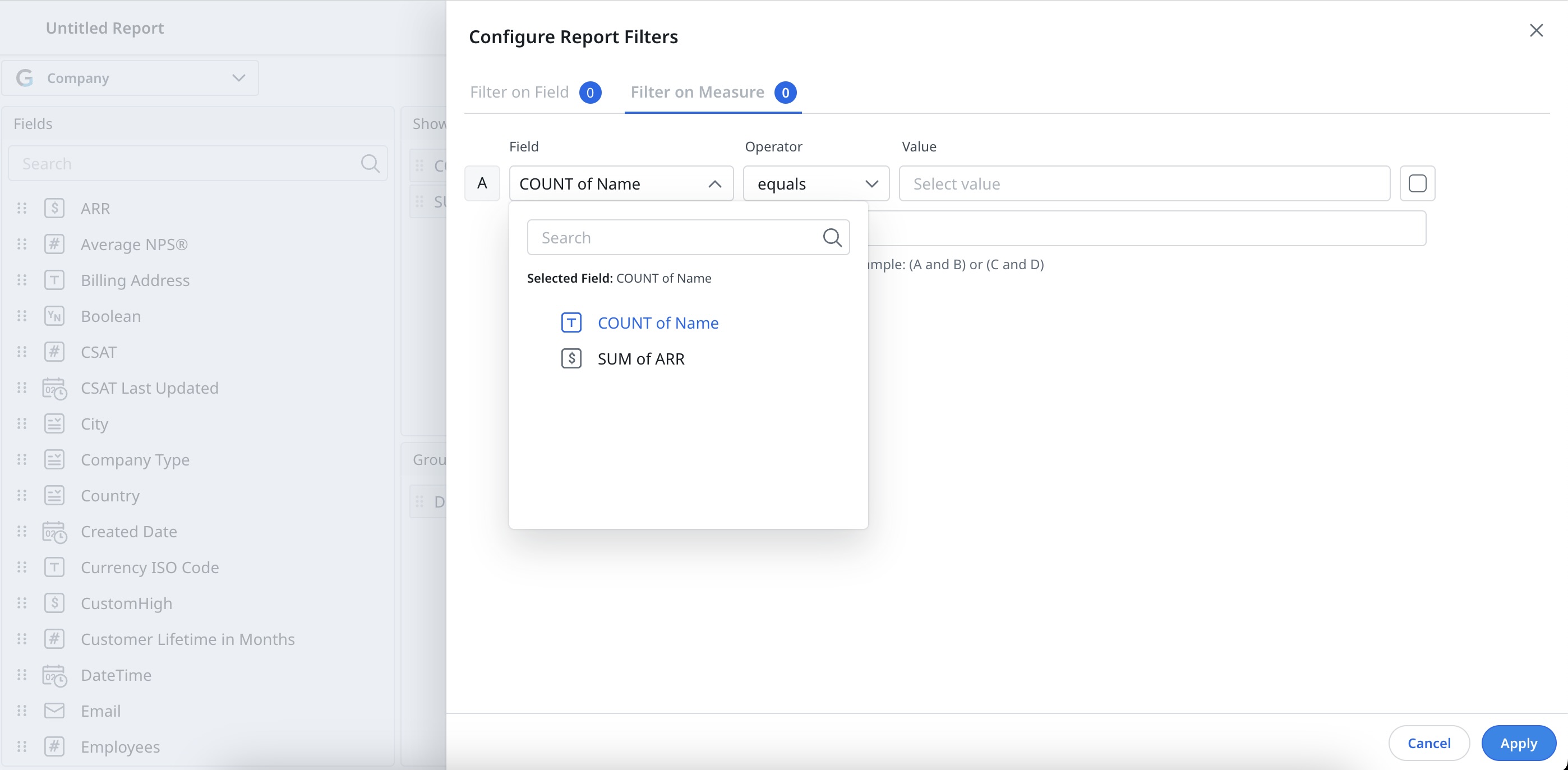
- Click Add Filters on Measures. The Configure Report Filters window appears, click on the Filter on Measure tab to apply filters on a measure field.
- Click Add Filter.
- From the Field dropdown list, select the required aggregated field.
- From the Operator dropdown list, select the required operator.
- Input the data in the Value text box.
- Select the Checkbox next to the Value text box to include Null values.
- Click Save.
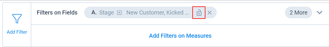
Locked Filters: Filter value remains fixed and cannot be changed in the consumption area such as Dashboards page. Click the lock icon to lock the filter.
Unlocked Filter: The value can be changed in the consumption area such as Dashboards. Leave filters unlocked to allow end users to change the value.
Note:
- Add more filters by clicking the + icon next to the Value text box.
- Delete a filter by clicking the x icon.
- Add advance filters such as (A OR B) AND C, type in your desired expression in the Advanced Logic text box.
- If there are no fields in the Group By, filters on measures cannot be applied.
- By default all filters are unlocked.
- If you are using dates in the filters, place them first to optimize the query.
- If you are using the operators 'contains' or 'equals,' place them last in the filters.
- Contains Operator can be applied only on the following data types: String, Email and URL.
- If you delete a filter, the advanced logic is reset to AND.
- In the chart reports drill down, you can only apply inline searches to a maximum of 26 fields. This is because the system supports filtering on up to 26 fields only.
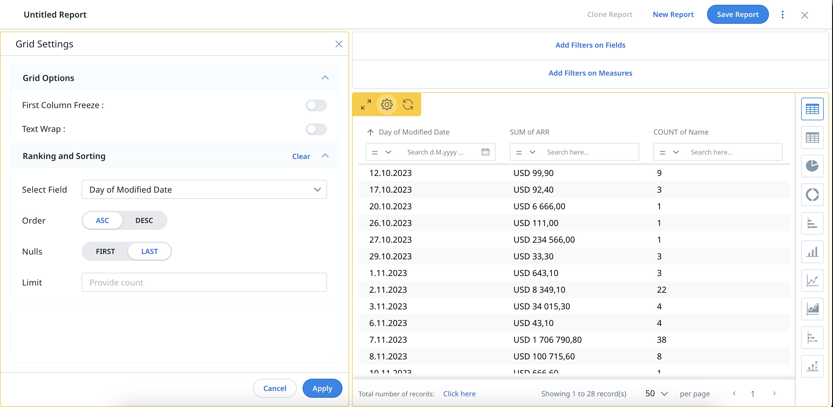
Run Report
To Run a Report, click Run Report or click on any available visualization icon on the right side. If you click Run Report, by default data is displayed in a table type visualization.
The following options are available in the Tabular Reports:
- Search: Type in the keyword and search for any record within the report, and you can also apply search filters based on your requirement.
- Sort: you can sort for any column in the report.
Notes:- Only the records displayed on the current page will be sorted when sorting by a picklist. You can use the Pagination option to determine the number of records that are visible on each page.
- In pivoted reports, only the records on the current page are sorted when sorting is applied on any of the fields under Show me.
- Maximize: View the tabular report in a full-screen view by clicking the Maximize icon.
- Settings: Click the Settings/Gear icon on the upper left corner of the report to apply the Grid Settings. In Grid Settings, you can configure the following:
- Grid Options: Enable or disable the First Column Freeze and/or Text Wrap.
- Ranking & Sorting: Configure the Ranking and Sorting options as required. For more information on Ranking and Sorting, refer to the Advanced Report Settings article.
- Refresh: clears all the applied sort and search filters.
- Pagination: If there are too many records, use the pagination tool to navigate through different pages and view multiple records, in a set of 50, 100 or 200 on a single page, based on your selection.
Use Conditional Coloring in Tabular Reports
Conditional Coloring allows report owners or report users with edit and admin access to apply color to tabular data based on field values used in the report (for example, Company stage), define value ranges for numeric fields (for example, , ARR), and either inherit or override color settings pre-applied from other sources such as Object settings, GDM, or Scorecards.
Note: Charts continue to display colors as per their built-in configuration and global settings.
To use conditional coloring in reports:
- Navigate to Insights > Reports > Report List tab.
- Open an existing tabular report or create a new one where you want to apply conditional coloring. Click Run Report to display the data. For more information on how to create a report, refer to the Create Report section.

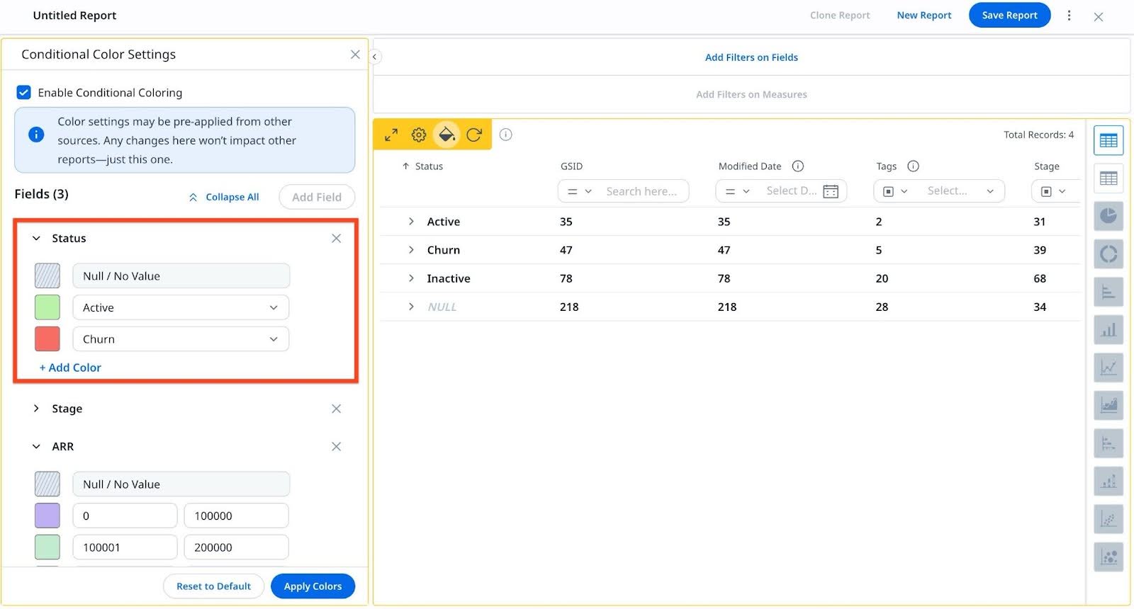
- Click the Conditional Coloring Settings icon. The Conditional Coloring Settings left slide-out panel appears.

- Select the Enable Conditional Coloring checkbox. Color settings that are pre-applied from other sources (such as Object Settings, GDM, or Scorecards) appear automatically.
Note: Any changes made here apply only to the current report and do not affect other reports.

From the Conditional Color Settings panel, you can perform the following actions:- Add or remove fields
- Assign a color to a value or range
- Reset a color value
- Delete a color mapping

- Click Add Field to add a new field.
- From the Select Value dropdown list, select a field. The list displays only fields that are used in the report and do not already have any color mappings.

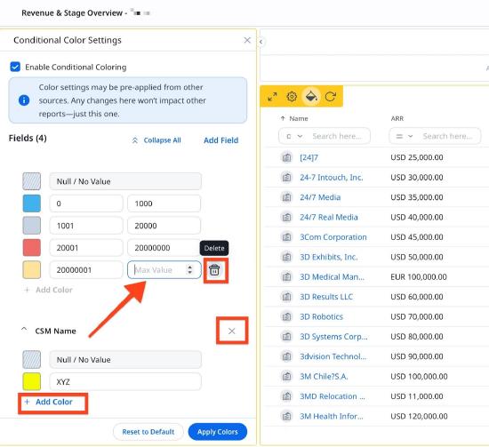
- Click Add Color to add a color value or range to a field. For a numeric field, define minimum (Min Value) and maximum (Max Value) to create a range. For a picklist or string field, select a field from the dropdown.
Note: You can use the color box next to a value to modify its assigned color. - (Optional) Click the Delete icon to delete the color mapping. You can edit the pre-defined colors from other sources (example: Scorecard, GDM, Color Palette) but cannot delete them.
- (Optional) Click Remove field (X) icon to delete a field.
Note: Use the Reset to Default option to discard local changes and revert to predefined settings. Charts continue to display colors as per their built-in configuration and predefined settings from sources (example: Scorecard, GDM, Color Palette) settings.
- Click Apply Colors to confirm the selection.
Note: If the Enable Conditional Coloring checkbox is unchecked after colors have been applied, all conditional formatting is hidden from the report view. However, the configurations are retained and can be reused when the option is enabled again.

IMPORTANT
- Predefined color from sources (for example, Scorecard, GDM, or Color Palette) can be edited but cannot be deleted from reports.
- Conditional coloring is not supported for Date, DateTime, or Multi-select Picklist fields.
- Drilldown views and Explore Report capabilities do not support conditional coloring.
- When setting value ranges for color, the next range always starts one unit above the previous range’s max value.
- Colors configured in a report will not be retained when the report is downloaded or when used in JO, Success Snapshots, Sally, and Email Templates.
Use Row Grouping with Conditional Coloring
Row grouping with color helps visually distinguish data categories, making reports easier to scan and interpret. It enhances clarity by highlighting grouped rows and displaying detailed field-level colors on expansion.
If row grouping is activated for a field (for example, Status), you can apply conditional coloring to the grouped field using the Conditional Coloring Settings option .
Note: Row grouping is supported only in tabular views, not in charts.
To use color in row grouping:
- Open the desired report.
- From the Show Me section, select a field (for example, Industry, Status) and click the Settings icon.
- Turn on the Row Grouping toggle and run the report.

- Add a color value for the group field and click Apply Colors. For more information on how to apply colors, refer to Use Conditional Coloring in Tabular Reports section.
- The entire row is highlighted with the color of the grouped field value. Expand each row to view value-specific colors for fields.

The following image displays field-specific colors that appear upon expansion, based on the configurations set in the conditional coloring settings:

Share Report
Once you have saved your report, you can share it with other users as a link, excel file or as an image as follows.
- Click the three-dots vertical menu.
- Select Share Report.
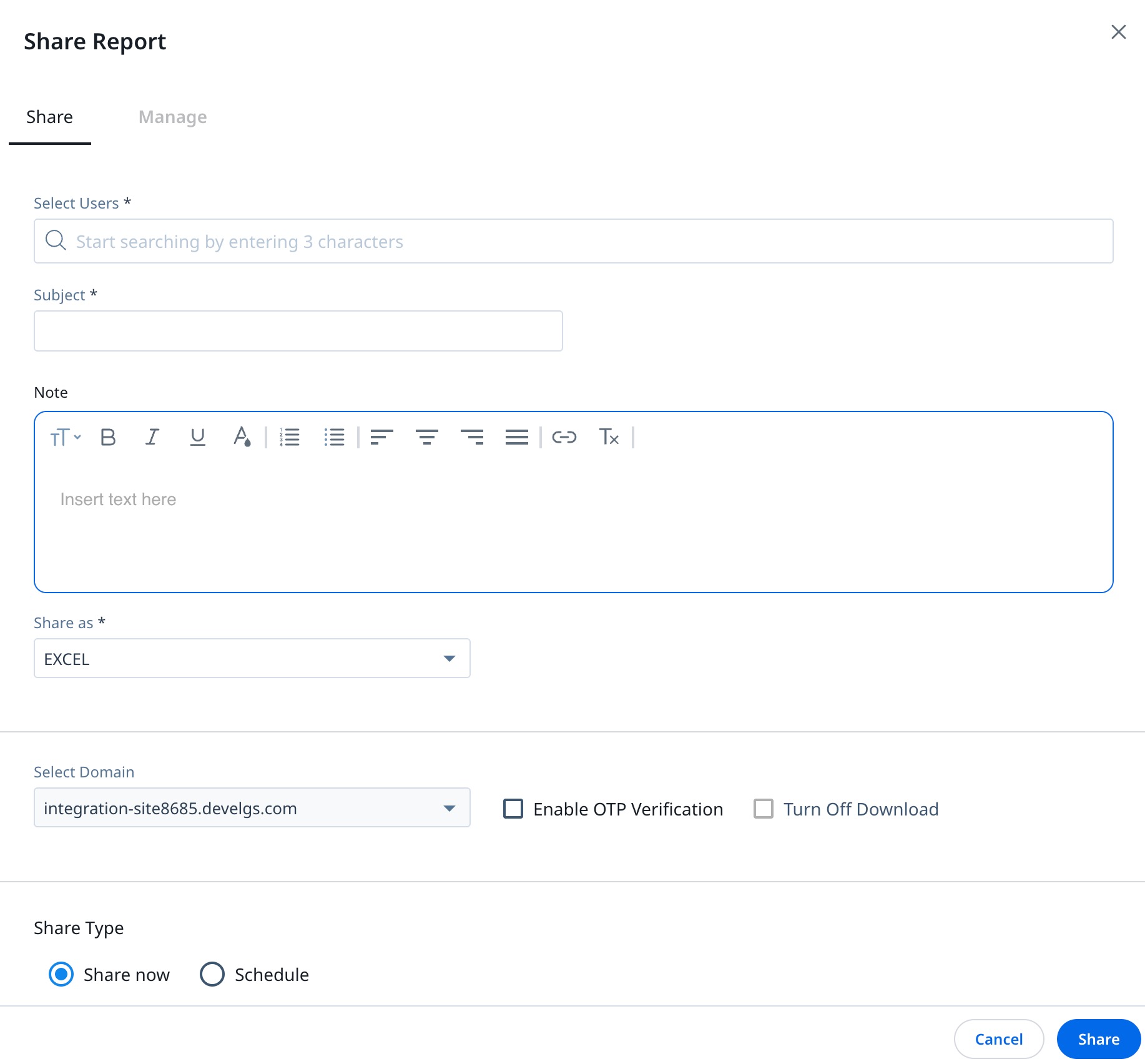
- Navigate to the Share tab.
- In the Choose Users fields, search and add the users with whom you want to share the report.
- Provide a Subject and a Note. You can use the rich text editor in the Note field to format your message. The formatting is preserved in the shared report email.
- From the Share As dropdown, select one of the following options:
- Link: The report is shared through a link with the selected users. You can share the link as follows:
- In the Select Domain field, select the domain. For more information on how to set up a Domain, refer to the Setup a Gainsight Domain article.
- (Optional)Select the Enable OTP Verification checkbox, if you want users to access the report link through OTP.
- (Optional) Select the Disable Download checkbox, if you want to refrain users from downloading the data.
Note:
- Link: The report is shared through a link with the selected users. You can share the link as follows:
- This option is not editable if the admin has already deactivated it.
- When using the share report functionality, the email report link will expire seven days after it is shared, regardless of the set expiry date.
- Excel: The report is shared as an excel file with the selected users.
- Image: The report is shared as an image with the selected users.
- Select the Share Type option:
- Share now: This option lets you share the report immediately. In case, the report is being shared through a link, you can also set the expiry date.
- Schedule: You can schedule a report to be shared daily, weekly or monthly as follows:
- Select the frequency:
- Daily: Share the report either Every Weekday (Mon - Fri) or Everyday.
- Weekly: Select the preferred day in a week to share the report on a weekly basis.
- Monthly: Select a preferable date or day in a month to share the report on a monthly basis.
- Select the frequency:
- Select the start date and end date.
- Provide the details for sharing.
- Click Share.
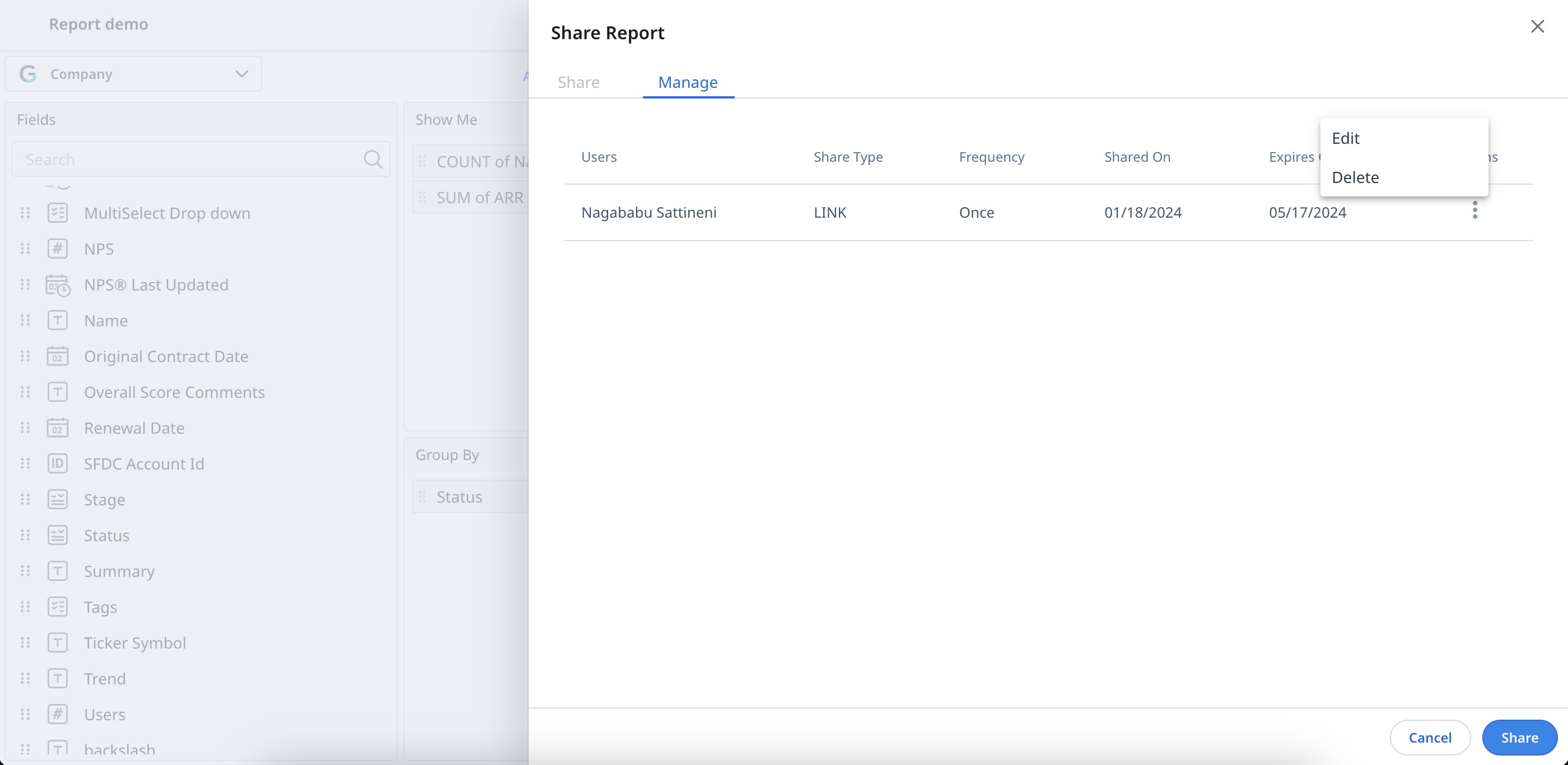
Manage Shared Reports
You can manage reports shared through links as follows:
- Click the three-dots vertical menu.
- Select Share Report.
- Navigate to the Manage tab. You can see all the details of the shared report (shared through link).
- Click the three-dots vertical menu, to perform the following actions:
- Edit: You can edit the settings of the shared report.
- Delete: You can revoke the user access to the shared report.
Note: Only Super Admins can delete a scheduled report.
- Click Share.
Edit Record Details (Inline Edit)
CSMs can directly edit record details on the record page. Inline editing supports Low-volume custom objects, Case objects, GS opportunities, Lookup fields, and Standard objects such as Company, Relationship, Relationship person, and Company person. However, for GS opportunities, the Renewal Center must be activated.
To perform inline editing of the records:
- Hover over the fields on the record page.
Note: Editable fields can be easily identified by the rectangular box around them. - Click the record you wish to edit.
- Edit the record as required.
- Click outside the text area to apply and view the changes.
- (Optional) To edit the rich text fields, click the three-dots menu adjacent to the field, and edit the text, click Save.
 Note:
Note:
- The record auto-saves and displays in real time, and remains highlighted for a few seconds.
-
To modify information through inline editing, the functionality must be enabled and configured by the Report module admin for the specific reports.
- Inline edit does not support controller and dependent dropdowns.
-
Fields set as Match Criteria cannot be edited directly within the Report section. For more information on Match Criteria, refer to the People Management article.
Add Record
CSM can easily add and edit records directly from any consumption area, ensuring efficient data management. Add and Edit Record supports low-volume custom objects and SFDC objects.
To add a new record:
- Click Add Record. The Add Record window is displayed.
- Add the values in the required fields.
- Click Add.
- (Optional) To edit a record, click on the three-dot vertical menu and select Edit. Edit Record window appears. Edit the information as required, click Save.

Manage Add Record Settings in Report Builder
You can manage the Add Record settings in the Report Builder and Report Consumption Areas to determine whether you can add and edit records within these areas.
The table below outlines how the settings affect the availability of these options in various parts of the system.
| General Setting | Report Builder | Report Consumption Areas |
|---|---|---|
| Enable Add Record toggle on. | The Allow Addition of New Records checkbox is selected by default when saving the report. You can uncheck it if not needed. | Add Record, Edit, and Preview options are available. |
| Enable Add Record toggle off. | The Allow Addition of New Records checkbox is inactive by default when saving the report. To enable the Allow Addition of New Records checkbox, turn on the Enable Add Record toggle from the Settings page. |
Only Preview is available. Add Record, Edit options are not available. |
Reporting admins can enable or deactivate the Add and Edit Record options to allow users to perform these actions on the Report Listing or Report Builder pages.
-
Enable Add Record toggle on during report creation: Go to the specific report and select Disable Add Record from either the Report Listing page or Report Builder page to make both Add Record and Edit Record unavailable to end users.
-
Enable Add Record toggle off during report creation: Go to the specific report and select Enable Add Record from either the Report Listing page or Report Builder page to make both Add Record and Edit Record available to end users.

Note:
-
Add and Edit Record capabilities are supported on all the report consumption areas for all reports on low-volume custom objects.
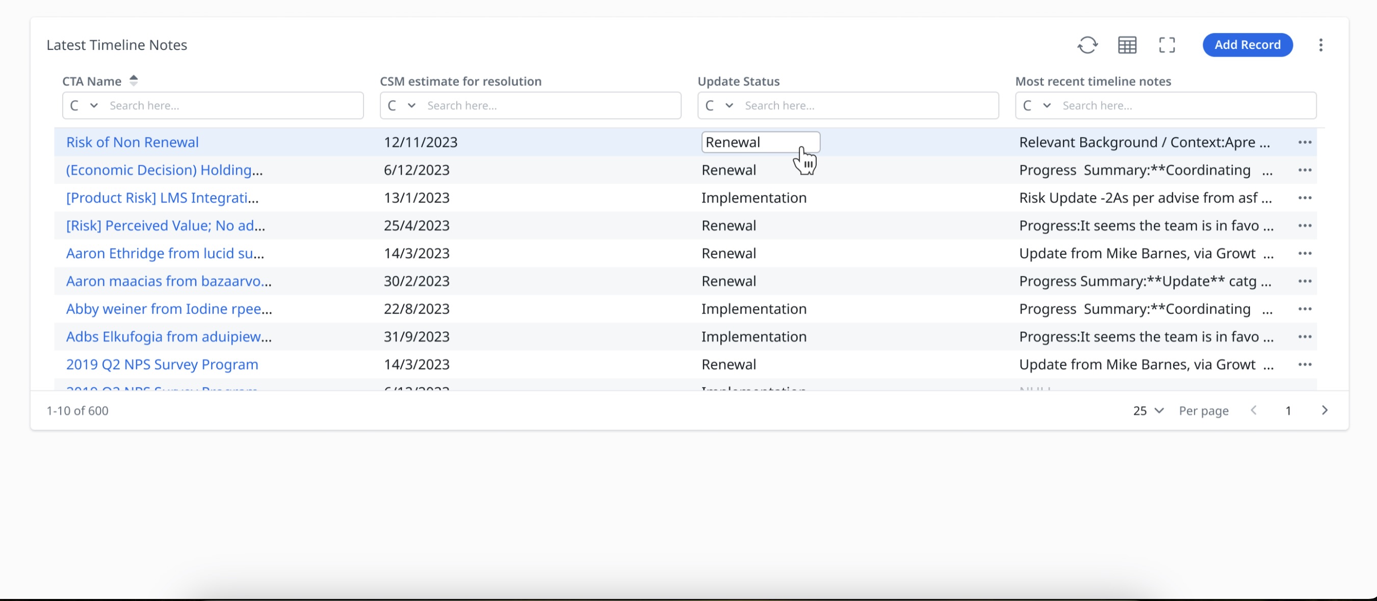
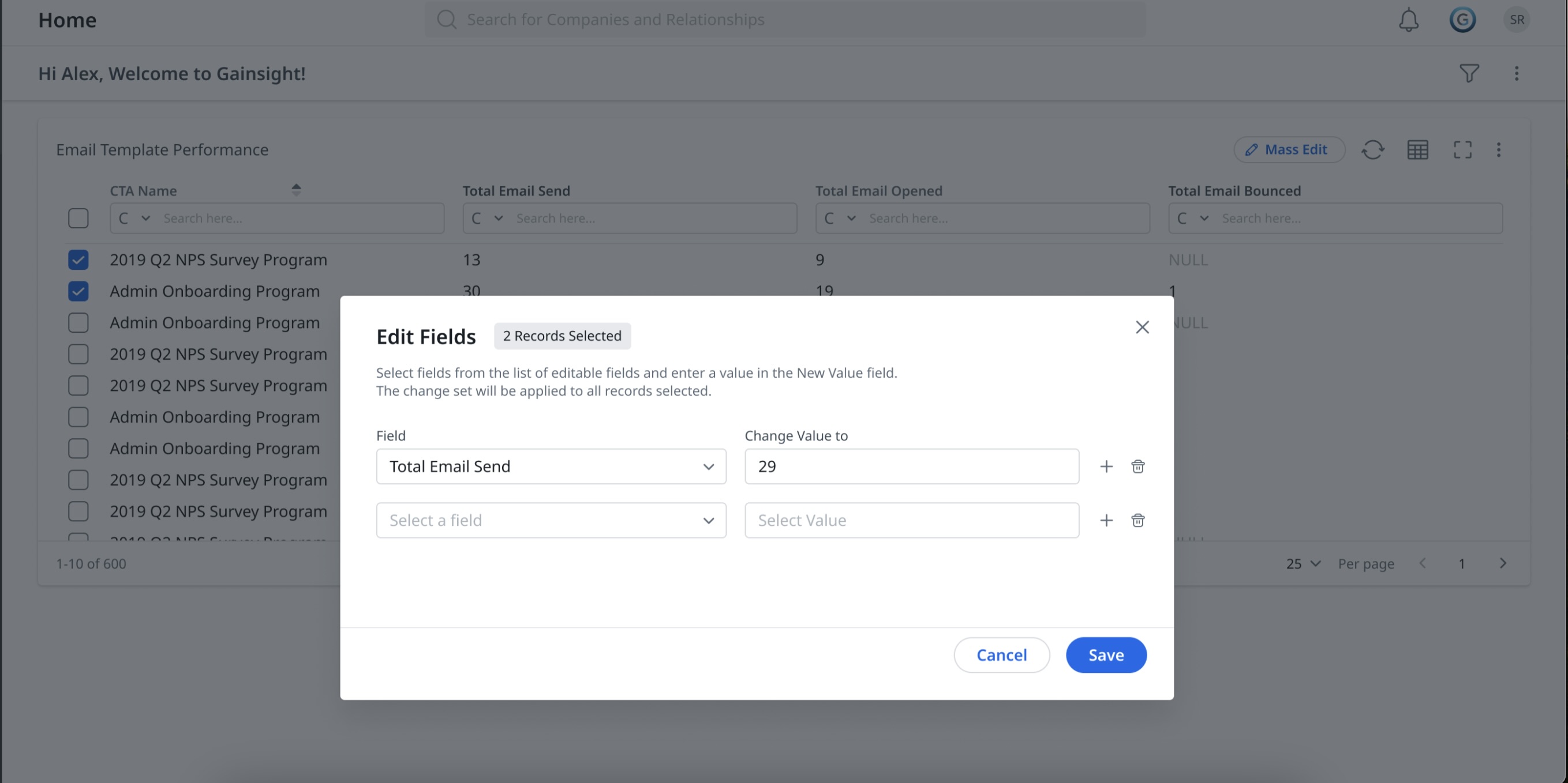
Mass Edit
In the Chart Settings, you can Enable Mass Edit.
To enable Mass Edit:
-
Click the Settings/Gear icon. The Chart Settings window appears.
-
Expand Grid Option, turn on the Mass Edit toggle.
-
Click Apply.
-
Select all the records you wish to edit. The Mass Edit icon becomes active.
Note: Using the mass edit functionality, you can update up to 200 records at once.
-
Click Mass Edit. The Edit Fields window is displayed.
-
Edit values in the required fields.
-
Click Save. A confirmation pop-up appears, asking if you are sure about mass editing the selected records. Select Yes to confirm.
-
(Optional) Mass edit can also be activated from any report consumption area. Click the three-dots vertical menu and turn on the mass edit toggle.
Note:
-
To perform mass editing, ensure that Inline Edit is enabled and configured for your organization, and appropriate fields are selected.
-
Mass edit does not support controller and dependent dropdowns.
-
After you enable the Mass Edit toggle in Settings, it automatically turns off in the following scenarios—even if the report was saved with the toggle on:
-
When a report refreshes
-
When the page refreshes.
-
This applies to all the report widget consumption areas.
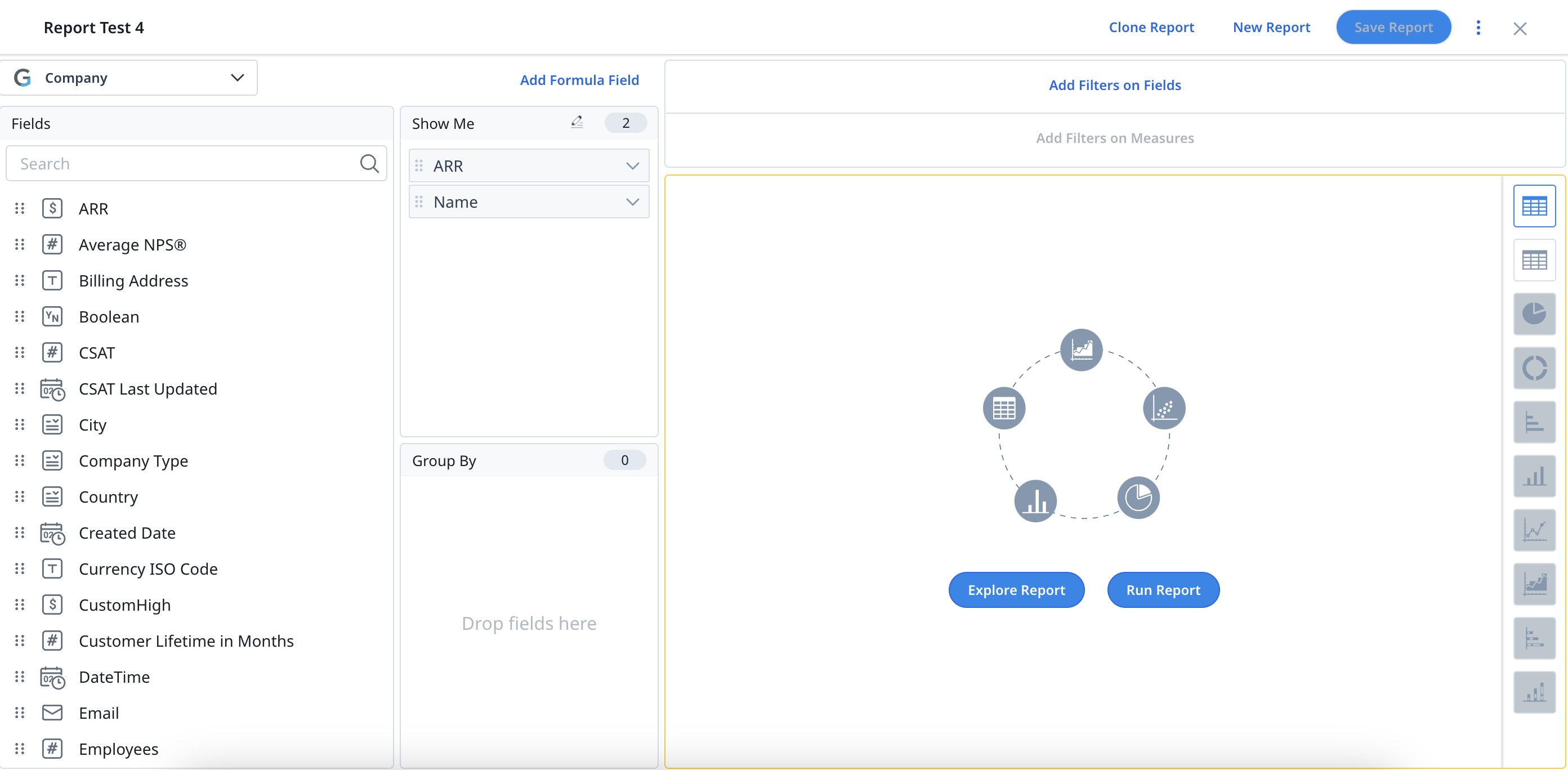
Explore Reports
You can create reports using existing reports created on the same object. Existing reports can be cloned and then modified as per the requirement. Changes made to the cloned report are private and not reflected in the original report.
To reuse a report:
- Navigate to Insights > Reports.
- Click the Create Report button.
- From the Select Object dropdown, select the required object.
- Click the Explore Reports option. All the reports created on the selected object that you have access to are displayed.
- Select the report that you want to reuse by clicking the Use this report option
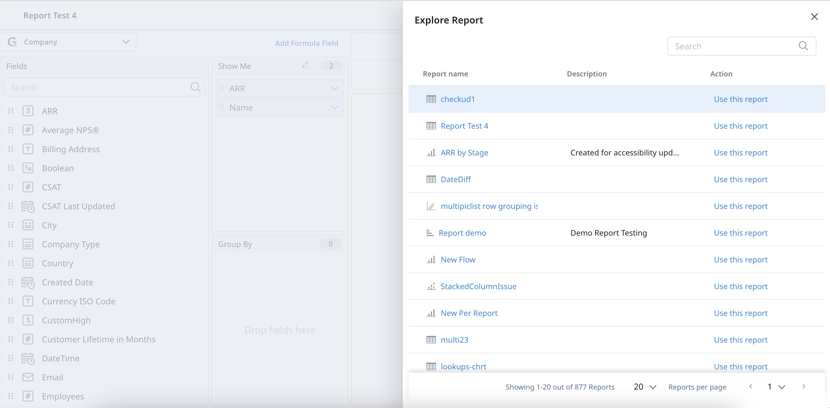
- Provide a name for the new report.
- Click Save.
Add Reports to Dashboard
You can also add the reports to Dashboards. For more information on adding reports to Dahboards, refer to the Configure Dashboards article.