Configure Column Line Visualization Report
Gainsight NXT
The article describes how Admins can configure a Column Line visualization report in the Report Builder.
Introduction
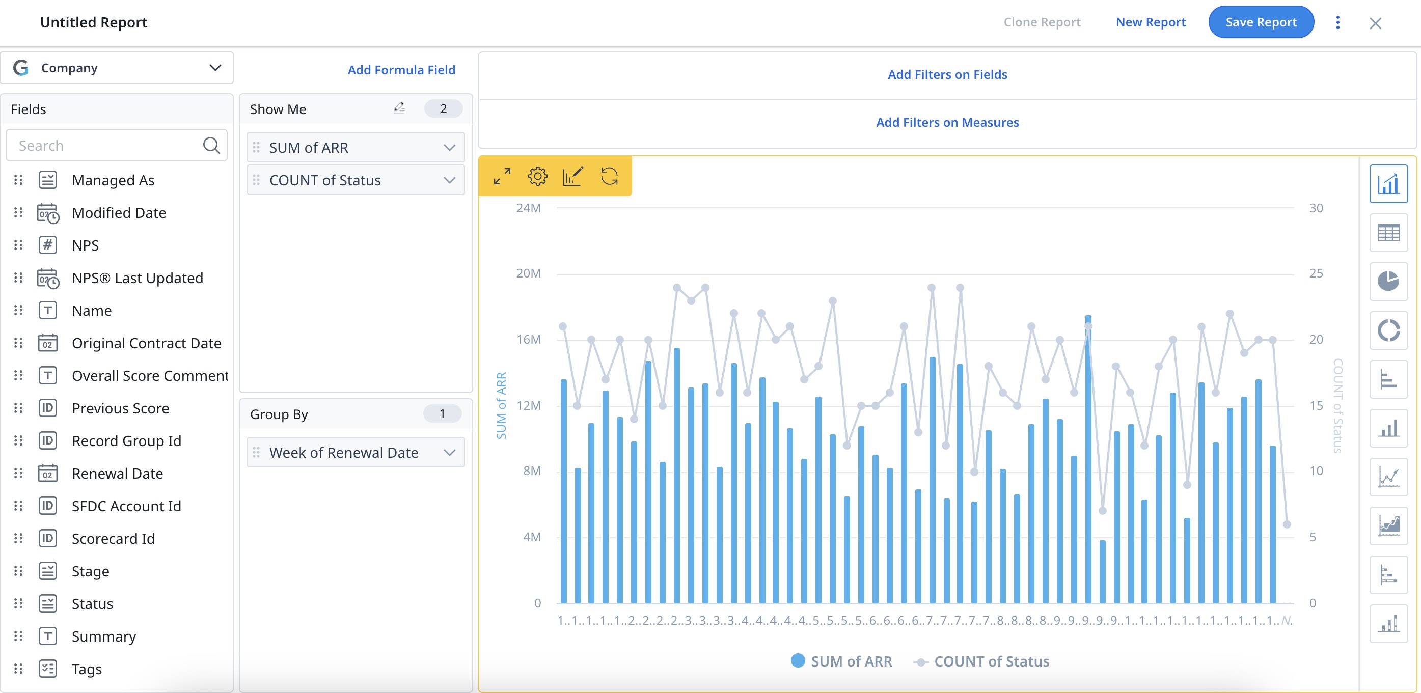
The Column Line visualization is enabled only when a minimum of 2 Fields are added in Show Me and a maximum of 1 Field in Group By.
The Column Line visualization can be created in the combinations of 2x1, 3x1, 4x1, 5x1, and 6x1 Fields for Show Me and Group By, respectively.
Note: Column Line visualization supports a maximum of 6 Fields in Show Me.
Configure Column Line Visualization
To configure the Column Line Visualization:
- Navigate to Insights > Report Builder (BETA).
- Click on the existing report to edit the report or click Create Report to create a new report.
- Add the Fields required in the Show Me and Group By sections.
Notes:
- A minimum of 2 Fields are required in Show Me, and a maximum of 1 Field is needed in Group By to enable Column Visualization.
- Column Line Visualization is not enabled for more than 1 Field in Group By section.
For more information on creating new reports, refer to the How to Build Basic Reports article in the Additional Resources section at the end of this article.
-
From the right pane of visualizations, select the Column Line chart. The data in the report is displayed in a Column Line chart.
Note: By default, the last field in the Show Me section is assigned as Line and other fields as columns. Admins can change the representation of the fields as Lines in the settings sections of the report.

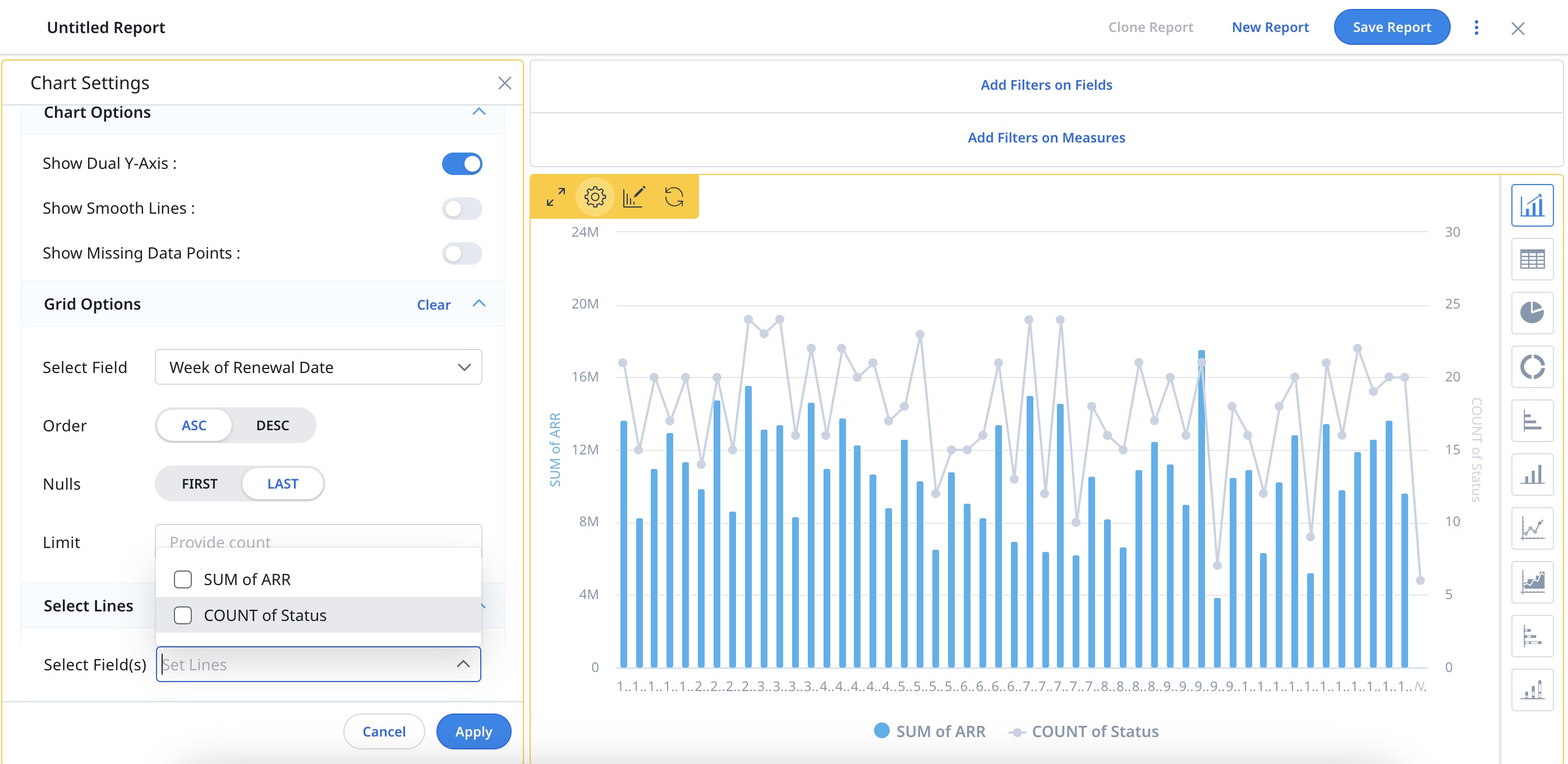
- Click the Settings/Gear icon on the report. The Chart Settings page appears.
- Click the Select Lines dropdown section.
- From the dropdown list of Select Fields, select the required field to be represented as Lines.
Notes:
- Only 1 Field can be selected at a time for representation as Line.
- To enable Column Line visualization, you must have at least one column and one line.
-
Click Apply.

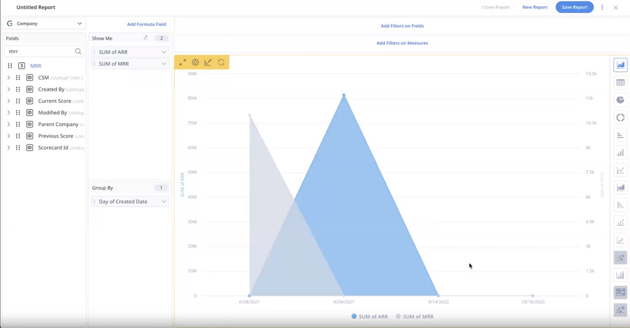
Note: The visualization types: Column Line, Line, and Area chart are consistently presented in ascending order to improve chart readability. Even if the user applies the DESC (Descending) filter in Chart Settings, causing the system to sort the underlying data in descending order, the chart continues to visually display the data in ascending order, when the data is grouped by a Date or Date time field.
For example, consider the dataset with records 6/28/2021, 8/24/2021, 3/14/2022, and 10/18/2023. When applying the DESC filter, the underlying data is sorted in descending order as 10/18/2023, 3/14/2022, 8/24/2021, 6/28/2021. However, despite the descending sorting, the chart visually displays the data as 6/28/2021, 8/24/2021, 3/14/2022, 10/18/2023. In terms of appearance, the data seems to progress from left to right, creating a visual impression of ascending order.

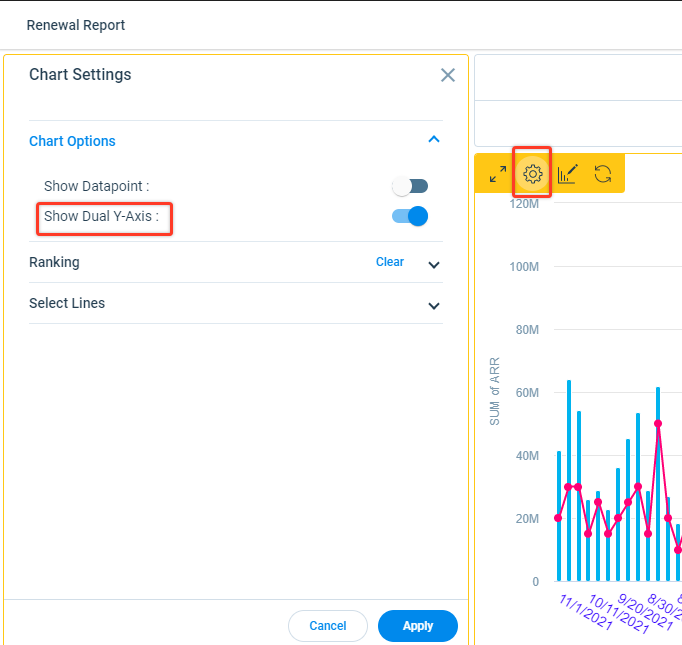
In Column Line visualization, the Dual Y-axis is enabled automatically, all the Lines corresponding to the Y-axis are on the right side, and all the Columns corresponding to the Y-axis are on the left side.
To enable or disable the Dual Y-axis:
- Click the Settings/Gear icon on the report. The Chart Settings page appears.
- Click Chart Options.
- Toggle the Show Dual Y-axis switch.

For more information on the Chart settings, refer to the Chart Setting and Chart Editor article in the Additional Resources section at the end of this article.