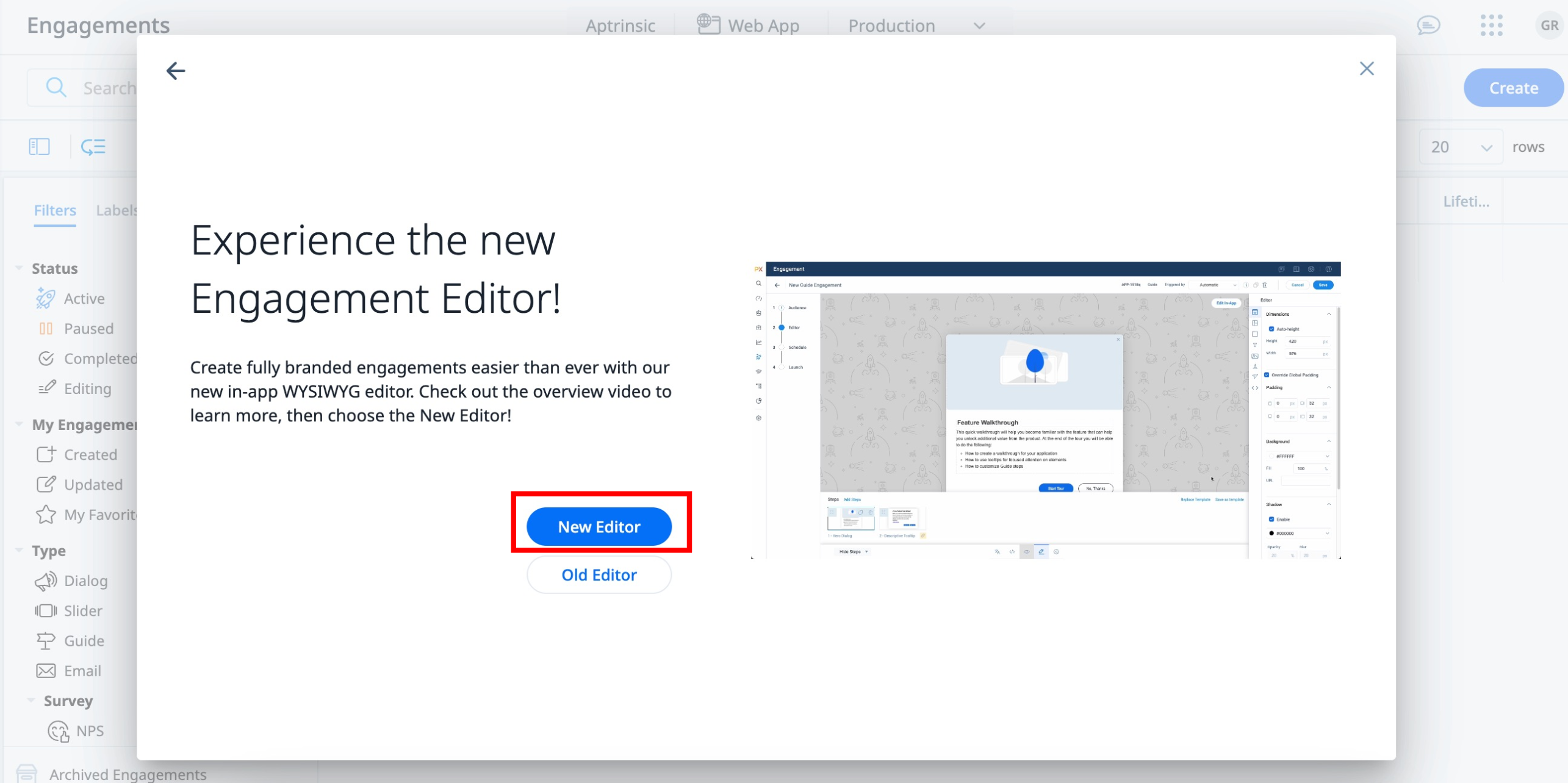
Know your Editor
This article explains the various configurations available in the New Editor and how to use it to create guide engagements.
Overview
The New Editor in Gainsight PX allows you to design and administer in-app guide engagements. Its user-friendly interface simplifies the process of creating guides without extensive technical know-how. It offers configurations that easily customize guides to meet the specific needs and aesthetics of your applications. Ultimately, the guide editor boosts user engagement by enabling the straightforward creation of interactive and helpful in-app guides.
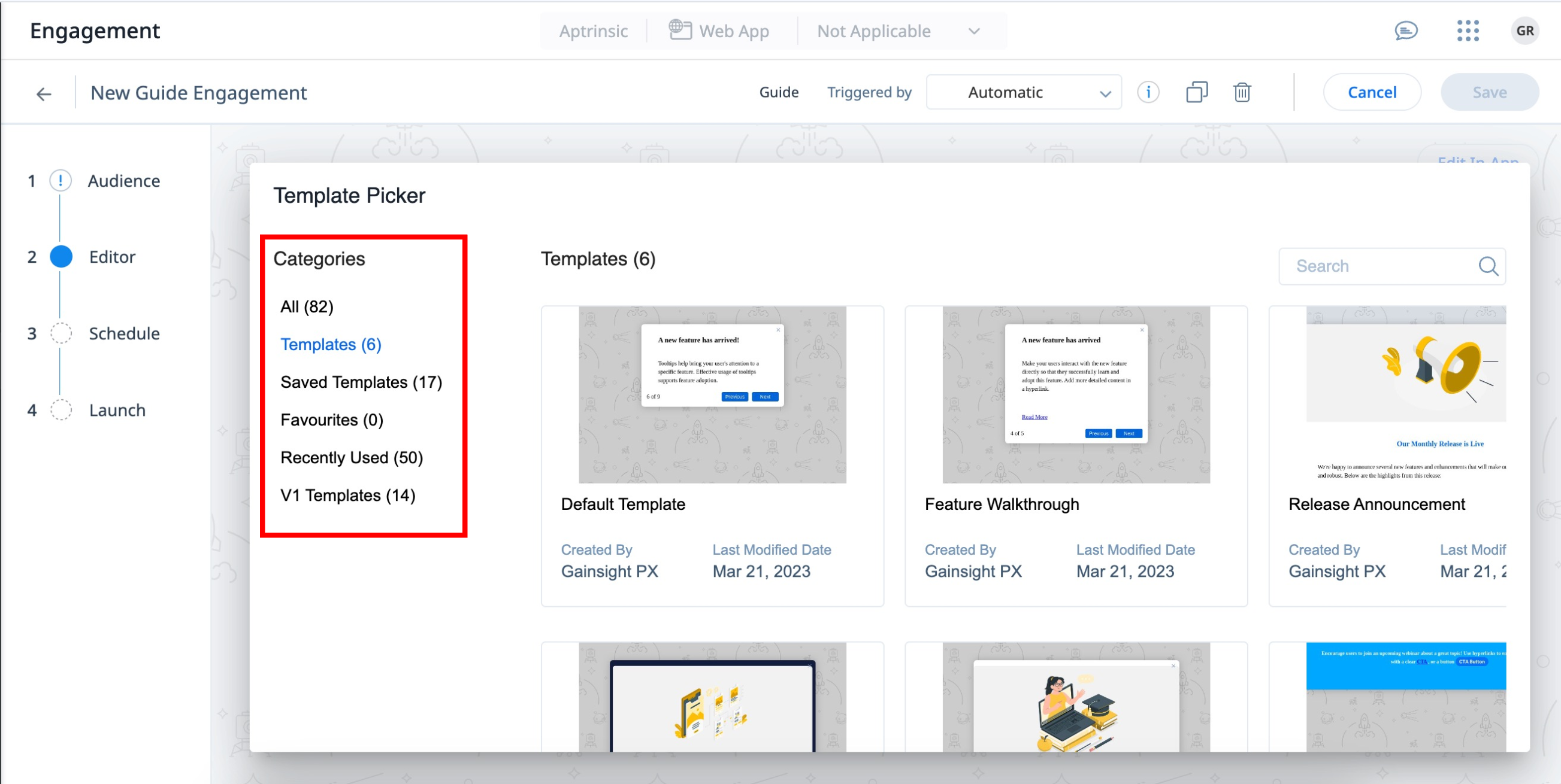
Choose the Right Template for Your Guide Engagement
PX offers a library of engagement templates. Templates are categorized into the following tabs:
- All: Displays the list of all the templates, Saved Templates, Default Templates, Favorite Templates, Recently used, and V1 Templates.
- Templates: The templates listed here are default Gainsight templates that help you to quickly start with your first set of In-App guides. They function as ready-to-use templates that have customizable font style and layout dimensions across steps, where content and images can be added directly. For more information on the different templates, refer to the Engagement Template article.
- Saved Templates: Displays the list of your saved templates.
- Favorites: Displays the list of templates you have marked as favorites.
- Recently Used: Displays the list of your recently used templates.
- V1 Templates: Displays the list of templates for Editor V1. The V1 Templates category is designed for users who have extensively used the old editor to create templates. This category ensures that they can continue to use these templates in the new editor.
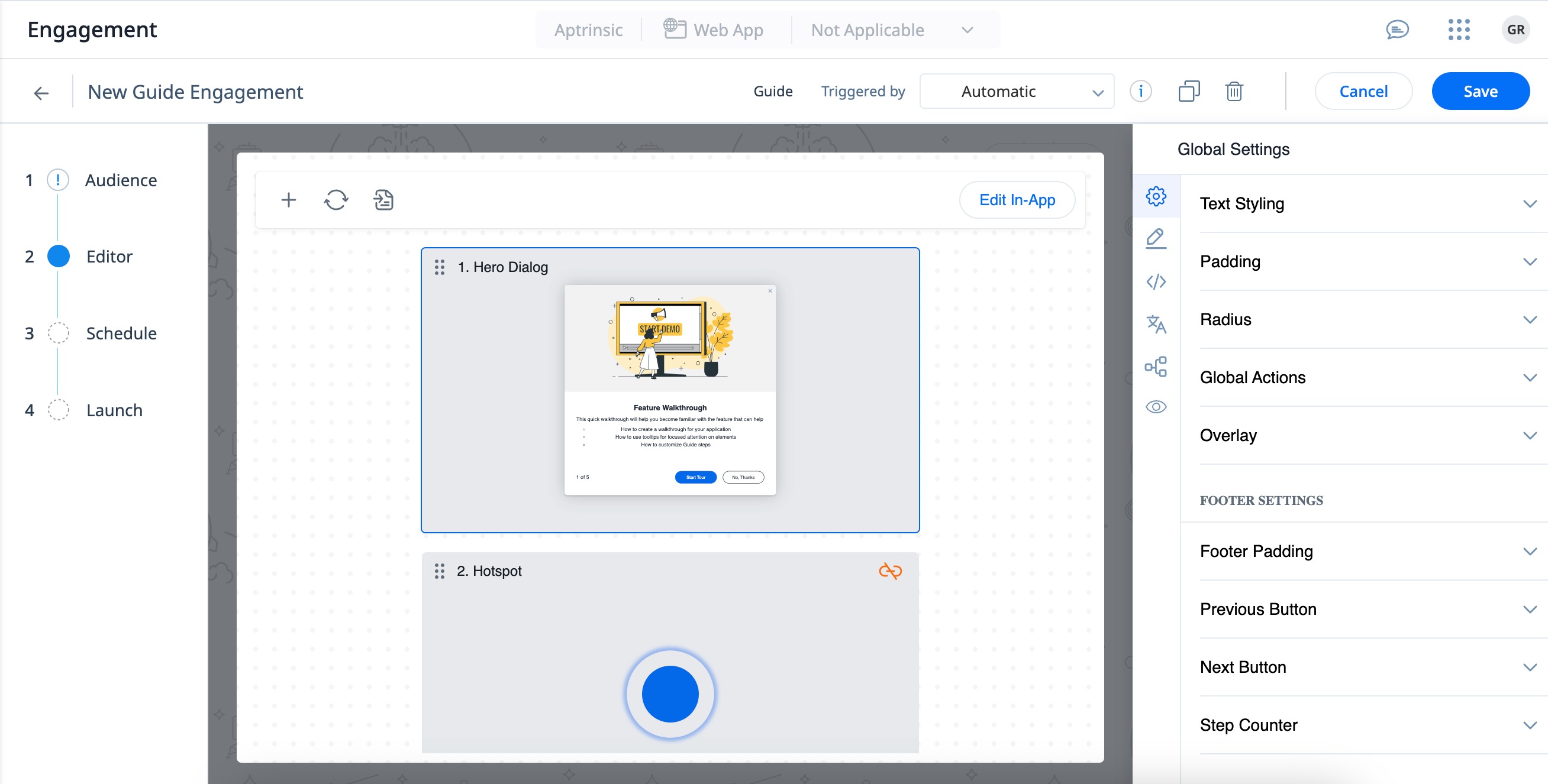
View All Steps of an Engagement
The Global Settings section allows you to view all the steps that are part of the engagement. From here, you can configure the padding, text styling, footer settings, and so on, that are applied to all the steps within the engagement.
To configure the global settings:
- Navigate to the Editor section in the guide engagement.
- Select a guide template from the library in the Template Picker dialog box.
- View all the steps in the editor with the corresponding Global Settings on the right panel.
- (Optional) Click the plus icon to add more steps.
- (Optional) Click the doc icon to save the guide engagement as a new template.
|
Section |
Description |
Customizable Options |
|---|---|---|
|
Text Styling |
Configure the font, size, and color of the text for all the steps of the engagement in one go. |
|
|
Padding |
Configure the space between the content of the step and its layout. |
|
|
Radius |
Configure the radius of the step corners. This helps in achieving rounded corners. |
Corner radius |
|
Global Actions |
Configure the guide engagement to either close or navigate the user to a specific URL when a user clicks on the close option or completes the Guide. |
|
|
Overlay |
Adds a colored overlay on the target application page, underneath your engagement. This helps bring the engagement in focus, or grabs user attention more clearly, especially in multi-colored applications. |
|
|
Footer Padding |
Configure the space between the content and its border. |
|
|
Previous Button |
Configure the button to navigate the user to the previous step of the guide engagement. |
|
|
Next Button |
Configure the button to navigate the user to the next step of the guide engagement. |
|
|
Step Counter |
Display of the current step number along with the total number of steps in the guide engagement. Note: The step counter is not available for the first and the last step. |
|
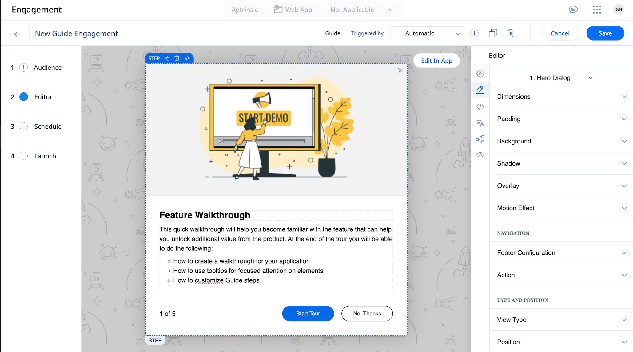
Editor
Edit the content at any element level, whether it is a step, row, cell or button level. When an element is selected the editor console automatically adapts, displaying all relevant setting options for that particular element.
Step Settings
This section describes the different configurations available at step level of the guide.
|
Section |
Description |
Customizable Options |
|---|---|---|
|
Dimensions |
Configure the dimensions(height and width) of the step in guide engagement. |
|
|
Padding |
Configure the space between the content of a step and its layout. |
Enable override step padding |
|
Background |
Configure the background of the step. |
|
|
Shadow |
Configure the shadow color of the step to improve the aesthetics of engagement. |
|
|
Overlay |
Overlays help focus out the background of the application, and focus attention to the guide engagement. Note: When turned on, overlays deactivate the application while the guide is displayed. |
|
| Automation Settings |
Automations Settings allows you to configure:
|
|
|
Navigation |
Configure how users navigate across the engagement steps |
|
|
Action |
Configure what happens when the user clicks Next. |
|
|
Skippable |
Allows users to skip a particular step. |
Enable |
|
Selector |
Configure the details of the final element selector mapped for Hotspot or Tooltip |
|
|
Mapping |
Configure different class or ID options based on strength for a mapped element. |
|
|
Position |
Configure the position of your engagement on the user’s application. |
|
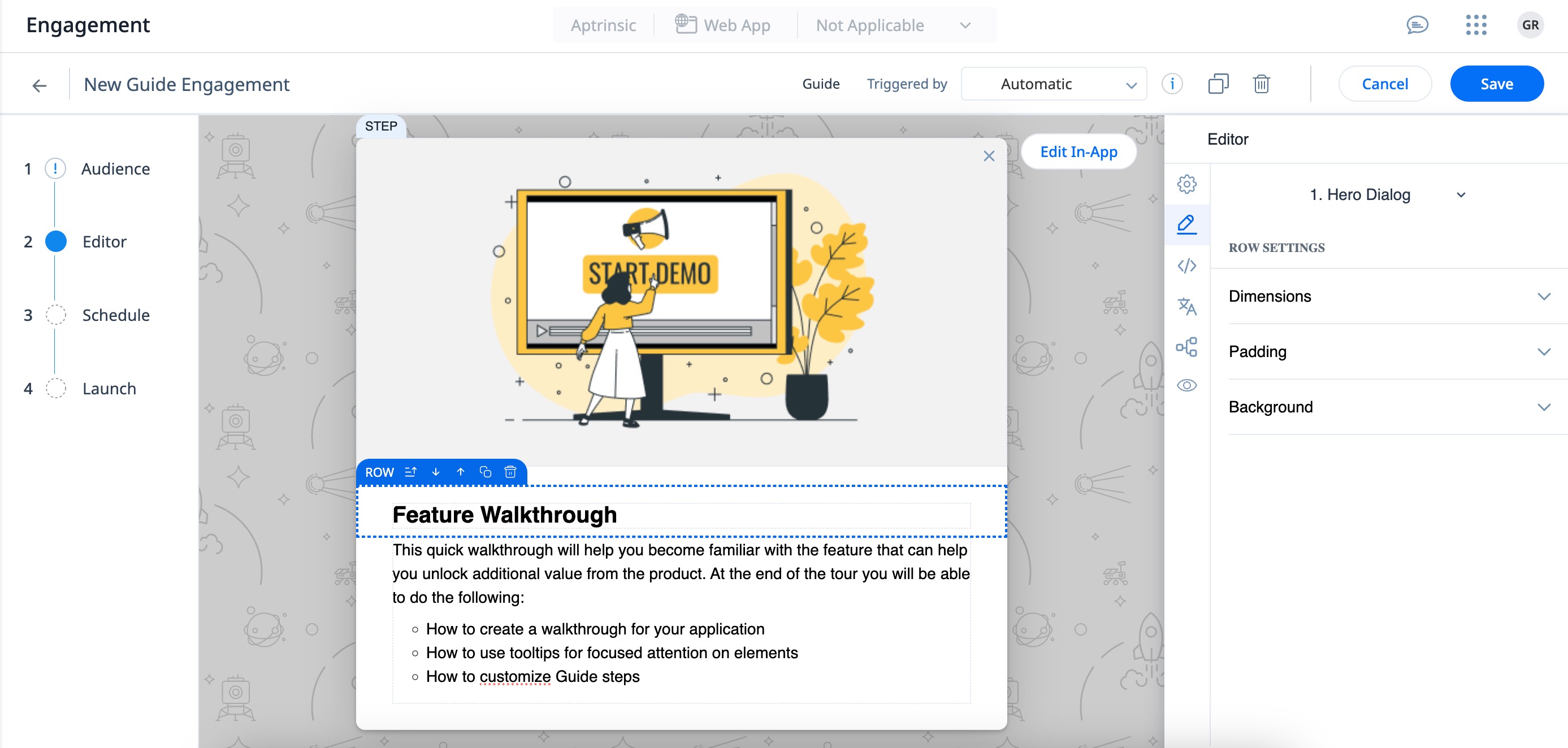
Row settings
This section describes the different configurations available at row level of the step in the guide engagement.
|
Section |
Description |
Customizable Options |
|---|---|---|
|
Dimensions |
Configure the height and width of the row in the step of the guide engagement. |
|
|
Padding |
Configure the space between the content of a row and its layout. |
|
|
Background |
Configure the background of the row in the step of the guide engagement. |
|
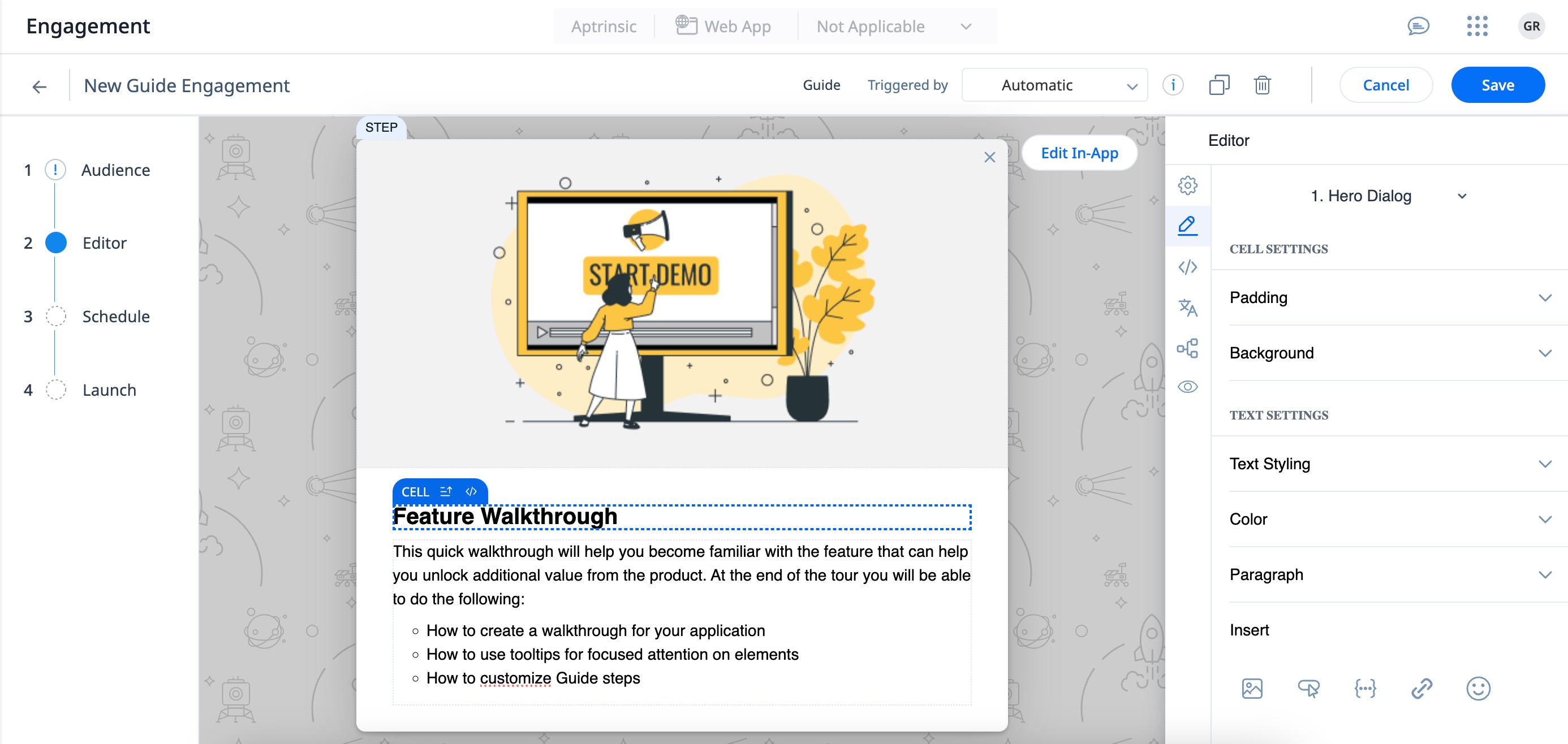
Cell Setting
This section describes the different configurations available at cell level of the step in the guide engagement.
|
Section |
Description |
Customizable Options |
|---|---|---|
|
Padding |
Configure the space between the content of the cell and its layout in the step of the guide engagement. |
|
|
Background |
Configure the background of the cell. |
|
|
Text Styling |
Configure the text font in the cell. |
Select Font |
|
Color |
Configure the color of text in the cell. |
|
|
Paragraph |
Configure the text for a selected paragraph in the cell. |
|
|
Insert |
Insert images, custom buttons, personalized User and Account tokens, links, and emoticons to enhance the user experience. |
|
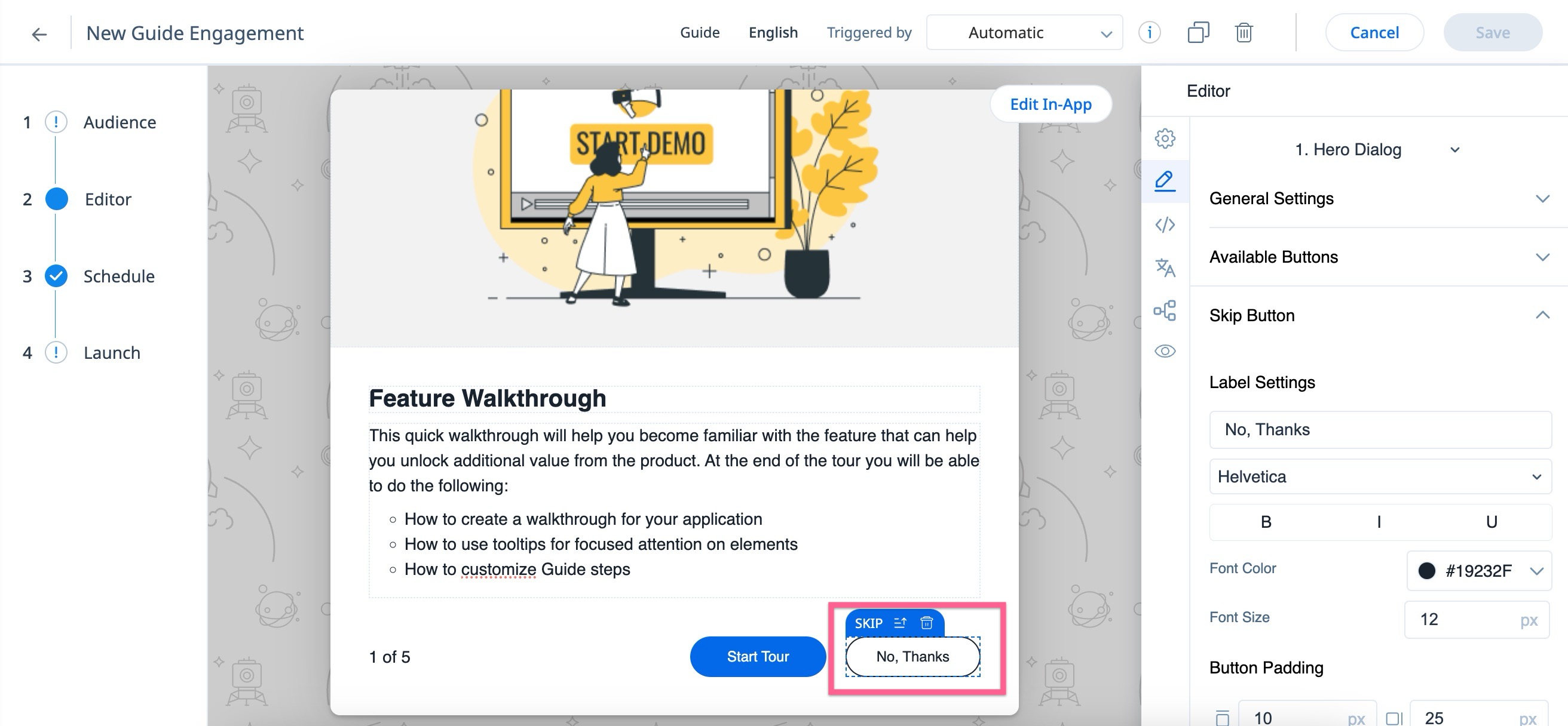
Button Settings
This section describes the different configurations available at the button level of the step in the guide engagement.
|
Section |
Description |
Customizable Options |
|---|---|---|
|
General Settings |
Allows you to override the Global Settings for the buttons. |
|
|
Available Buttons |
Lists the buttons that can be added to the guide. Note: The Snooze option allows postponing viewing of the engagements to a later point in time. For more information on Snooze, refer to Snooze Engagements. |
|
|
Selected button(Skip) |
Configure the look and feel of the selected button. |
|
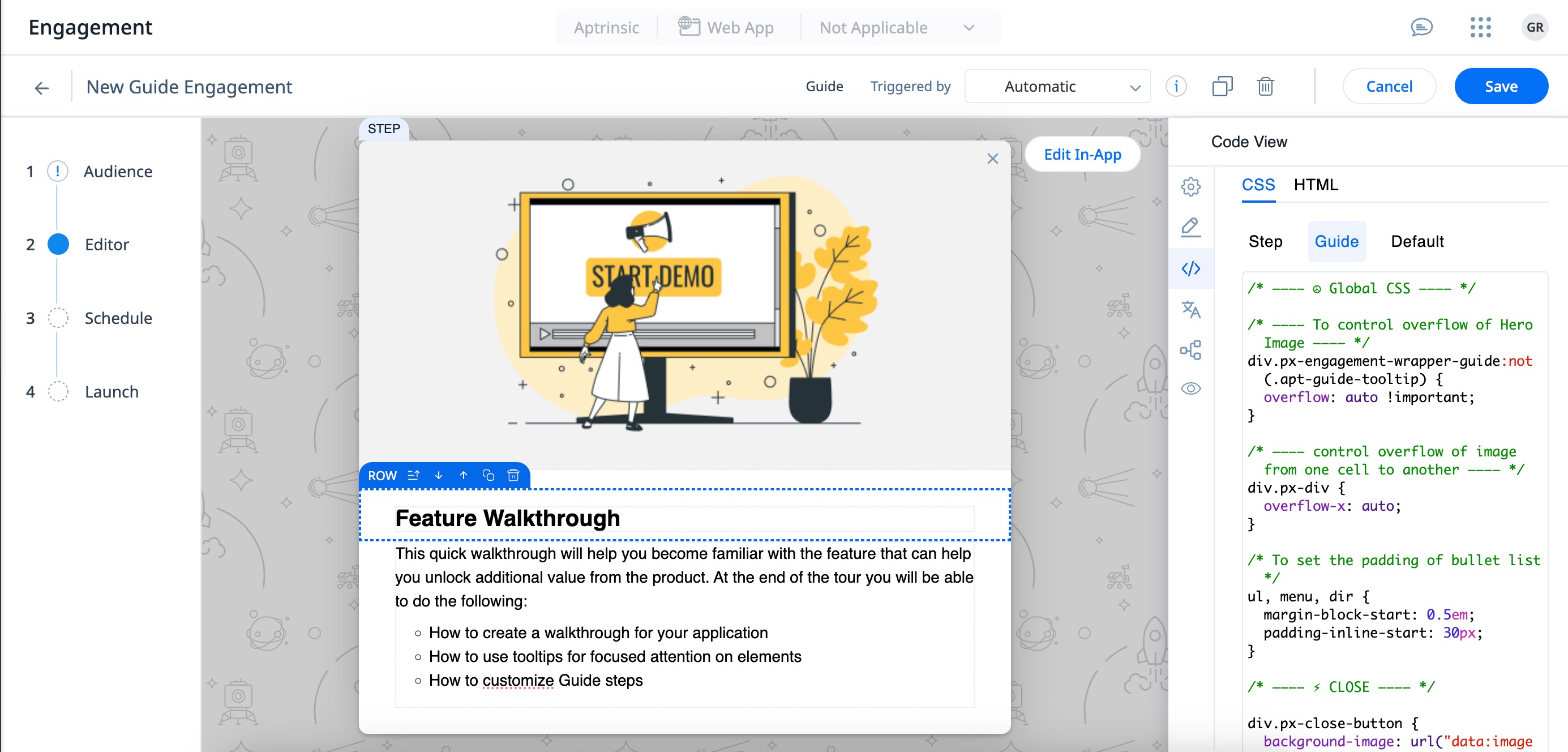
Code View
The Code View section focuses on a snippet of CSS and HTML code. You can directly edit the styles that affect the appearance and formatting of the user engagement guide.
The CSS code provided has comments that guides you on what each section of the code does. The comments are marked with asterisks and hyphens, a common convention for multi-line comments in CSS.
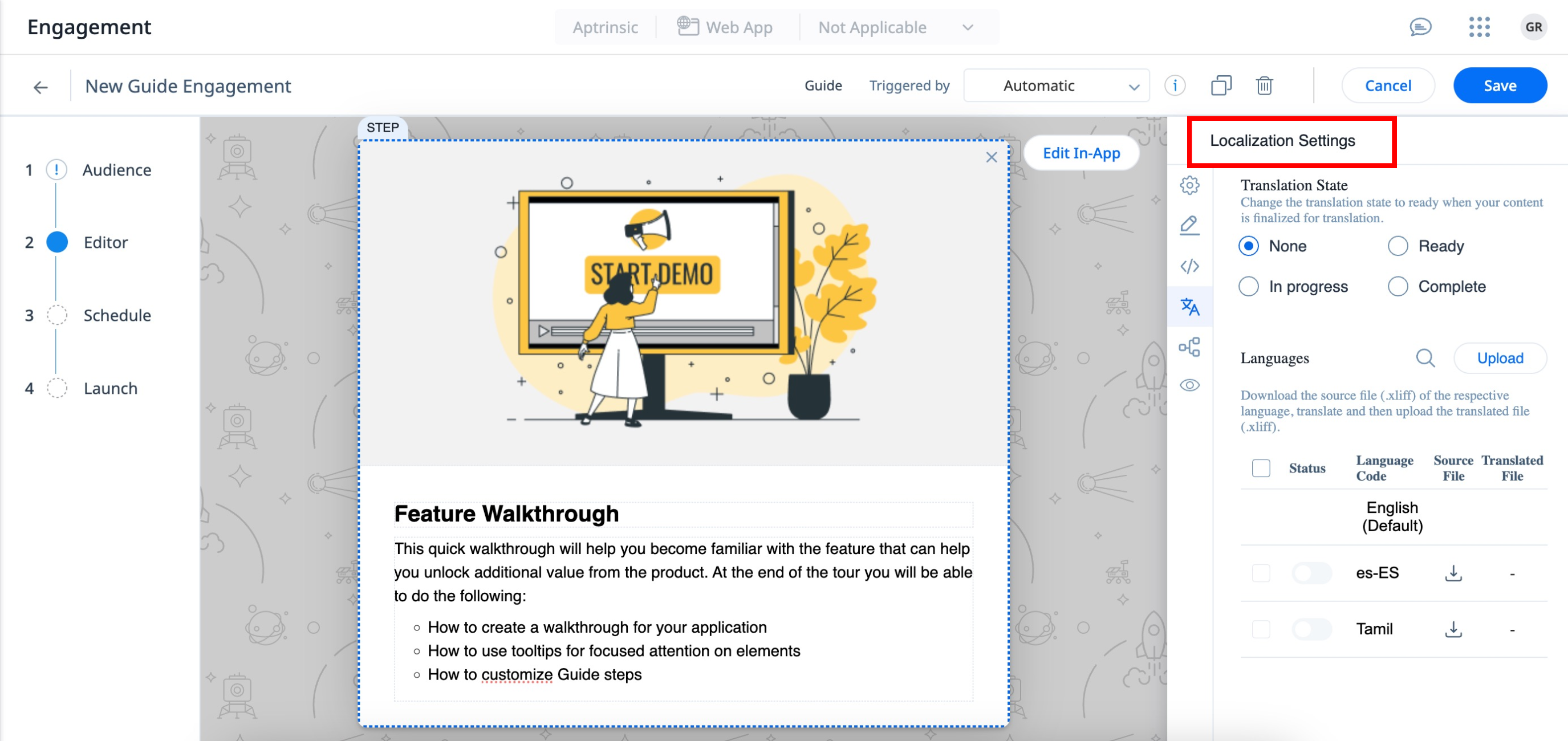
Localization Settings
Gainsight PX allows you to translate the content of your engagement into other languages. You can set a default language and translate the engagement content into multiple languages, from the default language. If you have customers in different parts of the world, you can use this feature to display engagements to your customers in their local language. Gainsight PX supports translation to 107 languages.
To understand the engagement localization feature in detail refer to the Engagement Localization article.
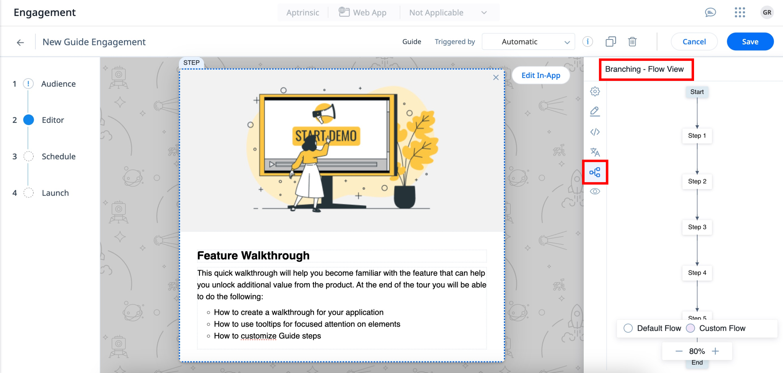
Branching
The branching capability for Guide engagements created in New Editor empowers you to direct the flow of Guide engagements. You can include and configure custom CTA buttons within each step which grants users the flexibility to navigate directly to the preferred step, rather than adhering to a strict sequential flow. You can also customize the navigation path to the preferred next step when a tool-tip is skipped.
To customize the navigation flow and create branches in the Guide engagements refer to Branching in Guide Engagements.
Preview Engagement
You can preview the current step of the guide engagement in-app to verify how the engagement is displayed on the application interface and to make further modifications.