Color Setting in Reports
Gainsight NXT
This article explains about the default color palette and the process of using custom colors for representing the reports.
Overview
Reports can be viewed with various visualization types such as Pie Charts, Bar Graphs, and Bubble Charts. The colors that represent these visualizations are based on the Gainsight Default palette of 30 colors.
This article discusses the color palette, explains the method of overriding the default palette, and how to choose a custom color for specific values related to specific fields, such as CTA Risk = Red, CTA Opportunity = Green.
Note: The reports exported as images will not inherit the color palette of the PPT template.
Color Palette
To view and make changes to colors in Reports:
-
Navigate to Insights > Report Builder (BETA) > Settings.
-
The Settings page appears. This page has 3 sections:
- General Settings
- Color Palette Settings
- Custom Colors
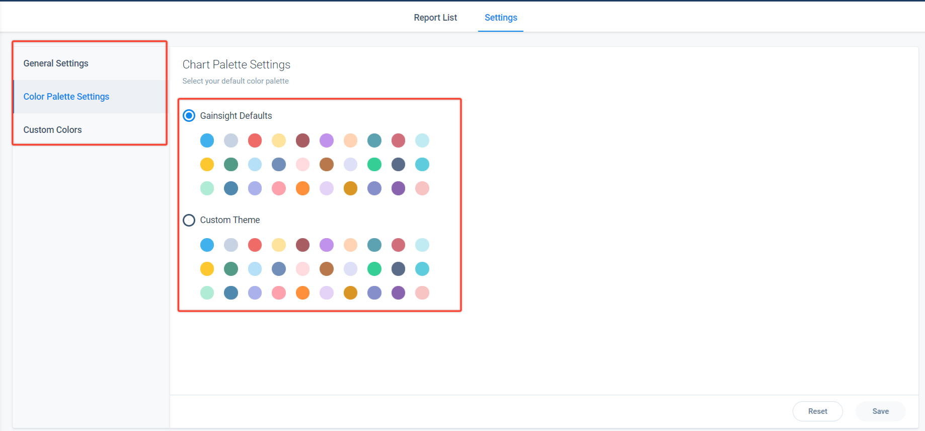
Color Palette Settings
By default, Gainsight Defaults color palette is selected, it assigns the sequence of colors used in reports (or) select Custom Theme to customize the colors, as per your branding.
The Color palette assigns the sequence of colors used in reports in an order from left to right. This palette also works similar to the color palette in Microsoft PowerPoint. For example:
-
For a single value in a bar chart, the bars will be displayed in the first color of the palette.
-
For bar charts or stacked bar charts, when plotting multiple values, the groups of multiple bars are displayed with the first bar represented with first color in the palette and followed by other colors for subsequent bars.
-
The Pie chart representation (based on sort order) displays the first color, followed by other colors. Reordering the values (or reordering the Group By fields) changes the color of a value field or field in the report.
-
If there are more than 30 sections, the colors start from the first one again. Since the colors depend on the order of values and not the value itself, reordering the values (or reordering the By fields) changes the color of a value or field in report.
-
For 1x2 graphs, the colors of data labels match the color palette settings. However, when visualized, the data labels appear in ascending or alphabetical order.
Override Default Color Palette
By default, Gainsight Defaults color palette is selected, Admins have the ability to select Custom Theme in the Settings page based on the requirement.
Admins can use the Custom Theme to customize and make sure the charts have the same color palette in all places or follow the branding of their company. To choose the theme:
-
Navigate to the Insights > Report Builder (BETA) > Settings > [click Color Palette Settings] > [select Custom Theme].
-
To modify the colors within the Custom Theme, click the Pencil icon on the specific colors.
-
Input the values for HEX, R, G, and B or select the color from the palette.
-
Click Save (or click Reset to return to the default setting).
Note: Change colors for series: For side-by-sidebar reports, where there are multiple bars in each time threshold, re-order the Show me variables in the report builder to change in which order the bars appear in the chart.
Updating Colors for Specific Field Values
Call to Action (CTA) Colors
To modify the colors associated with Call to Action, navigate to Administration > Call to Action (CTA). For more information, refer to the Configure Cockpit Tasks article in the Additional Resources section at the end of this article.
Scorecards Colors
To modify the colors associated with Scorecards, navigate to Administration > Scorecard. For more information, refer to the Configure Scorecard Schemes article in the Additional Resources section at the end of this article.
Custom Colors
From the Settings page, use Custom Color to change colors for specific field values under a source object.
For example, the CTA object is a source object, under which Overdue type is a field object. To indicate the Overdue object as a Risk factor, set the color to Red for the Overdue object, which results in displaying all the reports containing Overdue objects in Red color. Other field objects that might be helpful to color code include Industry, NPS Promoters, and NPS Detractors.
Follow the below steps in-order to change colors for specific field values:
-
Navigate to Custom Colors in Settings page.
-
The Custom Colors page displays Object name, Field name, and Colors that are assigned to the field values within the Field name.
-
To modify the existing colors of the specific field values, click the Context menu and select Edit Color.
-
The Map Colors page appears, navigate to the Set Value Name, and change the corresponding Set Value Color.
-
Click the color value and select the color or input the Hex, R, G, and B values.
-
Click Save.
-
Click Reset to reset the colors setting.
- Admins can delete the existing colors, by navigating to the Context menu and select Delete Color.
Limitation: Setting custom colors to the values in the lookup fields, and GSID is not possible.
Map Colors
Alternatively, Admins can configure and assign colors to Field values on the Map Colors page.
To assign colors to Field values:
-
Click Map Colors.
-
From the Select Object dropdown list, select the Source object.
-
The Fields dropdown list displays all the fields associated with the Source object. Select the required Field object.
-
Click Add Value.
-
Input the Set Value Name and select the corresponding Set Value Color as required.
-
Click Save (or click Reset to return to the default setting).
Note: A maximum of 30 Set Value Names can be configured.