Survey Properties
Gainsight NXT
Overview
This article explains admins on applying different configurations on a survey in the Survey Properties page. After a new Survey is created, the Properties page of the new Survey appears. In this page, Admins can:
- Change the Basic Configuration of the Survey like Entity, Name, and Languages in Mandatory Fields section.
- Apply Additional Configuration like Survey Type, Category in Additional Fields section.
- Configure the Visual Experience in the Theme section.
To learn more on how you can create a Survey, refer to Create a Survey.
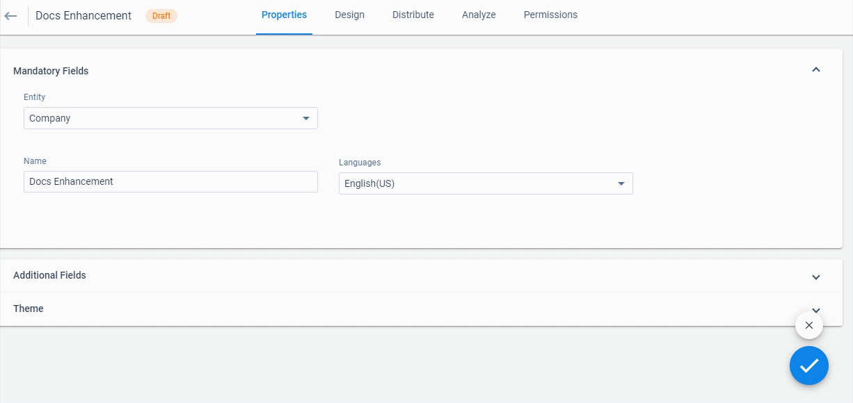
Click ✓ at the bottom-right of the page to save any changes, and click X to undo any changes.
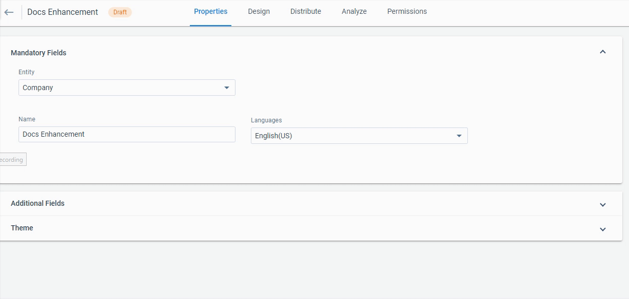
Mandatory Fields
You can change the following options in the Mandatory Fields section. Configure the following options in the Create Survey page:
- Entity: Select if you would like the Survey to be for Company or Relationship. For Relationship, you can change the Relationship type.
- Name: Edit the survey’s name.
- Languages: Select one or multiple languages.
Additional Fields
Configure the following options in the Additional Fields section:
- Survey Type: Select one of the following options:
- Transactional: Transactional surveys tend to be event-based such as after training or a conference, after key customer stages (for example, implementation/time of launch), after case closure, or after an opportunity is closed.
- Non-Transactional: Non-transactional surveys are about gathering overall periodic input on your product or process such as NPS®/Customer loyalty and satisfaction assessment; measure ROI; or identify advocates for possible references.
If you select the Transactional survey type, the following fields are available for configuration:
- Associated Object: You can select an object to be linked to survey responses. Typically an admin would select an object where a transaction is recorded such as case closure or new opportunity.
Note: Data designer objects are not supported for the transactional survey. - Associated Field ID: You can select the ID of a field to associate with the survey. If the Associated Object is an MDA object, Associated Field can be any field available in the MDA object.
- Associated Field Name: You can select the field to associate with the survey.
- Survey Category: Select from the following options for the Survey:
- Non-Anonymous: The person responding to the survey is known and tracked.
- Anonymous: The person responding to the survey is completely unknown and not tracked.
- Semi-Anonymous: The person responding to the survey is unknown, but the person’s associated company or relationship is known and tracked.
Note: If Anonymous is selected, the survey cannot be changed to Non-Anonymous. The Anonymous and Semi-Anonymous are only supported by the generic survey Program model. For more information on Program models, refer to Available Models for Programs. For more information on sending Anonymous and Semi-Anonymous surveys, refer to Distributing Anonymous and Semi-Anonymous Surveys through Programs.
- Start Date: Enter the Open Date of the survey
- End Date: Enter the Closed Date of the survey
- Link Expiration: Configure the number of days for which the survey link is valid after the survey is sent. If this field is left blank, the survey link does not have an expiry date.
- Partial Completion: Enter the number of days for partial completion.
Survey responses are automatically saved every 5 seconds. If a respondent drops off a survey due to survey fatigue or navigates away from the survey, partial data will be saved. The respondent can also complete the survey later without losing any data. Incomplete submissions will be logged as “Partial Saved” until a set amount of time determined by the admin elapses. The Partial Saved survey will be logged as “Partial Submitted” after the set amount of time passes. The field Partial Completion allows you to configure the amount of time required before a “Partially Saved” response gets converted to “Partially Submitted”. By default, this value is set to 10 days.
Notes:
- Once a partially saved response gets converted to partially submitted, participants will not be able to continue taking their survey.
- If you publish your survey (it's "live") and you're testing it, keep in mind that the partial save functionality will store any answers that you select during testing. Partial save occurs automatically in the background and does not require the user to click save or submit. This could inadvertently lead to answers being stored for a contact that did not actually take the survey.
- Survey Code: Check the survey code here. For backend purposes, available in reports and to track surveys. Gainsight automatically generates a code.
- Allow Internal Submission: Select this check box if you would like to be able to manually enter responses on behalf of survey recipients. This can be used if you have a low response rate and decide to do a phone campaign to ask the same questions. For more information on submitting internal responses, refer to Submit Surveys Internally.
Note: Internal Submission is only available for surveys with the Non-Anonymous category. - Allow Auto Save Answers: When enabled, saves the survey responses automatically while the survey participant is filling out the survey.
Note: By default, the toggle remains enabled, and you can turn it off based on your requirements.
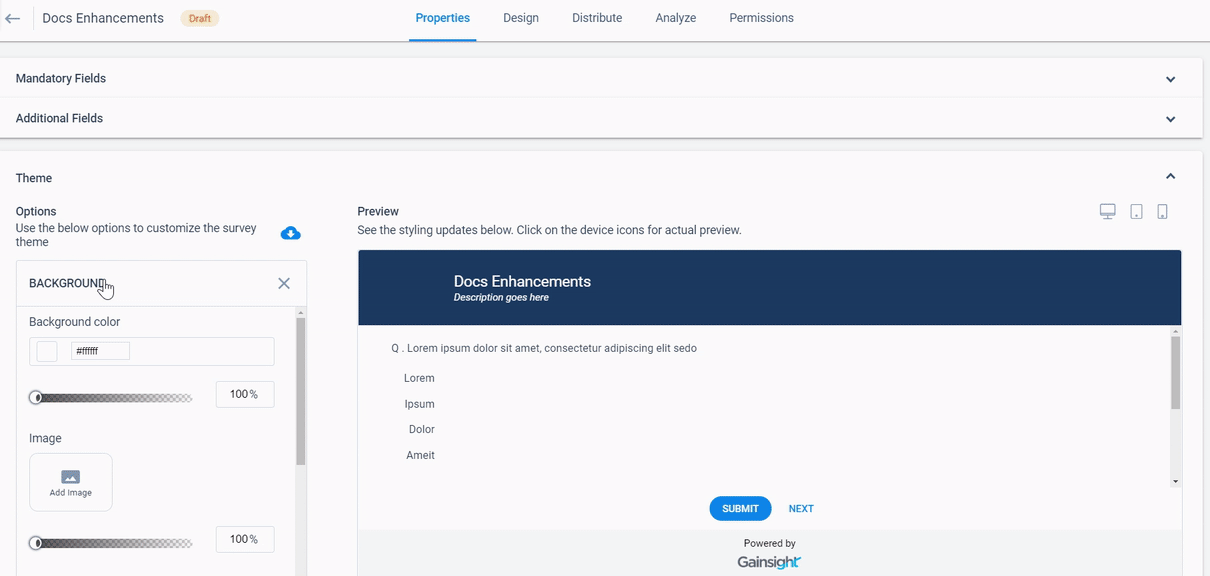
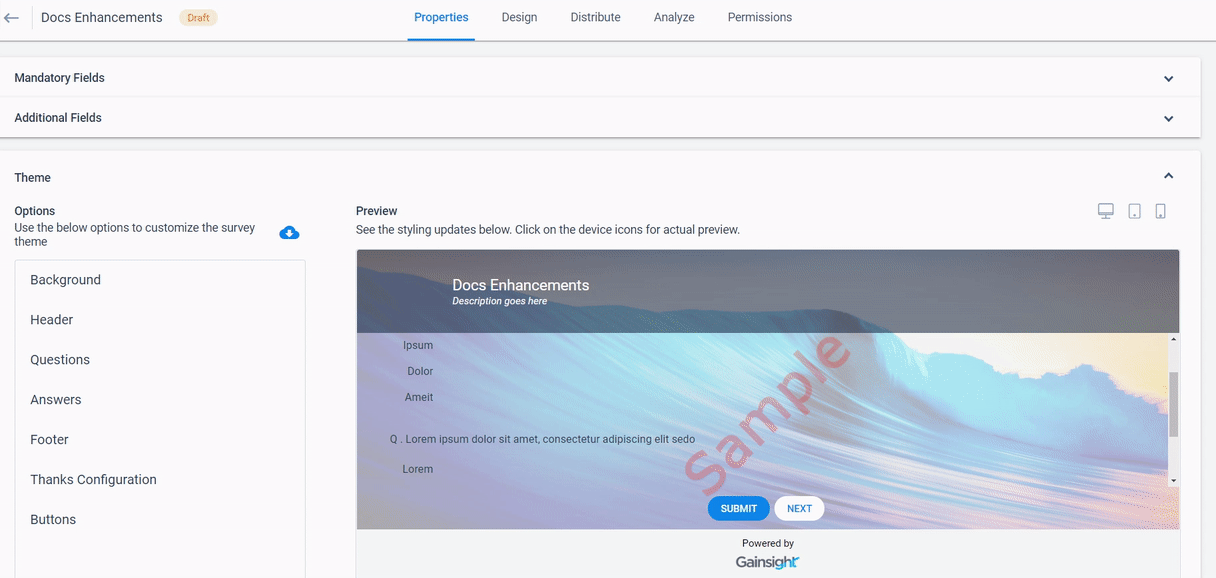
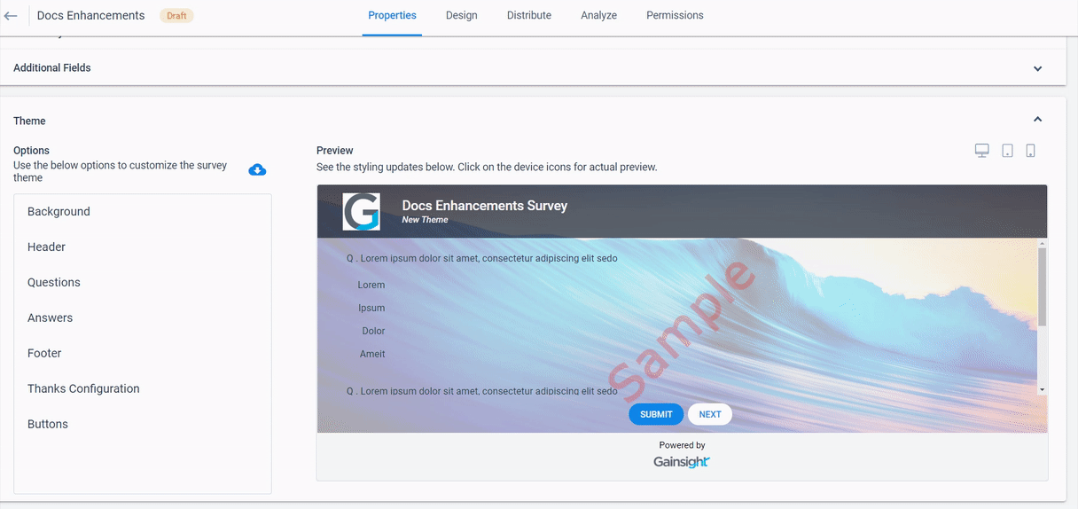
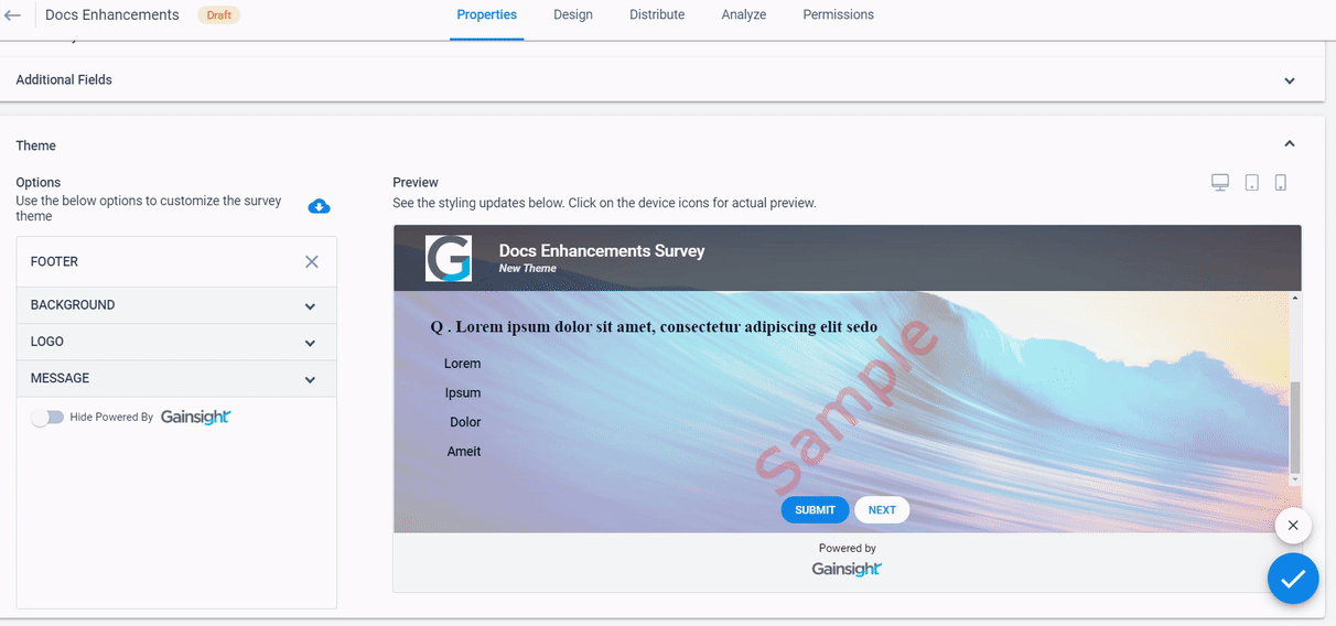
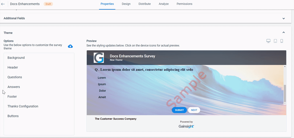
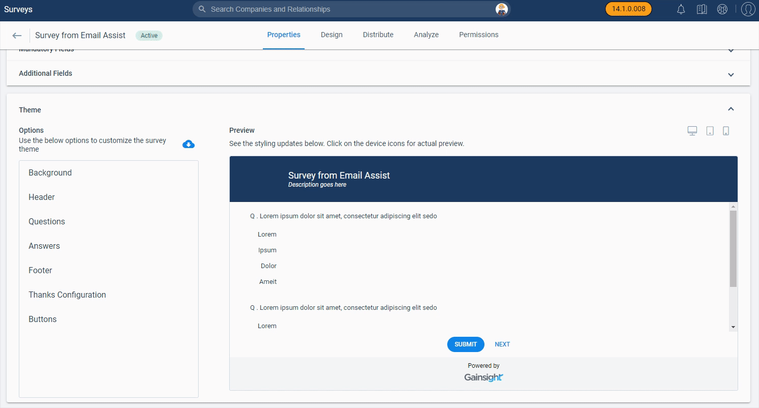
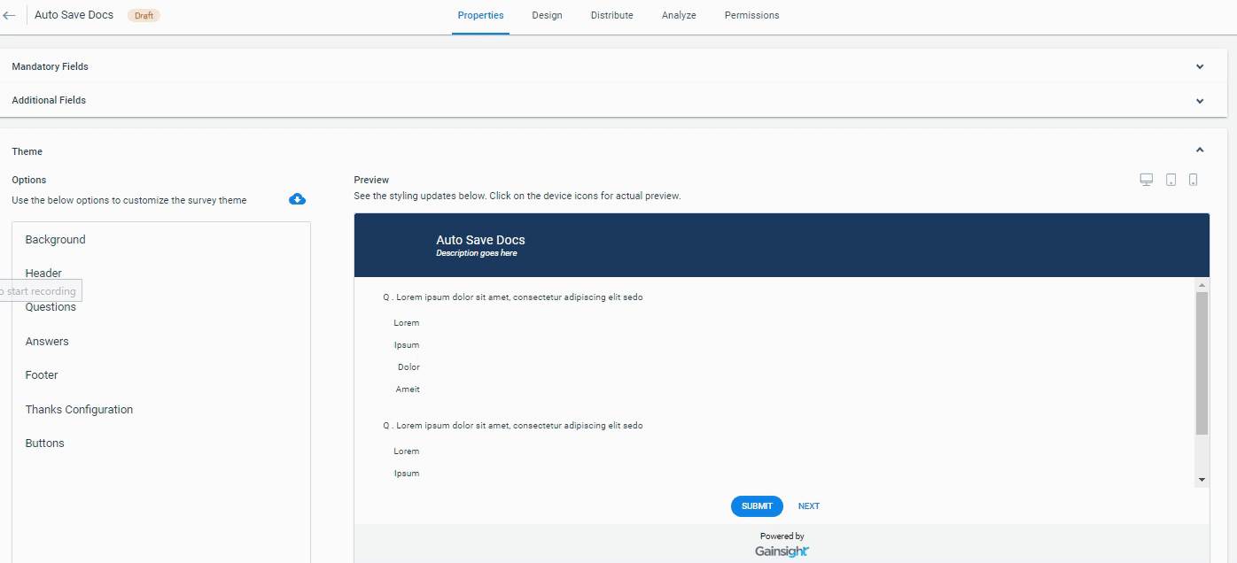
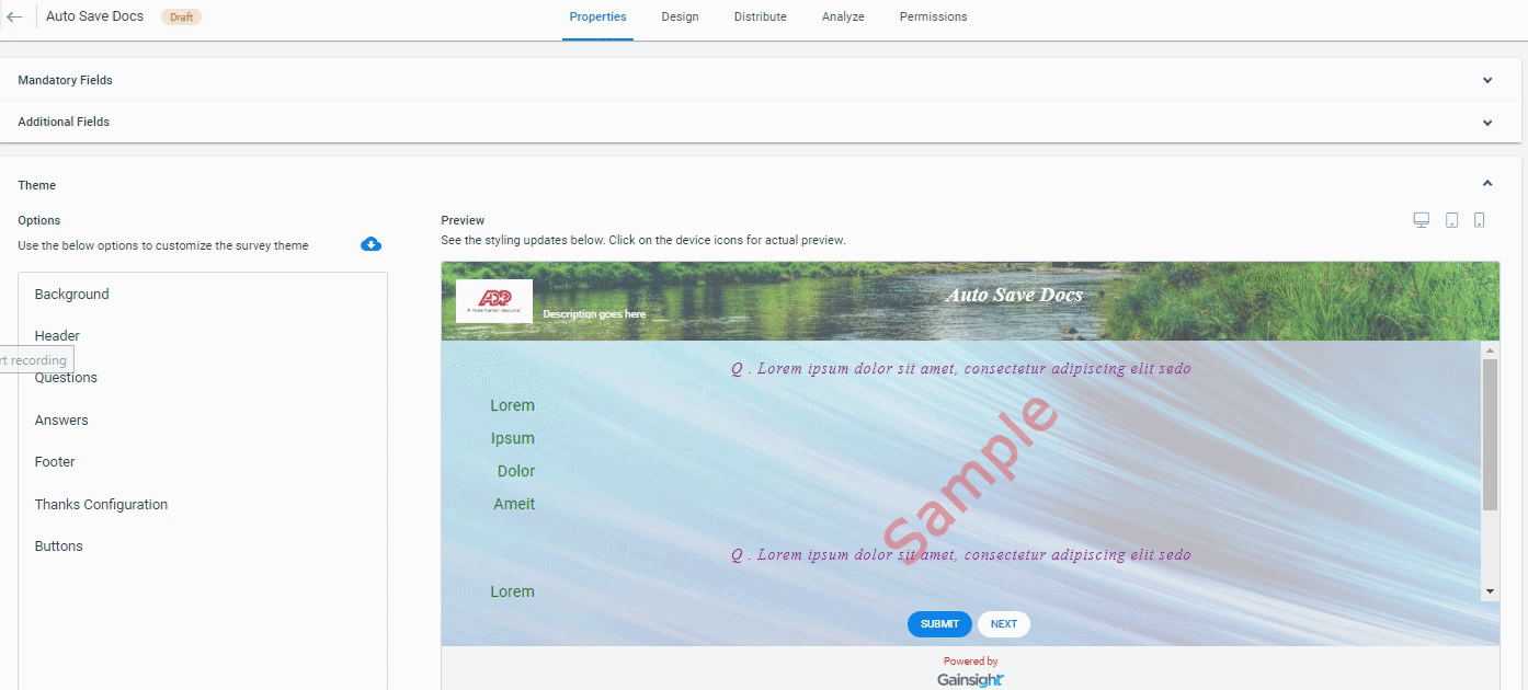
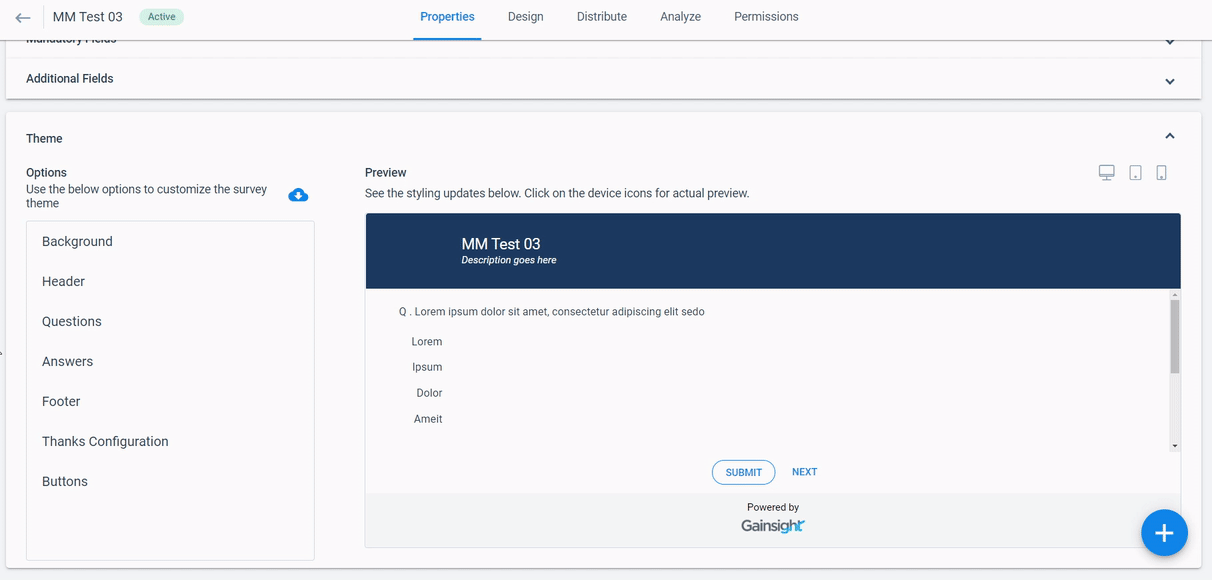
Theme
In the Theme section, you can configure the survey’s visual appearance. You can preview your configurations in the Survey Theme Preview on the right-hand side. Theme section includes the following options:
- Background: You can configure Background appearance of a Survey using this option. Background option includes the following sub-configurations:
- Background color: Select a color from the color pane or enter the hex color code for the background of the survey. You can adjust the opacity of the background color by sliding the bar below the Background color option.
- Image: Upload an image to use as a background of your survey. You can click Add Image and browse to upload an image from your computer. You can view the existing images that you have already uploaded. You can adjust the opacity of the background image by sliding the bar below the Image option.
- Image Position: Adjust the position of the background image as required.
- Watermark Image: Upload an image to use as a watermark in the background of your survey. You can click Add Watermark and browse to upload an image from your computer. You can view the existing images that you have already uploaded. You can adjust the opacity of the watermark image by sliding the bar below the Watermark Image option.
- Watermark Position: Adjust the position of the watermark as required.
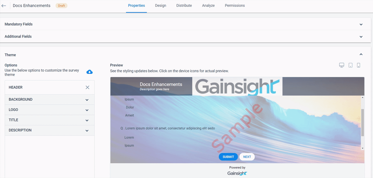
- Header: You can configure the Header appearance of a Survey using this option. Header option includes the following sub-configurations:
- Background: You can configure the visual appearance of the Header Background. It has the following sub-configurations:
- Background color: Select a color from the color pane or enter the hex color code for the header of the survey. You can adjust the opacity of the background color of the header by sliding the bar below the Background color option.
- Image: Upload an image to use it as a header within your survey. You can click Add Image and browse to upload an image from your computer. You can view the existing images that you have already uploaded. You can adjust the opacity of the header image by sliding the bar below the Image option.
- Image Position: Adjust the position of the header image as required.
- Header height: Adjust the height of the header as required.
- Background: You can configure the visual appearance of the Header Background. It has the following sub-configurations:
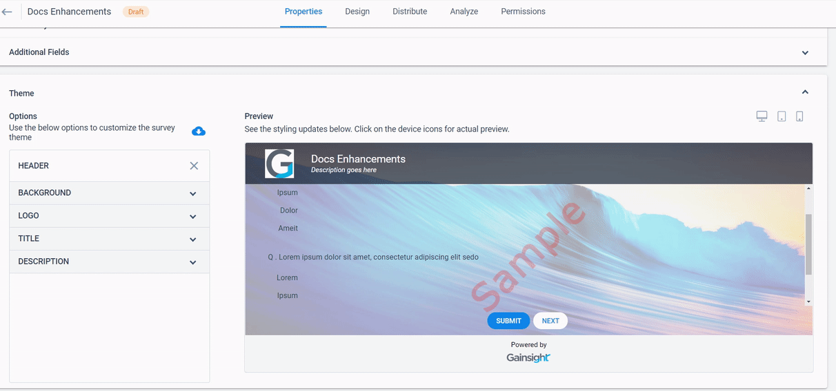
- Logo: You can add a Logo to the Header:
- Image: Upload an image to use as a header logo within your survey. You can click Add Image and browse, upload an image from your computer. You can view the existing images that you have already uploaded.
- Logo Position: Select the position of the header logo.
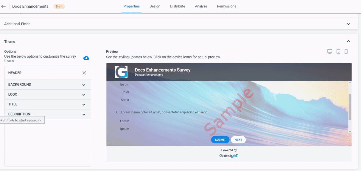
- Title: Enter the following details in the Title section
- Title: Title that displays at the top of the survey.
- Select Font: Select the font of the title.
- Font Size and Color: Select the font size and color of the title.
- Styling: Select the typography styling of the title (Bold, Italic and Underline)
- Alignment: Select the alignment of the title (Left, Center and Right)
- Character Spacing: Select the text character spacing of the title.
- Description: Enter the following details in the Description section
- Description: Enter description to the survey.
- Select Font: Select the font for the description field.
- Font Size and Color: Select the font size and color of the description.
- Styling: Select the typography styling of the description (Bold, Italic and Underline)
- Alignment: Select the alignment of the description (Left, Center and Right)
- Character Spacing: Select the text character spacing of the description.
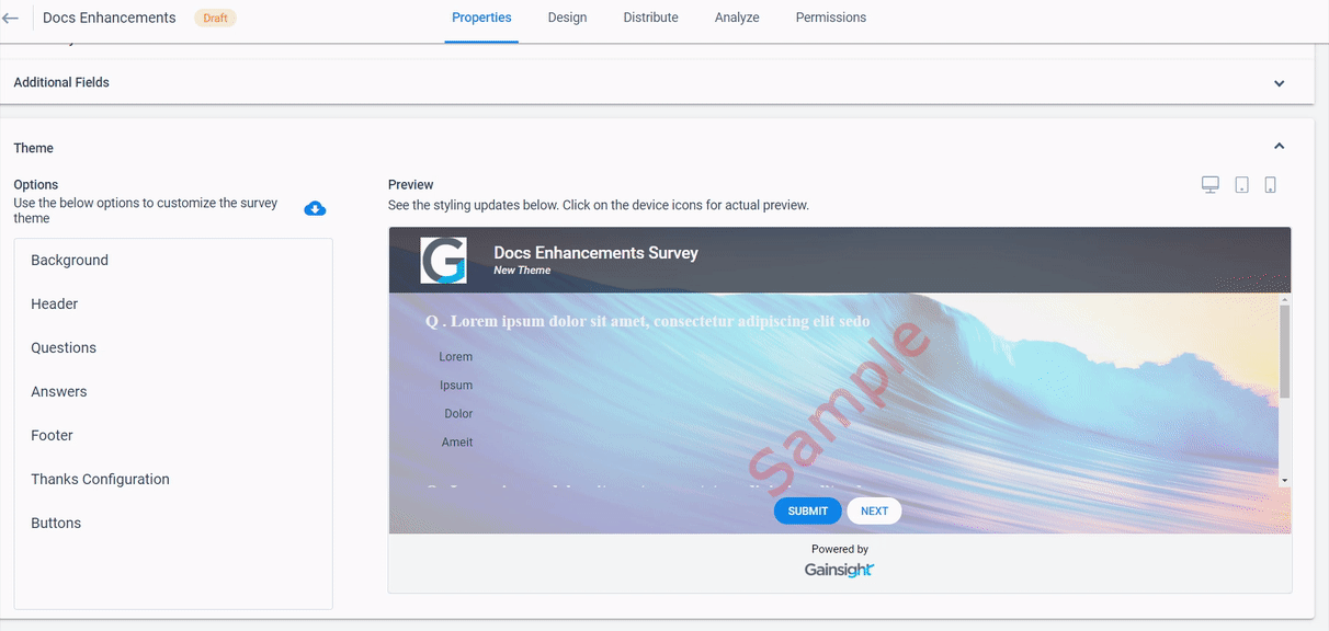
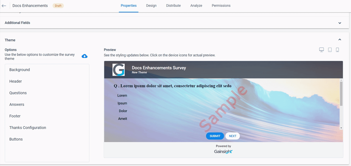
- Questions: You can configure the Question’s visual appearance using this option. Enter the following details in the Question section:
- Select Font: Select the question font.
- Font Size and Color: Select the font size and color of the question.
- Styling: Select the typography styling of the question (Bold, Italic and Underline)
- Alignment: Select the alignment of the question (Left, Center and Right)
- Character Spacing: Select the text character spacing of the question.
- Answers: You can configure the Answer’s visual appearance using this option. Enter the following details in the Answer section:
- Select Font: Select the answer font.
- Font Size and Color: Select the font size and color of the answer.
- Styling: Select the typography styling of the answer (Bold, Italic and Underline)
- Alignment: Select the alignment of the answer (Left, Center and Right)
- Character Spacing: Select the text character spacing of the answer.
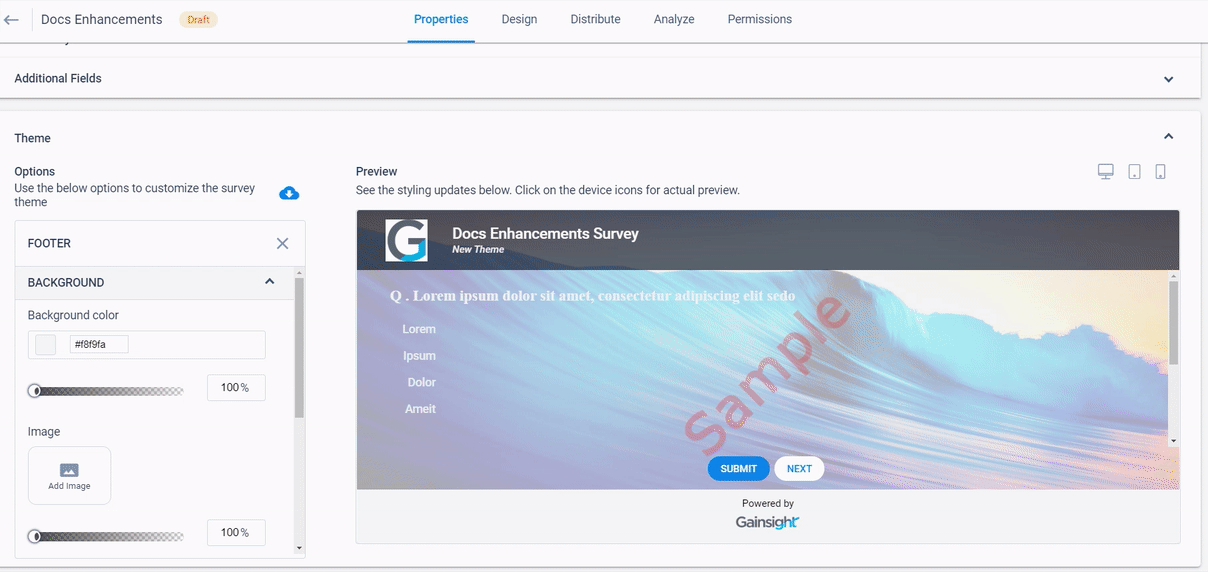
- Footer: You can configure the Footer appearance using this option. Footer option includes the following sub-configurations:
- Background:
- Background color: Select a color from the color pane or enter the hex color code for the footer of the survey. You can adjust the opacity of the background color of the footer by sliding the bar below the Background color option.
- Image: Upload an image to use as a footer within your survey. You can click Add Image and browse to upload an image from your computer. You can view the existing images that you have already uploaded. You can adjust the opacity of the footer image by sliding the bar below the Image option.
- Image Position: Adjust the position of the footer image as required.
- Footer height: Adjust the height of the footer as required.
- Background:
- Logo: You can add a Logo to the Footer:
- Image: Upload an image to use as a footer logo within your survey. You can click Add Image and browse to upload an image from your computer. You can view the existing images that you have already uploaded.
- Logo Position: Select the position of the footer logo.
- Message: You can add a Message to the Footer:
- You can enter your Message as required.
- Select Font: Select the font of the message.
- Font Size and Color: Select the font size and color of the message.
- Styling: Select the typography styling of the message (Bold, Italic and Underline)
- Alignment: Select the alignment of the message (Left, Center and Right)
- Character Spacing: Select the text character spacing of the message as required.
- Toggle for Gainsight Logo: By default the Powered by Gainsight logo is enabled in the Footer. You can Enable the toggle to hide the Powered by Gainsight logo.
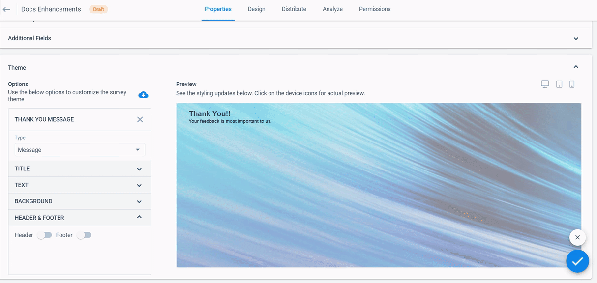
- Thanks Configuration: Select Message, Redirect URL, or Custom Page.
- Message will enable you to type in a custom message.
- Redirect URL allows you to input a URL that the participant will be directed to after they click Submit at the end of the survey.
- Custom Page allows you to select a custom page that the participants are directed to after clicking submit at the survey's end. The selected page must be added as an associated page on the site used to publish the survey. Only pages configured under Administration > Pages are available to be selected as a Thank You message. To learn more about creating pages, refer to Setup a Gainsight Domain.
Note: After a custom page is selected as the Thank You message for a survey, only the site associated with that page will be an option to select on the survey distribution tab. For more information on selecting sites for survey distribution, refer to Distribute Surveys.
- Type: Message Enter the following details when you configure Thank You Message of type Message.
- Title: Enter the following details in the Title option
- Title: Enter the title of the thank you message.
- Select Font: Select the font of the thank you message title.
- Font Size and Color: Select the font size and color of the thank you message title.
- Styling: Select the typography styling of the thank you message title (Bold, Italic and Underline)
- Alignment: Select the alignment of the thank you message title (Left, Center and Right)
- Character Spacing: Select the text character spacing of the thank you message title.
- Title: Enter the following details in the Title option
- Text: Enter the following details in the Text option
- Message: Enter the text of the thank you message.
- Select Font: Select the font of the thank you message text.
- Font Size and Color: Select the font size and color of the thank you message text.
- Styling: Select the typography styling of the thank you message text (Bold, Italic and Underline)
- Alignment: Select the alignment of the thank you message text (Left, Center and Right)
- Character Spacing: Select the text character spacing of the thank you message text.
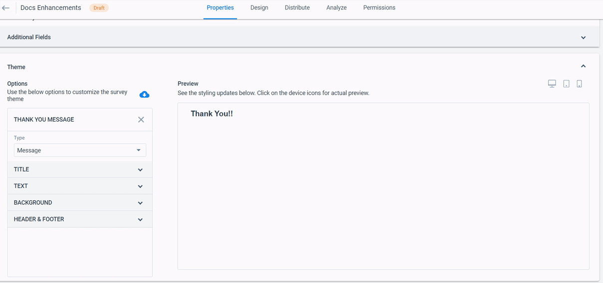
- Background: Select the following options in the Background as required.
- Background color: Select a color from the color panel or enter the hex color code for the thank you message of the survey. You can adjust the opacity of the background color of the thank you message by sliding the bar below the Background color option.
- Image: Upload an image to use as a background for thank you message within your survey. You can click Add Image and browse to upload an image from your computer. You can view the existing images that you have already uploaded. You can adjust the opacity of the background image by sliding the bar below the Image option.
- Image Position: Adjust the position of the background image of the thank you message as required.
- Image height: Adjust the height of the background image.
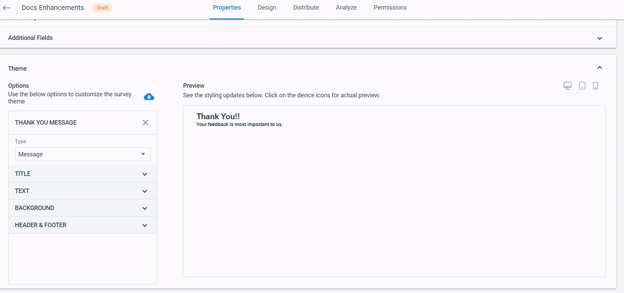
- Header & Footer: Enable Header and Footer toggles to add Header and Footer respectively.
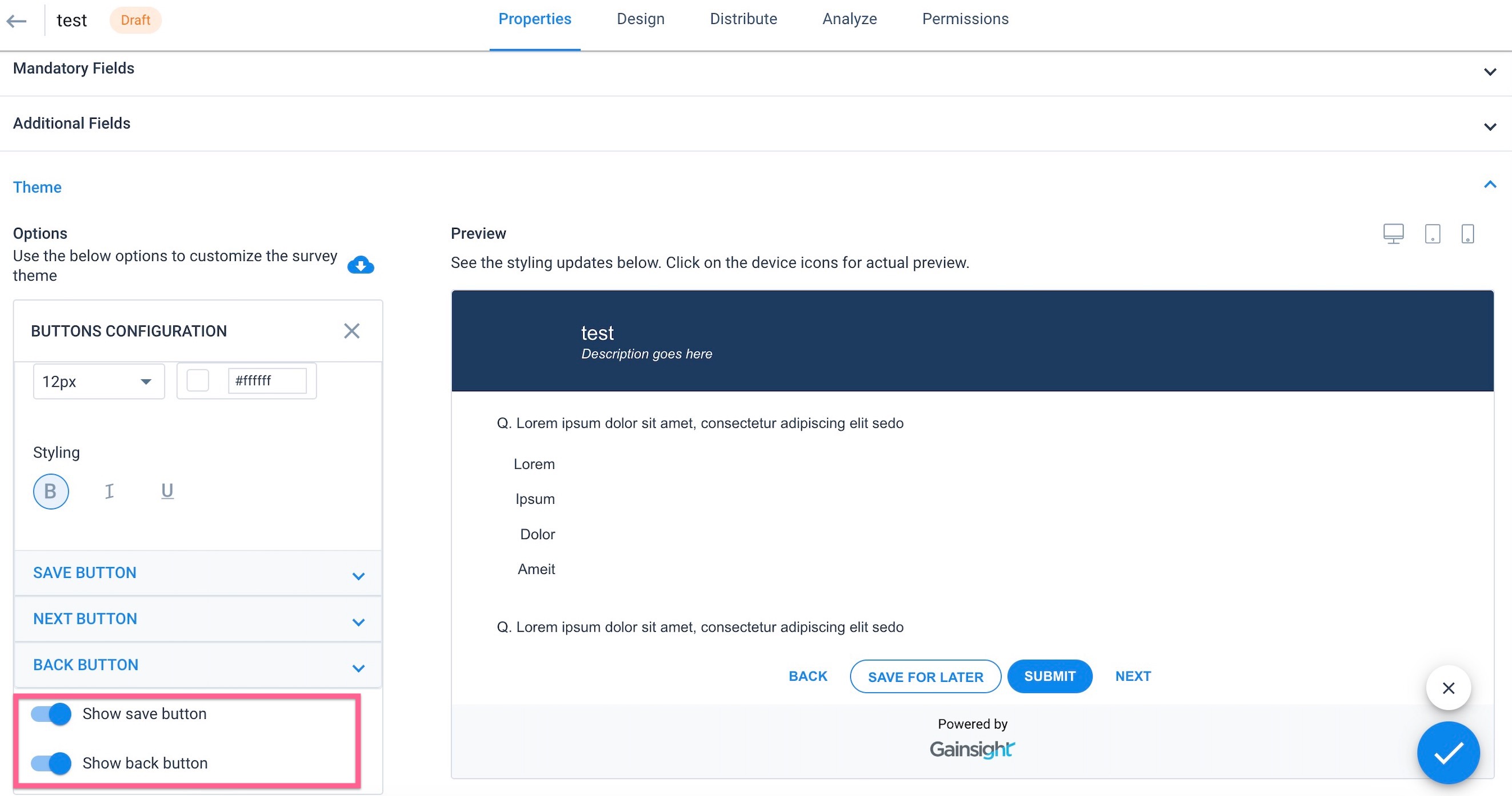
- Buttons: You can configure the survey Button’s appearance using this option. Enter the following details in the Buttons option.
- Select Shape: Select the shape of the Submit, Save and Next buttons
- You can configure the Submit, Save, Back, and Next Buttons as specified below:
- Select the required visualization type of the button from the dropdown list.
- Color: select a color from the color panel or you can enter the hex code of the color.
- Label: Edit label of the button.
- Select Font: Select the font of the buttons.
- Font Size and Color: Select the font size and color of the buttons.
- Styling: Select the typography styling of the buttons (Bold, Italic and Underline)
Notes:
- Turn on the Show save button toggle option to display the Save button.
- Turn on the Show back button toggle option to display the Back button in the multi-page survey.
You can also preview Survey in Desktop, Tablet and Mobile view.
Import Survey Theme
If you have configured a theme, you can import the theme of an existing survey, and use it in a new survey.
To import the theme:
- Navigate to Survey 2.0 > Select the Survey/New Survey > Properties > Theme.
- Click Import theme from Existing survey
 . Select Existing Theme window appears.
 - From the existing survey list, select the required survey.
Note: You can view the selected survey theme on the Right pane. - Click APPLY.
To restore the theme to default:
- Click Import theme from Existing survey
 . Select Existing Theme window appears.
 - Click Default.
- Click APPLY.
Translate Survey Properties
If you select multiple languages under the Basic Configuration section, you can translate the survey properties like Survey Name, Display Name, Header, Thank you Message and Footer.
Note: You can see the Translate option, if you have configured the survey’s visual appearance.
To translate survey properties:
- Click + at the bottom right of the page.
- Select the Translate option. Survey Properties Translation dialog appears.
- On the left side of the dialog, you can view the properties that are already configured in visual appearance.
- On the right side of the dialog, you can view the Translate to option and can choose the language to Translate.
- Enter translation for the properties.
- Click Save.
| NPS, Net Promoter, and Net Promoter Score are registered trademarks of Satmetrix Systems, Inc., Bain & Company and Fred Reichheld. |