How to Build Gainsight PX In-App Guide Engagement
Overview
A Guide engagement allows you to create a walkthrough on a specific feature. You can either create a single step guide to assist users with one or more features of your application, or a multi-step guide with a sequence of tool tips and dialogs that navigate the user through different screens of your application.
Prerequisite
Ensure that the Gainsight PX org has the latest features/pages for which you want to build a guide. Copy the url to use later for setting in-app engagements.
If an org does not have the Gainsight PX installed, you will not be able to create/target guides in that org. If you think that your target element appears more than once in a specific module, you may add a specific page that has a unique URL. This helps you to identify your target element in a specific page.
Create In-App Guide Engagement
Use the Gainsight PX editor to create in-app Guides in your product, and deliver a winning product experience.
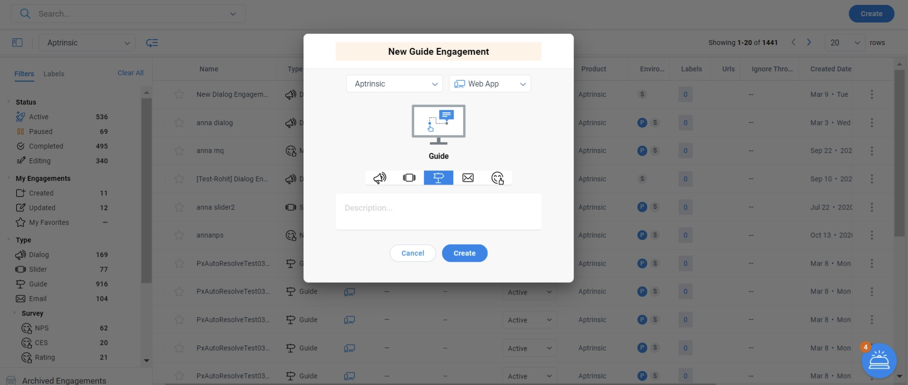
To create a guide engagement:
- From the left pane, click Engagements.
- Click Create.
- Enter a name for the Guide engagement.
- Gainsight PX recommends naming the guide so that others can easily identify its purpose and/or location.
- Select the environment. This is applicable only if you are using multiple environments.
- Select the type of target application: Web App or Mobile.
- Click on the Guide icon.
- Enter a description. This is an optional step.
- Click Create.
Do the following to configure and launch your guide engagement:
- Set The Audience
- Choose a Template
- Design your engagement
- Schedule your engagement
- Launch
Set The Audience
Select the target audience based on user, account and/or behavioral rules and trigger the engagement guide. Gainsight PX supports basic audience rules such as user signup date or more advanced rules that represent relevant adoption behaviors by using account attributes sourced by your CRM and feature usage rules based on the mapped features and modules.
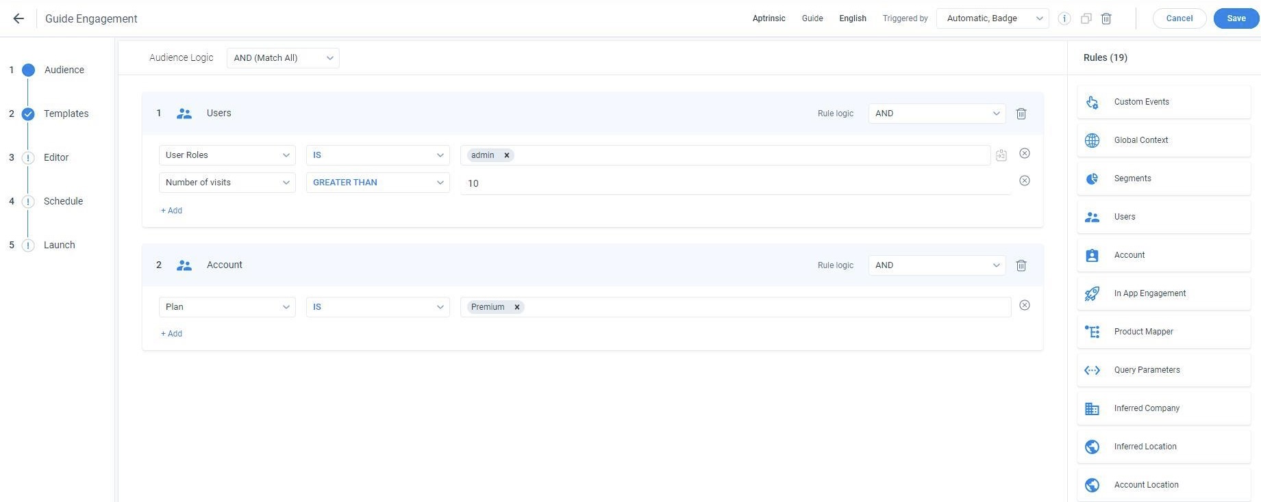
For more information about how to select the audience for engagements, refer to the Audience Selection (Engagements) article from the Additional Resources section.
Choose a Template
Gainsight PX offers a library of engagement templates. Choose the template of your choice from the default or existing templates. You can also create your own and reuse these templates.
To use the default or existing template:
- Navigate to the Templates section.
- Hover on the template and click Preview. Templates are categorized into the following tabs:
- Saved Templates: Displays the list of your saved templates.
- Default Templates: Displays the list of default templates, provided by PX.
- Recently Used: Displays the list of your recently used templates.
- Click Use. You are navigated to the Editor section.
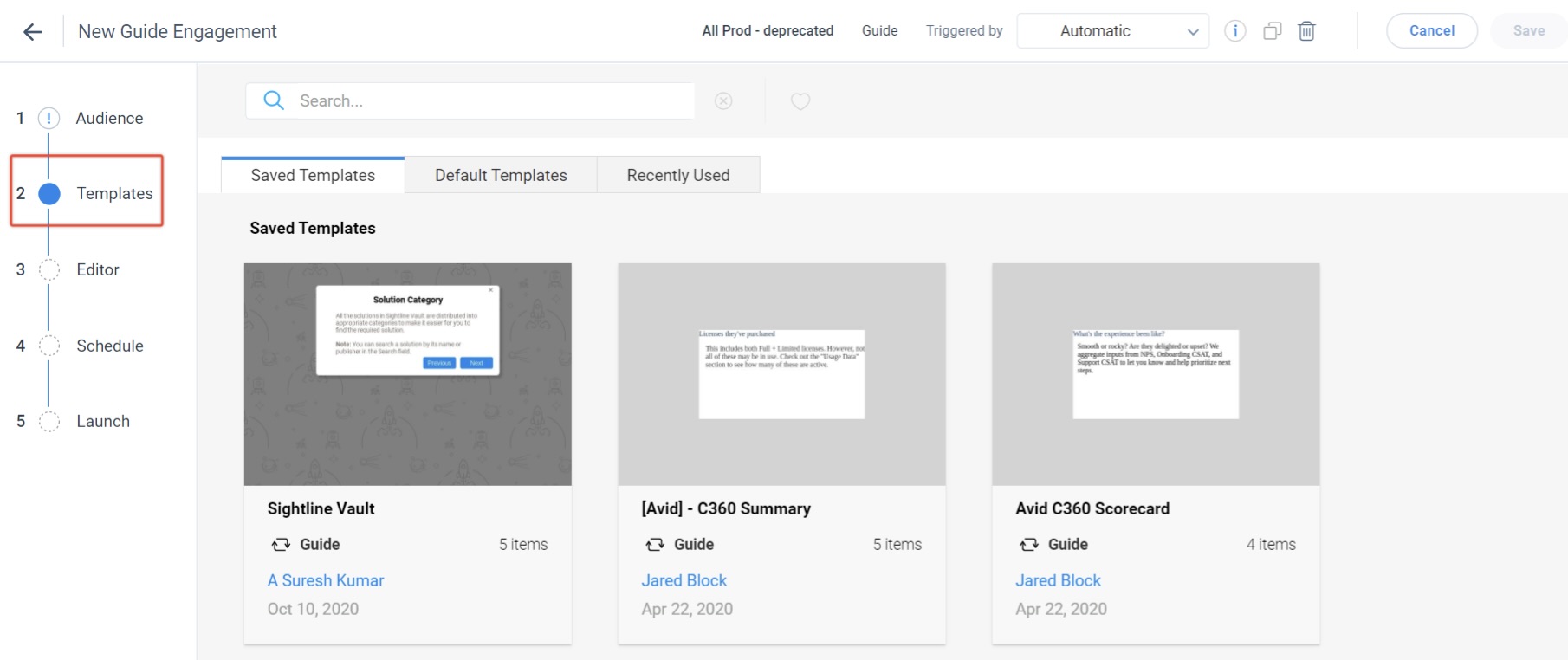
Use existing templates while setting up Guide engagements. Also, Gainsight PX allows you to save the new/modified template and use the saved template in the future. After you select the template, you are navigated to the Editor step where you can modify your template.
Design Your Engagement
Use the WYSIWYG editor to configure the content and look and feel of your engagement. Editor section of the smart wizard on the left allows you to:
- Set the background color, text, border color, position, navigation and timeout parameters on the Editor tab.
- On the Settings tab, set the default Overlay and select the action on Close and Completion of the guide.
- Edit the default CSS styling on the CSS tab.
For more information on the Editor section of your engagement, refer to the Anatomy of Engagements article from the Additional Resources section.
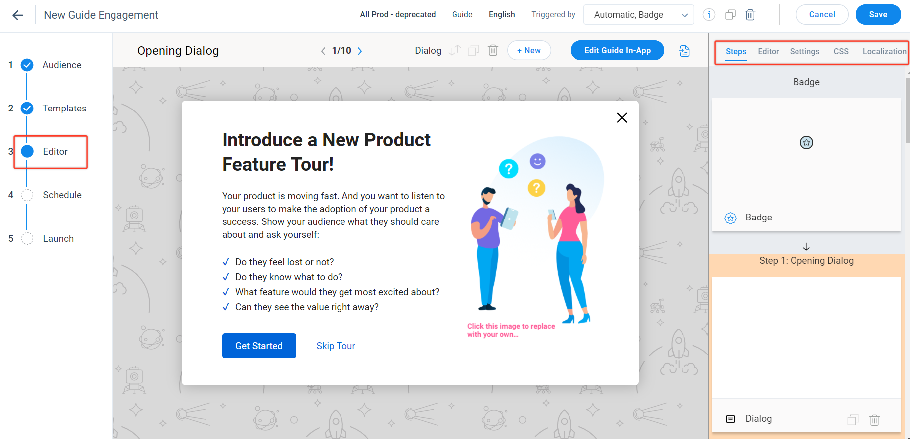
A guide engagement has the following components:
- Hotspot: A Hotspot is a colored circle which is used at the start of the guide to inform users about the presence of the guide. You can configure the hotspot beacon for a less invasive guide launch.
- Dialog: You can either use the Dialog engagement within a guide engagement, or independently.
- Tooltip: A tooltip is a small information box, attached to some UI component. Tooltip describes the UI component to which it is attached.
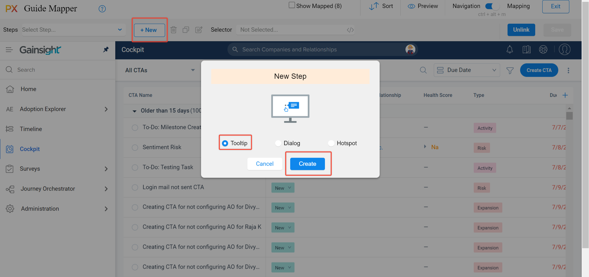
Click the +New button to add Tooltip, Dialog, or Hotspot steps in the walkthrough.
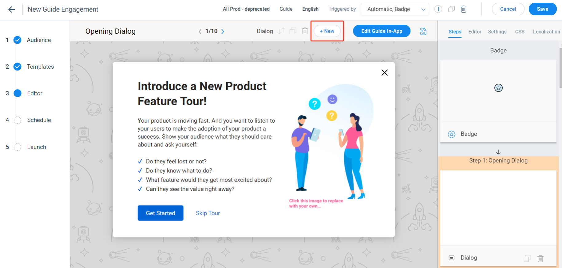
You can re-order the steps and delete the steps from the Guide.
Configure the Guide in Application
Configure guide steps such as the dialog, tooltips and hotspots and link them with the components of your application.
To configure the guide in your application:
- In the Editor step, click Edit Guide In-App.
- Select or enter your application URL in the Select A Url to Start Linking pop up.
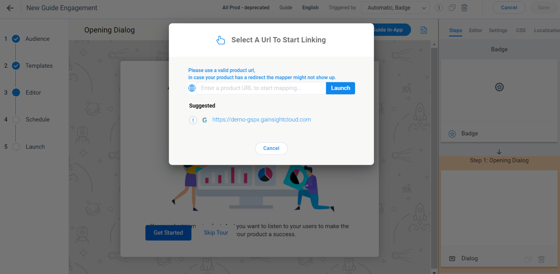
- Click Launch to navigate to the application.
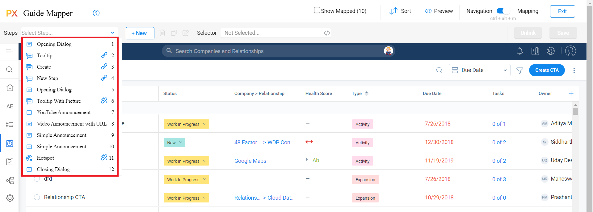
- In the PX Guide Mapper, link the UI elements to the engagement steps added in the Guide.
Following image shows the steps added to a guide engagement wherein the steps 2, 3, and 4 are linked to an element on the application and are shown with a Linked icon while the steps 6 and 11 have a Broken Link icon next to them as they are not linked to any UI element.
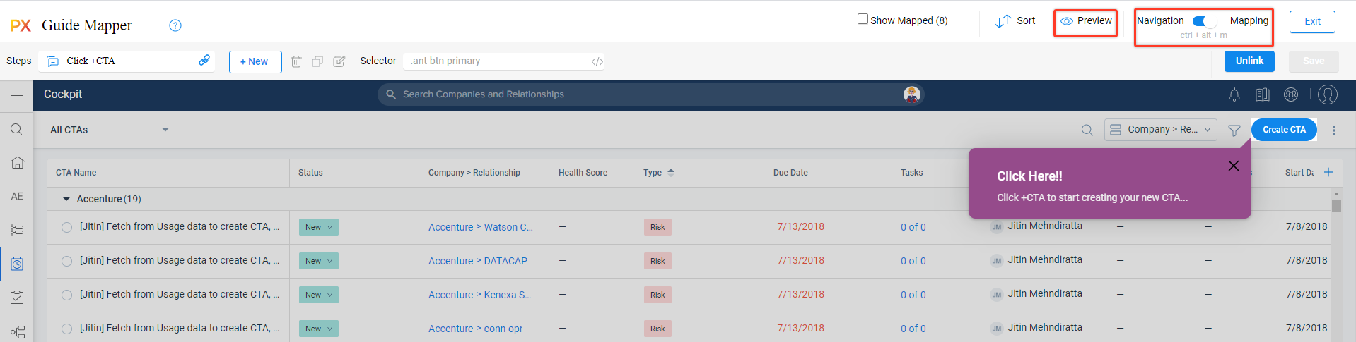
- Click on the UI elements to link with the Hotspot and Tooltip steps.
- Click Save. A hotspot or tooltip appears based on the selection of UI elements.
-
Select the step and click the Edit option to configure Settings and Navigation in the Step Settings pop up.
- To map an element within a menu, you must turn OFF the mapper. To do this:
- Turn OFF Linking. Click on the desired menu.
- Turn ON the Linking (mapper) and select the element to map. You can also turn ON the Linking via keyboard shortcut as shown in the upper right corner (On Mac: Control + Option + M).
- Click Save.
- Click the preview icon to review your experience on the target application.
Note:
- You can edit content for the steps using the PX Editor as well.
- When you navigate to the application where the Guide is already in use, , you must reload the page to see the latest changes you made in Gainsight PX.
- Click Exit.
Add Steps Using In-App Editor
You can add tooltips and dialogs from the in-app editor without the need to navigate to the PX editor.
- Click +New.
- Enter a name for the Step.
- Select the Tooltip option.
- Select the UI element of the application to which the tooltip must be associated.
Configure Step Settings Using In-App Editor
To configure the step settings:
- Select a step and click the Edit option. The Step Settings pop up is displayed.
- On the Settings tab, you can:
- Override the background color and padding properties
- Block the user clicks on the selected element
- Set the position of the dialog, tooltip or hotspot
- Adjust the reposition interval time for tooltip using the Reposition Interval field. This helps you reposition the tooltip faster with user actions such as window resizing or scrolls.
- Click on the Navigation tab to:
- Select the action in the When the navigation element is clicked field
- Look for the next element: After the user performs an action on the current element on the UI, the guide switches to the next element on the screen.
- The guide will automatically redirect the page to: If you select this option, enter the URL of the page in the where you want to configure the next item of the guide.
- Show or hide the Previous button on the dialog or tool tips.
- (Optional) Select the AutoScroll to this step checkbox to auto scroll the guide to the part where the next step of the guide is tagged. This is helpful when the next step in the guide is mapped to an element that is not visible on the page easily.
- Select the action in the When the navigation element is clicked field
- Click Apply.
Preview Guide Engagement from Specific Step
Preview the engagement from a specific step by selecting the required step. This helps you test the engagements that have more steps faster.
To preview the engagement:
- From the Steps drop down, select the required step.
- Click the Preview button. The engagement preview starts from the step.
- Switch the toggle to Mapping.
- From the Steps drop down, select the Clear selected step option to clear the step selection.
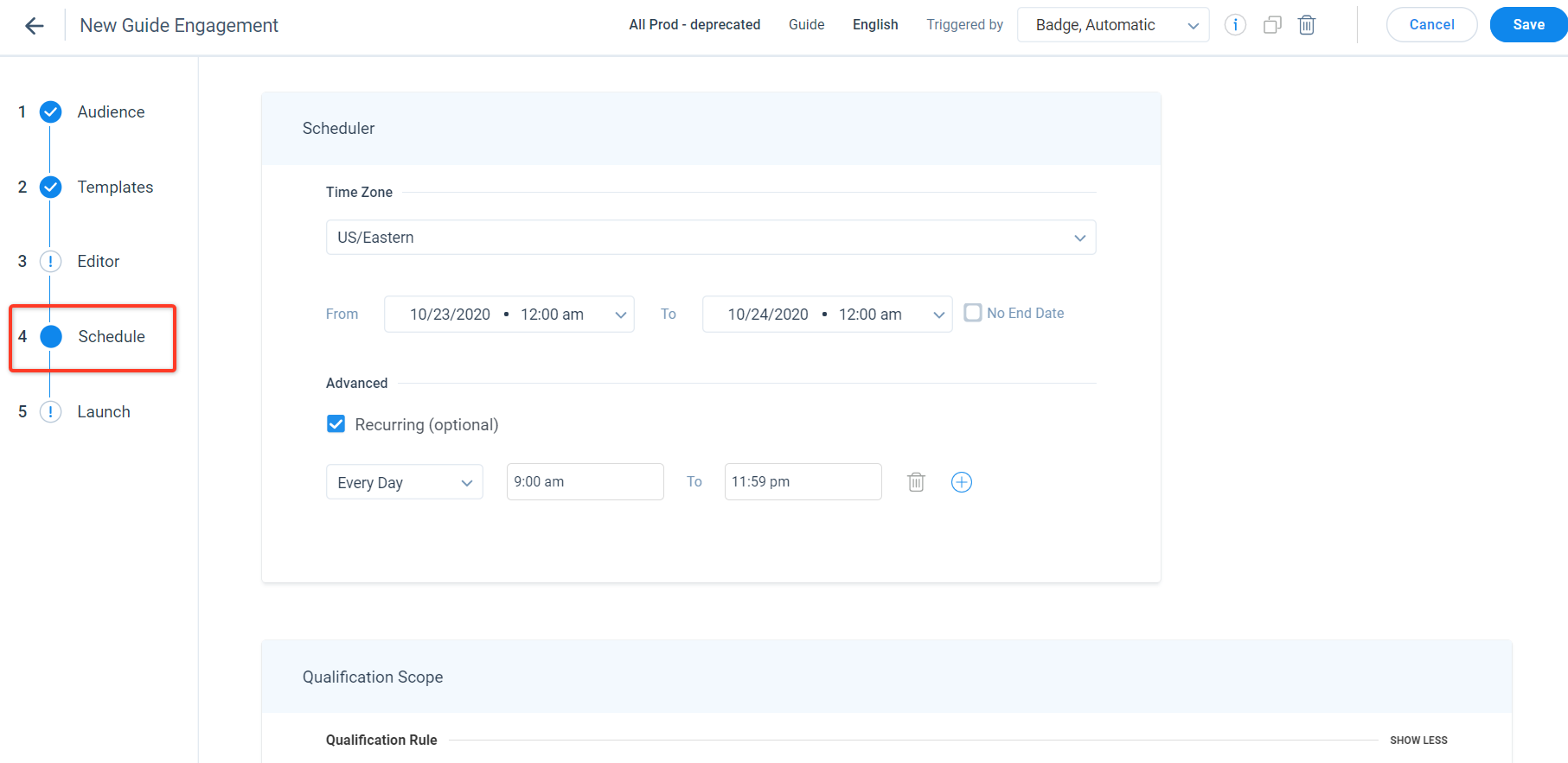
Schedule your Engagement
Schedule your guide to control when the engagement should be active and the threshold of how many times it must be shown to the users. Specify the number of times and additional intervals in which you would like to automatically re-engage your users (for example, display the engagement).
In the Schedule step, set the From and To Date for the engagement. You can also set the engagement to appear on the target application at recurring intervals such as daily or on a specific day of the week.
For more information on the In-App Engagement Scheduler, refer to the Engagement Scheduler article from the Additional Resources section.
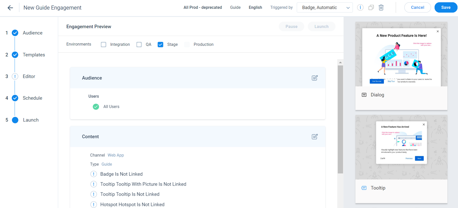
Launch
This section gives you an overview of the configurations for your engagement and validates them automatically. Click Launch to launch the engagement. Gainsight PX does not allow you to launch the engagement if:
- Steps in the Guide are not properly mapped to the UI elements
- Rules are not defined properly or saved for Audience
- Changes to any of the step are not saved
Analytics
View the number of times an engagement is launched from the LIFETIME VIEWS column, for an engagement. Click this column to arrange the engagements in either ascending or descending order of their views. This column displays zero if an engagement has never been viewed by customers or is not yet launched. Click the eye icon to navigate to the Analytics > In App Performance page.
To learn about all frequently asked questions, refer In-App Engagements FAQs article from the Additional Resources section.