Create Gainsight PX In-App Guide Engagement using the V2 Editor
This article explains how to create a guide engagement using the PX Engagement V2 editor.
Overview
A Guide engagement helps you to create a walkthrough of a specific feature, or bring user attention to a critical or new addition to the user interface. You can create a single step guide to assist users with one or more features of your application. You can also create a multi-step guide with a sequence of tool tips and dialogs that navigate the user through different screens of your application.
Prerequisites
- Your Gainsight PX subscription must have the latest features or pages of your application mapped using the Product Mapper for which you want to build a Guide.
- Copy the URL to use later to launch the In-App Engagements.
- Gainsight PX must be integrated with your product inorder to create or target guides in your application.
Create In-App Guide Engagement
Gainsight PX Editor helps you create Guide engagement in a fast and seamless way.
To create a guide engagement:
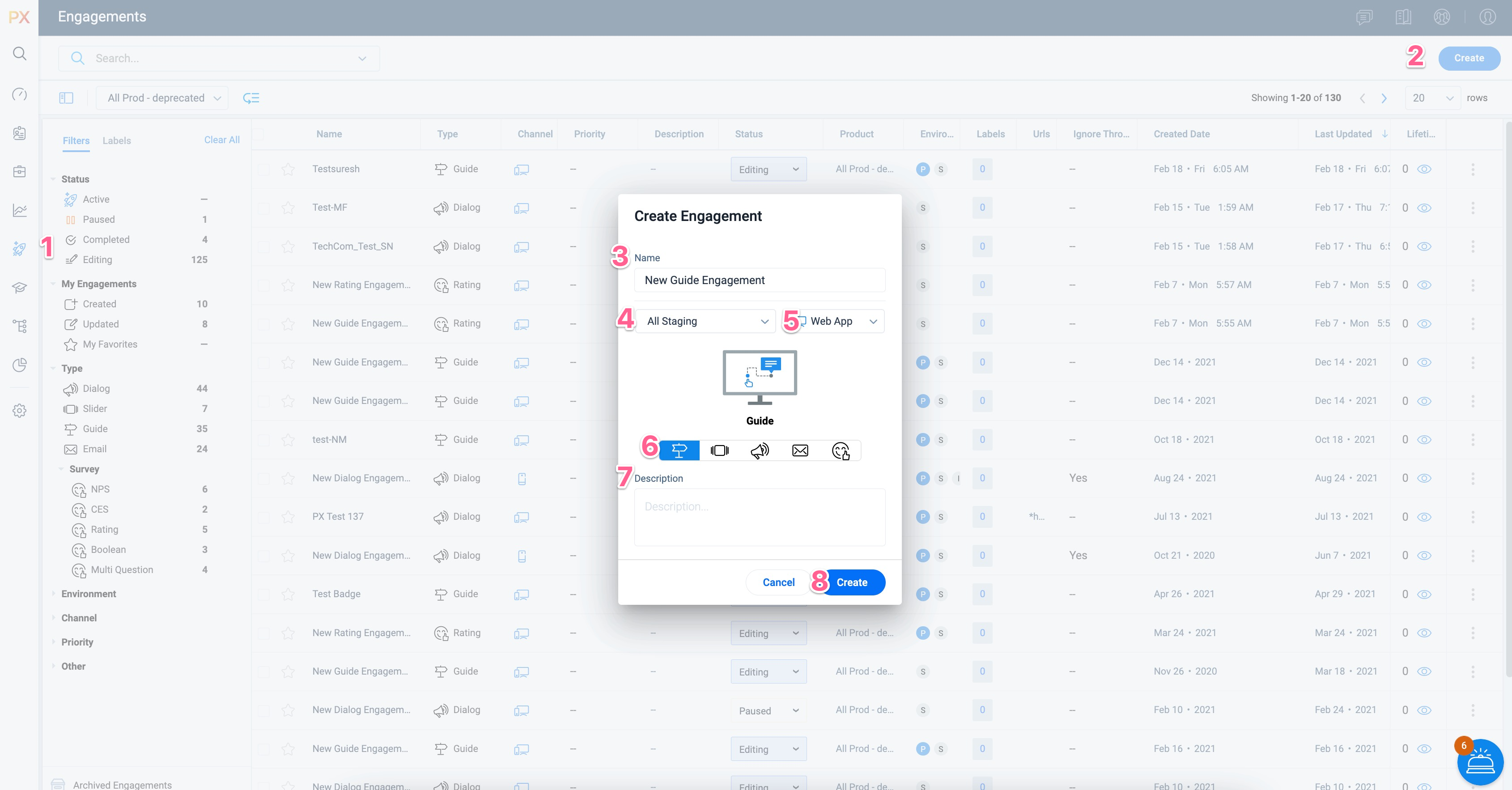
- From the left pane, click Engagements.
- Click Create.
- Enter a name for the Guide engagement.
Gainsight PX recommends you to name the guide so that others can easily identify its purpose and/or location.
- Select the environment. This is applicable only if you are using multiple environments.
- Select the type of target application: Web App or Mobile.
- Click on the Guide icon.
- (Optional) Enter a description.
- Click Create.
The following steps help you configure the engagement:
Set Audience
Audience is the group of intended viewers for the engagement. Select the target audience based on User, Account and/or behavioral Rules to trigger the engagement guide. Gainsight PX supports basic audience rules such as user signup date or more advanced rules that represent relevant adoption behaviors. For example, rules can be created by using account attributes sourced by your CRM or by using the mapped features and modules.
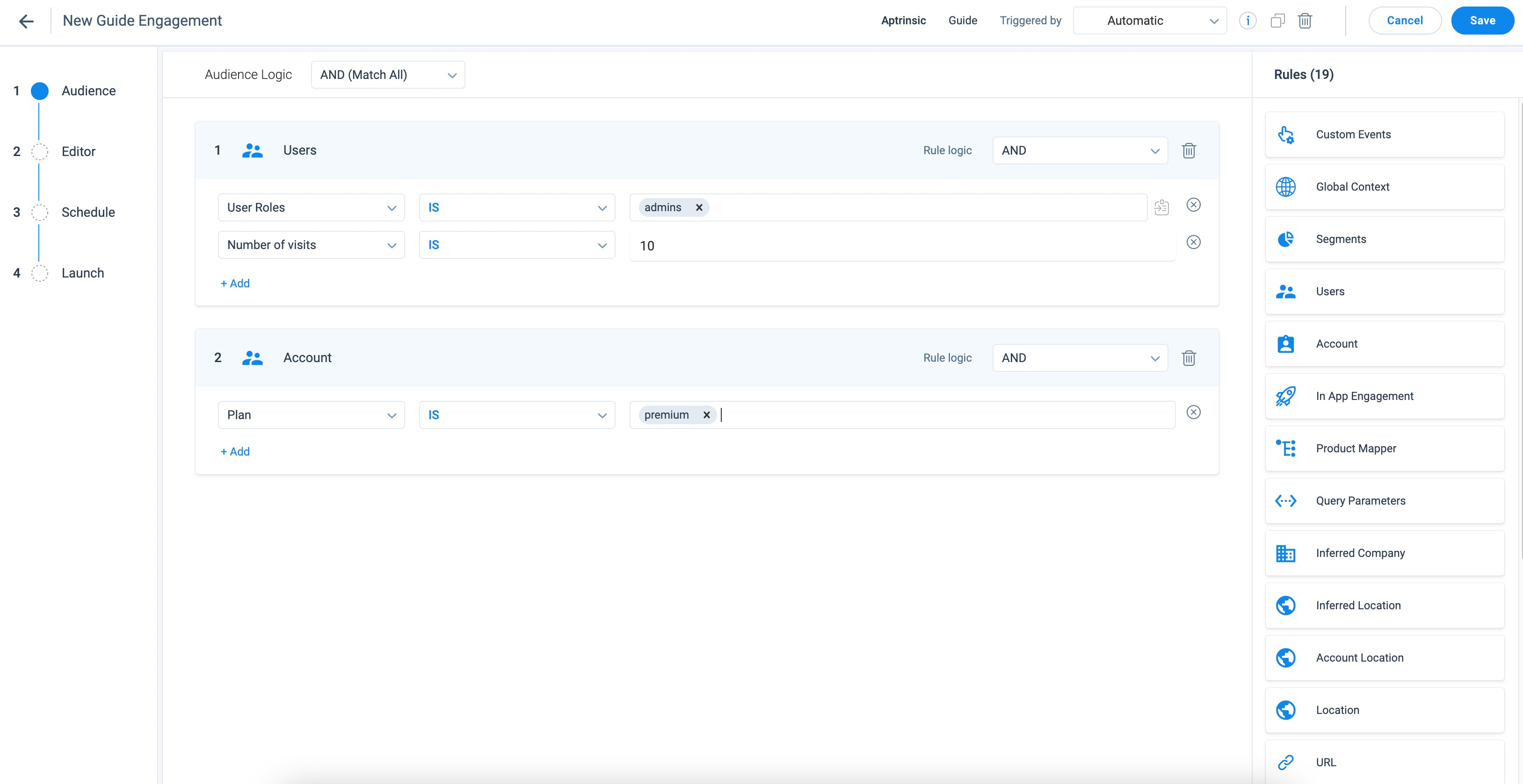
For more information about how to select the audience for engagements, refer to the Audience Selection (Engagements) article.
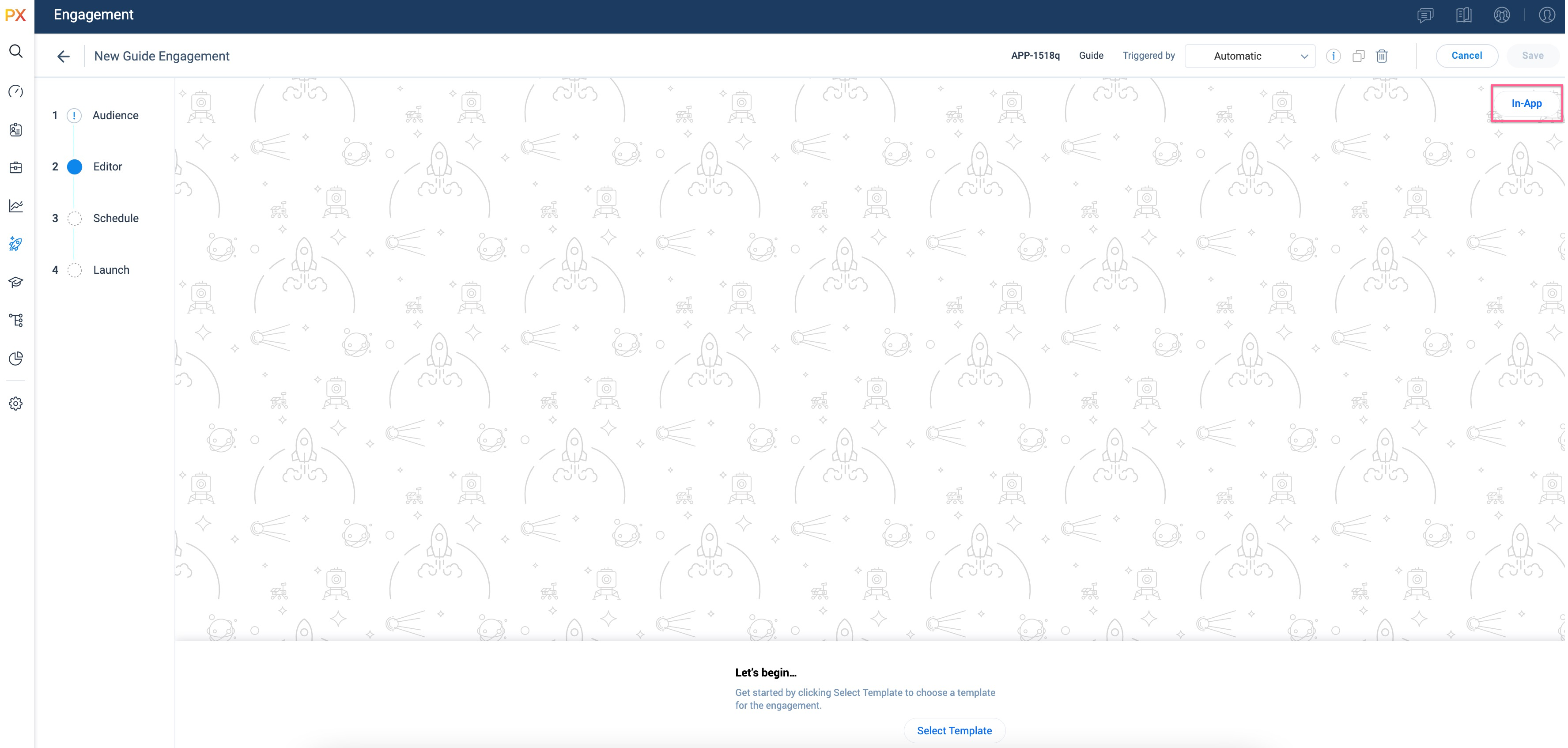
In-App Editor
Gainsight PX has redesigned the engagement editor with a simplified look and feel. The new WYSIWYG editor, which is scalable and easy-to-use, provides you the flexibility to design your engagements seamlessly. You can create engagements right from your application thereby instantly experiencing what your customers can view .
IMPORTANT: In the initial phase, the in-app editor is available only for Guide engagements. Gainsight PX is working to bring-in this editor experience to other engagement types soon.
In the Editor section, you can edit the engagement using the offline Editor.
To edit the engagement in the target application, click In-App.
Enter the URL of your product and click Launch to configure and map the engagement elements.
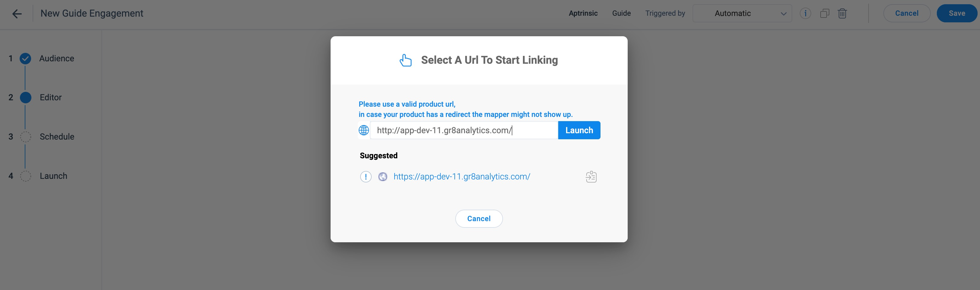
Note: You can also configure the engagement offline using the Gainsight PX V2 Editor.
Select a Template
After you click Launch in the Editor section, Gainsight PX displays the editor in your application. You can select the template or custom steps for the engagement.
To select a template/step:
-
From the bottom pane of the in-app editor, click Select Template.
-
From the Template Picker window, select the required template.
Notes:
-
The templates are categorized into the following tabs:
-
Default: Displays the list of templates provided by PX.
-
Saved: Displays the list of templates saved by the users in your subscription.
-
Recently Used: Displays the list of recently used templates.
-
-
To add a template to the Favorites list, select the star for the template.
-
From the right pane, select the steps that you want to add to the engagement.
-
Click Apply.
Note: The templates saved in V1 Editor can be used in V2 Editor. To use engagement templates from V1 Editor in V2 Editor:
- Navigate to the Editor section.
- From the bottom pane of the in-app editor, click Select Template.
- In the Template Picker window, navigate to the Saved tab.
- In the V1 drop down list, select the required template.
- Click Apply.
Configure Guide Engagement Steps
You can trigger the Guide engagement with the following options:
Badge
A badge is an icon that can be used to trigger a Guide engagement. You can link the badge icon to any element on your application.
IMPORTANT: If the target element appears more than once in a specific module, you may add a specific page that has a unique URL. This helps you to identify your target element in a specific page.
For more information on how to trigger an engagement using the badge, refer to the Trigger Guide Engagement from Badge icon in the New In-App Editor article.
Tooltip
The Tooltip as a label helps you highlight new changes or options in your application to navigate your end users. You can add text and images within the tooltip.
To configure navigation for a tooltip step in the Guide:
-
Select the Tooltip step.
-
Map the Tooltip to an element of your application.
IMPORTANT: If the target element appears more than once in a specific module, you may add a specific page that has a unique URL. This helps you to identify your target element on a specific page.
-
Use the following options in the Navigation element of the Editor, to customize the user navigation actions. In the Navigation section, select one of the following:
- Use Navigation Bar: This provides the user with navigation buttons in the Guide.
- Click in Target Element: The guide moves to the next step when the user clicks on the target element for the tooltip.
- Hover Over Target Element: The guide moves to the next step when the user hovers upon the target element for tooltip.
- Text Entry Submission: The guide moves to the next step when the user enters text in the target element for the tooltip.
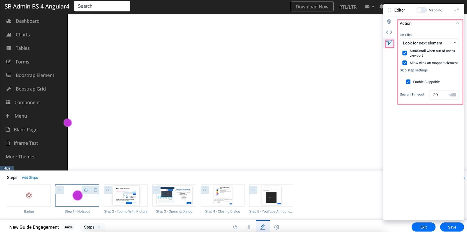
Hotspot
Hotspot can be used multiple times in a Guide engagement to draw attention towards important elements in the application.
To configure a Hotspot:
-
Select the Hotspot step.
-
Map the Hotspot to an element of your application.
IMPORTANT: If the target element appears more than once in a specific module, you may add a specific page that has a unique URL. This helps you to identify your target element in a specific page.
-
In the HotSpot element of the floating Editor, customize the hotspot using the following options.:
- In the Icon section, format the Height, Fill color of the Hotspot, and the Ring color of the hotspot.
- Configure the Animation settings for the Hotspot.
-
In the CSS Selector element of the floating Editor, you can configure the CSS Selector of the target element.
-
In the Navigation element of the floating Editor, configure the following options:
- Set the Action to be performed when the user clicks on the Hotspot.
- Look for the next element: Navigates the user to the next element in the guide.
- Redirect to URL: Navigate the user to a specific URL page within the product to be able to continue the engagement on that page.
- (Optional) Select the AutoScroll when out of user's viewport checkbox to auto scroll the guide to the part where the next step of the guide is tagged. This is helpful when the next step in the guide is mapped to an element that is not visible on the page easily.
- (Optional) Select the Allow click on mapped element checkbox to allow the Guide to be triggered when the user clicks on the mapped element to which the hotspot is mapped. If this is not selected, then clicking on the hotspot is considered as the action for proceeding further in the guide.
- (Optional) In the Skip step settings section, select the Enable Skippable checkbox to seamlessly display Guide engagements on the dynamic pages that appear based on the specific workflow action or permissions assigned to the end user.
When the mapped element for a specific step is missing, Gainsight PX waits for the element to appear until the specified time. If the element is not found, the application skips the step and continues to display subsequent steps in the engagement. Users can specify the time (in milliseconds) for the application to wait for the element in the Search Timeout field.
Replace a Template
To replace a template with a new one:
-
In the In-app editor at the bottom, click Replace Template. A warning message is displayed.
Note: The new template overwrites the current engagement content. This action cannot be undone. Click Ok to continue.
-
From the Template Picker window, select the required template on the left pane.
-
From the right pane, select the steps that you want to add to the engagement.
-
Click Apply.
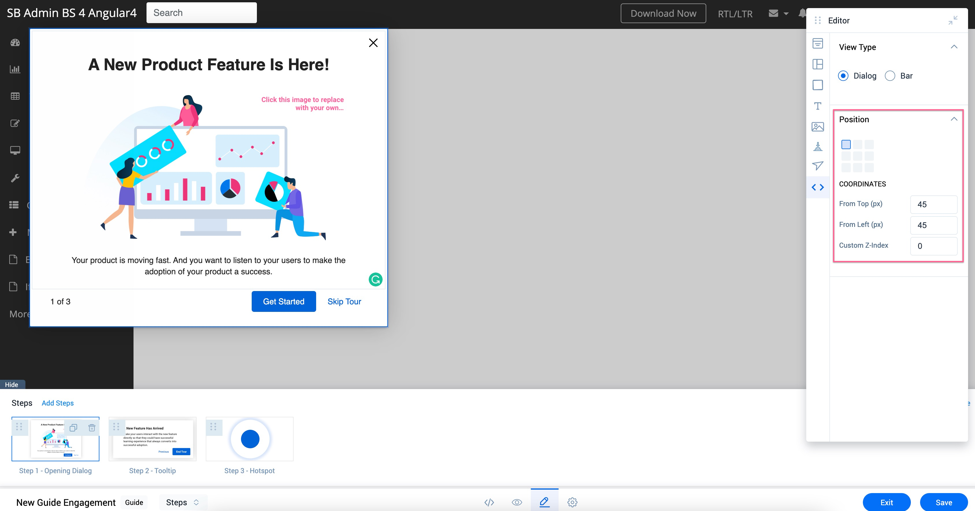
Configure Location of a Dialog Step in the Engagement
Navigate to the CSS Selector element in the Editor floating pane to configure the following:
Display the Dialog Step as Bar
You can set your engagement as a Dialog-Bar that appears at the Top or Bottom of the screen.
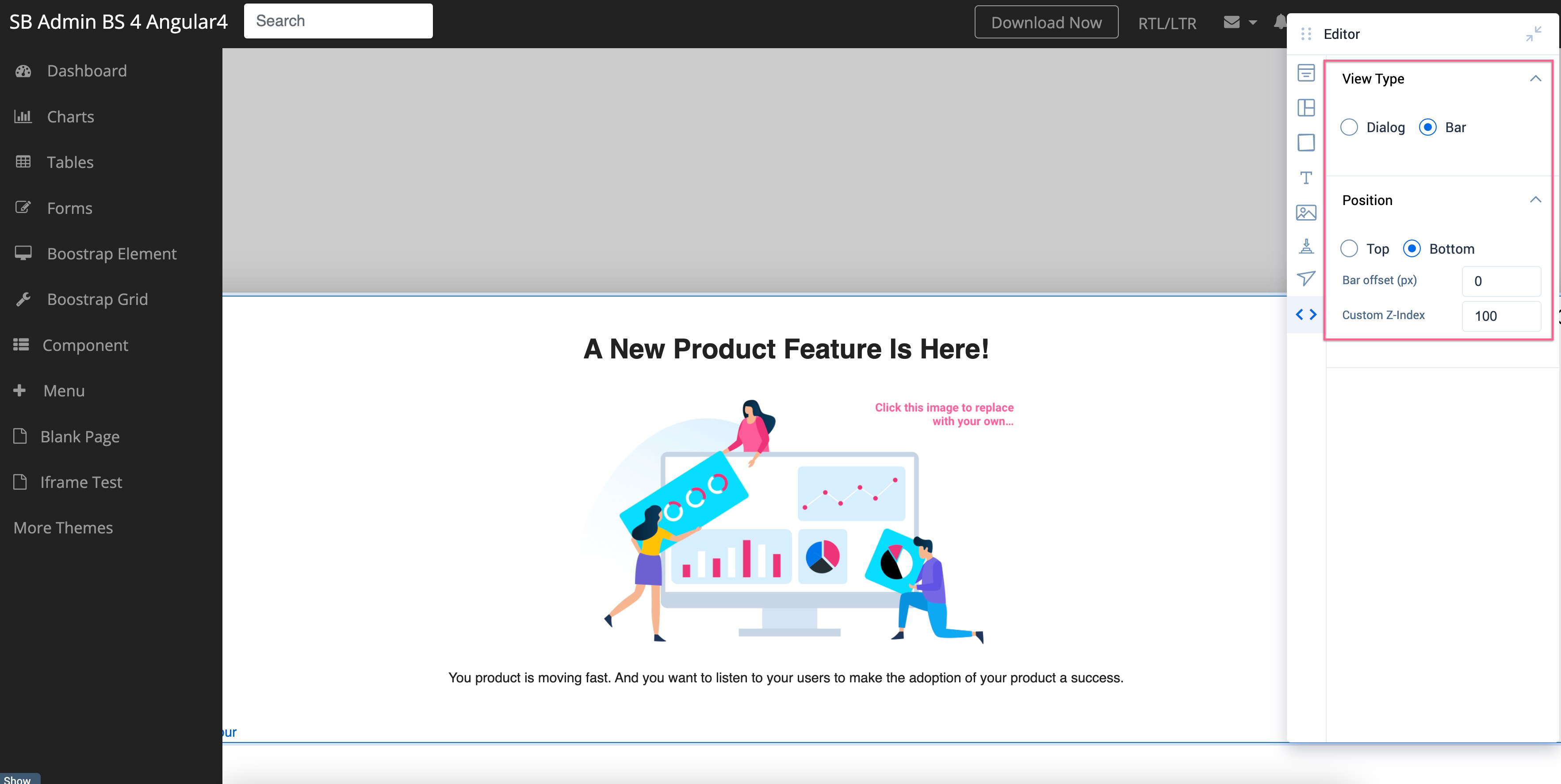
Configure Position of a Dialog Step of your Engagement
You can configure the position of your engagement on the user’s application screen. You can provide the offset from the top and left ends of the screen in the COORDINATES section.
Note: This is applicable when you set the View-Type of the engagement as Dialog.
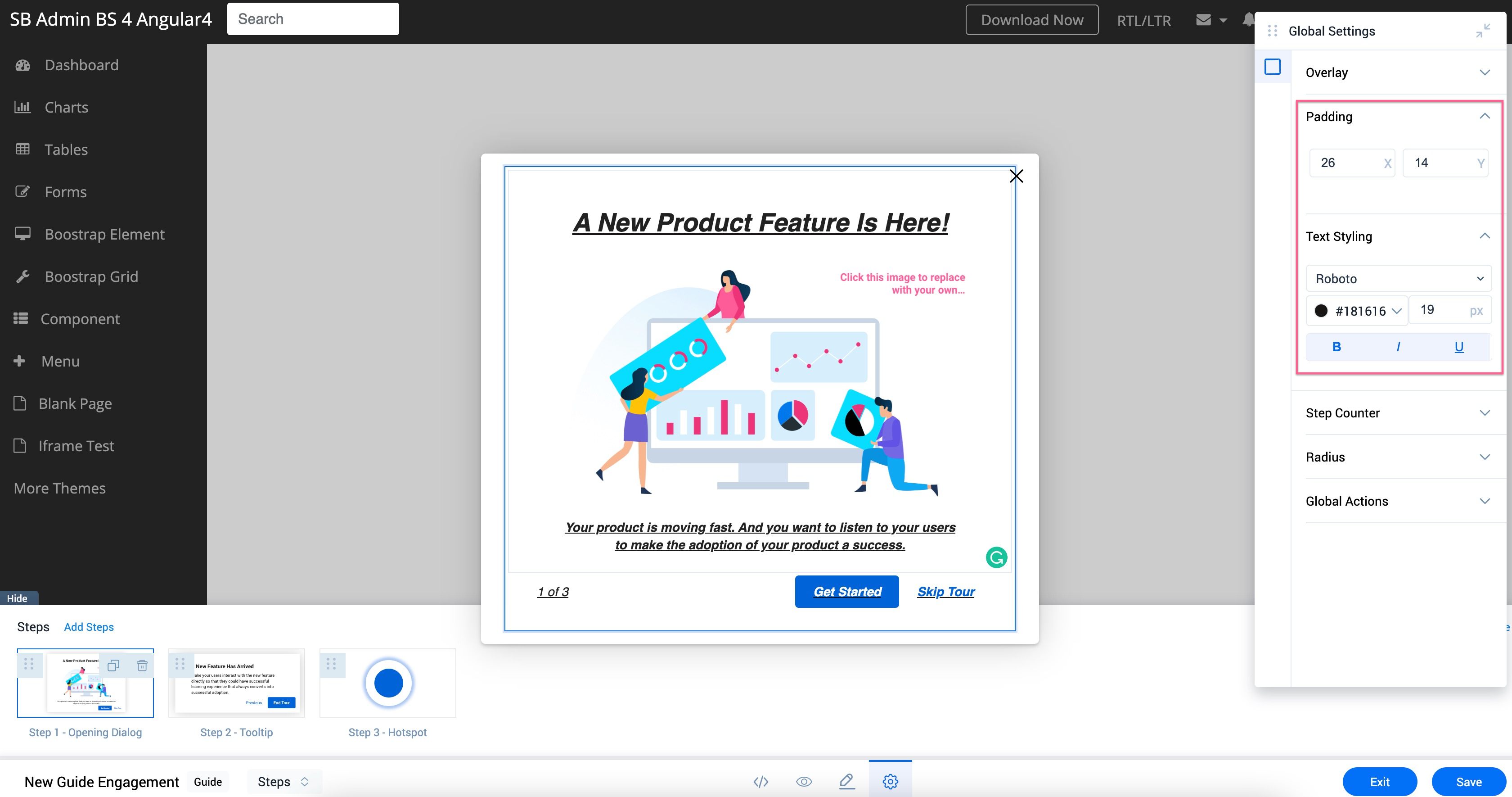
Set Global Settings for the Guide
The Global Settings section in the In-app editor at the bottom helps you configure the padding and text styling that is applied to all the steps within the engagement.
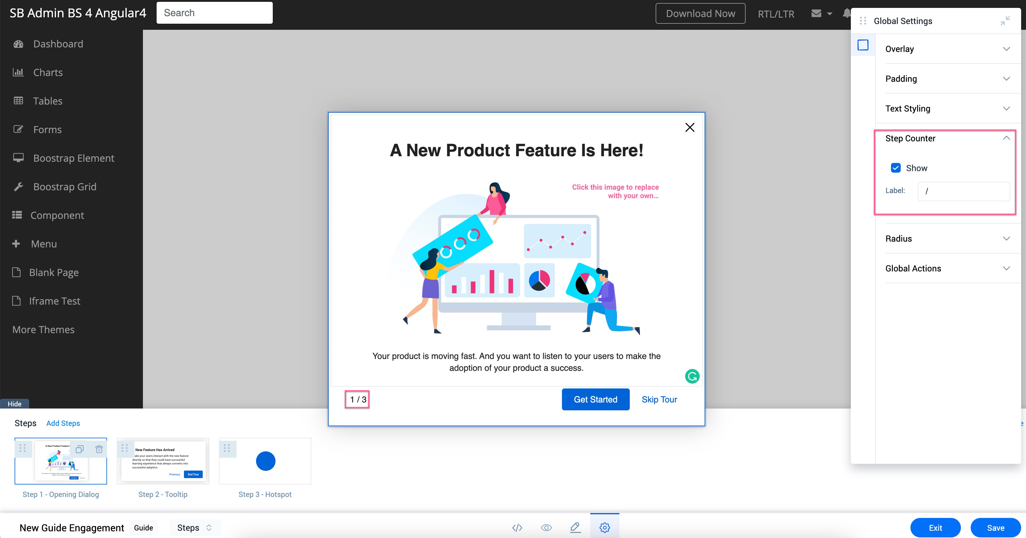
Show Step Count
Select the Show checkbox in the Step Counter section to display the current step number and the total number of steps in the Guide engagement. You can also modify the label for the step count.
For example, you can mention ‘of’ or ‘/’ in the Label as shown in the image below.
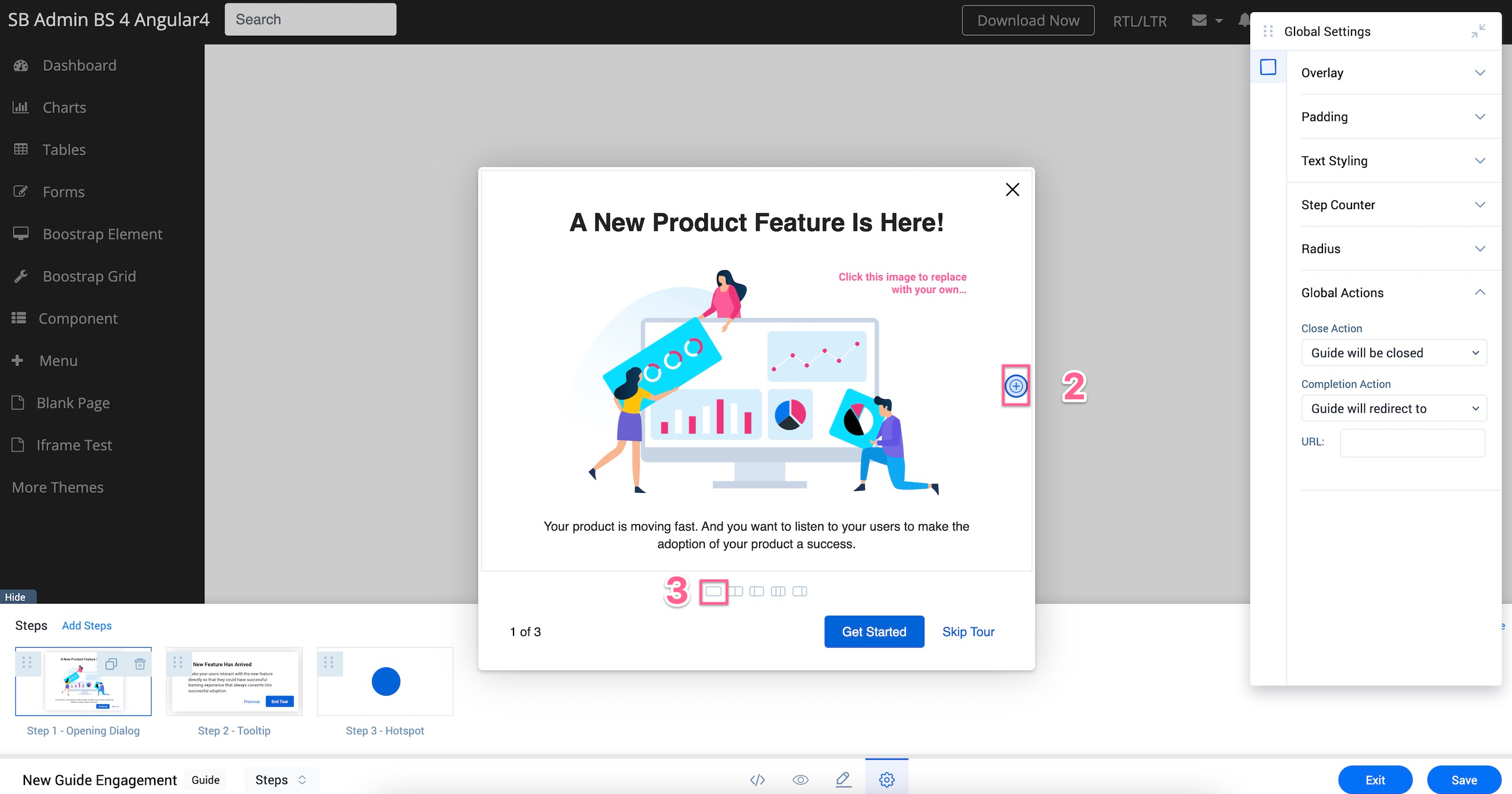
Configure Global Actions
You can configure Global Actions for your Guide engagement when a user clicks on the close option, or when the user completes the Guide. You can either configure the engagement to close, or navigate the user to a specific URL.
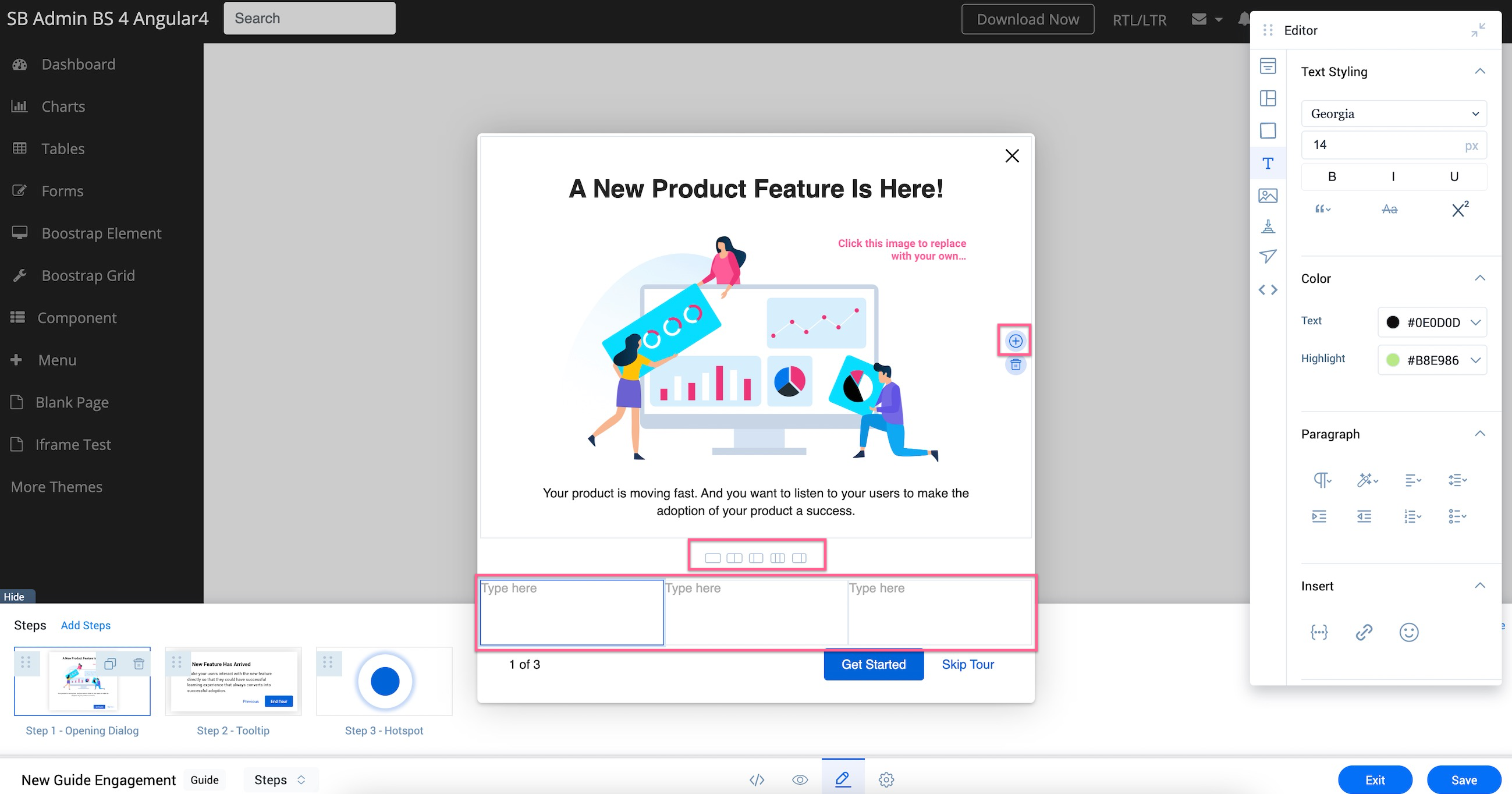
Work with Rows and Cells
You can add an additional set of rows to a Dialog step. This helps you to display an image and add relevant text side-by-side, or to present relevant information in groups such as properties of an element or feature. You can add a maximum of three cells in a row at a time.
Note: You can detect the selected element in the engagement highlighted in blue color.
To add a cell:
-
Select the required step to add a cell.
-
Click on the plus option that appears on the right side of the slide on mouse hover.
-
Select a single cell icon. The cell is added to your slide.
Add Rows
You can add multiple cells in a row at the same time. This helps you add text and images adjacent to each other.
To add a row:
-
Select the required step to add a cell.
-
Click on the plus option that appears on the right side of the slide on mouse hover.
-
Select a row with two or three cells. The row is added to your slide.
Note: You can add a row with a maximum of three cells at a time.
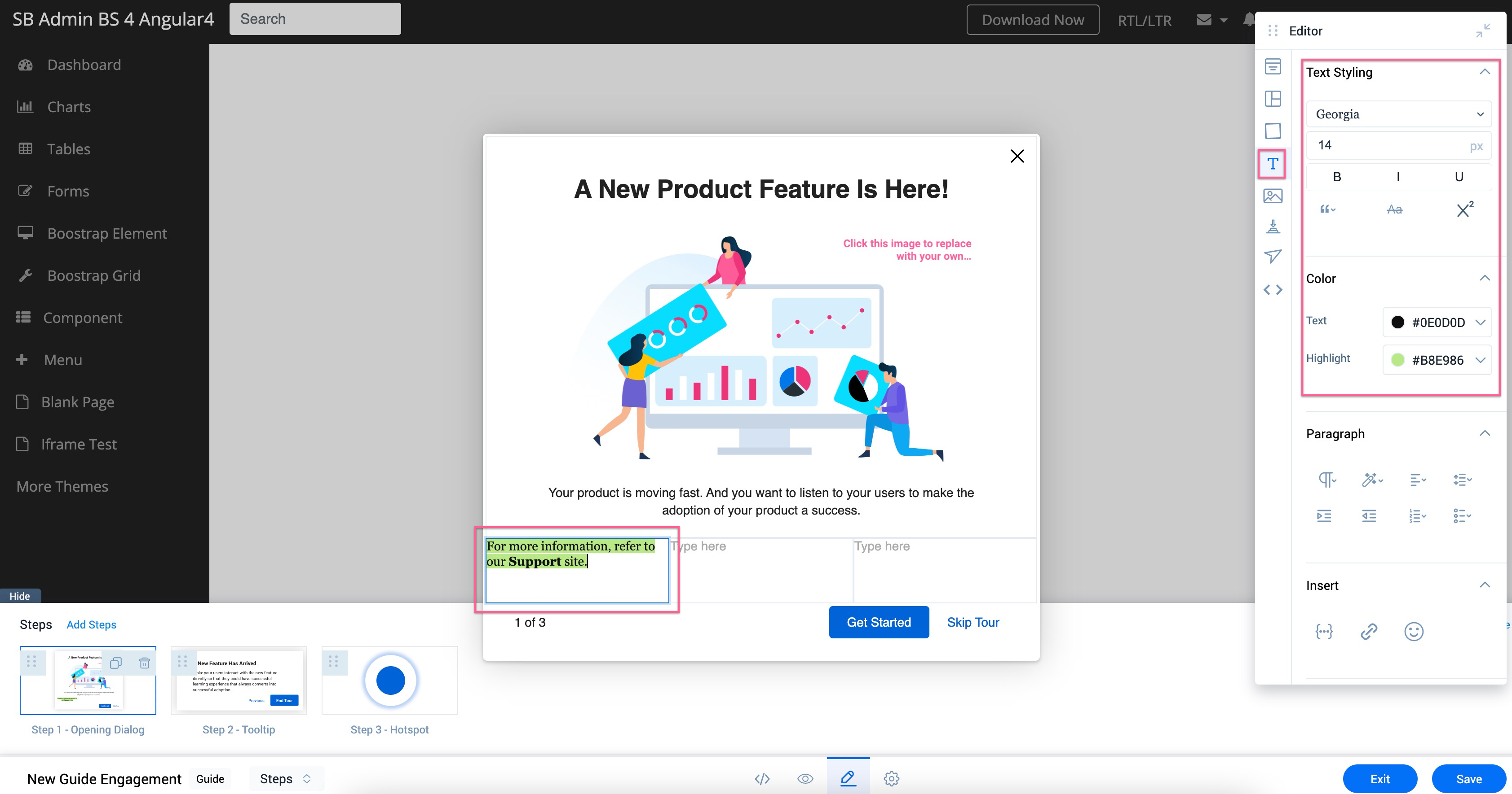
Add and Format Text
Select the cell to add text, and format text font, font size, font color, and highlight the text with a color from the Text element of the floating Editor.
Paragraph Settings
In the Paragraph section, you can use the following options to customize selected text paragraphs:
-
Add predefined heading formats to the text.
-
Format the font color to Gray.
-
Add Borders above and below the text.
-
Add Space between letters and words.
-
Change the font case of the text to Uppercase.
Note: Click on Uppercase again to change the font case to sentence case.
-
Format indentation of the text.
-
Add text in the form of bullets or numbered lists.
Insert a Token
In the Insert section, you can insert personalized User and Account tokens.
To insert a Token:
-
Select the cell where you want to insert the token.
-
Click on the token icon in the Insert section. The Personalized Tokens window is displayed.
Tip: Alternatively, you can type the flower bracket "{{" and this will list the available tokens that can be inserted.
-
Select User or Account to view the list of respective tokens.
-
Select the token you want to add.
-
Click Insert.
Insert a Link
In the Insert section, you can hyperlink the text to navigate users to a specific URL.
To insert a link:
-
Select the text to insert the hyperlink.
-
Click on the hyperlink icon in the Insert section.
-
Insert the link in the Link text box.
Note: Select the Open link in new tab checkbox to navigate the user to a new tab when they click on the hyperlinked text.
- Click Save.
Add Media
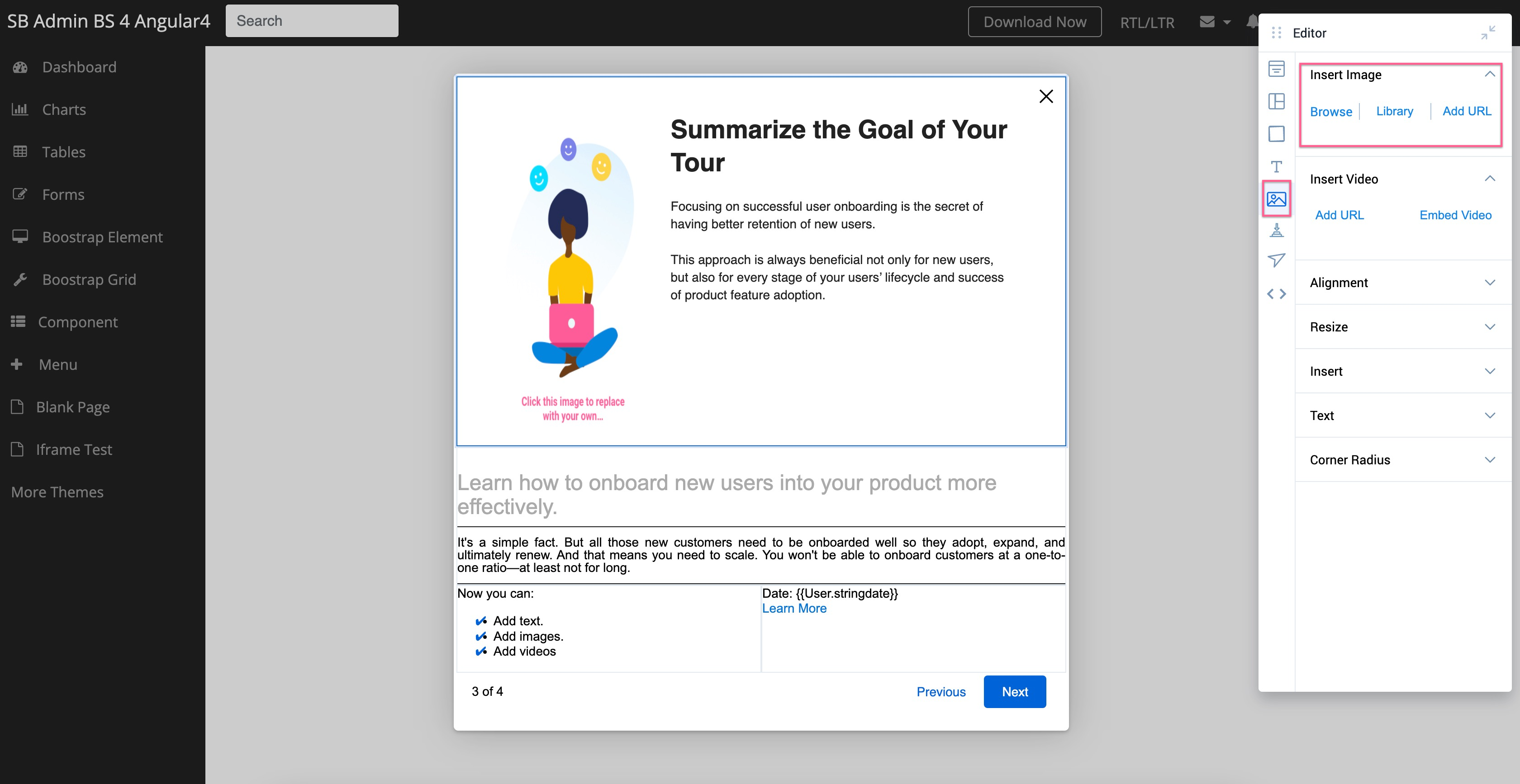
You can add images and videos along with text from the Media element in the floating Editor.
Insert Images
You can insert images using the following options:
-
Browse: Add images from your system.
-
Library: Add images from the Gainsight PX library.
- URL: Add images using image URL.
Insert Background Images
You can add a background image to a cell using the image URL.
To add a background image:
-
Select the cell in which you want to add the background image.
-
Navigate to the Cell section in the Editor.
-
Add image URL in the URL section under Background. The image is added to the cell.
Notes:
-
Navigate to the Row element in the Editor to add an image to the selected row.
- Navigate to the Global Overlay element to add an image to the entire dialog step.
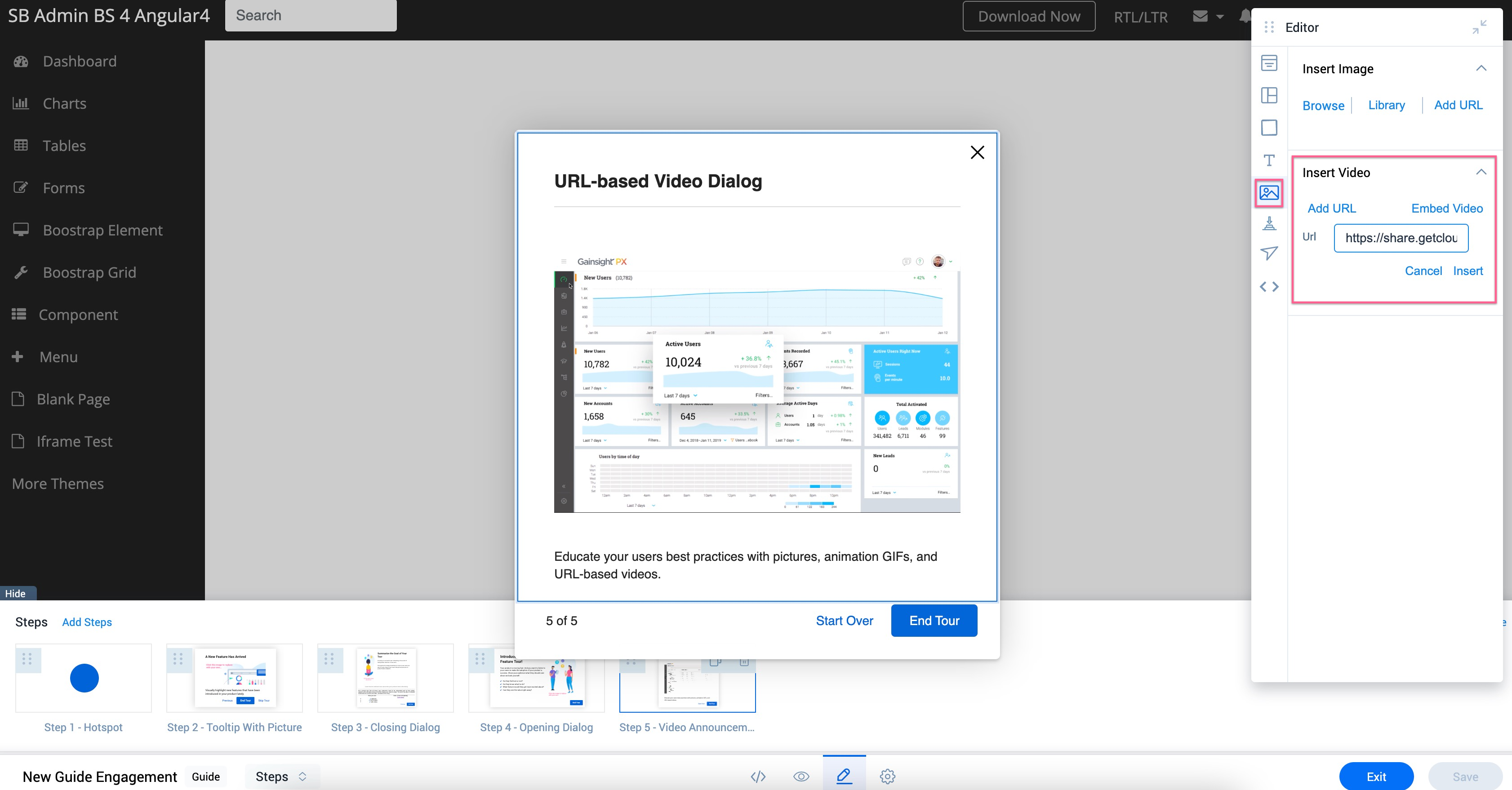
Insert Videos
You can either insert a URL or an Embed Code to add a URL based video, or to embed a video in the Dialog step respectively.
Add Custom Buttons
You can add custom buttons to the selected Dialog step from the Button Editor element in the floating Editor.
To add a custom button:
-
Select the required dialog step to add the custom button.
-
Navigate to the Button Editor element in the floating Editor.
-
Click on Insert button.
-
Add the name of the button in the Label section.
-
(Optional) Format the font Color, and Font Size of the button label.
-
(Optional) Format the Background Color and percentage of color Fill of the button.
-
(Optional) Add a link to the button text to navigate users to another page.
Note: Select the Open link in new tab checkbox to configure the URL to open in a new page.
-
(Optional) Configure Padding and Border Radius of the button.
-
Click Apply.
Configure Navigation for Dialog Step
You can perform the following configurations in the Navigation element of the floating Editor.
-
Set the Actions to be performed when the user clicks on the Start or the Next button.
-
Look for next element: Navigates the user to the next element in the guide.
-
Redirect to URL: Navigate the user to a specific URL page within the product to be able to continue the engagement on that page.
-
-
From the Available Buttons section, select the checkbox for the button you want to display in the slide.
-
(Optional) Select the Skip Button checkbox to allow the user to skip the engagement.
-
(Optional) Select the Previous Button to allow the user to navigate to the previous step in the Guide.
Note: The Use browsing history checkbox is enabled by default. You can redirect users to different URLs using $px-auto-resolve. Enabling this option allows Gainsight PX to use the browser history.…
-
(Optional) Select the Restart Button to allow the user to restart the Guide again.
-
Format the navigation buttons as desired.
-
Configure the navigation button’s alignment.
Note: This option is not available when the Step Counter is applied to the Guide.
Format Step Dialog
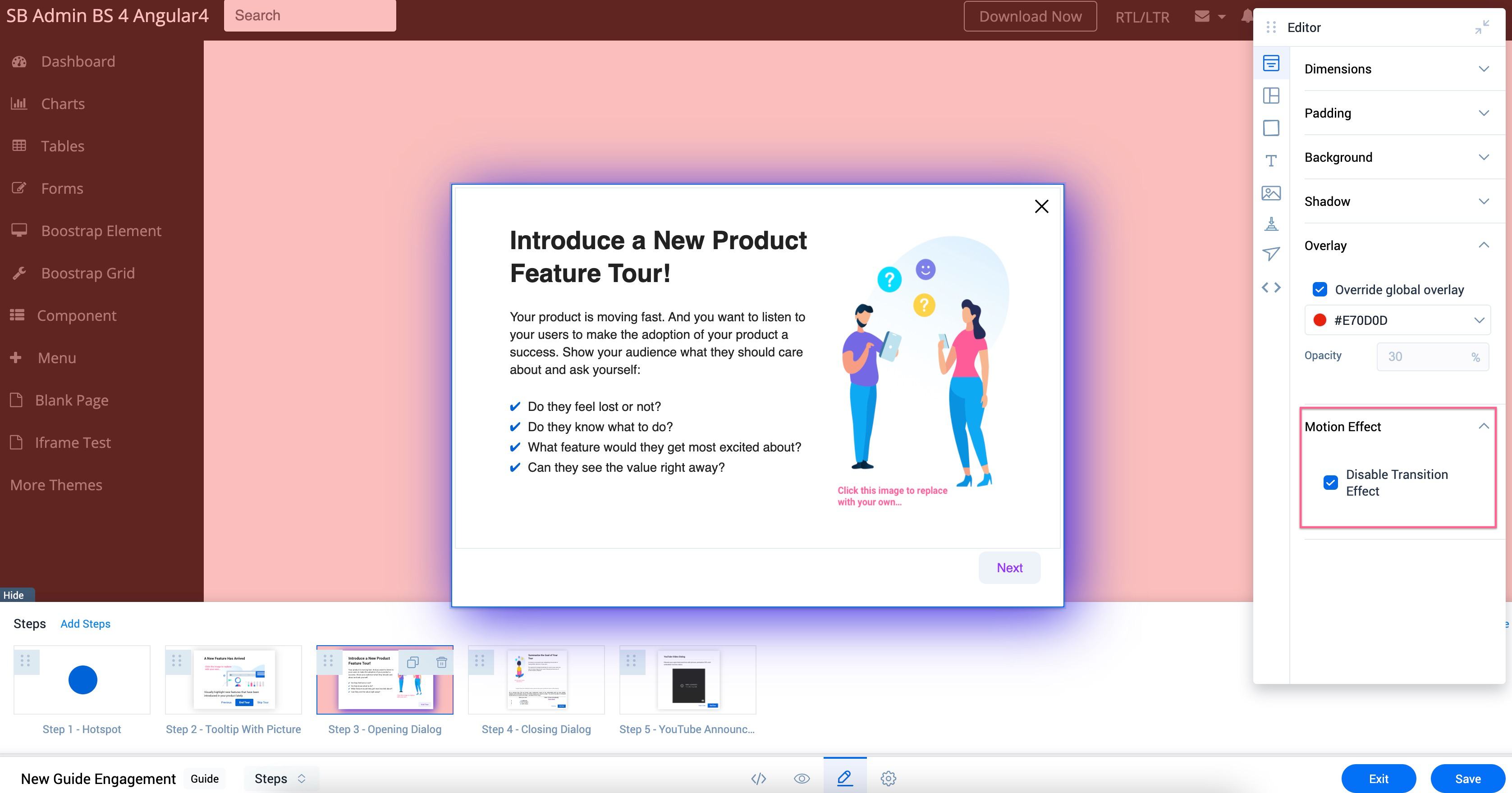
The Global Overlay element in the floating Editor lets you configure the Padding and the Dimensions that can be applied to all the steps within the engagement.
For more information on how to add background images, refer to the Insert Background Images section of this article.
Add Shadow Effect to the Step Dialog
Select the Enable checkbox in the Shadow section to add a shadow effect to all the steps within the engagement. You can modify the Color and the Opacity percentage of the color.
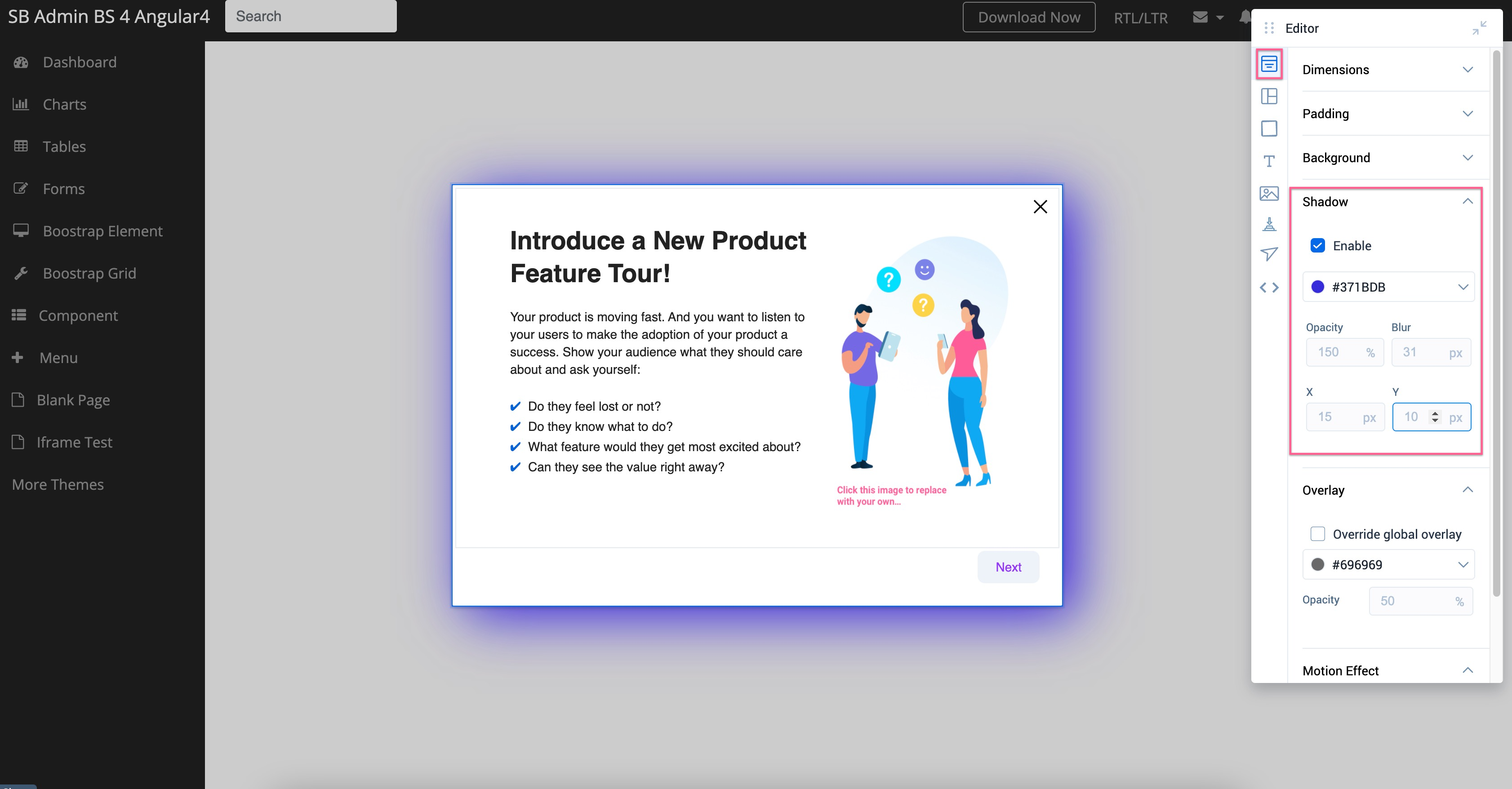
Configure Screen Overlay
Select the Override global overlay checkbox to add overlay to your engagement. You can select an overlay color and configure the Opacity of the color.
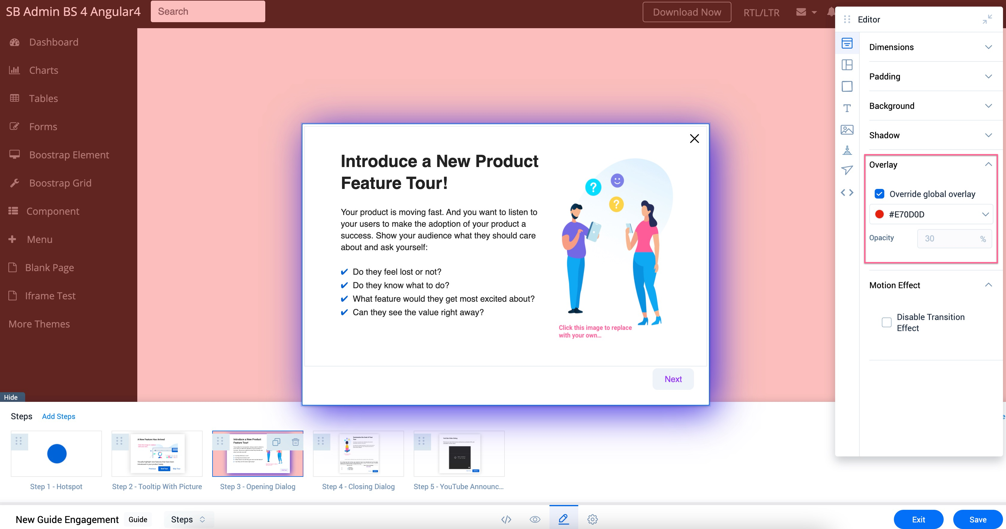
Apply Transition Effect
The transition effect is applied to all the steps in the Guide by default. To turn it off, select the Disable Transition Effect checkbox.
Configure Automation Settings
The Automations Settings section allows you to configure the following two aspects of the guide engagement:
- Timeout: Automatically close the engagement after a set period, ensuring it does not linger and disrupt user experience.
- Initial Delay: Introduce a delay before an engagement is triggered, allowing the user to interact with the page content before the engagement appears.

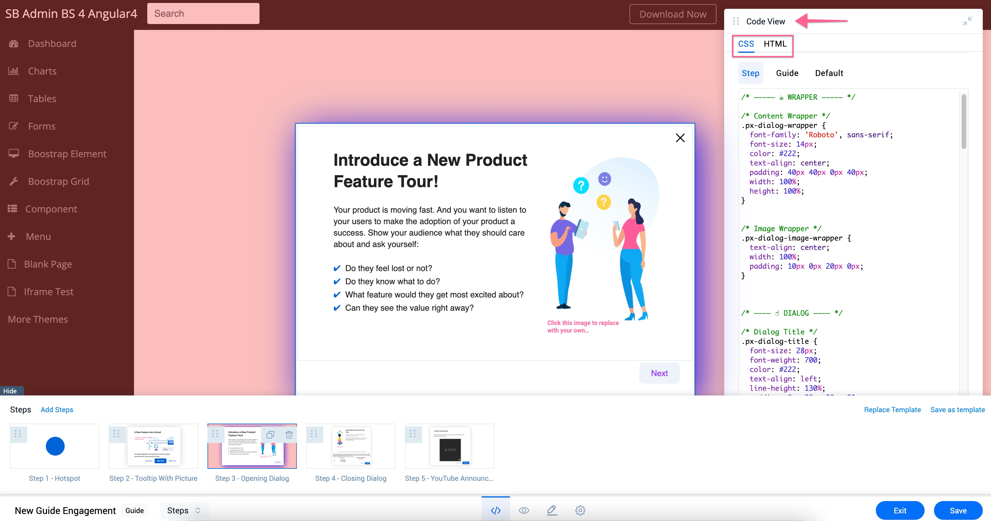
Use Code View to Configure Settings
The footer pane of the Editor provides you the option to view the programming code of the editor that caters to advanced use cases. The Code View helps you modify the engagement content in CSS and HTML formats. The step CSS takes precedence over the engagement CSS.
Create Localized Engagements
You can translate the content of an Engagement into different languages. Gainsight PX supports translation of content into 107 languages.
IMPORTANT:
- Gainsight PX only supports in creating multiple versions of your engagement in different languages but does not translate your content by itself.
- Currently, the translation of images, videos, and GIFs is not supported. Only text can be translated.
- You can translate your content to only those languages that are written from left to right (Arabic, Urdu, etc. is not supported).
- This localization feature is not applicable to Email engagements.
For more information on how admins can configure this feature, refer to the Configure Localization section of the Engagement Localization article.
Once the admin completes the configuration, users can translate the content to the required language. To translate content, users must first draft the content and then export it as an XLIFF file. The translation must be performed in the XLIFF file. Then the translated XLIFF file must be uploaded back to the engagement.
Note: You cannot translate the default language.
Gainsight PX has an automated workflow for Engagement Localization. This helps you integrate PX Localization with your existing CI/CD workflows. The workflow has the following capabilities:
- API Support for export/import of XLIFF file(s)
- Automatic update of the workflow status labels (ready for translation, in progress, etc)
Perform the localization in the following steps:
- Export XLIFF
- Set Engagement Status
- Import XLIFF
Export XLIFF File
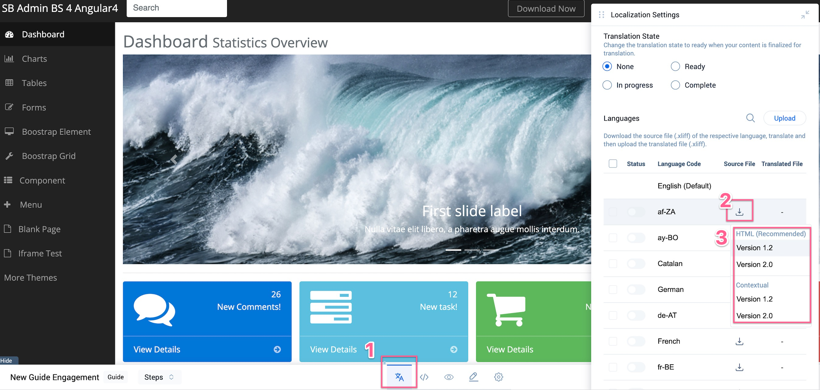
To perform translation:
- From the bottom pane of the in-app editor, click View localization settings icon.
- Download the Source XLIFF file for the required language from the Languages section.
- Select Version 1.2 or Version 2.0 for HTML or Contextual strategy.
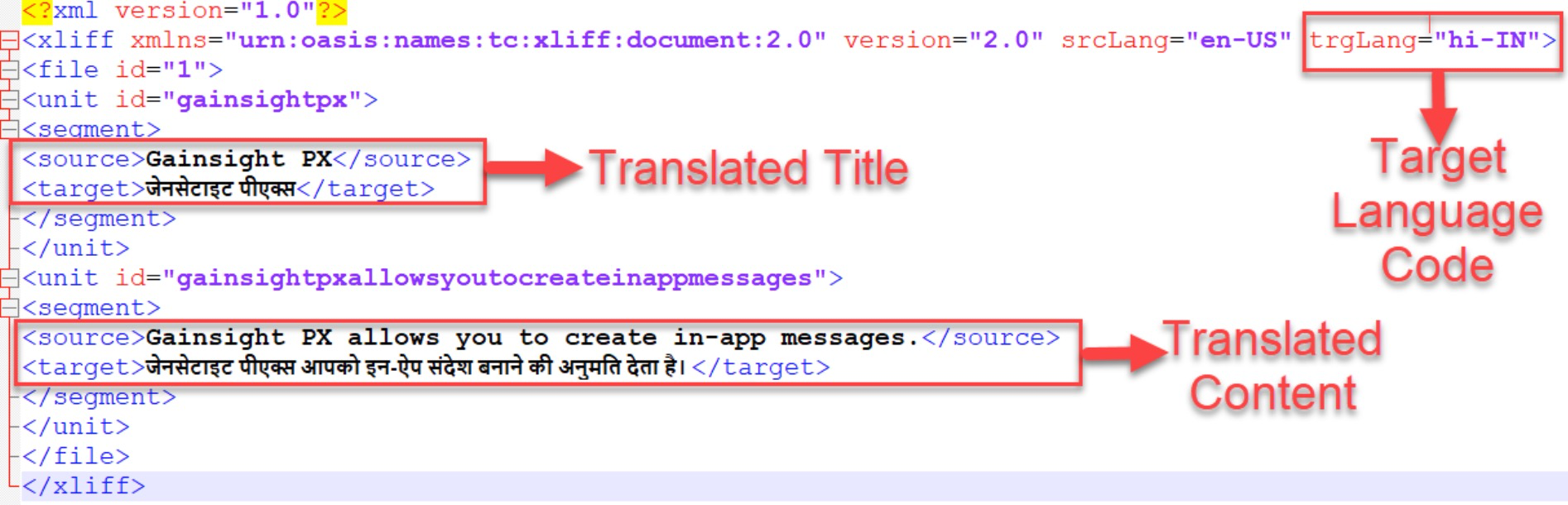
The exported XLIFF file has three important sections. The source language code and the source messages (title and content of the engagement).
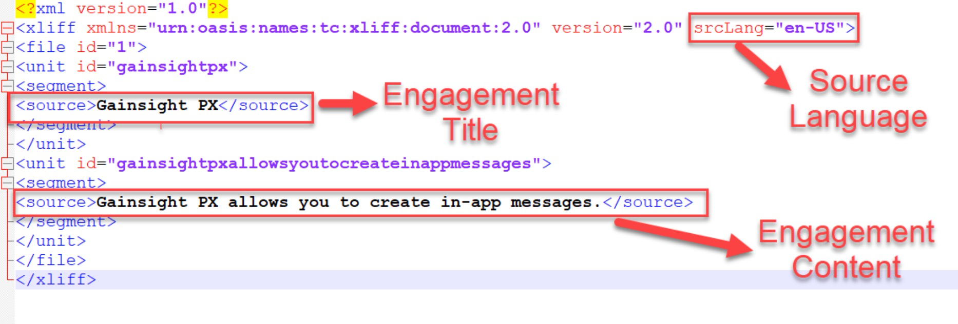
You can perform translation of the content from an external application. Once you perform the translation, you must ensure that:
-
The srcLang (source language) tag is followed by trgLang (target language) tag. This target language tag must have the language code of the translated language.
- Each source tag must have a target tag. The target tag must contain the translated version of the source language.
If the above two requirements are not present in your XLIFF file, you cannot upload it back to PX.
In the following image, the source language English is translated to Hindi language.
Set Translation State
You can set the status of your engagement before, during, or after the localization process. This enhancement helps you convey the idea when the engagement is ready for translation, translation is in progress or translation is complete.
The following statuses are available:
- Ready: Set this status when you finalize the content for translation. The content of the engagement is locked when the status is set as Ready for translation.
- In progress: Set this status to indicate that the translation is in progress and any further changes will not be included for translation.
- Complete: Set this status to indicate that the translation is complete and the translated content is available in the engagement.
- None: Set this status to indicate that the engagement is not yet localized.
Import XLIFF
You can now import the downloaded XLIFF file back into Gainsight PX. Click on Upload. Use the dropzone in the Upload Translated File window to bulk import multiple XLIFF files into Gainsight PX.
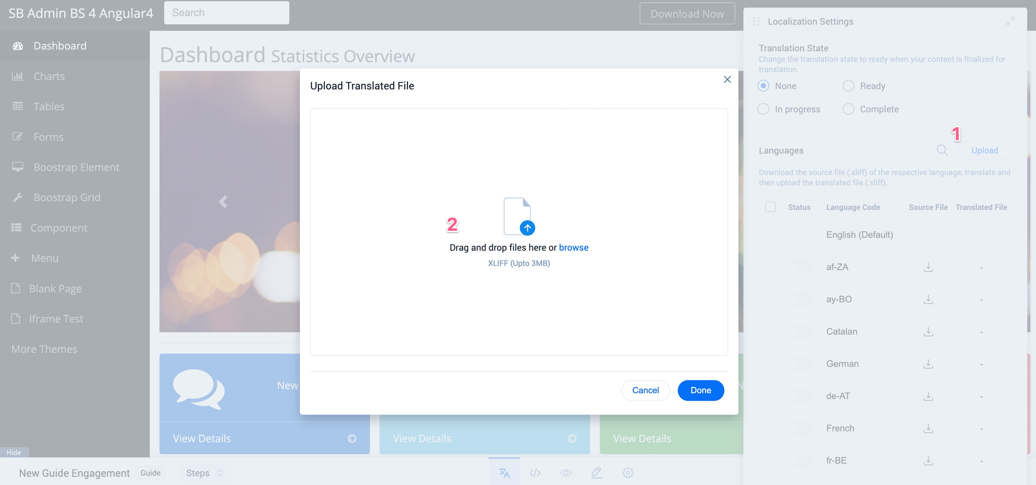
Notes:
-
You can upload a maximum of 3 MB in file size during a single import.
-
The Status toggle switch is automatically enabled when a valid translated XLIFF file is imported for a specific language. This signifies that for users with this language, the translated content is shown.
-
Hover on the translated file to download or delete the file.
-
To delete multiple languages at once:
- Select the checkbox beside each language file.
- Click on Remove Translation to delete the selected languages.
Once you upload the XLIFF file, you can click the language name to view and edit the engagement content in the translated language. Editing a translated engagement can be useful for making minor changes that you don’t need to make to every translation.
If you modify the engagement content (either from the default language or any of the translated language), the changes are not reflected in other languages. You must export the XLIFF file, translate the content, and import the XLIFF file, once again.
Similarly, translation can be performed for the French language as well. If you do not perform translation for any language and launch the engagement, the engagement is displayed in the default language if Fallback to default language in case translation doesn’t exist checkbox is selected by the admin in the Localization Settings section. If this checkbox is not selected, and the translation is not performed, the engagement is not displayed to those users for whom the non translated language is the local language.
Preview Engagement
You can preview the current step of the guide engagement to make necessary modifications while you are configuring the guide.
To preview only a selected step of the guide:
-
Click the eye icon on the footer pane of the editor.
-
Select Preview Current Step.
After you finalize the appearance and content of your engagement, save and preview the engagement.
To preview an engagement:
- Click the eye icon on the footer pane of the editor.
- Select Preview. The steps and Editor floating pane are minimized to provide you a full preview of the engagement.
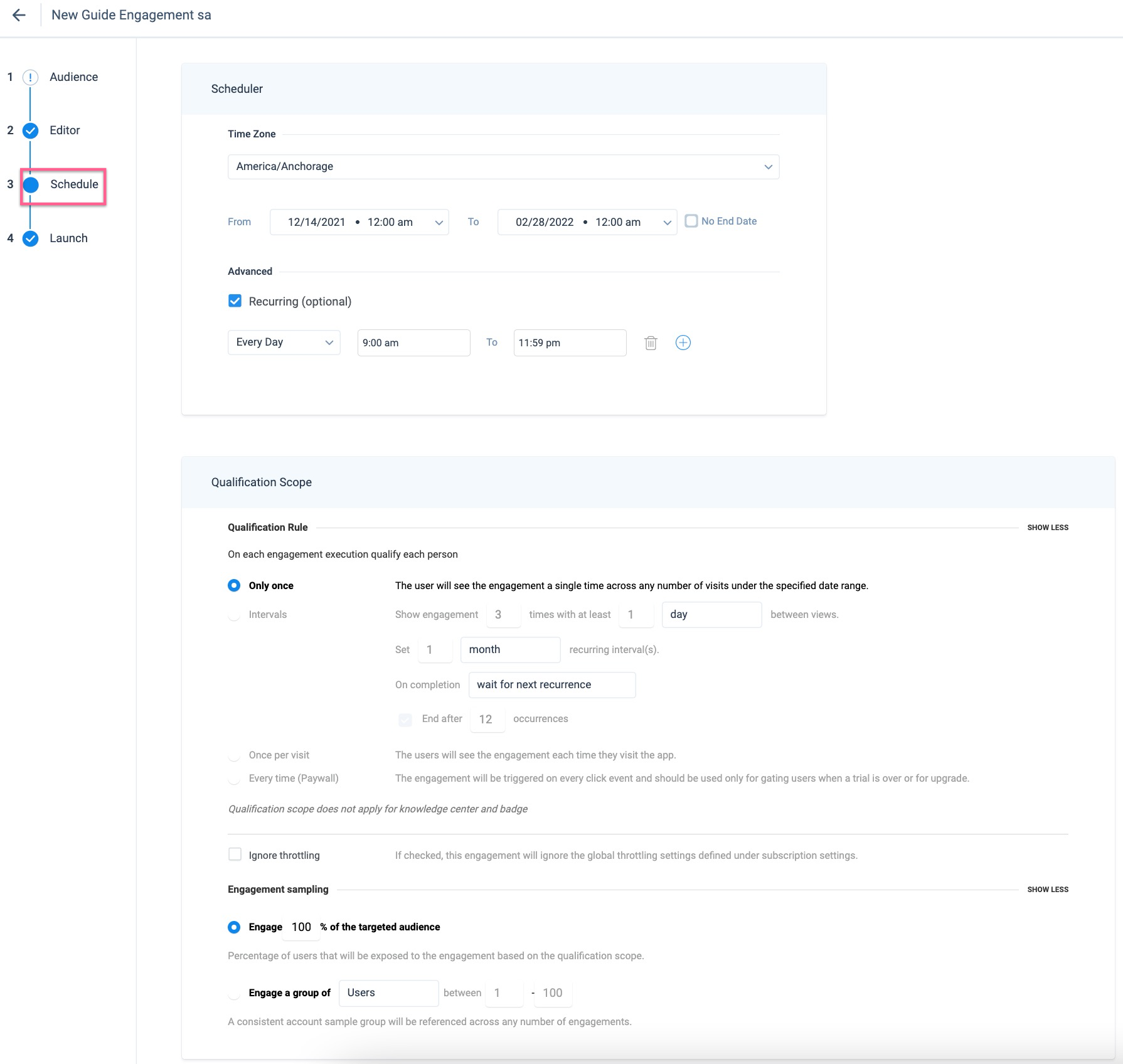
Schedule Engagement
Schedule your guide to control when the engagement should be active and the threshold of how many times it must be shown to the users. Specify the number of times and additional intervals in which you would like to automatically re-engage your users (for example, display the engagement).
In the Schedule step, set the From and To Date for the engagement. You can also set the engagement to appear on the target application at recurring intervals such as daily or on a specific day of the week.
For more information on the In-App Engagement Scheduler, refer to the Engagement Scheduler article.
Launch Engagement
This section gives you an overview of the configurations for your engagement and validates them automatically. Click Launch to launch the engagement.
Gainsight PX does not allow you to launch the engagement if:
-
Steps in the Guide are not mapped to the UI elements
-
Rules are not defined accurately or saved for Audience
-
Changes to any of the step are not saved
View Engagement Analytics
View the number of times an engagement is launched from the LIFETIME VIEWS column, for an engagement. Click this column to arrange the engagements in either ascending or descending order of their views. This column displays zero if an engagement has never been viewed by customers or is not yet launched. Click the eye icon to navigate to the Analytics > In App Performance page.
For more information about all frequently asked questions, refer to the In-App Engagements FAQs article.