
Trigger Guide Engagement from Badge icon in the V2 Editor
This article explains how to trigger a Guide engagement using the Badge icon in the new In-App Editor.
Overview
A badge is an icon that can be used to trigger a Guide, Slider, or Survey engagement. You can link the badge icon to any element in your application and configure it to trigger the engagement either through a click or hover on the badge icon. Customize the badge icon, and add or modify the tooltip content from PX Editor in your application.
Differences Between Badge and Hotspot
Following table shows the differences between a HotSpot step and a Badge icon.
| Hotspot | Badge |
| Hotspot can be used multiple times in a Guide engagement. | Badge icon can be used only once at the beginning of the Guide engagement. |
| Hotspot is considered to be a step in the Guide engagement. | Badge icon is not considered to be a step in the Guide engagement. |
For more information on how to configure Hotspot in the Guide engagement, refer to the Hotspot section of the Create Gainsight PX In-App Guide Engagement article.
Use Cases for Badge Icon
Following are a few sample scenarios where the badge icon can be used:
- When you have an option on the User Interface (UI) that can be set to Active but cannot be reverted, configure the badge icon with tooltip text. This eliminates the need for separate Hotspot and tooltip steps.
- When you create a walkthrough guide for a new feature , or a survey engagement to gather feedback on a new product, use the badge icon as a trigger for your engagement.
Select Badge Icon as Trigger Method
To select the badge icon as the trigger method:
- From the left pane, click Engagements.
- Click Create.
- Select the Guide, Slider, or Survey icon and click Create.
- From the Triggered by drop down, select Badge.
- (Optional) Deselect the Use Badge Tooltip checkbox in the Editor section, if you do not wish to include any tooltip text with the badge icon.
Note: If your Guide engagement has only the badge icon, it is mandatory for you to include tooltip text with the badge icon.
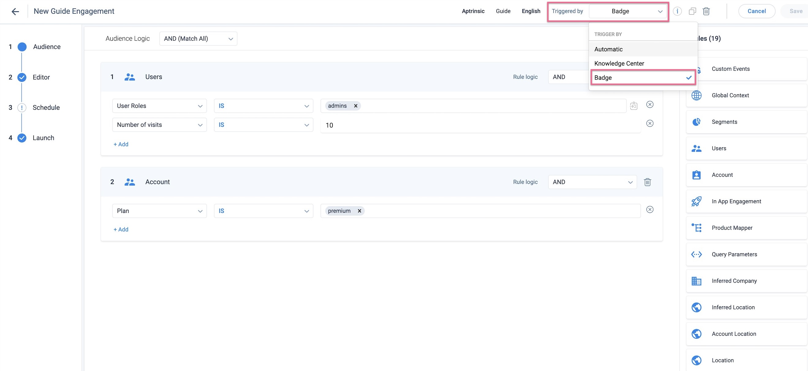
Note: When a guide is triggered by Badge, the audience criteria set in the engagement is still honored.
Configure Badge Icon
Configure the badge icon in PX or from your application.
To configure Badge icon using the In-App Editor:
- Click In-App in the Editor section.
- Enter your application URL and click Launch.
- Assign the Badge icon to an element of your application.
- In the Badge Style element of the floating Editor, configure the badge style.
- Select Icon to set the badge style as an icon.
- Select Image to configure the badge as an image using the image URL.
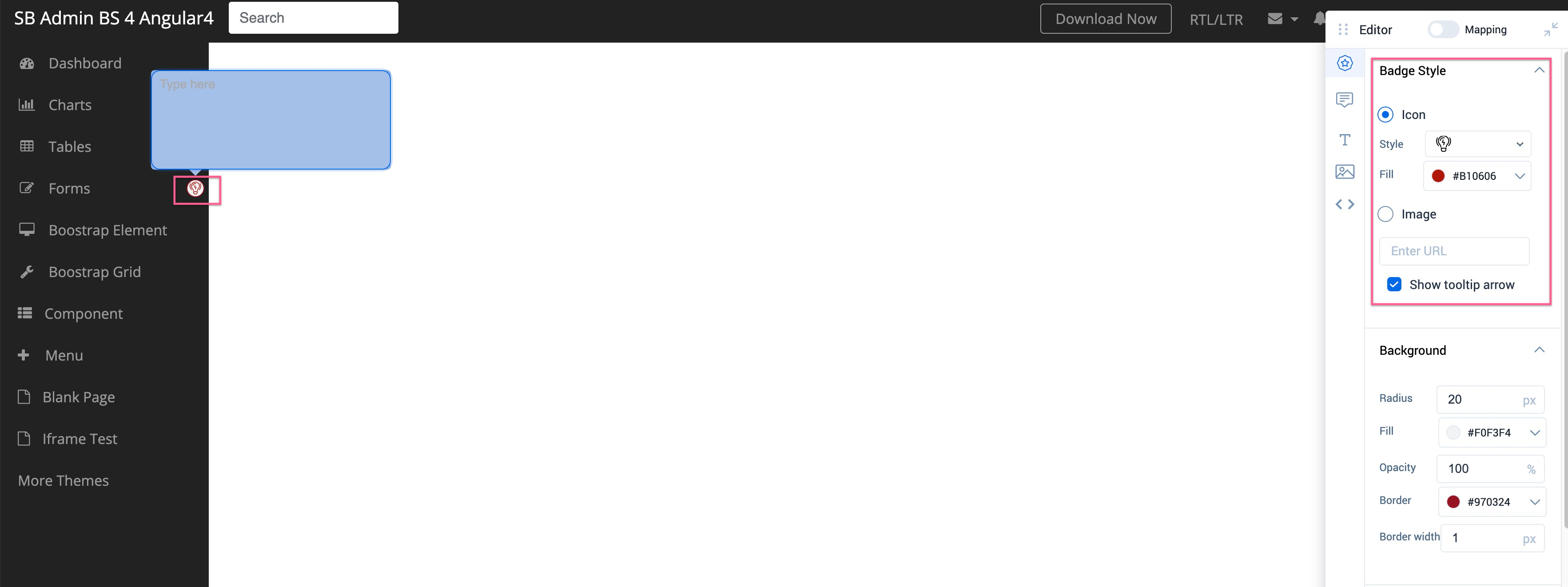
- Select or deselect the Show tooltip arrow checkbox to display or hide the pointer of the tooltip.
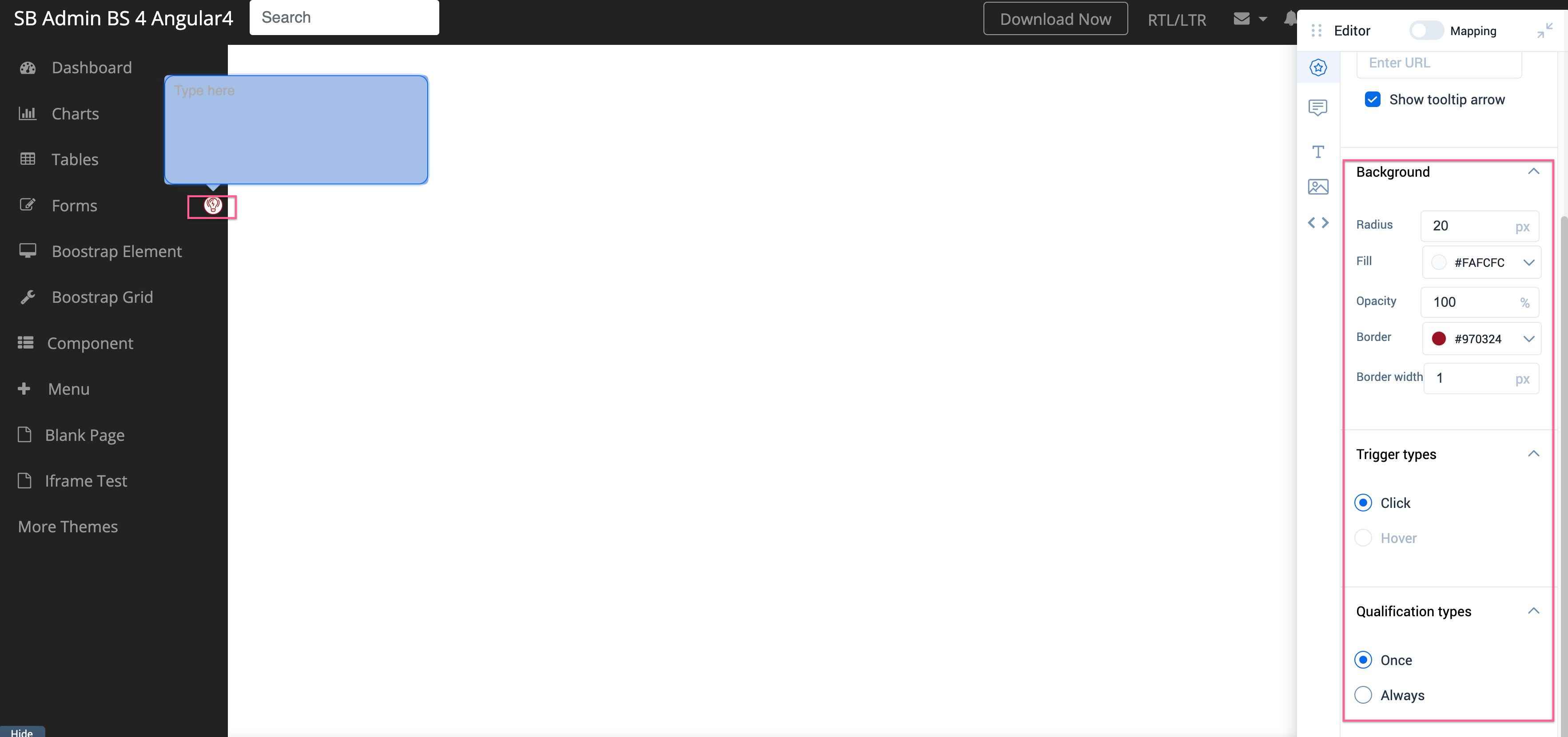
- In the Background section, format the Radius, Fill color, percentage of Opacity, Border Color, and Border Width of the badge icon.
- In the Trigger types section, select the trigger type for the engagement.
- If you select Click, then the tooltip text is displayed only when the user clicks the badge icon (or the guide engagement is triggered only upon clicking the badge icon).
- If you select Hover, then the tooltip text is displayed when the user hovers the mouse on the badge icon (or the guide engagement is triggered only upon hovering the badge icon).
- Select Badge Qualification Type. For more information, refer to the Badge Qualification Scope section of this article.
Configure Badge Tooltip
The tooltip as a label helps you highlight new changes or options on your application to assist your end users.
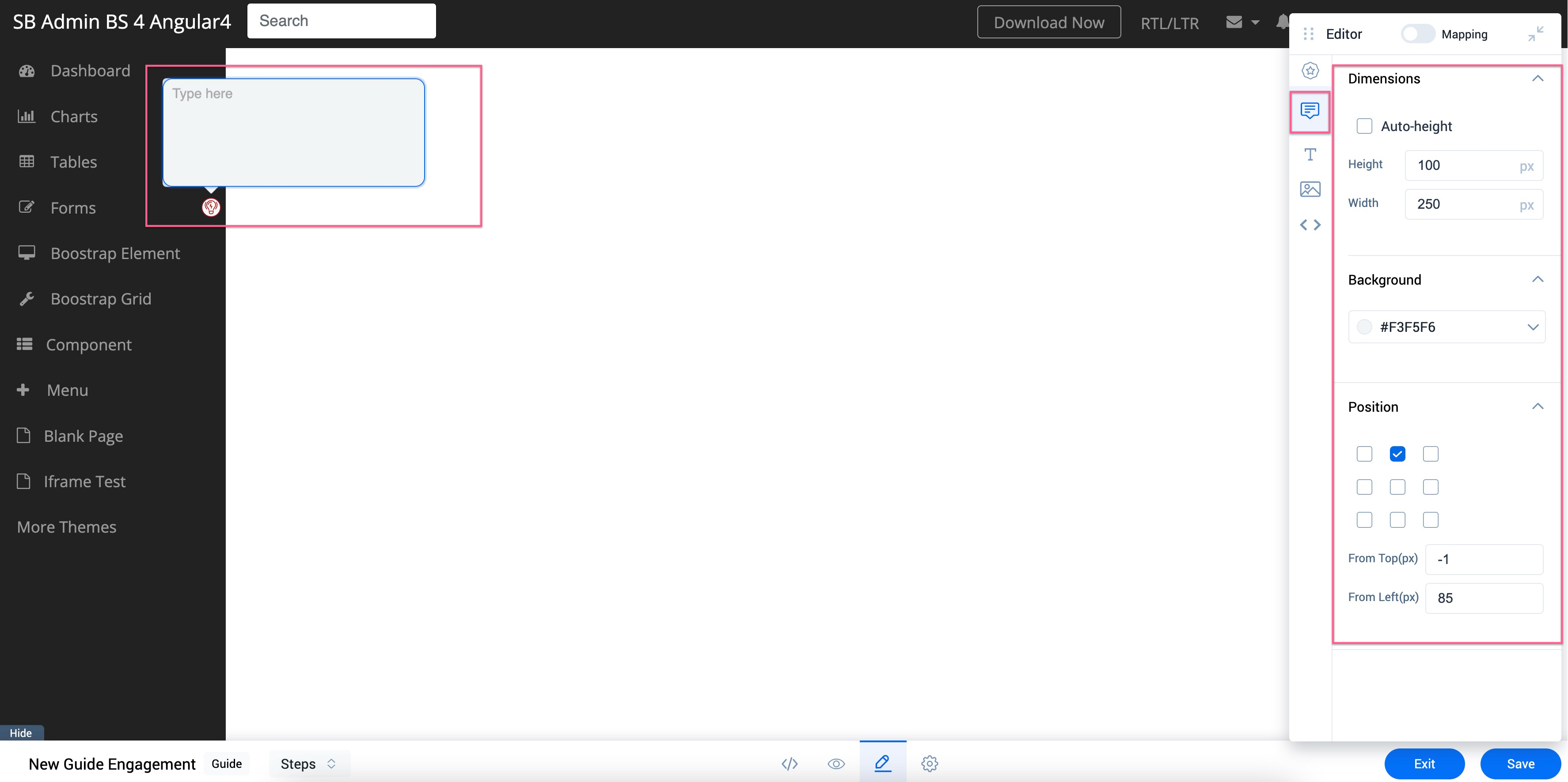
Navigate to the Badge Tooltip element of the floating Editor to configure the Badge Tooltip. You can perform the following configurations:
- Dimensions: Set the Height and Width for the tooltip.
Note: You can also select the Auto-Height checkbox to set default height for the tooltip. - Background: Set the background color for the tooltip.
- Position: Set the position of the tooltip.
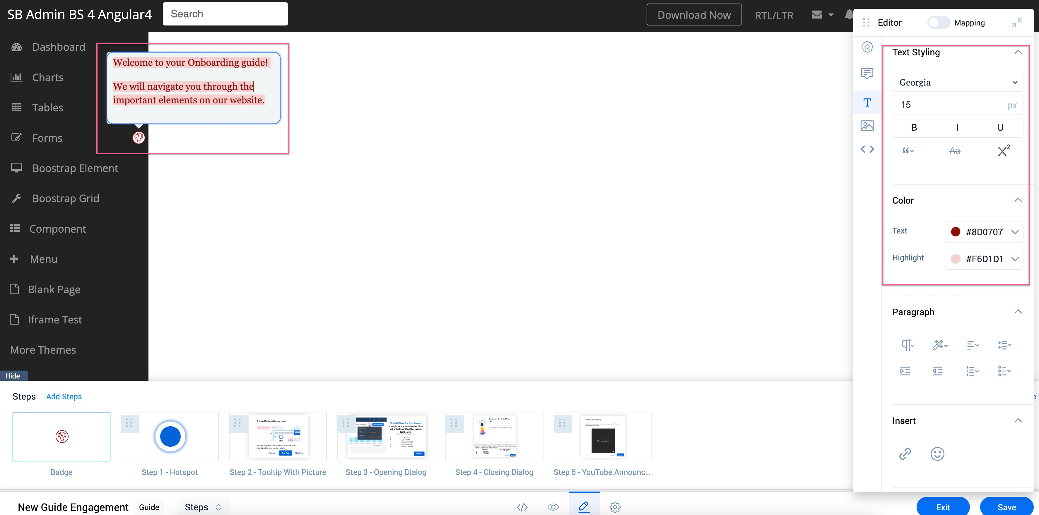
Text Styling
You can add text within the tooltip to make your guide more interactive in the Text section of the Editor. Select the text to:
- Format the font style and font size of the text.
- Format the color of the text. You can also highlight the text with a color.
Paragraph Settings
In the Paragraph section, you can perform the following to format selected text paragraphs:
- Add predefined heading formats to the text.
- Format the font color to Gray.
- Add Borders above and below the text.
- Add Space between letters and words.
- Change the font case of the text to Uppercase.
Note: Click on Uppercase again to change the font case to sentence case. - Format indentation of the text.
- Add text in the form bullets or numbered lists.
Insert Links
In the Insert section, you can hyperlink the text to navigate users to a specific URL.
To insert a link:
- Select the text to insert the hyperlink.
- Click the hyperlink icon in the Insert section.
- Enter the link in the Link text box.
Note: Select the Open link in new tab checkbox to navigate the user to a new tab when they click on the hyperlinked text. - Click Save.
Add Media
You can add images and videos along with text from the Media element in the floating Editor.
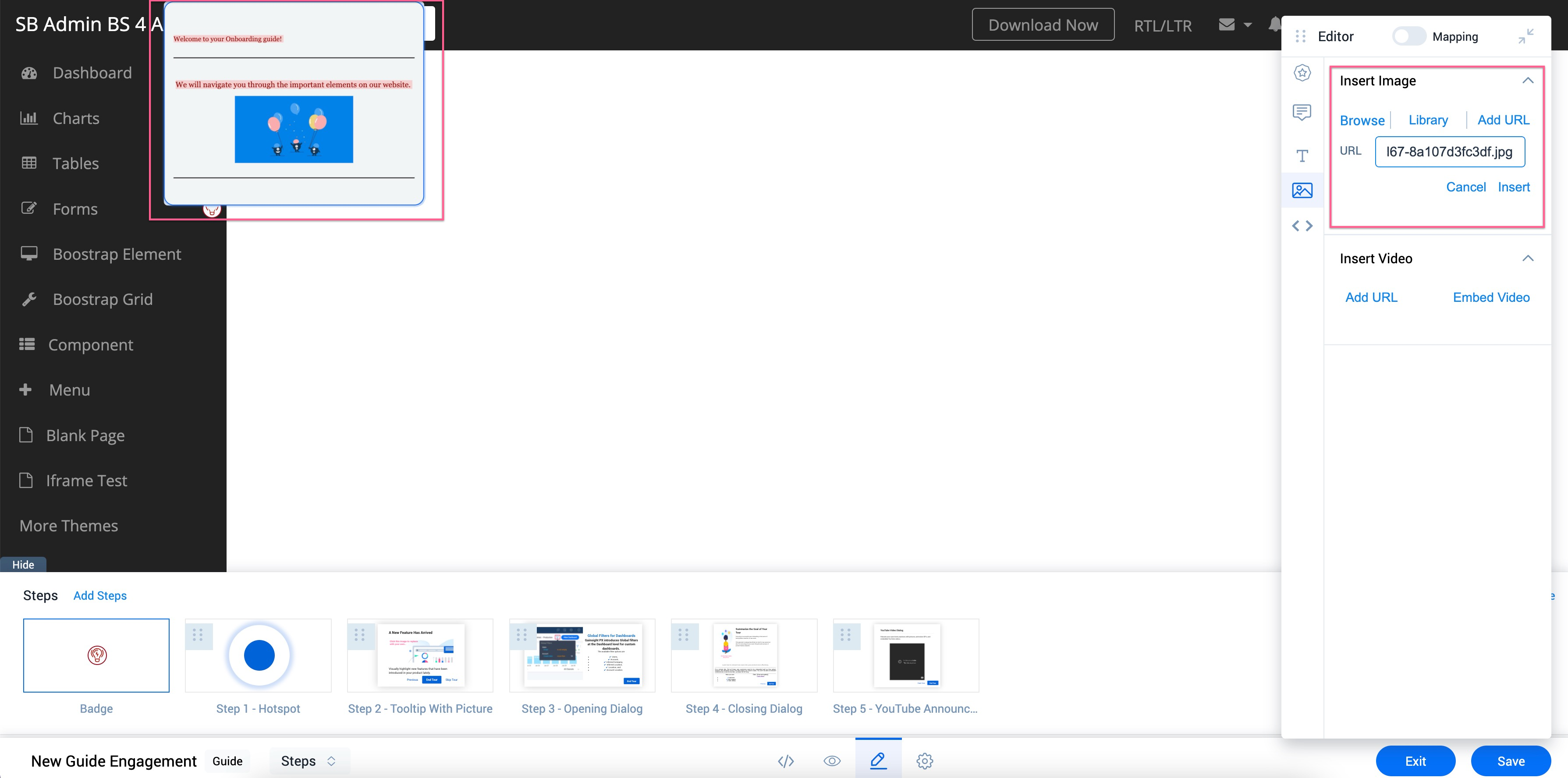
Insert Images
You can insert images using the following options:
- Browse: Add images stored in your system.
- Library: Add images stored in the Gainsight library.
- URL: Add images using image URL.
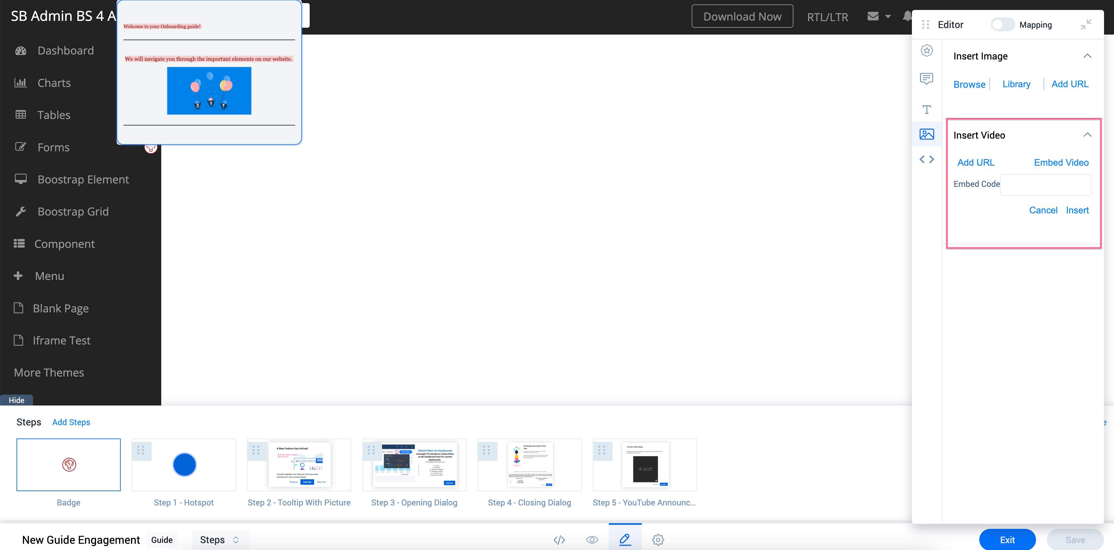
Insert Videos
You can insert a URL to add a URL based video. You can also insert an Embed Code to Embed a video in the Dialog step.
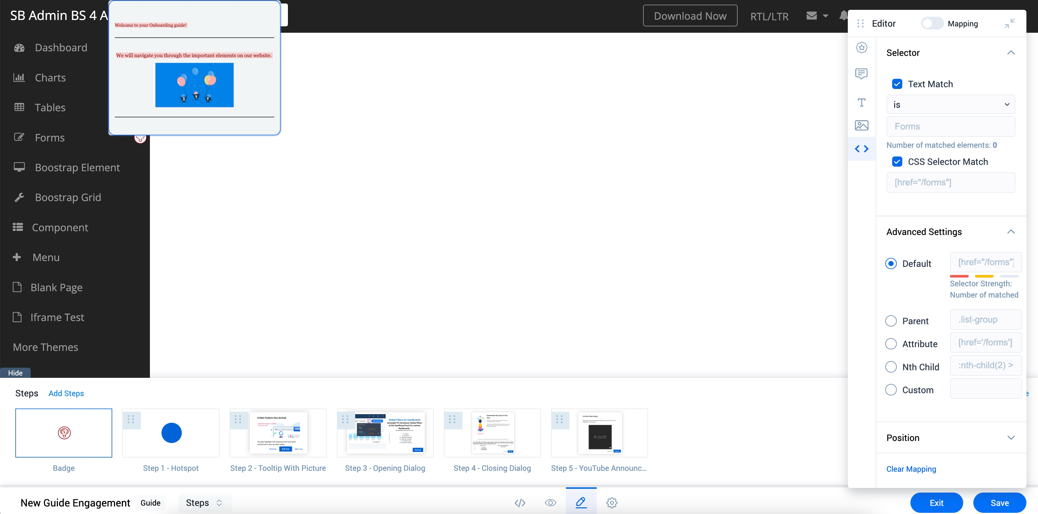
Configure CSS Selector
In the CSS Selector element of the floating Editor, you can configure the CSS Selector of the target element.
Badge Qualification Scope
The Qualification scope describes how many times the badge icon must be displayed. The Qualification Scope must be configured only from the PX Editor. You cannot configure the Qualification scope from your application.
When you select the trigger method of a Guide engagement to be only Badge, the Guide Qualification scope is disabled and only Badge qualification scope is applicable.
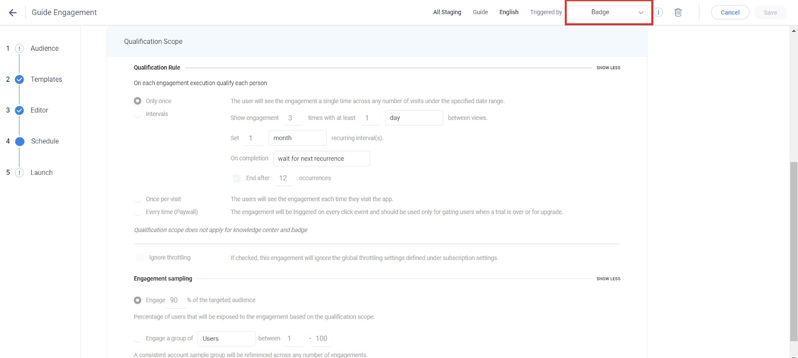
Badge Qualification Scope has the following two options.
- Once: If you select this option the badge icon is displayed only once to the user.
- Always: If you select this option, the badge icon is always displayed until the end of the Guide schedule.
For example, if you set the Guide schedule from March 1, 2020 to March 31, 2020, and select the Badge Qualification scope as Once, the Badge is shown only once. After this, the Badge is never displayed even if the guide schedule is active. If you select the Badge Qualification scope as Always, the badge icon is always displayed during the specified period.