Create Usage Report in a Dashboard
Gainsight NXT
This article explains the Usage Report and its types, and how to create/add an existing Usage Report to the dashboard, at Company and Person level.
Note: This article is the sixth item in a series of Adoption Explorer configuration articles. Gainsight recommends you to refer to the initial articles of the series and then start with this article.
Overview
This article describes Usage Report and the Usage Report listing page in Adoption Explorer.
Usage Report
Usage Reports are the main components of a Dashboard, which displays the usage data for a given configuration. For example, you can add a usage report for: a company’s total page views by page title, a person’s page views by page title, a company’s ARR contribution, a company’s segmented ARR, and so on.
To configure a Usage Report, you must first select a Usage Report Type. Usage Report configuration differs based on the selection of the Usage Report type. Adoption Explorer supports the following types of Usage Reports:
- Analytics
- Analytics with Gainsight Milestones
- Contribution
- Heat Map
- LeaderBoard
- Benchmark
- Grouped Contribution
The configurations for each Usage Report Type is explained in this article.
Note: To visualize the data in usage report sections, ensure that you must have run the project at least once from the Logs page. For information on how to run a project manually, refer to the Logs article from the Additional Resources section. Alternatively, you can also wait for the schedule to happen automatically (either Daily/Weekly), as configured in the Schedule Frequency section. For more information, refer to the Schedule Frequency article from the Additional Resources section.
|
Analytics |
Allows you to find the Number of Pages viewed by a user - Sum of PageViews by user in Last X days. |
|
Contribution |
Allows you to find a customer’s ARR Contribution to the total ARR generated by all customers. |
|
Heat Maps |
Allows you to segment a customer for ARR, Segment a customer for TotalPageViews, etc. |
|
Last time a user logged into Gainsight |
Max(LoginDate) by User. |
|
Number of days a User has been active in X days |
COUNT(Distinct Date) in the Last X days by User. |
|
Compare a specific company’s measure with a group of companies |
Percentage of total no. of active users per total license count for ARR > $1M. |
Usage Report Listing Page
To see the existing usage reports, navigate to Adoption Explorer > Administration. Select the required project and click the Dashboard Configuration tab.
From the dropdown menu on the top-left, select All Usage Reports. You can perform the following actions from the Usage Reports listing page:
- Search a Usage Report.
- Edit the name of the usage report from the list page.
- Delete the unused usage reports. The Delete icon is visible only for the usage reports that are unused.
IMPORTANT: Edit and delete operations on the Dashboards and Usage Reports can be performed only by the Super Admins and Owners (Created By). But, the other non-super admins/users can still create a new dashboard in any project and add usage reports to it.

Configure Usage Report for Each Type
Once a dashboard is created and saved, you can now create/add a new usage report or can add an existing usage report to the dashboard.
Analytics
To add a new Analytics usage report:
- From the listing page, click the Dashboard in which you want to add a usage report.
- Click the Edit Dashboard icon from the top-right corner.
- In the Dashboard detail view, click New Usage Report.
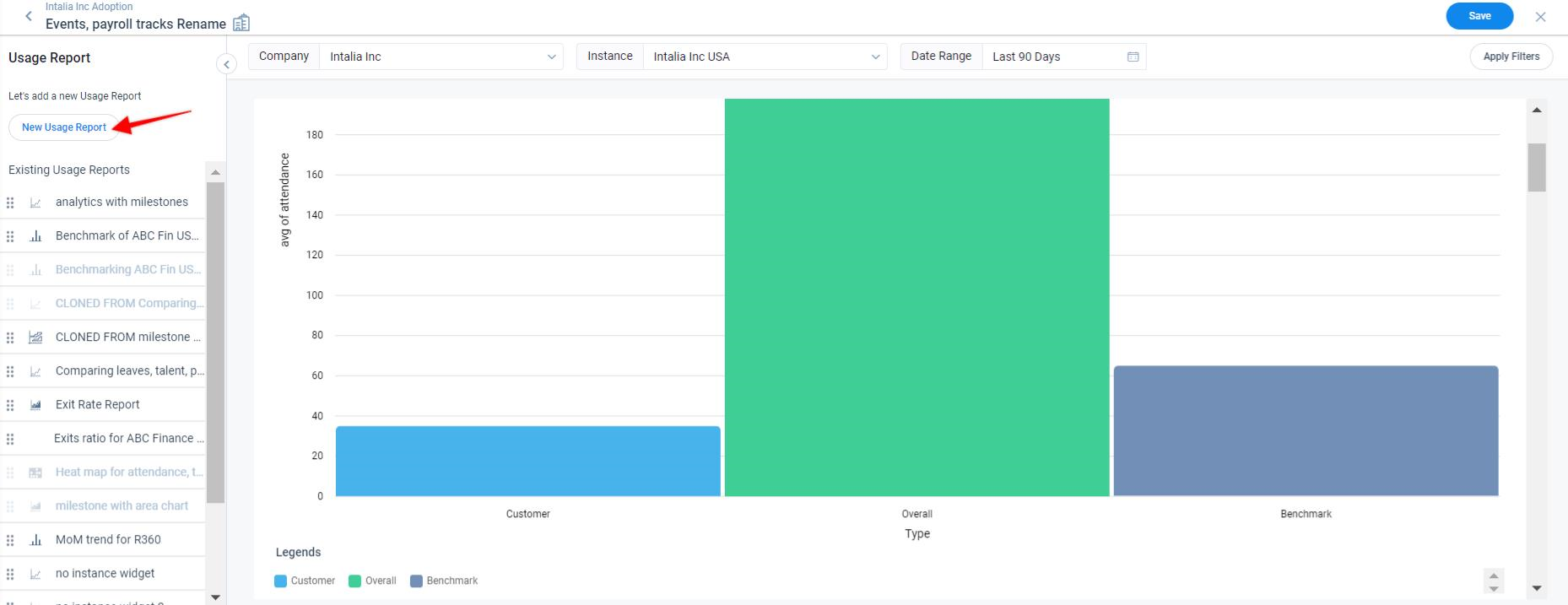
Usage Report Type
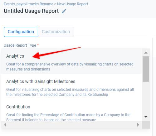
In the Usage Report Type field, select Analytics. Using this type of usage report, you can configure various visualization charts to analyze usage data based on the selected measures and dimensions.
Data Sources
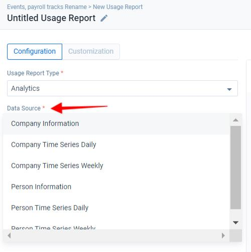
Selecting the Analytics Usage Report type enables the Data Sources dropdown.
Select the required Data Source Object (Ex: Company Information, Company Time Series, Company Entitlement, Person Information, Person Time Series, Person Entitlement, etc.) from the Data Sources to access the measures and dimensions of that particular Data Source.
Groups
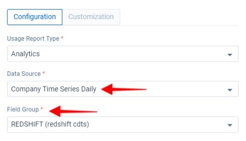
If the selected Data Source is of Time Series type, you will see an additional dropdown called Field Groups. Here, each group refers to the external data source which you have configured in the Objects section in Adoption Explorer.
Once you select a group, you will get access to all the measures and dimensions ingested from that external source along with all custom measures and dimensions. For more information on how to configure groups in a Data Source, refer to the Configure Groups article from the Additional Resources section.
Fields
Once you select a group from the Field Group dropdown list, you can add the required measures and dimensions to the Show Fields section. You can either add the measure or dimension, or apply certain functions on measures and dimensions.
Add Field
To add a field:
- In the Fields section, click + to expand the list of all the available measures and dimensions in the selected Data Source object.
- Drag and drop the required measures or dimensions from the Ingested Fields and Derived Fields sections to Show Fields and Order By sections.
Default Aggregation Functions
The Default Aggregate Functions option allows you to set a default aggregate function that can be applied across all the measure fields that you want to add after the first measure. You can select the aggregation of the other measure fields while adding the first measure field itself.
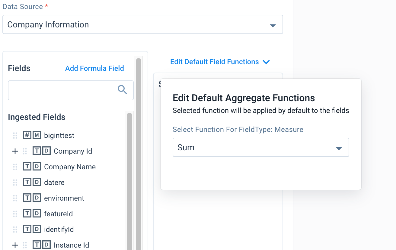
Notes:
- Once all the required measure fields are added to the Usage Report, if required, you can still change the Aggregate Function of a specific measure field.
- This option is applicable to Analytics and Analytics with Gainsight Milestones usage reports only.
Add Function
There are a wide range of functions available within Adoption Explorer. You can apply these functions on the required fields, based on your business requirements.
Following are the Functions that can be created while creating a usage report:
- Aggregate
- Analytics
- Expression Builder
- String
- Date
- Case
- Math
For information on the Functions available in Adoption Explorer, refer to the Adoption Explorer Functions article from the Additional Resources section.
To add a function:
- In the Fields section, click Add Formula Field. The Add Formula Field slide-out panel appears.
- Select the type of function from the Function Type dropdown.
- Select the required function from the Select Function dropdown. This list displays options based on the Function Type selected.
- In the Function Definition section, select the required Field on which you want to apply the function.
Note: The dropdown contains all the fields that are eligible for that particular function. For example, if you select the function type as Aggregate, you will only see the Number data type fields.
- Based on the function selected, enter the required information applicable for the respective function and function type.
- Enter Alias/Display Name in the Target Field Name.
- Enter the number of decimal places (digits) you want to assign after the decimal point.
Note: Decimal points are available only if the resultant data type is number. You need to specify up to what decimal point you want your data to be extracted and saved.
- Click Save.
To modify a function, click the Settings icon on the function added in the Show Fields section.
Order By
Order By allows you to sort the analytics data for this usage report in a particular order.
To configure Order By:
- Drag and drop the required fields from the Show Fields section into the Order By section.
Note: You can only use those fields that are present in the Show Fields section.
- Click the Settings icon. The Field Options window appears.
- From the Order By Direction dropdown, select the order either ASC or DESC.
- From the Nulls dropdown, select FIRST or LAST as applicable.
- Click Save.
Filters
Once you have added the fields/functions to the Show Fields section, you can apply filter conditions and filter out the unwanted data from the usage report, using Filters. You can define the logic for filtering the records, based on your business needs.
To apply filters:
- Expand the Filter and Limit Records section and click Add Filters.
- Select the required filter, either AND (or) OR.
- Click + to add a filter. You can add multiple filters in a single filter, by clicking +.
- Select the required field from the dropdown list, on which you want to apply the criteria.
- Select the required operator from the dropdown list, which meets your criteria /(business needs).
- Enter the required value of the field that meets your criteria (business needs).
You can also add multiple Sub filters/Nested filter conditions under a filter. The data filtering after applying the sub filter starts from the lowest level filter.
To add a sub filter within a filter:
- Click the rounded plus icon.
- Select the sub filter, either AND (or) OR.
- Click + to add a filter. You can add multiple filters in a single filter, by clicking +.
- Select the required field from the dropdown list, on which you want to apply the criteria.
- Select the required operator from the dropdown list, which meets your criteria /(business needs).
- Enter the required value of the field that meets your criteria (business needs).
The data filtering happens first using the OR filter conditions (starts from lowest level filter), and on the resultant data of the OR filters condition, then the AND filter condition will be applied.
Limit Records
Usage reports allow you the ability to limit the number of records to be shown on a usage report.
You can configure this parameter under the Filter and Limit Records section, in the Number of Records field.
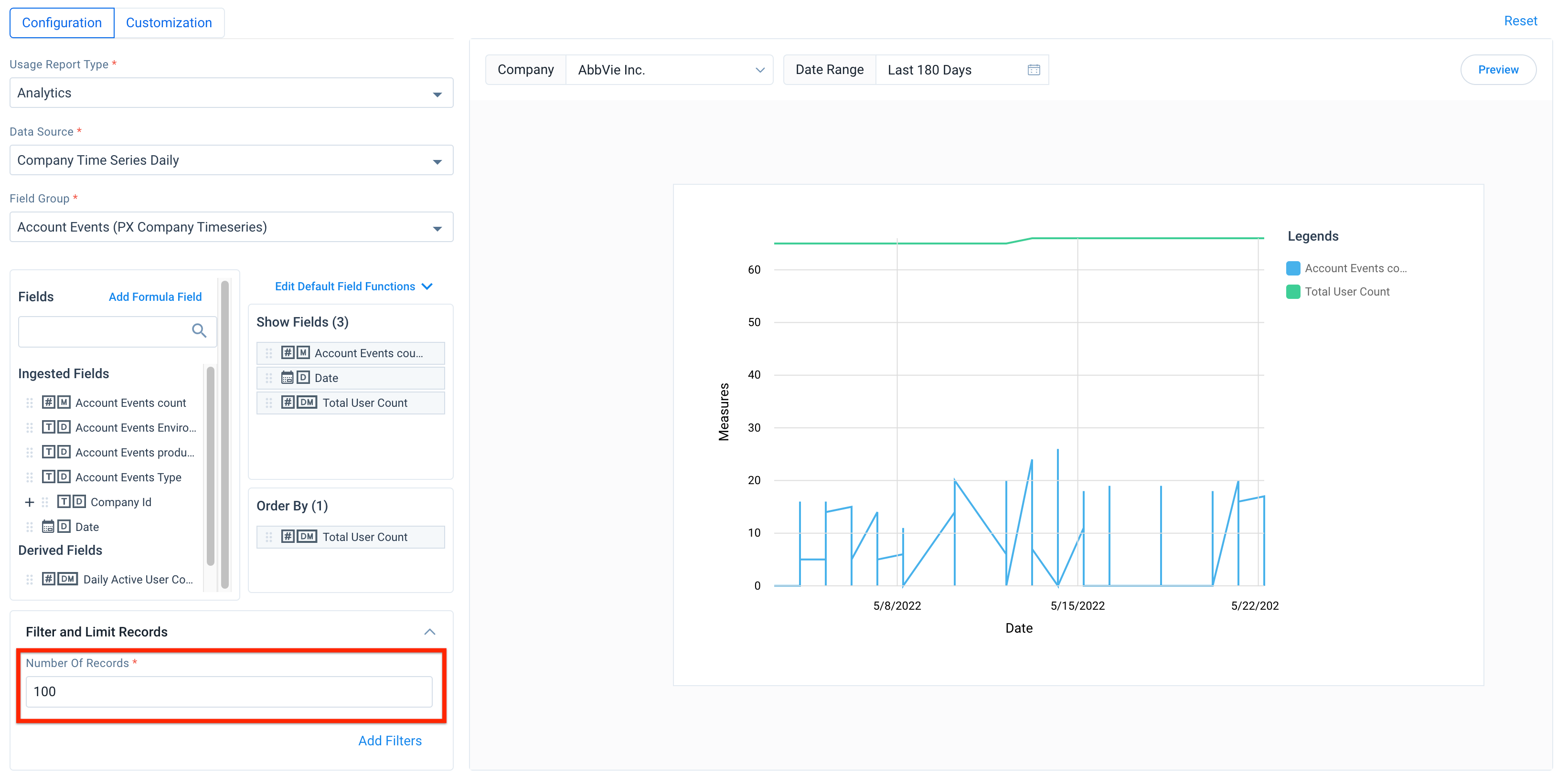
On entering the number of records, the system will return only those many records of data based on the sort conditions given in the Order By section.
Usage Report Preview
Once all the required fields, filters, functions, and other configurations are defined, you can preview the usage report..
To preview the usage report:
- Click Preview to proceed.
- (Optional) Click Reset to go back to the previous version.
- Enter the Usage Report Name on the top left, if you wish to save the usage report.
- Click Save.
For more information, refer to the Preview Options section.
Analytics with Gainsight Milestones
In this usage report, all Gainsight milestones created for the selected Company, its Relationship, and the selected Date Range are overlaid with the configured usage data trend, which allows CSMs to derive more insights and make faster business decisions.
For example, a CSM has created a Gainsight milestone called Onboarding, and may want to check the usage adoption trends before and after the Milestone. To achieve this use case, admins must first create the Analytics with Gainsight Milestones usage report and add the required fields to it, then enable this usage report on the C360 page for the CSMs to view.
For more information on how to create Gainsight Milestones, refer to the Configure Milestone Types article from the Additional Resources section.
Note: The Analytics with Gainsight Milestones usage report can only be built on Time Series data sources.
To create this usage report:
- From the Dashboard Configuration tab, click the required dashboard in which you want to add the Usage Report.
- You can also choose to add a new dashboard using the Create Dashboard button.
- Click the Edit Dashboard icon.
- In the Dashboard detail view, click New Usage Report.
- In the Usage Report Type dropdown, select Analytics with Gainsight Milestones.
- In the Data Sources dropdown, select the required source. You can only select a Time series data source.
- From the Fields section, drag and drop the required fields to the Show Fields section.
- In the Order By field, drag and drop the field by which you want to order the report.
- Select the Get Relationship Milestones checkbox, to include the Relationship Milestones of the selected Company. This option is only available for projects with instance level data.
- Select the required Company and Date Range, and click Preview.
- Enter the Usage Report Name on the top left, to save the usage report and click Save.
Contribution
Contribution usage reports are used to find the Percentage of Contribution made by a Company to the Segment it belongs to, based on the selected measure.
To add a new Contribution usage report:
- From the Dashboard Configuration tab, click the required dashboard (from Company/Person level) in which you want to add a Usage Report. For example, if you have selected a Company Dashboard, you will see the Segment Source and Contribution Sources only from the Company level.
- You can also choose to add a new dashboard using the Create Dashboard button.
- Click the Edit Dashboard icon.
- In the Dashboard detail view, click New Usage Report.
- In the Usage Report Type dropdown, select Contribution.
- From the Segment Source dropdown, select the required source. The options available (Company/Person)depend on the type of dashboard selected (Company/Person).
- From the Segment Field dropdown, select the applicable field.
- From the Contribution Source dropdown, select the required source object.
- From the Contribution Field dropdown, select the contribution field.
- Select the required Company and Date Range, and click Preview.
- Enter the Usage Report Name on the top left, to save the usage report and click Save.
The insights you could derive from the above video are: the selected company has made a contribution of 0.83% of Total Active Users generated from 113 Companies.
Heat Map
The Heat Map usage reports are useful in identifying the Segment/Cluster/Category into which the given Company or Person falls under, based on the selected measure.
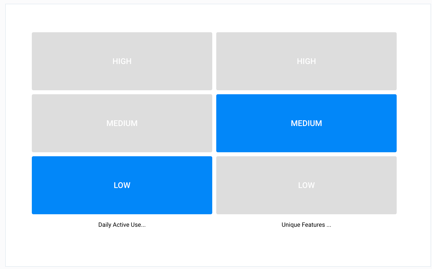
From the above image, you could easily identify which segment the selected company falls under for various Measures. For example, Daily Active Users falls into Low segment, whereas, Unique Features Used falls under the Medium segment.
To add a new Heat Map usage report:
- From the Dashboard Configuration tab, click the required dashboard in which you want to add the Usage Report.
- You can also choose to add a new dashboard using the Create Dashboard button.
- Click the Edit Dashboard icon.
- In the Dashboard detail view, click New Usage Report.
- From the Usage Report Type dropdown, select Heat Map.
- In the Data Sources dropdown, select the required data source.
- From the Fields section, drag and drop the required fields into the Show Fields section.
- Select the required Company and Date Range, and click Preview.
- Enter the Usage Report Name on the top left to save the usage report and click Save.
Customization
The Customization tab of the usage report allows you to make visual changes to the report.
To customize the Heat map usage report:
- Click the Customization tab.
- You can perform the following actions:
- View the usage report in a Table, List, or Ribbon pattern
- Enable X Axis labels by selecting Show X Axis Label
- Enable Animations using the Animations checkbox.
- Enable Gradients by selecting the Use Gradients checkbox.
LeaderBoard
The LeaderBoard usage reports help identify the list of people ranked, either ascending or descending, who are leading, either ascending or descending, based on the selected measure/derived measure.
For example, from a leaderboard, you can identify the Top 10 Person’s Sum of PageViews, Top 50 Person’s Sum of Unique PageViews, Top 10 Person’s Maximum Time on a Page, etc.
Notes:
- You can create a Leaderboard Usage section on the measures/derived measures enabled for Leaderboard, in the Person Time Series Weekly object only.
- Leaderboard usage reports can be created only under the Company Dashboard, as a person always belongs to a Company.
To add a new LeaderBoard usage report:
- From the Dashboard Configuration tab, select a Company Dashboard in which you want to add a Usage Report.
- You can also choose to add a new dashboard using the Create Dashboard button.
- Click the Edit Dashboard icon.
- In the Dashboard detail view, click New Usage Report.
- From the Usage Report Type dropdown, select LeaderBoard.
- From the Data Sources dropdown, select the required data source. You will see only the Person Time Series Weekly object.
- From the Fields section, drag and drop the required fields into the Show Fields section.
- In the Rank Upto textbox, enter the number of records to be shown in the usage report.
- Select the required Company and Date Range, and click Preview.
- Enter the Usage Report Name on the top left, to save the usage report and click Save.
Benchmark
The Benchmark usage report helps analyze how a specific company performs based on various measures/derived measures compared with a group of similar companies defined by a criteria, by aggregating the measures data. This report also helps you compare the performance of a company with overall companies.
While configuring Benchmark usage report, you must set the criteria for grouping the similar companies using any Company attribute.
For example, using Benchmark, you can compare a specific company’s measure (Ex: Percentage of total no. of active users per total license count) with a group of companies (Ex: ARR > $1M). You can also compare the same measure with all companies.
Note: Benchmark usage reports can be created only under the Company Dashboard.
To add a new Benchmark usage report:
- From the Dashboard Configuration tab, select a Company Dashboard in which you want to add a Usage Report.
- You can also choose to add a new dashboard using the Create Dashboard button.
- Click the Edit Dashboard icon.
- In the Dashboard detail view, click New Usage Report.
- From the Usage Report Type dropdown, select Benchmark.
- From the Data Sources dropdown, select the required data source.
- If the selected Data Source is of Time Series type, select the required group from the Field Group dropdown.
- From the Choose Field dropdown, select the required measure/derived measure fields.
- From the Aggregate Function dropdown, select the required function.
- Select the Overall checkbox to compare a specific company with overall companies.
- If the Overall checkbox has been selected, select the Show In Percentages check box, to see the results in percentages.
- Select the Group checkbox to compare a specific company with a group of companies.
- If the Group checkbox is enabled, select the required source from the Group Source dropdown.
- In the Define Group with criteria section, you can apply Dynamic Filter/Static Filter conditions on the Benchmark report based on your business needs. For more detailed information on how to apply filters, refer to the Filters section.
Note: For dynamic filter conditions, the benchmarking field can be Industry, Location, ARR, Company Stage, etc. depending on the business need.
- Select the required Company and Date Range, and click Preview.
- Enter the Usage Report Name on the top left to save the usage report and click Save.
Grouped Contribution
The Grouped Contribution usage report helps create different groups of companies or cohorts based on filter criteria and analyze how each group of companies contribute to various measures/derived measures by percentage of measured data over contribution of overall companies.
To help visually identify the nature of contributions, you can define specific percentage value ranges and assign color schemes to the ranges, to indicate whether the contribution is Bad, Neutral or Good. This usage report helps visualize operational bottlenecks of various groups of companies and drive operational efficiencies for these groups.
For example, CSMs may handle multiple groups of companies and each group takes specific time to complete different stages of the Onboarding process. Grouped Contribution Analytics helps analyze which group takes more time to complete each stage and identify the bottleneck to address.
Note: Grouped Contribution Analytics usage report can be created only under the Freeform Dashboard.
To add a new Grouped Contribution usage report:
- From the Dashboard Configuration tab, select a Freeform Dashboard in which you want to add a Usage Report.
- You can also choose to add a new dashboard using the Create Dashboard button.
- Click the Edit Dashboard icon.
- In the Dashboard detail view, click New Usage Report.
- From the Usage Report Type dropdown, select Grouped Contribution.
- From the Data Sources dropdown, select the required data source.
- In the Define Group with criteria section, select the required Company attribute from the Select An Object dropdown.
- Click Add Group. The Group slide-out panel appears.
- Enter the Filter Name and Filter Description as required.
- Apply the filter criteria based on your business needs. For more detailed information on how to apply filters, refer to the Filters section.
- Click Save.
- From the Fields section, drag and drop the required fields into the Show Fields section.
- Select the required Date Range and click Preview.
- Enter the Usage Report Name on the top left, to save the usage report and click Save.
Customization
The Customization tab of the usage report allows you to make visual changes to the report.
To customize the Grouped Contribution usage report:
- Click the Customization tab.
- You can perform the following actions:
- Enable X Axis labels by selecting Show X Axis Label and adding the label name.
- Enable Y Axis labels by selecting Show Y Axis Label and adding the label name.
- Add animations using the Animations checkbox.
- Add gradients by selecting the Use Gradients checkbox.
- Set the Default Value for Card Color and Text Color.
- In the Specific Value Between section, you can add specific ranges for percentage values and configure color schemes to the ranges
Drill-Down of Usage Report
Usage reports provide you better insights when you correlate them. In the usage report, when you click on any point in a graph/chart (pivoted reports), a drill-down view of the data associated with that data point is shown in a new window. To derive deeper insights, you can correlate the data by further selecting and adding additional fields to the drill-down view from the list of fields available in the object drop-down list.
A drill-down report allows you to explore multidimensional data and navigate to granular levels of data by clicking on a specific data point. This allows you to view aggregated, summary data for specific analysis.
The following illustration shows the standard drill-down report based on the configured usage report.
Custom Drill-Down Report
To explore granular levels of the data for specific analysis, you can create a custom drill-down report on a usage report. Adoption Explorer retains all custom drill-down report settings regardless of the changes made to the parent usage report. However, the custom drill-down report resets when you modify the common fields between parent and custom drill-down reports.
Example Business Use Cases:
- Assume, you have per Account > Stacked Feature Chart (for Pivoted Reports) and you may want to find who all (persons) in that Account are using a specific feature in the same time period. To achieve this use case, you can easily drill down to data from different sources between Company Usage data and Person Usage data to see who in that account used that feature.
- A CSM has a usage report built on the Company Usage Data but wants to drill-down and correlate company data with person data. To achieve this, you can build a custom drill-down report using Person Usage Data as a Source, on the Company Usage Report.
- Assume, you have a Top 10 Users report and you may want to find out what all features were used by a user in the selected time frame. This gives you a better understanding of the Feature habits of a Power User. You can achieve this by using Person Time Series Daily as the Data Source and Page Tracking (Person TS Daily) from the Field Group dropdown.
To create a custom drill-down report:
- Click the three-vertical dots menu icon from the top right corner of the usage report, and select Custom Drill Down.
- From the Data Sources dropdown, select the required source object.
- From the Field Group dropdown, select the required group.
- From the Fields section, drag and drop the required fields to the Show Fields section.
- In the Order By field, drag and drop the field by which you want to order the report.
- In the Filter and Limit Records section, add filters. If required, or the total number of records that should be included in the report.
- Enter a name for the custom drill-down on the top left, and click Save.
Date Functions in Custom Drill-Down Reports
Date functions in usage report help admins and CSMs to drill-down the Weekly Time Series trend of measure to Daily Time Series trend of measure.
Example Business Use Case: A CSM wants to understand the weekly page views trend and gain deeper insights on a specific day of the week.
To configure the date function:
- Click the three-vertical dots menu icon on the top right corner of the usage report and select Custom Drill Down.
- From the Data Sources dropdown, select the Daily Time Series source object.
- From the Groups dropdown, select the required group.
- From the Fields section, drag and drop the required fields to the Show Fields section.
- In the Order By field, drag and drop the field by which you want to order the report.
- In the Filter and Limit Records section, click Add Filter.
- Select the appropriate logic - AND or OR and click the + icon.
- Select the Date field.
- Choose the operator as =.
- Select the Date value as Last N Weeks.
- Click Save.
Preview Options
Once the parameters for a usage report are defined, you can use the Preview button to view the report based on the selected measures and dimensions.
You can use the Company and Date Range filters to view specific data based on the requirement.
Customizations
The Customization tab of a Usage Report allows you to make visual changes to the report. Here, you can configure the following parameters:
The Customization tab of a Usage Report allows you to make visual changes to the report. Here, you can configure the following parameters:
- Visualization: Once you apply the required filters, the data will be shown in a default chart. However, you can change the chart type in the Visualization section.
- Axis Labels:
- X-Axis: You can enable X Axis labels by selecting Show X Axis Label and adding the label name.
- Y-Axis: You can enable Y Axis labels by selecting Show Y Axis Label and adding the label name.
- Show Missing Dates With Nulls checkbox: Select this checkbox to include the dates for which the usage data is Null, for the selected date range. Once you select the checkbox, the visual representation includes the Null data.
- Legends: You can select the Show Legend checkbox, to enable Legends. Once enabled, enter a title and position as applicable.
- Data:
- You can select the Show Data Labels checkbox to view the data labels on the report
- You can select the Show Data Points checkbox to directly see the data points on the Line Chart or Area Chart.
- Other options:
- Smoothen Edges: Select the Smoothen Edges checkbox to view rounded corners on the usage report, instead of pointed edges
- Animations: Select the Animations checkbox, to enable animations.
- Show Grid Lines: Select the Show Grid Lines checkbox to enable grid lines.
- Use Gradients: Select the Use Gradients checkbox, to enable Gradients.
- Auto Scale: Select the Auto Scale checkbox to automatically use the bottom range of the data set on the Y axis, for instance 100, 200, 250 and so on.
- Donut: (Applicable only for Pie Chart) Select the Doughnut checkbox, to enable the Doughnut view of a chart. You can also edit the width of the arc in the Arc Width (fraction of radius) checkbox.
- Explode Slices: (Applicable only for Pie Chart) Select the Explode Slices checkbox, to explode the visualization into slices.
- Timeline: (Applicable only for Line, Area and Stacked area charts) Allows you to add a bar below the x axis, where you can zoom in/out or focus on a particular date range for the chart.
- Reference Lines: You can set Reference Lines and values to display on the Trend Charts. For example, you can use this option to set a reference value for Minimum Page Views and Maximum Page Views, through which you can analyze and know if the usage adoption is pointing towards a Minimum or Maximum.
- Date Format: You can select the required date format to display on the Trend Charts, from the Date Format dropdown list. The available formats are:
- MMM Day: For example - August 25th
- DD/MM/YYYY: For example - 25/08/2020
- MMM YY: For example - Aug 20
- Ribbon Widget: Summary Ribbon widget allows you to group a set of metrics in a single widget, to give a summary or overview of the information. For instance, there is a renewal up for a customer, and CSM wants to view a set of metrics such as Total Licenses, Used Licenses, and License Expiration/Renewal Date in a single widget, to get a holistic analysis of the information.
Note: The set of metrics you can group can include both Measures and Dimensions.
Best Practices
We recommend following these best practices when working with Usage Reports:
- Naming Conventions: Although you try to make things as intuitive as possible, it is always advisable to give proper names for Dashboards, Usage Reports and Legends (Display Names) based on your business need, for better identification.
- No.of Usage Reports: It is always recommended to add only the required number of Usage Reports to the Dashboard. You can create as many Dashboards, based on the logical grouping of Usage Reports rather than crowding out with too many Usage Reports in a single Dashboard.
- Chart Type: By default, Adoption Explorer Analytics selects the best possible Chart Type, based on configured Measures and Dimensions. But, it is always recommended to try out other chart types, based on your business requirement, before saving the new Usage Report.
Once the Usage Reports are configured in a dashboard, wait for the project to run automatically (either Daily/Weekly) as configured in the Setup Source Connection article (or) you can also schedule a project manually from the Logs page. For more information on how to run a project manually, refer to the Logs article from the Additional Resources section.
IMPORTANT: Salesforce customers often had use cases where their partners needed access to usage data but from Salesforce Widgets. Adoption Explorer Dashboards are displayed in the Team View Widgets in Salesforce, provided a Usage Report in C360 dashboard and Gainsight NXT Widget are already configured. For information on how to configure Custom Widget in Salesforce, refer to the Configure Gainsight NXT Custom Widgets article from the Additional Resources section.