Configure Custom Buttons
This article provides an overview of custom buttons is PX, and the key action types you can configure to increase engagement.
Overview
Custom buttons in PX engagements are interactive elements that empower users to take specific actions, enhancing their in-app experience. Unlike standard navigation buttons confined to the footer, custom buttons can be placed anywhere within an engagement, offering greater flexibility and interactivity. They allow users to navigate within engagements, open the Knowledge Center Bot or specific articles, or redirect to external URLs. This feature enables more dynamic user interactions, improving engagement flow and making actions more intuitive and seamless.
Incorporating custom buttons into your Gainsight PX engagements not only enriches the user experience but also provides valuable insights into user behavior, enabling more informed decision-making and targeted engagement strategies.
Benefits:
- Enhanced Interactivity: Custom buttons make engagements more dynamic, enabling users to interact in ways that are most meaningful to them.
- Personalized Experience: By updating user attributes through custom buttons, engagements can adapt to individual user needs and preferences, delivering a more personalized experience.
- Immediate Access to Resources: Users can quickly access help articles, tutorials, or external links directly from the engagement, reducing friction and improving satisfaction.
Sample Business Use Case:
When introducing a new feature, you may want users to access detailed documentation for a deeper understanding. If an engagement is triggered to announce the feature, you can add a Custom Button with the action type set to Knowledge Center. This allows users to seamlessly open the relevant support article within the KC Bot without leaving the product. Additionally, you can configure the Custom Button to open a dedicated support document from your help center, providing users with quick and relevant assistance. This ensures they have easy access to the information they need, improving feature adoption and reducing support dependency.

Insert Custom Button
Custom buttons can be added at any desired place in the engagement. This makes the buttons more dynamic in use and adds value when compared to the standard navigation buttons that can only be placed in the footer section.
To insert a custom button:
- From the left pane, click Engagements.
- Navigate to the required guide engagement, or create a new one. For more information on how to create an engagement, refer to the Create Guide Engagement article.
- Navigate to the Editor step.
- Select or add a new row in which you wish to add the custom button.
- From the Insert section, select Button.

- In the CONFIGURE CUSTOM BUTTON section, perform the following:
- Action Controls: Define what happens when users click the custom button. Configure actions such as navigating within the engagement, opening the Knowledge Center Bot, and more. For more information, refer to the Custom Button Action Types section
- Design: Customize the appearance of the custom button to align with your engagement’s look and feel. Adjust the text, style, size, colors, padding, and other options.

- Click Insert Button to add the custom button to the engagement.
Custom Button Action Types
Gainsight PX offers various custom button configurations, enabling more automated and guided in-app user journeys. These buttons help streamline user interactions by triggering specific actions within engagements. The following actions can be configured for a custom button:
Engagement Navigation
The Engagement Navigation action type allows users to move seamlessly between different steps of an engagement. With this action, you can configure a Custom Button to navigate to the next step, go back to a previous step, or skip specific steps based on user interactions. This helps create a more flexible and user-driven engagement flow, ensuring that users progress through the experience at their own pace.
To configure engagement navigation action type:
- Insert a custom button.
- In the Action Controls section, under Action Types, select Engagement Navigation.
- Configure how the engagement must progress from one of the following options:
Configuration Description Additional Configuration (if any) Next Step Navigates to the next step of the engagement. On Click: Configure if PX must look for the next element, or redirect to a URL. Go to Step Jumps to a specific step within the engagement. Select Step: Choose the desired step. Skip Skips and ends the entire engagement. NA End Guide Ends the engagement immediately (only available if the navigation footer is excluded from the engagement). On Click: Configure if PX must close the engagement, or redirect to a URL. Previous Step Navigates back to the previous step in the engagement. NA Start Over Restarts the engagement from where you started. Use browsing history: Select to help PX identify the user's starting page for accurate redirection.
Note: The options available are based on the step index. For example, the first step will have Next and Skip options, whereas the last step will have Previous and Start Over options.
Update User Attribute
The Update User Attribute action type allows you to tag and update a custom user attribute in real time. For example, if you want to capture user preferences, you can create an engagement with multiple role options. When a user selects a role, the Custom Button can be configured to update the corresponding user attribute. This information is stored in the PX Audience object and can be used in engagement rules to trigger more personalized and relevant experiences.

The custom buttons with Update User Attribute Action can also be configured in such a way that the user can close the engagement once the attribute is tagged.
To configure the Knowledge Centre Action type:
- Insert a custom button.
- In the Action Controls section, under Action Types, select Update User Attribute.
- From the Select Attribute option, tag a customer user attribute.
- In the Attribute Value field, enter the value that must be assigned to the attribute.
- (Optional) Select the Close Engagement checkbox, to close the active engagement and update the customer attribute to the selected option.
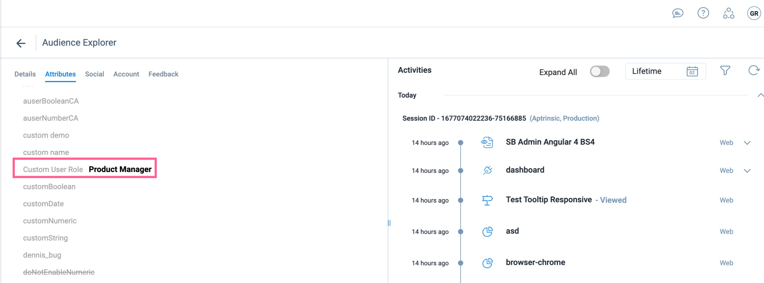
Based on the selection by the user, the entered value is added to the customer’s attribute value. In the above example, the attribute value is displayed in the Audience Explorer page as follows:
Knowledge Centre Action
The Knowledge Center action type allows users to open the KC Bot or a specific article while simultaneously navigating to the next step in an engagement. Custom buttons with this action can also be configured to close the engagement when directing users to the KC Bot, ensuring a seamless transition to relevant support content.
To configure the Knowledge Centre action type:
- Insert a custom button.
- In the Action Controls section, under Action Types, select Knowledge Centre Action.
- Select either of the following options:
- Open Bot: Opens the bot and navigates the user to the next step in the engagement.
- Open Article: Opens an article in the bot and navigates the user to the next step in the engagement. Additionally, select the KC Article that must open.
Note: The KC articles available in the list are those that are added to at least one active bot. To open an article, it is not necessary for the article to be a part of the bot content.
- (Optional): Select the Close Engagement checkbox, to close the active engagement once the custom button is clicked.

Redirect to URL
The Redirect to URL action type allows users to navigate to an external page for additional information from an active engagement. You can configure the Custom Button to open the target link in the same tab, ensuring the engagement remains active on the redirected page.
To configure the Redirect to URL action type:
- Insert a custom button.
- In the Action Controls section, under Action Types, select Redirect to URL.
- In the URL field, enter the webpage that users must be directed to. This field supports the Auto Resolve feature. For more information, refer to the Handle Dynamic URLs with Auto Resolve Feature article.
- (Optional) Configure the following additional settings:
- Open URL in new tab: Redirect the user to the target page in a new tab.
- Close Engagement: End the engagement once the user clicks the button.

Delete Custom Button
To delete an inserted custom button:
- Click the custom button you want to delete.
- Click the Delete icon on top of the button. Alternatively, click the Delete icon at the bottom of the Editor panel.
