Widgets in Gainsight PX
This article explains all the widgets that can be used in Gainsight PX Dashboards. Gainsight recommends that you refer to the Dashboards Overview article and then proceed with this article.
Overview
Gainsight PX allows you to create multiple Dashboards and add any number of widgets to your Dashboards. It is essential to know the function of each widget so that you can effectively add widgets and use your Dashboards more efficiently.
This article explains all the widgets available in Gainsight PX Dashboards.
Widget Categories
Gainsight PX provides you with five categories of widgets.
KPIs
The widgets in this category display important performance metrics about your users. You can gather information such as the active application usage active application usage, first-time logins, active users, preferred time of the day users access your application, and so on. It becomes easy to analyze user behavior like the location from where users are accessing your application, the browser(s) used by your users, sessions recorded, and so on.
This category has the following widgets:
-
New Leads: This widget displays the number of new leads that were generated during the selected time period.
-
New Users: This widget displays the number of users whom Gainsight PX finds for the first time or had their first login to PX during the selected timeframe (based on the first seen event for the product selected in the widget ).
- New Accounts: This widget displays the number of accounts that were created during the selected timeframe. A "New Account" is counted when a user logs in from an account that Gainsight PX has not previously tracked (marked as the product's first seen event). Another user in that same account who logs in to your subscription for the first time would count as a new user, but not a new account.
- Note:
- The current day’s data is not included in the calculation of new accounts.
- The New Accounts widget is powered by BigQuery data. Displayed metrics may be delayed by up to 30 minutes while data sync completes.
- Active Users: This widget displays the unique number of users who logged in to your application at least once during the selected timeframe. The current day’s data is not included in calculating new users. Unique in this context implies that if a user logged in to your application multiple times during the selected timeframe, only the first visit is taken into account and not the subsequent ones. So, if 10 users logged in to your application 10 times each during the selected timeframe, the widget displays 10 and not 100.
- Note: The Active Users widget is powered by BigQuery data. Displayed metrics may be delayed by up to 30 minutes while data sync completes.
-
Active Accounts: This widget displays the number of accounts from which at least one user logged in to your application during the selected time period.
-
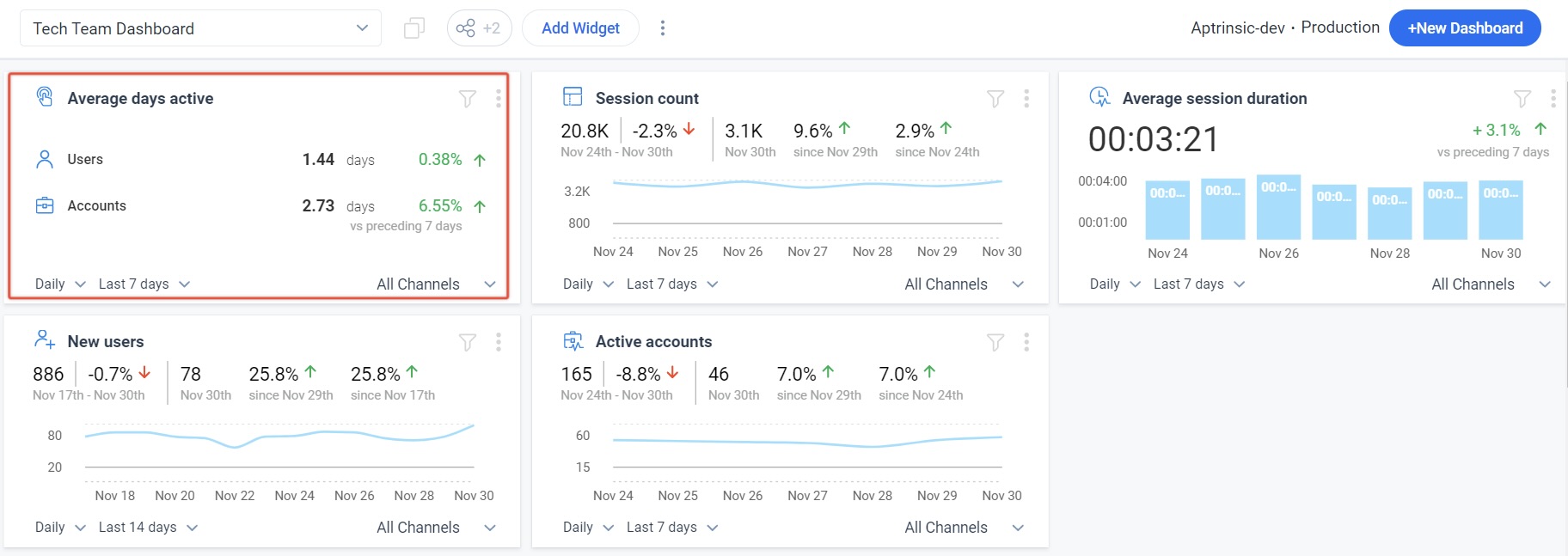
Average Days Active: The average number of days in the selected timeframe during which users and accounts were active.
-
Average Session Duration: This widget displays the average session duration of all the sessions during the selected timeframe. This widget displays data at two levels; frequency level and global level.
-
At the frequency level, bar graphs are used for each frequency. For example, if you have selected the Daily frequency and selected the Last 7 days as the timeframe, seven-bar graphs are created that display the average session duration for each day.
-
At the global level, the average duration is calculated by considering the session duration for all the sessions recorded in the seven days (or the selected timeframe).
-
-
Browser Usage: This widget displays the various browsers from which users accessed your application, during the selected timeframe. When you hover on a browser, you can view the number of users who used that browser. When you select a browser, you can view the various versions of that browser used by your users.
-
Session Count: This widget displays the total number of sessions that were initiated during the selected timeframe.
-
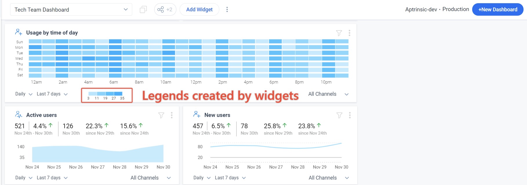
Usage by Time of Day: This widget displays the various times of the day during which users logged in to your application. This widget also creates legends automatically to show the number of users who logged in during different times of the day.
-
Session by Country: This widget displays the various countries from which a session was initiated on your application, during the selected timeframe. This widget also displays the list of the top 5 countries that recorded the highest number of sessions during the selected timeframe and also appropriate legends. When you hover on any country, you can see the number of sessions that were initiated by that country.
Note: Turn on the Enable IP masking toggle in the SDK settings page. This allows the widget to use the countryCode Global Context Name as per the standard of IBAN Alpha-2 codes instead of IP addresses for displaying session data. This ensures compliance while maintaining access to crucial analytics. the widget.
-
Events Recorded: This widget displays the total number of events tracked during the selected timeframe. Events include URL rules, Tag UI element rules, custom events, and a variety of standard tracked events such as Session initialized, Identify, page view, Feature match, Segment match, Engagement Events, KC bot events, mobile events, User Signup, Feedback, and other backend events. This encompasses everything visible in the Activity section of the User profile screen.
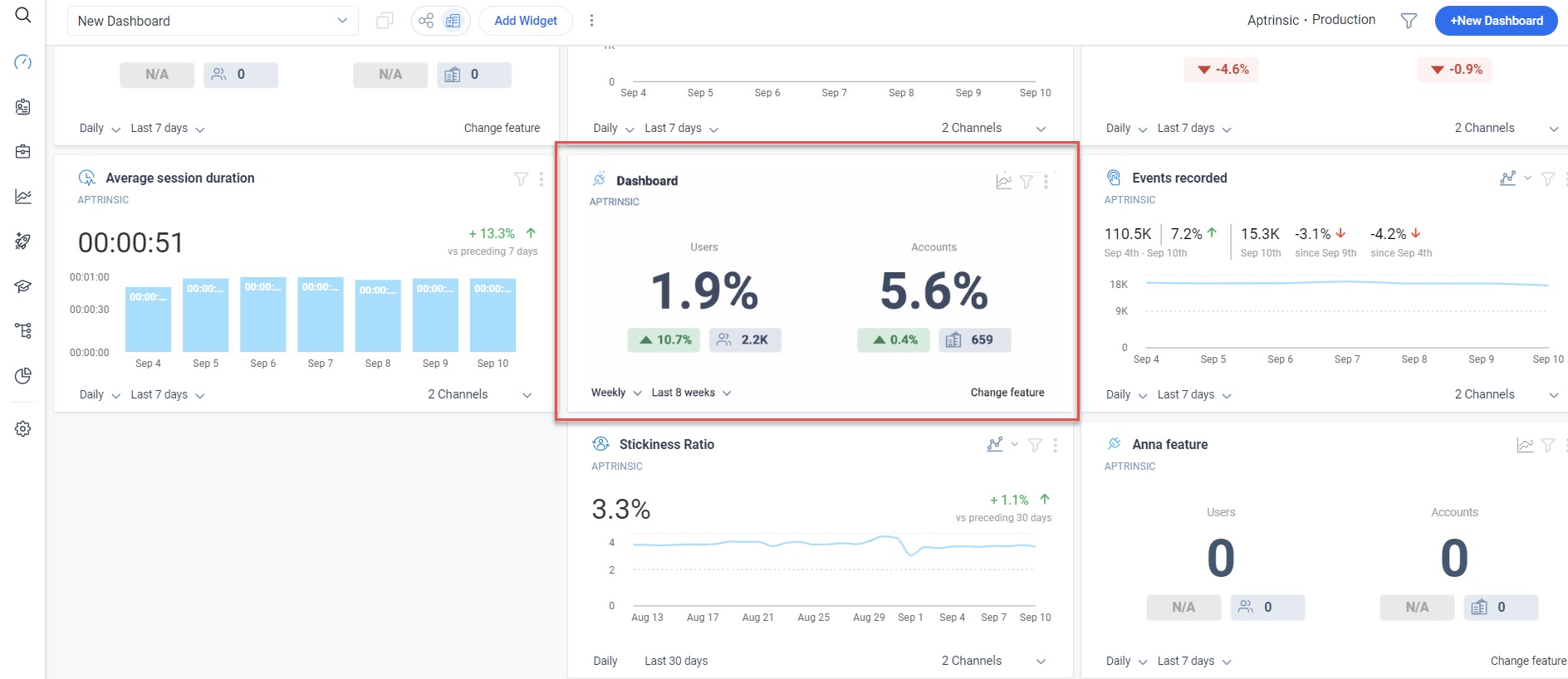
- Feature KPI: The Feature KPI widget in Dashboard helps you to analyze the user and account-based adoption data for the product features. This widget allows you to capture the adoption percentage of your active users that uses the selected feature/module both at the account and user level. The metrics also show the increase or decrease in adoption as compared to the previous time period that you selected.
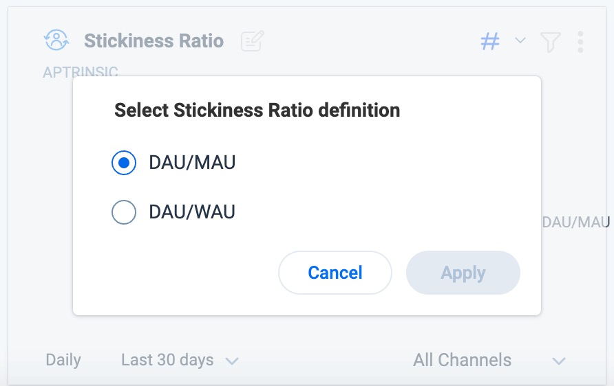
- Stickiness Ratio: This widget displays the average stickiness ratio value for the selected time period. You can select a timeframe for the Stickiness Ratio to be displayed on the widget. By default the Stickiness Ratio metric on the widget is calculated as the average DAU/MAU in the chosen time period. Select Edit to change the default stickiness ratio definition(DAU/MAU) to DAU/WAU.
-
Active Users Right Now: The widget displays the metrics of active users of the application based on data from the past 30 minutes.
-
Average Events: This widget displays the average number of events recorded per session, over the last week.
-
Slipping Away: Slipping away compares two time frames; current and equivalent historical period. If the usage is trending down, it signals the users are slipping away. The number you see on the widget is the number of users who are slipping away. This widget has a built in filter which filters users who had minimal activities with your product, during the selected time period.
-
Total Activated: This widget displays the following metrics:
-
The total number of Users and the total number of Leads present in your application, from the day PX started tracking your application. You cannot apply any time period for this widget.
-
The total number of Modules and Features of your product mapped with the Product Mapper since PX was installed in your application.
-
Reports
The Reports widgets allows you to select and use reports from the Analytics section in Gainsight PX. This section has the following widgets.
-
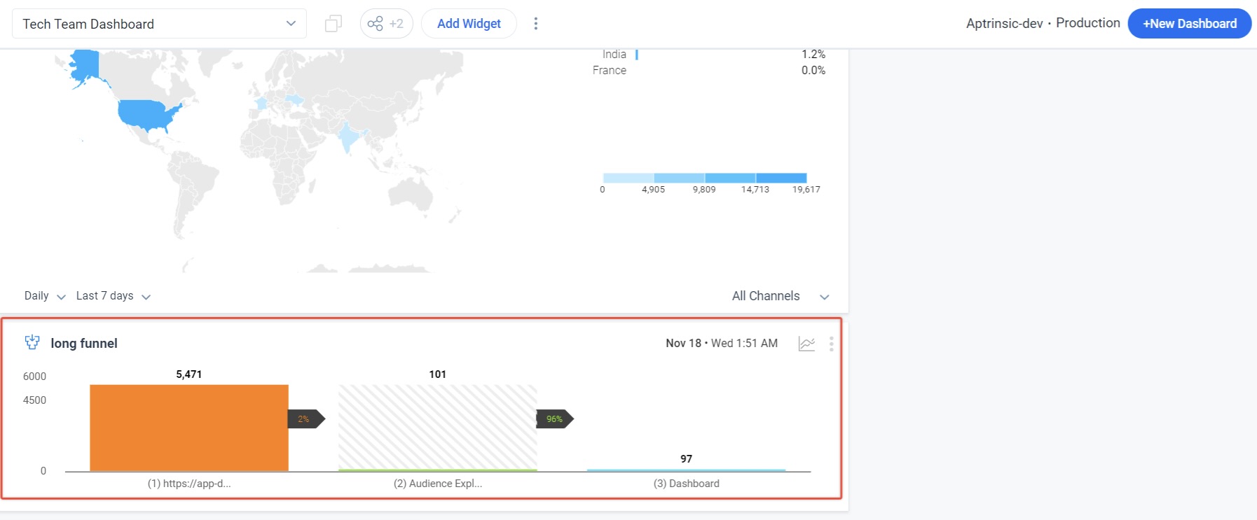
Funnel: This widget allows you to select and display the funnel reports. When you select this widget, a list of funnel reports created by you in the Analytics section is displayed. You can select a report to be displayed on the widget. To display multiple Funnel reports on the widget, add more instances of this widget to your Dashboard.
-
Feature Performance: This widget displays the number of events recorded for a specific feature. When you select this widget, a list of all the features configured in Product Mapper are displayed. You can select a feature to be displayed on the widget. To view events recorded for more features, select multiple instances of this widget. You can use the Change Layout option under the three-vertical dots menu to modify the dimension of the widget.

-
Retention Analysis: This widget displays the Retention Analysis report. You can modify various parameters like cohort size, end date, date range, and so on from the widget itself.
The Retention Analysis widget is powered by the Retention Analysis report of your choice that was created in the Analytics section. When you click the widget, you can select the Retention report from a list of Retention Analysis reports much like other report widgets.
- Query Builder: This widget displays the selected Query Builder report that is generated to analyze different cohorts and behaviors for custom events, in the Analytics section. In addition to the existing time series format, you can view the report data on the widget in bar or pie chart formats. The default widget dimensions are 1*2 in the 3x3 grid layout. You can change the the dimensions of the widget by clicking the three dot vertical menu according to your preference.

Surveys
This section displays data from various Survey Engagements. This section has four widgets.
-
NPS® Performance: This widget displays the performance of the selected NPS® Survey engagement, during the selected timeframe. To view the performance of multiple NPS® Survey engagements, create multiple instances of this widget on your Dashboard.
-
CES Performance: This widget displays the performance of the selected CES Survey engagement, during the selected timeframe. To view the performance of multiple CES Survey engagements, create multiple instances of this widget on your Dashboard.
-
Rating Performance: This widget displays the performance of the selected Rating Survey engagement, during the selected timeframe. To view the performance of multiple Rating Survey engagements, you must create multiple instances of this widget on your Dashboard.
-
Boolean Performance: This widget displays the performance of the selected Boolean Survey engagement, during the selected timeframe. To view the performance of multiple Boolean Survey engagements, you must create multiple instances of this widget on your Dashboard.
Engagement
These widgets display information related to various engagements (Dialog, Slider, and Guide) that you have created. This category has the following widgets:
-
Dialog Performance: This widget displays the performance of the selected Dialog engagement, during the selected timeframe. To view the performance of multiple Dialog engagements, create multiple instances of this widget on your Dashboard.
-
Guide Performance: This widget displays the performance of the selected Guide engagement, during the selected timeframe. To view the performance of multiple Guide engagements, create multiple instances of this widget on your Dashboard.
-
Slider Performance: This widget displays the performance of the selected Slider engagement, during the selected timeframe. To view the performance of multiple Slider engagements, create multiple instances of this widget on your Dashboard.
Mobile
This section displays widgets related to mobile data. These widgets display data only if you are using any of the PX mobile SDK. If not, these widgets always display NULL values. This section has five widgets.
-
Mobile Crash Events: This widget displays the number of times your application crashed, during the selected timeframe.
-
Mobile Application Installs: This widget displays the number of times your application was installed, during the selected timeframe.
-
Mobile Screen Size Distribution: This widget displays the various screen sizes used by your users to access your mobile application, during the selected timeframe.
-
Mobile Device Distribution: This widget displays the various mobile devices (iPhone, Samsung etc) on which users used your application, during the selected timeframe.
-
Mobile Platform Distribution: This widget displays the various mobile operating systems (Android, iOS etc) on which users used your application, during the selected timeframe.
Desktop
This section displays widgets related to desktop data. These widgets display data if you are running your application on desktop.
- Desktop App Version: This widget displays the proportion or percentage of users who used different versions of the application. This data can be useful to understand how users are adopting new versions of the application and identify any potential issues with older versions that may need to be addressed.
- Desktop OS Version: This widget displays the representation of the proportion or percentage of users who used different operating systems during a specified period of time. This data can be used to determine which operating systems are most popular among users, and therefore, can help in making decisions regarding development and compatibility of the application.
Additional Resources
| Net Promoter®, NPS®, NPS Prism®, and the NPS-related emoticons are registered trademarks of Bain & Company, Inc., NICE Systems, Inc., and Fred Reichheld. Net Promoter ScoreSM and Net Promoter SystemSM are service marks of Bain & Company, Inc., NICE Systems, Inc., and Fred Reichheld. |