
Gainsight Inc.

PX Release Notes Q2 (May, June, July) 2026

Release Date: July 30, 2026 (EU | US)

Enhancements

Analytics

[Know More]
Build Custom Metrics with the Enhanced Query Builder

Admins can now build custom metrics and perform formula-based calculations directly within the Query Builder in Gainsight PX. With this update, Query Builder includes a new Metrics experience alongside the existing Cohort Query Builder experience. You can select from pre-built PX metrics such as Unique Users, Unique Accounts, and other standard metrics, or define custom metrics using aggregate functions such as Sum, Average, and Count. 

You can further refine these metrics by applying filters across events, user attributes, account attributes, and custom event properties. Multiple metrics can be combined using the metric builder to create custom aggregate metrics with standard mathematical operators such as +, -, *, /, %, ^, and () directly within Query Builder. The updated experience makes it easier to understand and validate complex queries.

This enhancement enables advanced analysis directly within PX without the need to export PX data to external tools for metric calculations.

Key Highlights

  • Use pre-built PX metrics to quickly create reports with commonly used metrics such as Unique Users, Total Events, and Active Users.
  • Create custom metrics using aggregation functions on events, user attributes, account attributes, or their properties.
  • Apply filters using events, user attributes, account attributes, and custom event properties.
  • Combine multiple metrics using the metric builder to define an aggregate metric.
  • View computed metric values directly and use them in dashboard widgets.
  • View queries in a structured, human-readable format for improved readability.
  • Access both the new Metrics experience and the existing Cohort Query Builder.
  • Access a new centralized list view in Query Builder to view and manage all reports.

Metric Builder report showing an advanced calculation formula, results chart, and metric values for the selected time range.

The Query Builder page also displays a list of all your custom reports, along with details such as the report name, owner, last modified date, and creation date. 

Query Builder page with the Create Report menu open, showing options to create a Metric report or a Cohort report.

For more information on how to build custom reports, refer to the Query Builder report.

View Average Time Metrics in Path Analyzer

The Path Analyzer report is enhanced to display two additional time-based metrics to help you better understand user progression through a path.

  • Average Time: Hover over the connection between two nodes to view the average time users take to transition between consecutive path steps.

    Path Analyzer report showing a tooltip for a transition between two steps with session count and average time.
     
  • Average Time to Reach: Hover over a node to view the average time users take to reach that step from the previous node.

    Path Analyzer report showing transition metrics, including through traffic, drop-offs, conversion percentage, and average time to reach the next step.

These metrics provide additional insight into how users progress through your application and help identify areas where users may be spending more time.

  • Average time to reach is not available for the first node in a path because PX does not capture the time between the start of a session and the first recorded event.
  • If two consecutive path steps are configured using the same underlying event, the average time between those steps may be displayed as 0 seconds.

For more information, refer to the Path Analyzer article. 

Engagements

[Know More]
Preserve Original Image Shapes of Badge Icons

The Badge icon trigger type supports displaying custom images in their original shape and aspect ratio. Previously, uploaded images were displayed as circles regardless of their original dimensions.

Enable the Preserve image shape setting to display custom badge images in their original shape while maintaining their aspect ratio. Use the Size setting to adjust the image width while the height automatically scales to preserve the original aspect ratio.

Badge Design settings showing the Preserve image shape option enabled and disabled, with a preview of the badge icon.

Key Highlights

  • The Preserve image shape option is enabled by default for new engagements. 
  • Existing engagements retain their current behavior. Enable Preserve image shape to maintain the original aspect ratio of custom images. 
  • The Radius setting is renamed to Size to better reflect its behavior when resizing images.

For more information, refer to the Trigger Guide Engagement from Badge icon in the V2 Editor article. 

Issues Addressed

The following table has the list of all the fixes which were resolved in the July release.

Product Area Description
In-App Hub Community posts with embedded videos now render correctly in In-App Hub, allowing users to view video content directly within the post.

Release Date: June 25, 2026 (EU | US)

Enhancement

Engagements

[Know More]
Set a Default Font Across Themes

Brand Settings is enhanced to allow you to designate a default font in Font Library. When a font is marked as default, it is automatically applied to all themes and engagements configured to use the default font option.

Highlights

  • In Font Library, mark any font as the default.
  • Automatically apply the selected font across themes and engagements configured to use the Default option.
  • Maintain consistent typography while reducing manual theme updates.
  • New cells added to V2 engagement steps automatically use the configured default font and can be customized.

Font Library dialog in Brand Settings displaying available fonts, with the More options menu open to set Arial as the default font.

For more information, refer to the Brand Settings article. 

Release Date: June 16, 2026 (EU | US)

Enhancements

Dashboard

[Know More]
View Detailed Data Powering Dashboard Widgets

Directly view the underlying user and account data behind key dashboard widgets, without exporting data, creating segments, or building additional reports. 

This enhancement applies to the following widgets:

  • New Accounts
  • Active Accounts
  • New Users
  • Active Users

Dashboard widget options menu with View Data selected, allowing users to open the underlying widget data in a detailed table view.

Highlights

  • View the underlying users or accounts directly from the widget using the View Data option.
  • Access detailed user and account data based on the selected filters and time range.
  • Search and apply additional filters to focus on specific users or accounts.
  • Access data that honors all applied global and local filters.
  • Navigate to Audience Explorer from user-level data or Account Explorer (account drill-down) from account-level data.
  • Export the data as CSV while preserving the applied filters.
  • Create account or user CSV segments directly from the detailed view.

New Accounts dashboard widget displaying account metrics, product scores, active users, feature usage, first seen and last seen dates, with segment creation and CSV export options.

For more information, refer to the Configure PX Dashboards article. 

Production-Only Reporting for Weekly Email Reports

The weekly email reports in PX have been enhanced to use data from the Production environment only. Data from non-production environments, including Stage, QA, and Integration, is excluded from weekly report calculations and email summaries.

This enhancement ensures that weekly reports reflect production activity and provide a more accurate representation of reported metrics.

In-App Hub (formerly KC Bot)

[Know More]
Embed Third-Party Experiences in In-App Hub

Custom Embed in In-App Hub allows you to bring external applications and experiences directly into your product, eliminating the need for users to switch contexts or navigate away. By embedding custom HTML, CSS, and JavaScript, you can integrate third-party tools seamlessly within the hub, allowing users to complete tasks across tools while leveraging existing integrations within your product experience.

This helps deliver a more personalized in-app experience while extending the capabilities of In-App Hub beyond native content.

Key Benefits 

  • Embed third-party chatbots or search solutions directly within In-App Hub.
  • Personalize embedded content using dynamic variables or tokens such as user, account, or Global Context data.
  • Integrate interactive experiences using custom HTML, CSS, and JavaScript.
  • Reduce context switching by keeping users within your product.

Custom Embed configuration showing Gainsight Blog Updates rendered in the In-App Hub, with HTML and CSS code used to generate the embedded article feed.

For more information, refer to the Configure In-App Hub article.

Release Date: Jun 04, 2026 (EU | US)

Announcement

Redesigned In-App Hub Now Available to All Users

The redesigned In-App Hub is now generally available. The new modular editor makes it easier to create, manage, and personalize in-app resource hubs, with improved layout flexibility, targeting, and centralized content management for a more streamlined authoring experience.

In-App Hub editor showing a custom embedded Gainsight Blog Updates page with blog articles preview and editable HTML, CSS, and script content.

For more information on how to leverage the new hub editor, refer to the In-App Hub (formerly KC Bot) Overview - What's Changed article.

New Feature

Measure Engagement Effectiveness with Engagement Goals

This release introduces Engagement Goals, allowing you to track whether your in-app engagements are driving the intended user actions, enabling you to measure effectiveness against specific business outcomes.

With Engagement Goals, you can define success criteria using a feature or custom events, and track whether users complete those actions within a defined time window after interacting with an engagement. This provides clear visibility into how engagements influence user behavior and business outcomes, moving beyond basic metrics such as views and clicks.

Key Capabilities

  • Measure whether engagements drive intended user actions and business outcomes.
  • Track completion rates, time to completion, and more, using the new Goals tab within engagement analytics.
  • View goal status (Active, Completed, Not Completed) for better analysis.
  • Create user segments based on goal outcomes for targeted follow-ups.
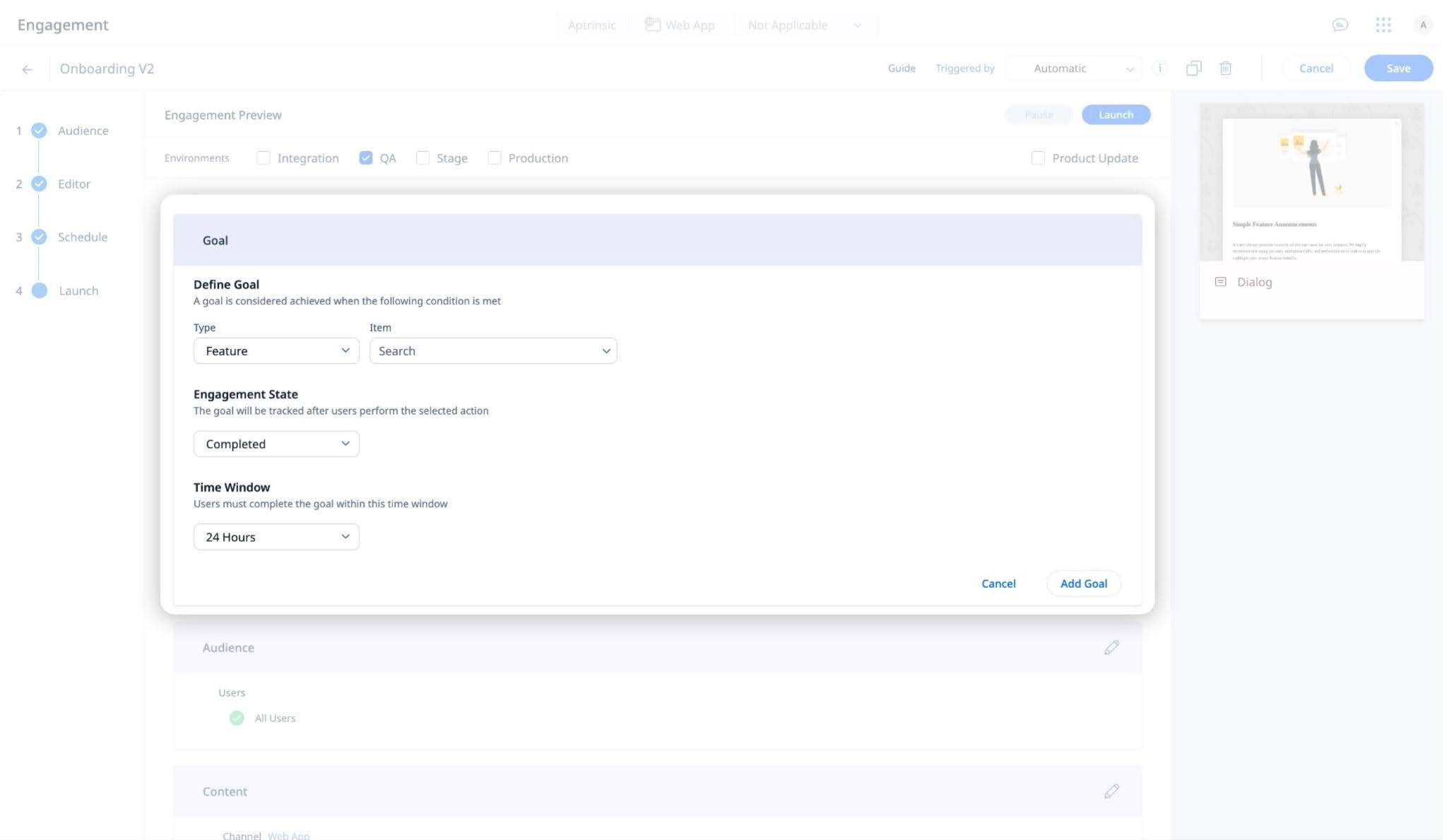
Guide engagement goal configuration showing goal type, tracked item, engagement state, and completion time window settings.

Example Business Use Case

A team running an onboarding or feature adoption campaign can define a goal, for example, completing a setup or using a key feature, and track whether users achieve it within a set timeframe. This helps measure campaign effectiveness and identify users who need follow-up engagement.

For more information on how to set goals and analyze results, refer to the Anatomy of Engagements article.

Enhancement

In-App Hub (formerly KC Bot)

[Know More]
Use Community Widget in the New In-App Hub Editor

The Community widget allows you to display community posts directly within the In-App Hub, making it easier for users to discover relevant discussions and resources without relying solely on search. In addition to search-based discovery, the widget adds a proactive way to surface community content within the hub, improving visibility and engagement.

Key Capabilities 

  • Display latest community posts directly in the In-App Hub
  • Configure number of posts to show in the widget
  • Allow users to view all posts or navigate to the community for more details
  • Enable users to further search and filter community content

Community widget configuration displaying post card settings, latest post count, and category and product area filters with live preview."

For more information, refer to the Configure In-App Hub article. 

Release Date: May 25, 2026 (EU | US)

Define and Apply Consistent Branding Across PX Engagements 

Brand Settings provides a centralized way to define and manage design themes for Guide V2 engagements. You can configure reusable styling elements such as colors, typography, and button styles in one place.

These settings help ensure a consistent look and feel across in-app engagements, reduce the need for repetitive styling, and make it easier to maintain branding as updates are made.

Key Highlights

  • Centralized Theme Management: Define and manage all brand elements from a single location, ensuring alignment across every PX engagement.
  • Reusable and Scalable Design Assets: Create reusable design tokens and apply them across engagements to maintain consistent branding with minimal effort.
  • Cross-Engagement Consistency: Apply one theme across multiple engagements to deliver a cohesive end-user experience without manual reconfiguration.
  • Brand Compliance: Maintain full control over branding by standardizing design rules and minimizing ad-hoc style variations.
  • Font Library Management: Manage fonts centrally by adding Google fonts that can be applied across themes, ensuring consistent typography without manual updates.

Example Business Use Case

A product marketing team creates a single branded theme and reuses it across multiple engagements. When branding changes, updating the theme automatically applies those changes everywhere, ensuring consistency without manual rework.

Brand Settings page displaying multiple theme cards with color palettes, typography previews, and button styles for different themes.

For more information, refer to the Brand Settings article.