Text Analytics Home
Gainsight NXT
This article explains about an overview of the Text Analytics feature and how CX users can use it.
Overview
The Text Analytics Home page presents CX users with advanced analytics on their Timeline and Survey Response data. It includes out-of-the-box reports that help users get a holistic view of the insights derived from the given input data.
Admins must first configure the data in the Text Analytics Admin page to view analytics on the Text Analytics Home page. For information on how to configure the Text Analytics, refer to the Configure Text Analytics article in the Additional Resources section.
To start analyzing the data, navigate to Text Analytics. The Text Analytics Home page is categorized mainly in to two sections, namely:
- Settings
- Widgets
Settings
When you first visit the Text Analytics Home page, all the settings are in the default state. You can also change the default settings. The options available in this section are:

- View Dropdown List: Displays the name of the selected View. As a standard, you can see the Default View is selected. You can select the required view from the dropdown list if you have already created some views. To create a new view, edit or delete a view, refer to the Create or Edit View section in this article.
- Context Menu: Click the Context Menu icon to perform the following actions:
- Edit View: Clicking Edit View navigates you to the Layout Builder screen.
- Delete View: Clicking Delete View deletes the present view.
Notes:- Edit and Delete View actions are not available for Default View.
- Users with the Viewer+ Analytics license type cannot create a new, edit, or delete a view.
-
Share View: You can share your View with other Users and/or User Groups and can assign specific access to specific User/User Groups. The following access options are available for User/User Groups:
- View: Users with View permission can only View the shared view.
- Edit: Users with Edit permission can View, Edit, and Save the shared view.
- Admin: Users with Admin permission can View, Edit, Delete and Share the shared view.
In the Views dropdown list, users have two views:
- My Views: Displays the list of views created by a logged-in user.
- Shared Views: Displays the list of views that were shared to the logged-in user by other users.
To share a View:
- Select the View to share, from the Views dropdown list as required.
Note: You can also create a new View and share it. - Click the Share Icon. The Share window appears.
- Select the Permission type from the Select Permission Type dropdown list. You can select any of the following permission types:
- Private: user, who created that specific view can access.
- Public: View: shared with all users in view-only access.
- Give access to specific people: shared with specific User and/or User Group.
To give access to User/User Group:
- Select the Users/User Group radio button.
- Type in and select the user/user group name in the Search box.
- Select either View, Edit, or Admin from the Access Type dropdown list.
- Click ADD.
- Who got access: you can search or scroll down to see the list of users and user groups, that specific view is shared with.
Note: You can also change the access type or revoke the access. - Click Save.
Notes:
- By default, users with Super Admin access have the visibility of all Text Analytics views in that org and can perform all view actions including Edit, Share and Delete. For Super Admin, you cannot revoke the access.
- In the SHARED VIEWS list, hover on the specific view to see the type of access you have been assigned by other users.
- Once the view is shared, the share icon displays the number and list of the Users and/or User Groups.
- You can also see the owner name of the View in the Share window.
- You cannot share the Default View.
- When a view is shared with specific users through Give access to specific people option, users receive an email notification about the View Sharing.
- Users with the Viewer+ Analytics license type cannot share a view.
-
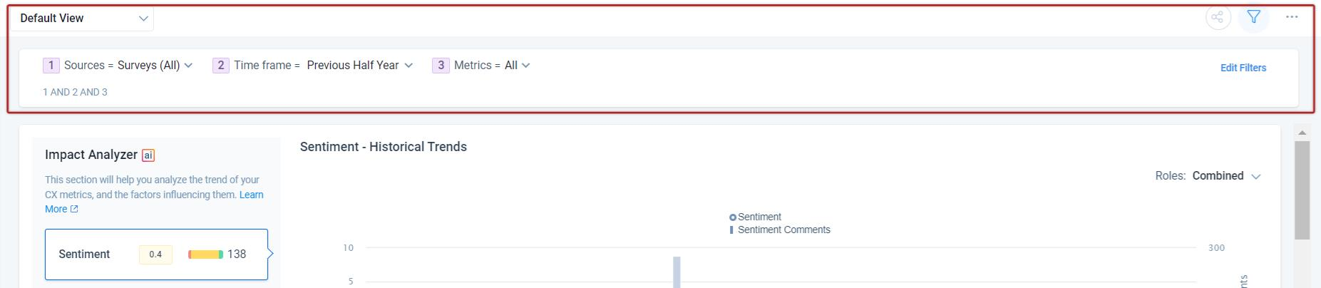
Filters: Click the Filter icon to view the default global filters (Sources, Time Frame, and Metrics) and additionally added filters (Company and Company Person) on the selected view. All the Widgets display the Sentiment score, NPS®, CSAT, Number of Mentions, and Number of Comments based on the filtered criteria.
-
Default Filters: Displays three filters (Sources, Time Frame, and Metrics) and allows users to select the required value for these filters.
Note: You can either directly select the required value in the Filters or in the Edit Filters section.
The default global filters view is made sticky. It no longer goes into off state mode. This enhancement makes it easy for the users to switch and apply different settings. Click the Filter icon to hide the default global filters.

-
Sources: Click the dropdown to toggle On/Off for all the Survey and/or Timeline data.
-
Surveys: Click the dropdown to select/unselect response data from specific surveys. You can search for surveys by name and can also filter available surveys based on the entity type (Company/Relationship) and click Apply to filter the data.
Note: You can see the Status, Total Responses, and Contextual Date information of a specific survey. - Timeline: Click the dropdown to select/unselect the type of activity data to display, and click Apply to filter the data.
-
-
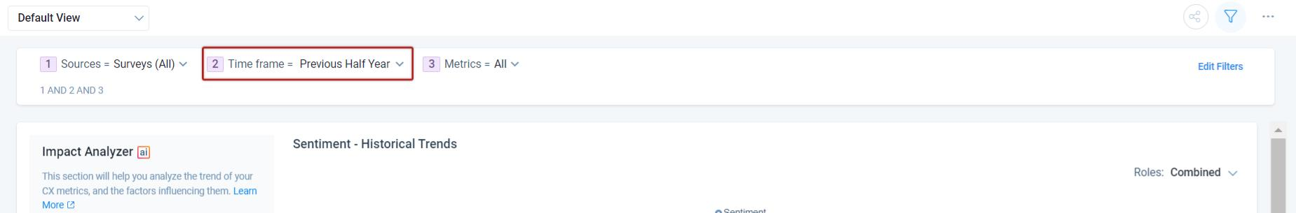
Time frame: Click the dropdown to select from pre-built time frames (Current Month, Current Fiscal Year, etc.) or configure a custom date range of data to display.
Note: The time frame is set as Current Half Year in the Default View > Edit Filters section. The time frame is set as Previous Half Year for Default View.
- Metrics: Click the dropdown to select/unselect Sentiment, CSAT and/or NPS (True/Average) scores.
-
-
Additional Filters: This allows adding multiple filters based on the Company and/or Company Person object. To add additional filters:
-
Click Edit Filters.
-
Click the Plus icon.
- You can select either of the following:
-
Company: From the Object dropdown, select Company to add filters based on the Company object. You can apply multiple filters and advance logic between them (AND or OR) to filter the response data as required. For more information on Company object, refer to the Gainsight Company Object article in the Additional Resources section.
- Company Person: From the Object dropdown, select Company Person to add filters based on the Company Person object. You can apply multiple filters and advance logic between them (AND or OR) to filter the response data as required. For more information on the Company Person object, refer to the Gainsight Person Object Model article in the Additional Resources section.
-
-
Click Apply.
Widgets
In the Text Analytics, the analytics are displayed in five different widgets. In the default view, you can see all the widgets and can customize them in your specific view(s).
The available widgets are:
- Companies
- Impact Analyzer
- AI Takeaways
- Revenue Matrix
- People
Companies
The Companies widget displays the list of Companies along with their aggregated Sentiment, Average or True NPS®, CSAT score, and Revenue. If you want to see the scores of a specific Company, you can search by the Company Name. Clicking on the company name navigates you to the respective C360 page. You can also select an operator in each column of the widget to filter the records.
Note: Companies widget is powered by Artificial Intelligence and Horizon AI. This widget uses AI to help Customer Success teams connect companies insights to business impact.
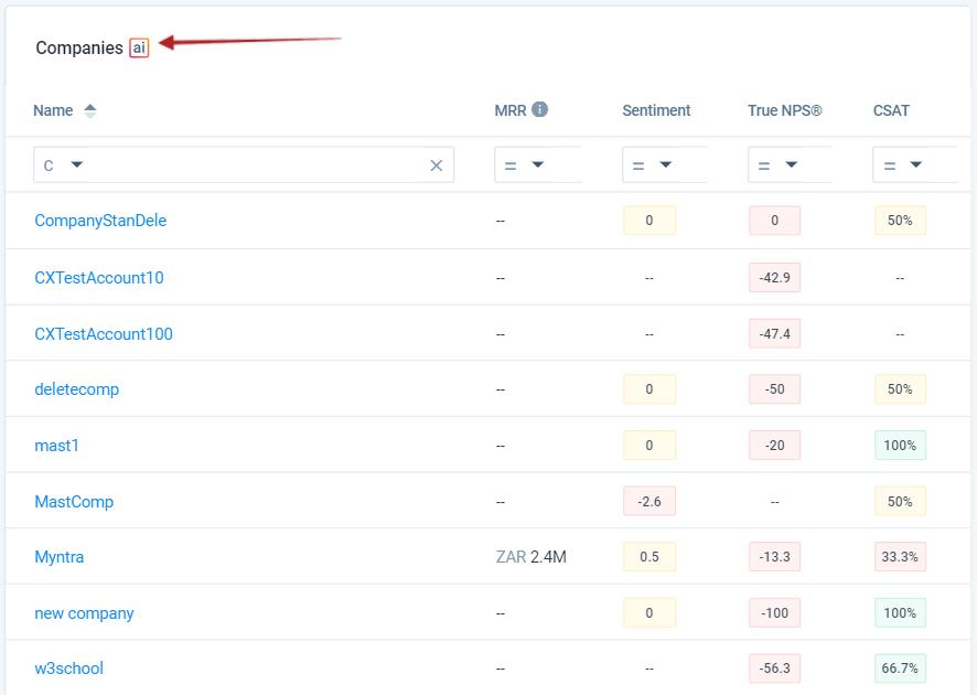
For deeper insights, click any score and to see the drill-down view.
Drill Down View
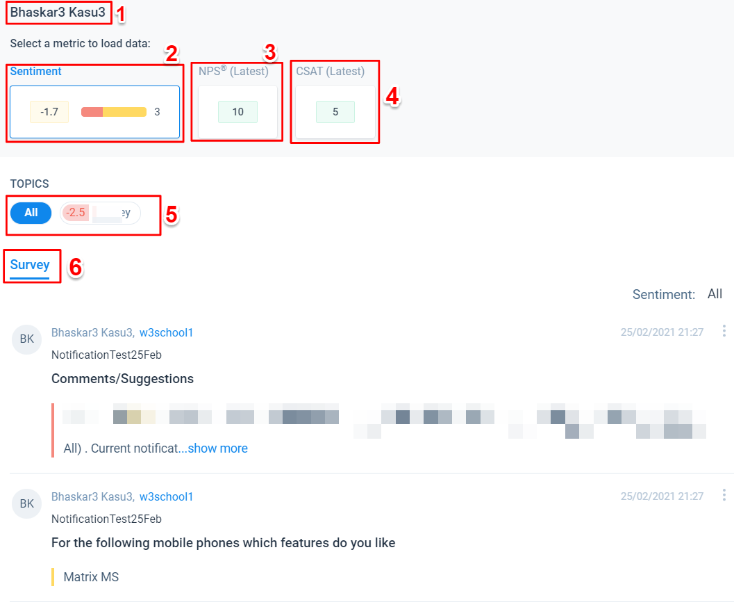
In the drill-down view, you can view all the Survey responses, sentiment, NPS®, CSAT, and more for a specific Company.
In the drill-down view, you can see the following options:
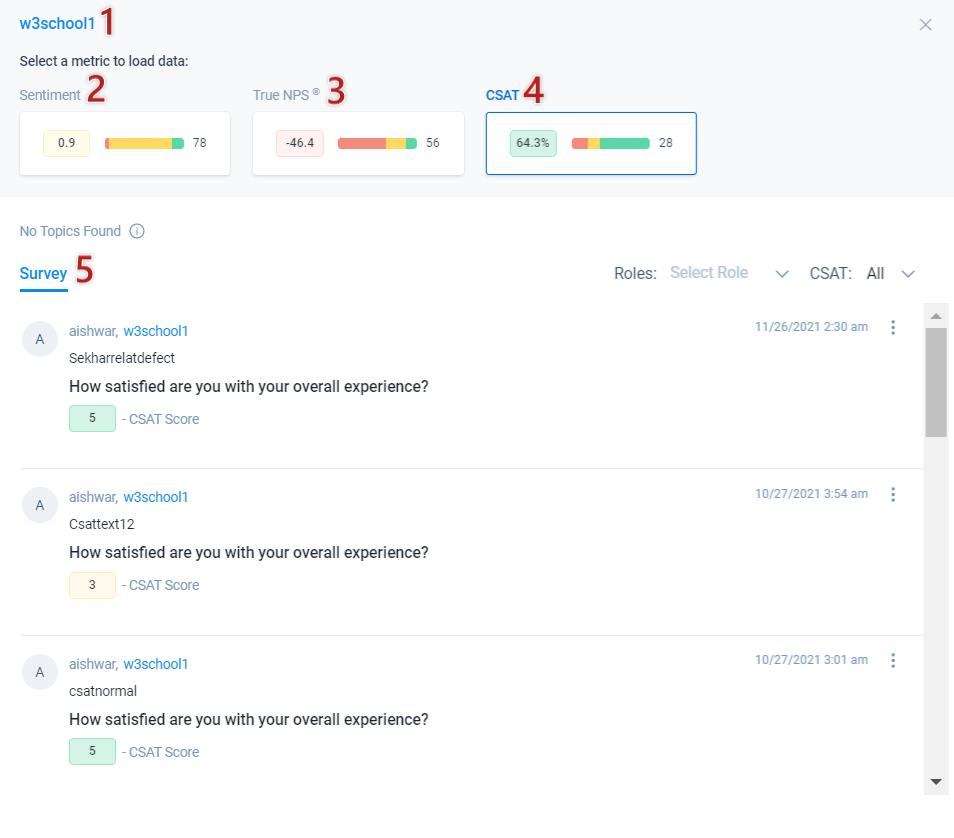
- Name: Displays the Company name.
- Sentiment Score: Displays the Aggregated sentiment score of the company and the number of comments.
- NPS®: Displays the NPS® of the company and number of responses.
- CSAT: Displays the CSAT score of the company and the number of responses.
- Survey: Displays all the Surveys of a company with Participant name, Company name, Survey question, and Survey response. You can filter the surveys further by User Role and Sentiment. You can see the response date and time and can also view the individual survey response by clicking the Three dots icon. The Survey list displays the recent entries first.
Topic: Displays all the topics. Select any topic, to know the sentiment derived from it. Hover on the topic to see the number of mentions. You can filter them further by Sentiment and Roles.
Timeline: When you click on the company name, you will be navigated to the C360 >Timeline page for the same company.
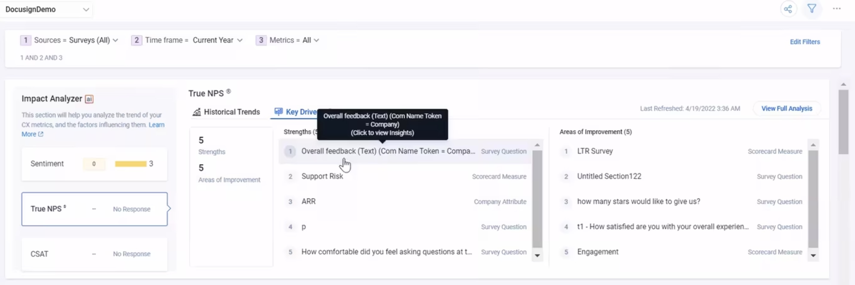
Impact Analyzer
Impact Analyzer is powered by Artificial Intelligence and Horizon AI. This AI-packed feature from Gainsight, uses AI to help Customer Success teams connect customer insights to business impact.
As part of Gainsight’s Text Analytics, Impact Analyzer uncovers how different drivers like scorecard measures or customer sentiment impact business goals like NPS® and renewals. Companies can then take these insights to identify which areas of their Customer Success strategy they need to focus on the most.
Impact Analyzer works by analyzing the survey responses, scorecards, and company attributes stored in the Gainsight company object. Our AI-based model identifies patterns in your data to bubble up your strengths and opportunities for the business KPI such as NPS.
Example Business Use Cases:
- For instance, every month you have sent multiple NPS® surveys to different user roles like Decision Maker, Executive Sponsor, or Power User. With Impact Analyzer, you can analyze the positive and/or negative NPS® trend by user role over a period of time on all the responses received.
- A CX user on Impact Analyzer wants to analyze metrics over a period of time and drill down into the metrics data for deeper analysis.
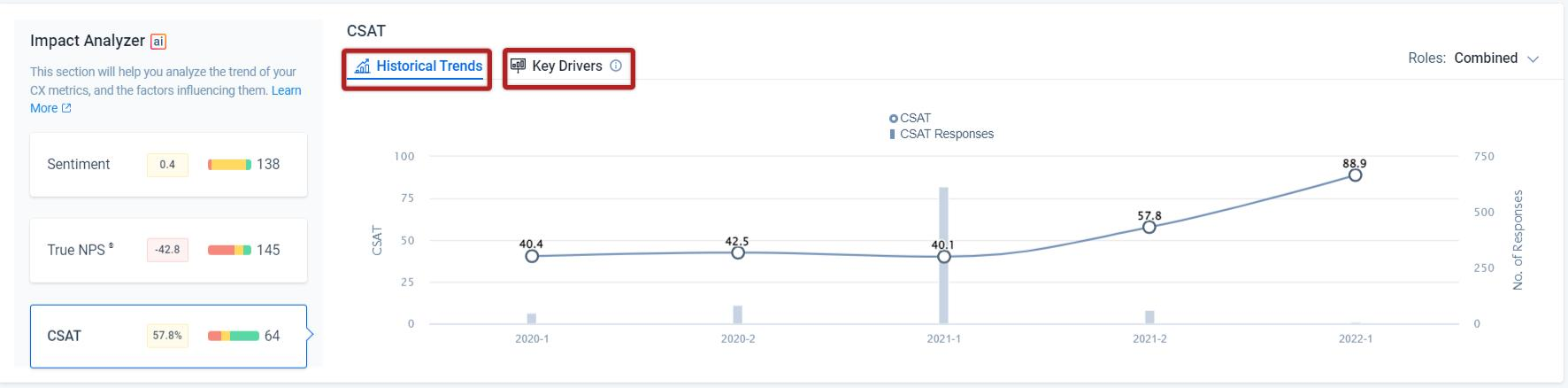
In the Impact Analyzer widget, you can select any of the following to access the Historical Trends and Key Drivers for the survey responses. Key Drivers tab is not available for Sentiment.
- Sentiment: On the left side, it displays the average sentiment score of all the responses and/or activities for the given source data. The Comments bar displays the number of comments and when you hover, it displays the distribution of Negative, Neutral/Mixed, and Positive comments.
On the right side, it displays the trend by user role for the selected time period. You can select a specific user role or a maximum of four roles to view different trend lines. You can combine all the roles to view a single sentiment trend line. Hover on the trend line checkpoint to view the sentiment and number of comments in detail. If you select Split by Role you can view all the User Roles on the top.
Sentiment score ranges from -10 to +10 and it is applicable for all the widgets. The score ranges are:- -10 to -2 is Negative
- -2 to +2 is Neutral/Mixed
- +2 to +10 is Positive
The below sample image displays the sentiment colors: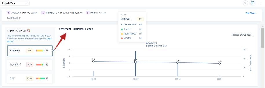
-
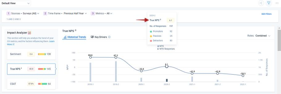
NPS®: On the left side, it displays aggregated NPS® for the given source data. You can either select Average NPS® or True NPS® in the metric filter. The Responses bar displays the number of NPS® responses and when you hover, it displays the individual count of Detractors, Passives, and Promoters.
On the right side, it displays either True NPS® or Average NPS® trend by user role for the selected time period. You can select specific user roles or all user roles to view different trend lines. You can combine all the roles to view a single NPS® trend line. Hover on the trend line checkpoint to view the True or Average NPS® and a number of responses in detail.- Average NPS®: Displays the 'Average' NPS® score, which has been averaged on total responses ranging from 0 to 10 and it is applicable for all the widgets. The score ranges are:
- 0 to 6 is Detractor
- 7 to 8 is Passive
- 9 to 10 is Promoter
- True NPS®: Displays the ‘True’ NPS® score of the total responses ranging from -100 to 100 and it is applicable for all the widgets. The score ranges are:
- -100 to 0 is Detractor
- 0 to 50 is Passive
- 50 to 100 is Promoter
- Average NPS®: Displays the 'Average' NPS® score, which has been averaged on total responses ranging from 0 to 10 and it is applicable for all the widgets. The score ranges are:
The below image displays the NPS® color:
For more information about Key Drivers for NPS, refer to the Impact Analyzer for End Users article listed under the Additional Resources section in this article.
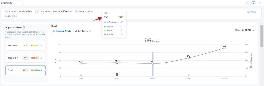
- CSAT: On the left side, it displays the average CSAT score for the given source data. The Responses bar displays the number of responses and when you hover, it displays the distribution of Negative, Neutral/Mixed, and Positive responses.
On the right side, it displays the CSAT trend by user role for the selected time period. You can select specific user roles or all user roles to view different trend lines. You can combine all the roles to view a single CSAT trend line. Hover on the trend line checkpoint to view the CSAT score and a number of responses in detail.
CSAT score ranges from 0 to 100 and it is applicable for all the widgets. The score ranges are:- 0 to 40% is Negative
- 40% to 60% is Neutral
- 60% to 100% is Positive
The below sample image displays the CSAT colors:
Notes:
- If the user was not assigned a role, by default the responses will appear under Unassigned Role.
- When you select Unassigned Role, you cannot select other user roles.
- The trend line color is specific for each user role.
- Hover or click the User Role to view the associated Sentiment, NPS®, or CSAT trend line.
For deeper insights, click any checkpoint to see the drill-down view and the following options:
- Time Frame: Displays the selected historical time frame.
- Metric: Displays the Sentiment, NPS®, or CSAT score of the selected historical time frame and a number of mentions/responses respectively.
- Topic: Displays all the topics from which the scores were analyzed.
- Timeline/Survey: For the Sentiment metric, it displays all the timeline activities and survey responses associated with it, and for NPS® and CSAT metrics it displays only survey responses. For more information on how to filter the activities/responses, refer to the Drill Down View section in this article.
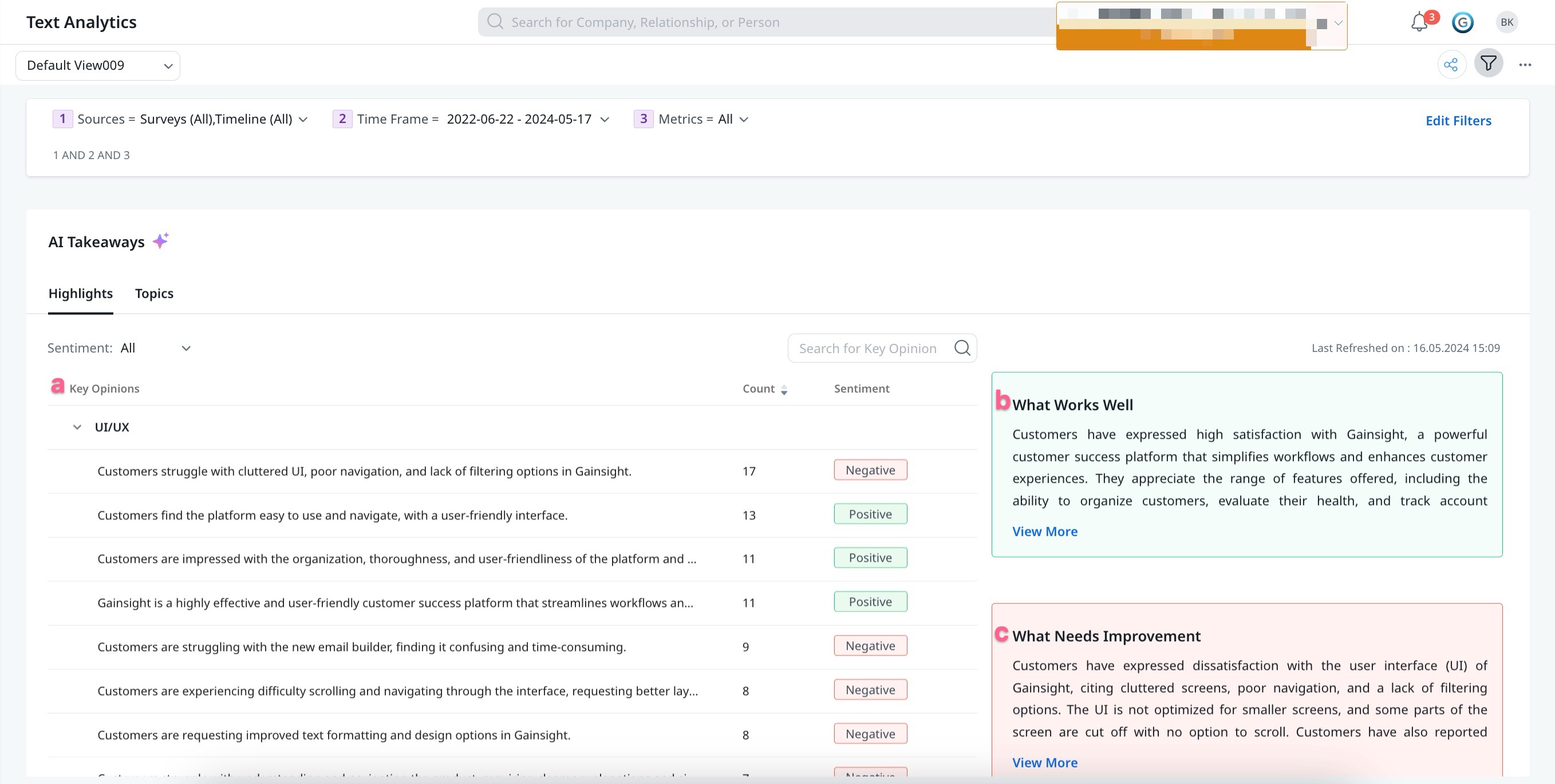
AI Takeaways
The AI Takeaways feature enables you to analyze and extract meaningful textual key points and manually added topics from various customer interactions from the Survey responses and/or Timeline data. This feature helps in understanding customer sentiment, preferences, and concerns better. The home page consists of the following sections:
Highlights
The Highlights tab displays automatic AI-generated key opinions along with the response counts, sentiment, and a summary of what works well for users and what needs improvement. This streamlined user feedback analysis helps in making informed decisions and targeted improvements of products, services, and processes. The Highlights list view page offers the following options:
-
-
Count
-
Sentiment
-
Note:
- To view the Highlights tab on AI Takeaways page, turn on the Highlights in AI Takeaways toggle button from the My Settings page. It takes up-to 72 hours for the initial setup of the Highlight tab to complete, after which an email notification is sent to your admin. For more information on how to enable the Highlights in AI Takeaways, refer to the Overview of Gainsight AI Toggle: Empowering User Data Control article.
- Highlights in AI Takeaways are refreshed only when 20 or more survey response texts are received since the last refresh date for a particular text analytics view. These responses can originate from any survey, with each text comment counted individually.
Key Opinions
Key Opinions are concise user opinions from all the available customer feedback offering precise insights on service, product, and process. It helps users to understand the customers viewpoints and offer a comprehensive view of the sentiments associated with it.
Count and Sentiment are attributes of key opinions. The count lists individual responses for each key opinion mentioned in the survey or timeline, and the sentiment displays the analysis of customer feedback, which can be either positive or negative.
Note:
- New key opinions are generated based on the latest text responses. If these responses match existing key opinions, no new key opinions are created. Instead, the count for the existing key opinion is updated.
- If a new key opinion does not align with a specific text analytics view, there are no changes to Highlights within that view. Consequently, even if new key opinions are created, the last refresh date for that view remains unchanged.
What Works Well
This section provides details about positive outcomes, enabling administrators to pinpoint effective aspects that meet customer needs. By analyzing these top opinions, users gain valuable insights into customer perceptions of the products, services, and processes.
What Needs Improvement
This section provides insights into areas that require improvement to meet customer needs. It serves as a clear roadmap for the improvement process, providing a deeper understanding of customer sentiments to enhance products, services, and processes.
Note: The Sentiment dropdown allows you to filter the key opinion list based on the sentiment status: All, Negative, and Positive.
Summary
For a deeper insight of a specific key opinion, click any Key Opinion from the list to access a comprehensive summary.
From the Summary section, click View Details, to see a complete set of Survey or Timeline data that associates to the key opinion.

Note: From the Source dropdown list, select Survey or Timeline.
-
Survey-users can see the complete survey questions along with customer feedback related to selected key opinions.
-
Timeline-users can see all the Timeline activities related to selected key opinions.

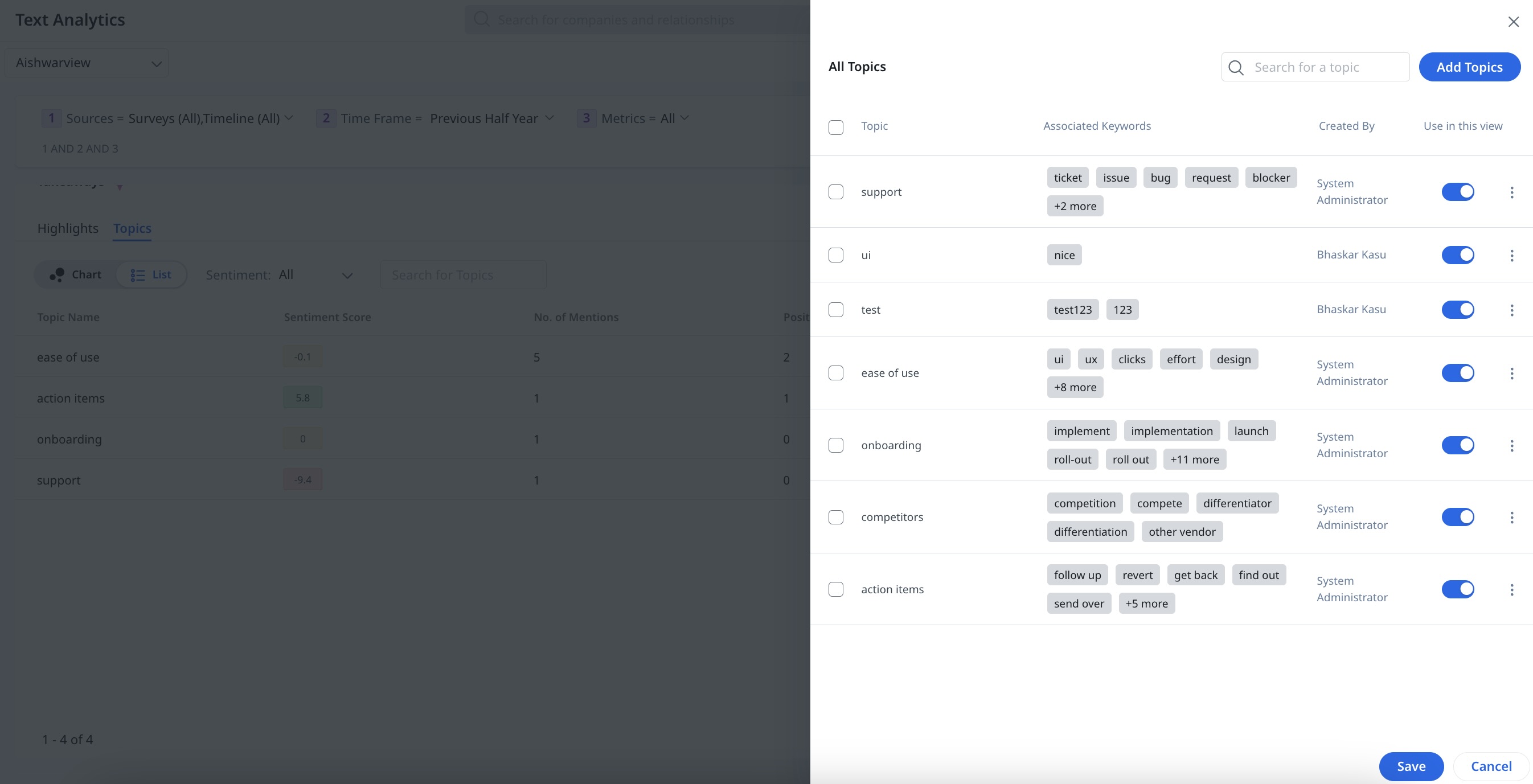
Topics
The Topics tab displays the topics configured by the admins and helps in capturing and providing better analytics on a particular subject. The following options are available:

Chart View
The chart view provides a quick and intuitive way to understand which aspects are perceived positively or negatively by customers. The size of the bubble chart indicates the number of times the keywords of a particular topic appear in Survey responses or Timeline entries. Hover on the topic to view the sentiment score and the number of times it is mentioned in all the activities and/or responses.

List View
The List View displays all the topics along with its Sentiment status and the number of mentions in the survey. Customize the view by sorting and rearranging columns as needed.
Sentiment
The Sentiment dropdown allows you to filter the relevant sentiment status. From the Sentiment dropdown menu, you can select the required sentiment (All, Negative, Neutral/Mixed, or Positive) to view the relevant results.
Manage Topics
The Manage Topics option enables you to add, edit, or delete the topics.
Note: You can turn the toggle switch ON or OFF to include or exclude specific topic results.
For information on topics and how to add, edit or delete it, refer to the Configure Text Analytics article in the Additional Resources section.
Notes:
-
The Manage Topics option is available in all the views except for the Default View.
-
Text Analytics does not support native NLP for non-English text. User needs to ensure that the Topics and associated keywords configured are in English language.
Click on any topic to drill-down the deeper insights. The following options are available:
-
Name: Displays the Key Opinions Topic or Keyword name.
-
Sentiment Score: Displays the sentiment score of the topic or keyword and number of mentions.
-
Keywords:
-
In Topic drill-down, displays the list of keywords associated with that topic.
-
In Keyword drill-down, displays all the keywords. Click any keyword to view the specific mentions.
Note: You can also see the sentiment of the keyword.
-
- Survey: Displays all the timeline activities and survey responses associated with the selected topic or keyword. For more information on how to filter the activities or responses, refer to the Drill Down View section in this article.

Revenue Matrix
The Revenue Matrix widget displays the Revenue vs Sentiment/NPS® of the Companies in a graphical representation. It segregates the Companies into four quadrants based on Company Sentiment/NPS® and Revenue. The four quadrants are:
- At Risk: Low sentiment/NPS® and High revenue
- Need Attention: Low sentiment/NPS® and Low revenue
- Growth Potential: High sentiment/NPS® and Low revenue
- Advocates: High sentiment/NPS® and High revenue
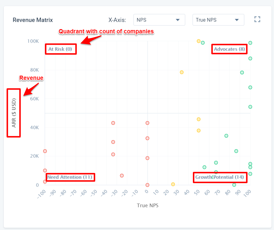
Note: Each quadrant displays a maximum of 50 companies.
On X-Axis, the revenue matrix displays the Sentiment/NPS®/CSAT and on Y-Axis it displays the Revenue (Selected currency field). Hover on any point on the graph to view the Company Name, Status, Revenue information, and Sentiment/NPS®/CSAT. For deeper insights, click any point on the graph and you can see the drill-down view. For more information on drill-down, refer to the Drill Down View section in this article.
People
The People widget displays the list of Company Persons along with their Role, Email, Company Name, historical Sentiment score, and their latest responded score to the CSAT and/or NPS® surveys. If you want to see the scores, company name, email, and role of a specific Person, you can search by the Person Name. Clicking on the company name navigates you to the respective C360 page. You can also select an operator in each column of the widget to filter the records.
For deeper insights, click on a name and you can see the drill-down view and the following options:
Note: In the People widget, you can only see the Survey tab in the drill-down view.
- Name: Displays the Person's name.
- Sentiment Score: Displays the person’s historical sentiment score and a number of mentions.
- NPS®: Displays NPS® latest response. For example: In the above image, that particular person responded with a score of 10 to the NPS® survey.
- CSAT: Displays the CSAT latest response. For example: In the above image, that particular person responded with a score of five to the CSAT survey.
- Topic: Displays all the topics from which the sentiment scores were analyzed.
- Survey: Displays all the Survey responses of that person. You can view Participant name, Company name, Survey question, and Survey response. You can filter surveys further by User Role and Sentiment. You can see the response date and time and can also view the individual survey response by clicking the Three dots icon.
Create or Edit View
To create a new view:
- Click View Dropdown.
- Click Create New View. The Layout Builder window appears, and now configure the following options:

- View Name: Enter the required View display name.
- Filters: While creating the view, you can set the global filters. For more information on filters, refer to the Settings section step 4 in this article.
- Widget: Out of the box, five widgets are available. Drag and drop the required widget onto the Canvas screen. You can resize the widget, change the order, or add/delete the widget as required.
Note: The Trend and Topic Explorer widgets require more space than other widgets for better visualization. - Save View: Click Save View to save the new view.
Note: You can Edit or Delete only the views that you have created.
To edit an existing view:
- Click View Dropdown.
- Hover to the view you wish to edit.
- Click the Edit icon. The Layout Builder window appears. For more information, refer to the Create or Edit View section step 2 in this article.
To delete an existing view:
- Click View Dropdown.
- Hover to the view you wish to delete.
- Click the Delete icon.
- Click Yes to delete.

Additional Resources
- Text Analytics Overview
- Configure Text Analytics
- Text Analytics FAQs
- Gainsight Company Object
- Gainsight Person Object Model
- Impact Analyzer for End Users
| Net Promoter®, NPS®, NPS Prism®, and the NPS-related emoticons are registered trademarks of Bain & Company, Inc., NICE Systems, Inc., and Fred Reichheld. Net Promoter ScoreSM and Net Promoter SystemSM are service marks of Bain & Company, Inc., NICE Systems, Inc., and Fred Reichheld. |