Configure Knowledge Center Bot (Beta)
This article explains how to configure the various elements of Knowledge Center Bot in Gainsight PX.
Overview
The Knowledge Center Bot is a tool designed to help you deliver content to end-users. These content could be in the form of in-app engagements, articles hosted on PX, external knowledge base articles, and so on. The Configuration section of the Knowledge Center Bot allows you to configure the various resources that should be available in the KC Bot.
You can further customize and fine-tune the Knowledge Center Bot’s settings to align with your organization’s needs. From defining activation rules to managing integrations and user access, this section ensures the bot functions seamlessly and delivers a tailored experience to your users.
Business Use Cases
- Consider a scenario where you want to create an onboarding checklist for new users who sign up to your application. You can leverage the KC Bot to create a curated list of tasks that new users should complete within the first week of joining. These tasks can include a collection of guide engagements to set up the application, links to security documents, and more.
- Consider a scenario where a user encounters a challenge in performing a task in your application, and seeks assistance. They would typically navigate away from the application, and look for help in your documentation or help center. However, with the KC Bot, you can bring the required help right into the application. By integrating your knowledge base with KC Bot, users can search and access information right in the application, without the need to navigate away.
- User feedback is of utmost importance, and the KC Bot streamlines the collection process. With the help of the Feedback widget, you can set up mechanisms to collect user feedback at the product level, to understand user pain points and valuable suggestions.
Widgets in KC Bot
You can add content to a bot using the various widgets available. Widgets allow you to structure and organize bot content into functional sections, making configuration more manageable and scalable. You can group content using widgets such as Task Lists, Content Groups, and Recommendations to deliver information in a clear and purposeful way. Widgets can be easily added, rearranged, and previewed in real time, helping you control the layout and prioritize content based on user needs.
Set up the following widgets to get started with Knowledge Center Bot:
Note
- Widgets can be dragged and rearranged, as required.
- Click the three-horizontal docs icon of a widget to temporarily hide or permanently remove it from the bot.
- In the Content Library slide-out panel, you can perform the following:
- Search or filter specific types of content.
- Select content in any order and later reorder them as required.
Set Up Bot Header
The Header section allows you to customize the title and welcome message displayed at the top of the Knowledge Center Bot. You can personalize the message using dynamic user or account attributes, such as first name, and set a tone that aligns with your brand. This section helps create a friendly, branded entry point that sets the context for users as they begin interacting with the bot.

Define the following fields of the header:
- Greeting: The main welcome message displayed at the top of the bot. This sets the tone for the interaction and can be personalized using user attributes (for instance, first name). A maximum length of 80 characters is allowed.
- User Attributes: Dynamic variables that insert personalized information into the bot, such as a user’s name, company, or role. Attributes are added using the format { {Attribute|FallbackValue} }, where the fallback value is shown if the attribute is empty or unavailable. You can use up to two attributes in the Greeting field.

- User Attributes: Dynamic variables that insert personalized information into the bot, such as a user’s name, company, or role. Attributes are added using the format { {Attribute|FallbackValue} }, where the fallback value is shown if the attribute is empty or unavailable. You can use up to two attributes in the Greeting field.
-
Subtext: A short supporting message that appears below the greeting. Use this to provide context, instructions, or a brief description of what users can do in the bot. A maximum length of 55 characters is allowed.
Customize the Search Experience
The Search widget enables users to search and access content from various sources directly within the Knowledge Center Bot. You can integrate external knowledge bases and platforms such as Gainsight Customer Communities (CC), allowing users to search, view, and upvote community content alongside articles and documentation. The widget also offers customization options for result appearance and behavior, helping you tailor the experience to your users' needs.
The following sections are available:
Connect a Knowledge Base with KC Bot
The Knowledge Base section in the Search widget supports providing search results from external knowledge bases, allowing end-users to access product documentation from third-party platforms directly within the KC Bot.
Prerequisite: Ensure that you have a successful integration with the required knowledge base set up in PX. For more information on how to connect PX with an external knowledge base, refer to the Knowledge Center Integrations category of articles.
To configure knowledge bases:
- In the Knowledge Base field, select the external knowledge base that must be configured with the bot.
- Based on the knowledge base selected, configure the specific options available. For more information, refer to the KB-specific article from the Knowledge Center Integrations category.

Enable Customer Community Content
Gainsight Customer Communities (CC) is an interactive Customer Success community platform. It helps users share and discuss feedback, queries, and suggestions on the technical enhancements and latest product updates. For more information refer to the Customer Communities website.
The Community Search section allows you to integrate the bot with Gainsight Customer Communities (CC), allowing users to search, view, and upvote community content directly within the bot. This enables users to access peer discussions, feedback, and shared solutions without leaving your application.
Prerequisite: To display CC content within a bot, ensure that a connection is established between Customer Communities and Gainsight PX. For more information, refer to the Gainsight PX Customer Communities Integration article.
To fetch community content in the bot:
- Turn on the Community Search toggle.
- In the Categories and Product Areas field, select the categories and product areas for which content must be displayed to the users.
- Click Save.
Once configured, users can access ideas and feature requests, search for popular use-cases and solutions, and even upvote content from the active KC Bot.
Note
- The options available for selection are based on the categories and product areas defined while integrating CC with PX.
- PX returns results only from the selected categories and product areas. If either field is left blank, it is excluded from the search.
- The capability to upvote content is only available in real-time, for users registered with your subscription of Customer Communities.

Customize the Search Results
The Search Results Tab section allows you to configure how search results are grouped and labeled in the bot. You can customize tab names for each result, arrange the order of the tabs, and choose whether to hide tabs that have no results.

Edit Search Text and Messages
The Search Text section allows you to customize the text displayed throughout the search experience. You can update the default placeholder in the search bar, and other options.
The following configurations are available:
- Search Help Text: Default placeholder text displayed in the search bar before the user enters a search term.
- No Results Text: Message displayed when no matching results are found for the entered search term.
- Empty Search Message: Default description that appears on the search results page, once the user clears the entered search term.

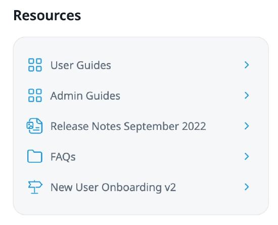
Create Task Lists in KC Bot
The Task List Widget helps guide users through structured workflows by presenting a checklist of actions directly within the bot. You can create up to 25 task lists per bot and target each to specific audiences using rules based on user or account attributes, global context, or page URLs. This allows you to create curated experiences using audience rules, for instance user role or geography, eliminating the need for multiple bots.
The Task List widget is ideal for onboarding, feature adoption, and guiding users through key product flows.
To configure a task list in the bot:
- Click the Task List widget.
- In the Title field, enter a heading for the set of tasks. A maximum length of 50 characters is allowed.
- In the Subtitle field, enter a description or additional information for the list of tasks. A maximum length of 100 characters is allowed.
- Click Add Step to add content from the library.
- In the Content Library slide-out panel, select the required content that applies to the list of tasks.
- Turn on the Enable Sequential Task Completion toggle to enforce the order of the task list, so users must complete tasks step by step. This setting activates one task at a time, based on the completion of the previous task, and keeps the remaining steps unavailable until the previous one is completed.
- Click Audience Rules to target this task list to a specific set of audience using user or account attributes, global context, or page URLs, else leave it to the default All Users.
- Click Save.
Note
- You can add up to 25 task lists in a single bot, each catering to a different audience. Only one task list is visible at a time and are evaluated in order, from first to last. A user views only the highest-priority task list they qualify for and haven't completed.
- If no task list applies or all qualified tasks are completed, nothing is displayed. This ensures that each user views the most relevant tasks, while guiding them through the right workflows.
- For content added to the task list, you can edit Display Name, Description, and thumbnail images directly from the bot editor. These updates are synced automatically with the content library.
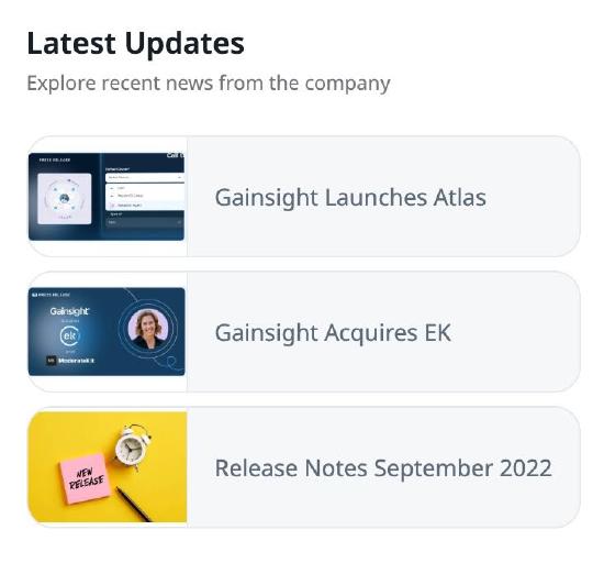
Organize Content Using Content Groups
The Content Group widget allows you to organize related resources into structured groups, making content easier to browse and more relevant to the user’s context. You can add up to five content groups in a single bot, each containing categorized items such as onboarding guides, troubleshooting articles, or feature documentation. This widget helps streamline the content experience, reduce clutter, and surface the most useful information in a format that aligns with user intent.
To add a content group:
- Click Add Widget and select Content Group.
- Select the widget.
- In Layout, choose how content must appear. For more information, refer to the Working with Layouts section.
- Click Proceed.
- In the Content section, enter a Title (maximum 50 characters) and Subtitle (maximum 100 characters) to describe the content.
- Click Add Category to first create folders, or Add Content to directly add individual content items, depending on the layout selected.
- In the Content Library slide-out panel, select the required content that apply to the list of tasks.
- Click Save.
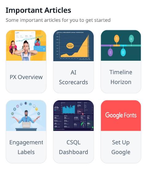
Deliver Contextual Content with Recommendations
The Recommendations widget allows you to display content that adapts to specific user attributes through audience-based rules. You can create up to 25 groups, each configured with its own targeting logic, such as user roles, page URL, and more. Within each group, you can add and organize content from the Content Library and use categories to further group related resources.
Recommendation groups are evaluated in the order they are added, and only the first group that matches the targeting rules is delivered to the user. As a result, only one group is displayed at a time within the bot. With support for multiple layouts (list, grid, card, tile and thumbnail) and real-time previews, the widget helps you deliver content in a structured and user-relevant way.
Tip: For more predictable and efficient targeting, use a consistent approach, either URL-based rules or user/account-based rules. Using both can create conflicts in the content delivery logic, which may lead to inconsistent experiences for end users.
To add a Recommendation widget:
- Click Add Widget and select Feedback.
- Select the widget.
- Click Add Group. You can add up to 25 groups.
- In Layout, choose how content must appear. For more information, refer to the Working with Layouts section.
- Click Proceed.
- In the Content section, enter a Title (maximum 50 characters) and Subtitle (maximum 100 characters) to describe the content.
- Click Add Category to first create folders, or Add Content to directly add individual content items, depending on the layout selected.
- In the Content Library slide-out panel, select the required content that apply to the list of tasks.
- Click Audience Rules to target this group to a specific set of audience using user or account attributes, global context, or page URLs, else leave it to the default All Users.
- Click Save.
Enable In-App Feedback Collection
The Feedback Widget allows you to collect input directly from users within the bot. Users can share suggestions, report issues, or provide general feedback right from their application.
Prerequisites: Ensure you have configured Feedback categories to use in bots. For more information, refer to the Configure Feedback Categories article.
To collect feedback:
- Click Add Widget and select Feedback.
- Select the widget.
- In the Feedback Type section, select whether the feedback mechanism must be displayed as a card or as part of the bot’s footer, along with the corresponding fields.

-
In the Feedback Categories section, select the categories that you want to provide in the bot. You can rearrange the order in which the categories are displayed.
Note: The categories available for selection are created in the Administration section. For more information, refer to the Configure Feedback Categories article.

-
In the Feedback Page section, configure the placeholders that aid users on how to provide feedback.

-
In the Acknowledgement Page section, configure the placeholders that appear once a user has provided feedback.

-
Click Save.
Working with KC Bot Layouts
Layouts define how content is visually presented within the bot. You can choose from multiple layout options such as list, grid, card, or thumbnail, to match the type and volume of content being shared. Selecting the right layout helps improve readability and ensures that information is organized in a way that supports quick access and action.

Knowledge Center Bot offers the following layouts for Content Group and Recommendations widgets:
|
Layout |
Description |
|---|---|
|
|
List: Ideal for step-by-step guides or sequential tasks. Additional Information:
|
|
|
Grid: Best for grouping content by topics or lifecycle stages. Additional Information:
|
|
|
Card: Great for highlighting tutorials or visual content. Additional Information:
|
|
|
Tile: Ideal for visually engaging call-to-action items. Additional Information:
|
|
|
Thumbnail: Perfect for quick links, tools, or updates with minimal text. Additional Information:
|


Tip: For best practices on which layout or widget to use for a use case, refer to this Community post.