
Brand Settings
This article explains the Brand Settings feature in Gainsight PX, and how it can be used to define and apply consistent branding across PX engagements.
Overview
Brand Settings helps you standardize the look and feel of your in-app engagements by enabling you to define reusable themes. Instead of configuring styling for each engagement individually, you can create a centralized set of design rules and apply them consistently across experiences.
With Brand Settings, you define styling once and reuse it across engagements, ensuring consistency while reducing manual effort. Any updates made to a theme are automatically reflected wherever it is used, making it easier to maintain and evolve your product’s visual identity over time.

Key Highlights
- Centralized Theme Management: Define and manage all brand elements from a single location, ensuring alignment across every PX engagement.
- Reusable and Scalable Design Assets: Create reusable design tokens and apply them across engagements to maintain consistent branding with minimal effort.
- Cross-Engagement Consistency: Apply one theme across multiple engagements to deliver a cohesive end-user experience without manual reconfiguration.
- Brand Compliance: Maintain full control over branding by standardizing design rules and minimizing ad-hoc style variations.
Prerequisites: Ensure that you have Manager access to Templates to create themes in Brand Settings.
To access Brand Settings:
- From the main menu, navigate to the Administration > SET UP > Brand Settings.
- The Brand Settings page has the following two tabs:
Themes
The Themes tab is where you define the foundational elements of your brand identity that can be applied across PX engagements. Themes ensure that every guide, dialog, or banner reflects a unified brand look and feel, without requiring manual customization for each.
- You can create up to 10 themes per subscription, each tailored for different products, use cases, or design variations.
- Themes are currently compatible only with Guide Editor V2.
To build and use themes effectively:
Configure General Settings
Before you start building themes, configure General Settings to establish the foundation for how themes behave. Setting up these configurations first ensures that every theme you create inherits a consistent framework.
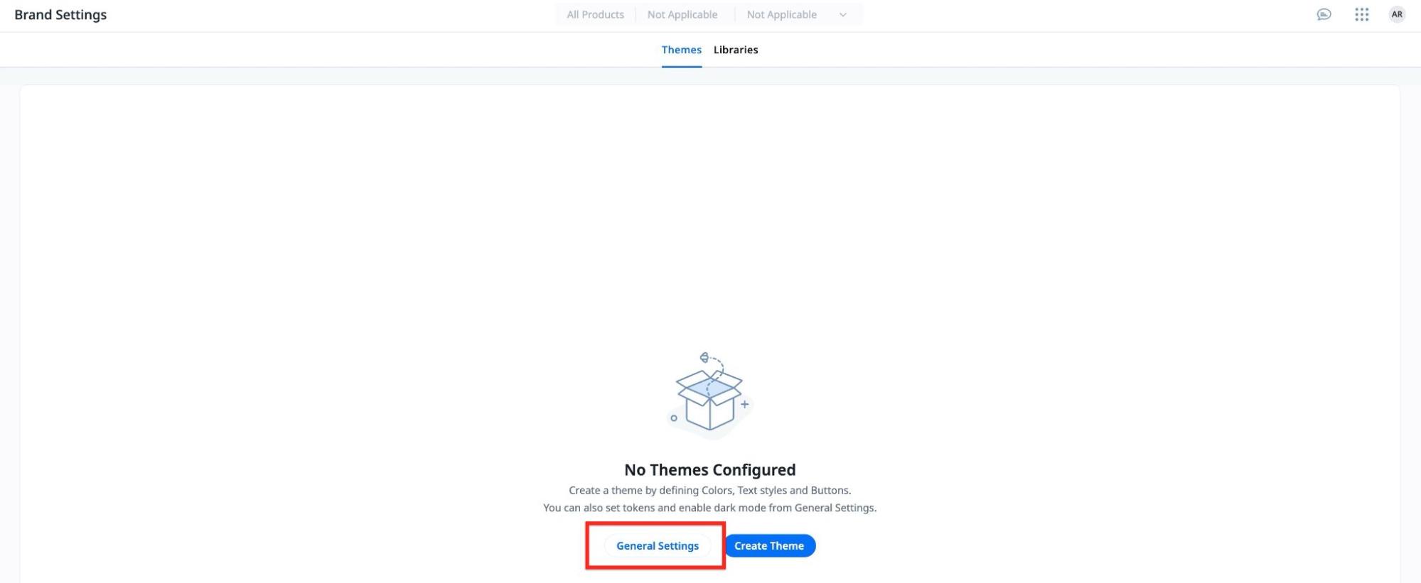
To configure,:
- In the Themes tab, click the General Settings button.
- The General Settings slide-out panel consists of the following two tabs:
- Tokens: Create and manage the design tokens that act as reusable labels for colors, text styles, and buttons.
- Light/Dark Theme: Configure how PX identifies and applies light or dark themes.
Design Tokens
Design tokens are global labels you define once and reuse in every theme. They act as the naming system for your brand building blocks across colors, text styles, and buttons.
- You can rename tokens, but cannot add or delete them that could affect engagements using that token within themes.
- Tokens define labels, not values. You must assign the actual colors, font specs, and button settings in the theme configurator
- Tokens only serve as quick identifiers and are common across all themes
To configure tokens:
- Click the Tokens tab.
- Rename tokens across the following sections:
- Colors: Color roles used across engagements.
- Text Styles: Typography roles for different text elements.
- Buttons: Styling roles for buttons.
- Click Save.

Configure Light and Dark Themes
The Light/Dark Theme section lets you control how PX detects and applies theme variations based on user or system preferences. You can enable dark mode and decide how PX determines which version to display, either by the browser’s system setting or a defined user attribute.
To configure dark theme:
- Click the Light/Dark Theme tab.
- Turn on the Enable Dark Theme toggle.
- In the Theme Identifier section, select how PX should determine when to switch between light and dark modes:
- Browser Settings: Uses the user’s system or browser preference to automatically apply light or dark mode.
- User Attribute: Uses a defined user attribute to control whether light or dark theme is applied. Additionally, select the attribute that determines the theme. Ensure the attribute is of type string and contains values that map to light or dark themes.
- In the Default Theme section, select the theme to apply when no valid identifier is detected.
- Click Save.

Create Themes
A theme is a collection of values assigned to your design tokens. Creating a theme allows you to define the visual identity of your engagements by assigning values to design tokens such as colors, text styles, and buttons. Each theme represents a complete set of styling configurations that can be applied across engagements.
Prerequisite: Ensure you have configured design tokens before creating a theme.
- Tokens are global labels; you set their values per theme.
- Updates to a saved theme affect every engagement that uses it
To add a theme:
- From the Themes tab, click Create.
- In the Light Theme tab, configure the following sections for the light theme:
- In the Colors section, click each color token to assign values and define the theme’s color palette.

- In the Text Styles section, click each text style token to configure typography settings such as font family, size, weight, and line height.

- In the Buttons section, click each button token to configure button styles, including background, border and text colors for default and hover states.

- In the Buttons section, click General Settings to further customize button design.

- (Optional) To configure the dark theme, switch to the Dark Theme tab and repeat the same configurations.
- Click Save to create the theme.
Libraries
The Libraries tab provides a centralized space to manage reusable style elements that ensure visual consistency across all engagements. This helps you streamline branding updates, maintain cohesive visual design, and minimize repetitive styling work.

The following tabs are available:
- Font Library: Add fonts or select a default typeface for themes.
- CSS Library: Define your own class definitions for existing PX classes or create custom classes to apply consistent styling across engagements.
Font Library
Font Library lets you manage the fonts available for use across your engagements and themes. This helps ensure consistent typography across guide V2 engagements while reducing the need to manually adjust fonts in individual themes or experiences.
Here, you can:
- Add fonts from the available Google Fonts directly into the Font Library.

-
Mark a font as default to update the font style across all themes configured to use the default option.

- Google fonts added to the library cannot be deleted.
- A maximum of 20 Google fonts can be added to the Font Library.
- Fonts defined within a theme override the default font selection. Changing the default font only affects themes that use it, not those with custom fonts.
CSS Library
CSS Library provides a centralized location to define and reuse custom styling rules across engagements. You can reference PX’s built-in default classes or create your own CSS classes to standardize layout, spacing, and button styles. This helps maintain uniform design patterns, reduce inline styling, and streamline updates to your brand’s look and feel.

Here, you can:
- Access PX classes: Click the Default Classes button to view all predefined CSS classes used across PX engagements to understand and reuse existing styling patterns.

- Customize existing classes: Click Edit to apply your own CSS rules to modify the default PX classes and align engagement styling with your brand’s visual identity.

- Create new classes: Define and manage custom CSS classes to introduce unique, reusable styling for components not covered by the default PX classes.
- Set global spacing: Define standard padding and margins in your Brand CSS to maintain consistent spacing across engagements.
- PX applies styles in the following order: inline styling, HTML-level styling, step CSS, guide CSS, brand CSS, and default CSS.
- Inner container classes (such as .px-start-guide-dialog and .px-end-guide-dialog) take precedence over outer classes, which may override brand or guide-level CSS.
- Add !important to a class to enforce your custom or brand CSS when overriding inline or default PX styles. Gainsight recommends caution while using this, as it can impact all engagements where a Brand theme is being used.
Manage Themes
After you create a theme, you can edit or remove it as needed to keep your theme library organized and up to date.
To manage an existing theme:
- Click the three-vertical dots menu for the required theme. The following options are available:
- Edit: Modify theme colors and configurations.
- View Dependency: View which active engagements or templates use this theme. This option is available only when the theme has dependencies.
- Delete: Permanently remove a theme. This option is available only when the theme is not used in any active engagement or template.

Apply Brand Settings to Engagements
Once you configure themes and libraries in Brand Settings, you can apply them to engagements to ensure consistent styling across your in-app experiences. You can apply styling in two ways: by selecting a theme to define the overall visual structure of an engagement, and by using Brand CSS to apply custom styling rules. Together, these options allow you to standardize design while maintaining flexibility for specific use cases.
Use Themes in Engagements
Once you have defined your themes for different use cases, you can apply them to engagements to instantly align their appearance with your brand.
To use themes in engagements:
- When creating or updating an engagement, navigate to Global Settings and select the desired theme. This sets the visual foundation for all assets within that engagement.

- Next, map each asset to the corresponding design token:
- For every text or button, select the appropriate token from the chosen theme.

- For every text or button, select the appropriate token from the chosen theme.
- When selecting colors, the color palette available in the editor automatically inherits the colors defined in the theme.

After mapping, you can switch between themes at any time to apply new color schemes and styles across the entire engagement instantly, without reconfiguring individual assets. This shift happens as the token labels are consistent across the themes, thereby making it easy to maintain consistency while experimenting with different visual variations or brand updates.
When previewing in-app engagements in a subscription that has dark theme enabled, you can choose which version to preview the engagement in:

Use Brand CSS in Engagements
Once you have defined your custom CSS for different use cases, you can apply them to engagements to ensure a consistent look and feel across all PX experiences.
When creating an engagement, the Brand tab contains the styling rules defined in your CSS Library that automatically apply to any engagement associated with a selected theme.
The Brand tab is only available when an engagement uses a theme.
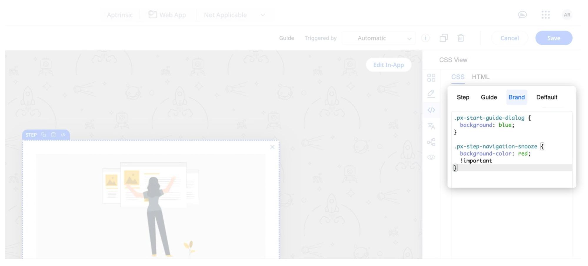
When you apply Brand CSS, PX uses the following styling hierarchy to determine which rules take effect:
- In-line style
- Brand kit theme
- Step CSS
- Guide CSS
- Brandkit CSS
- Default CSS