Use Templates
This article provides information on how to create and use templates for your engagements.
Overview
Templates are pre-formatted layouts that help you create engagements in a specific format. Templates save you time on the initial setup and configuration of your engagement layouts. Gainsight PX provides default templates out of the box. You can use the default templates for creating engagements or customize the templates as required. For example, you can customize a template to display your company logo. The goal of this feature is to help you create personalized engagement templates.
Create Template
While building in-product engagements Gainsight PX recommends that you build reusable templates and create a consistent experience that matches your product and brand styling. The template will be available in your Saved Template section of the template library.
To create a template:
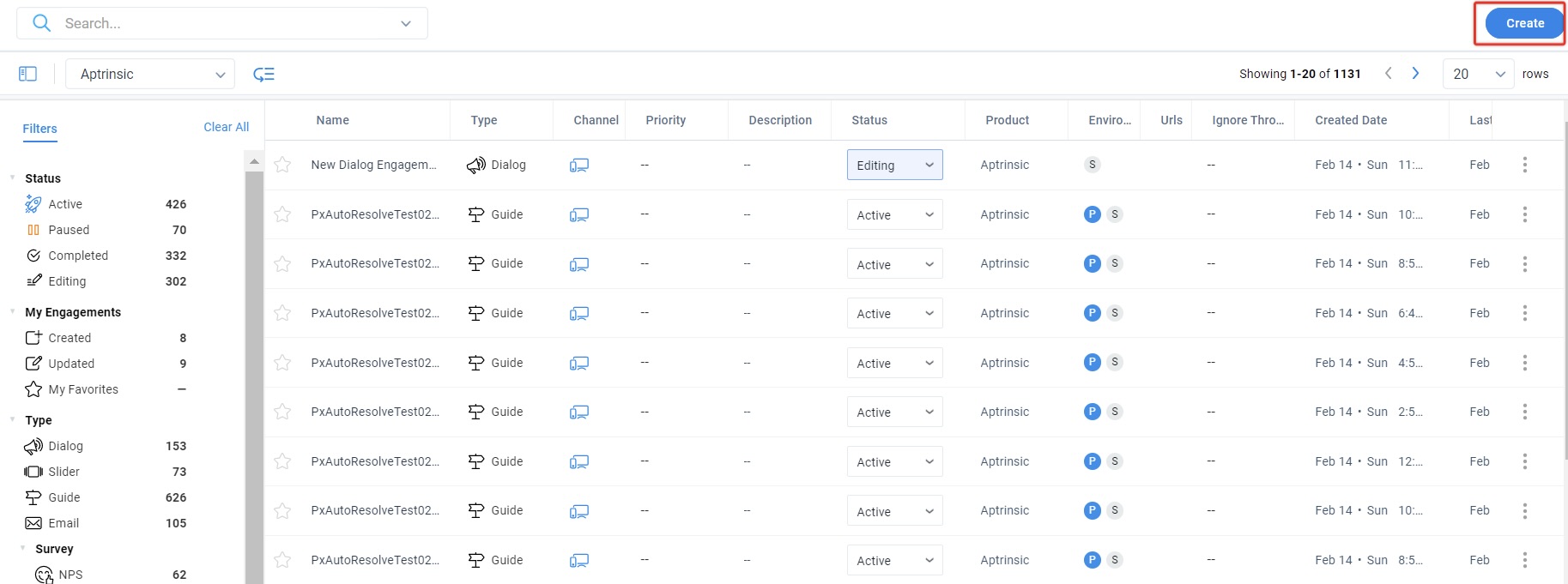
- Click Engagements from the left pane.
- Click Create.
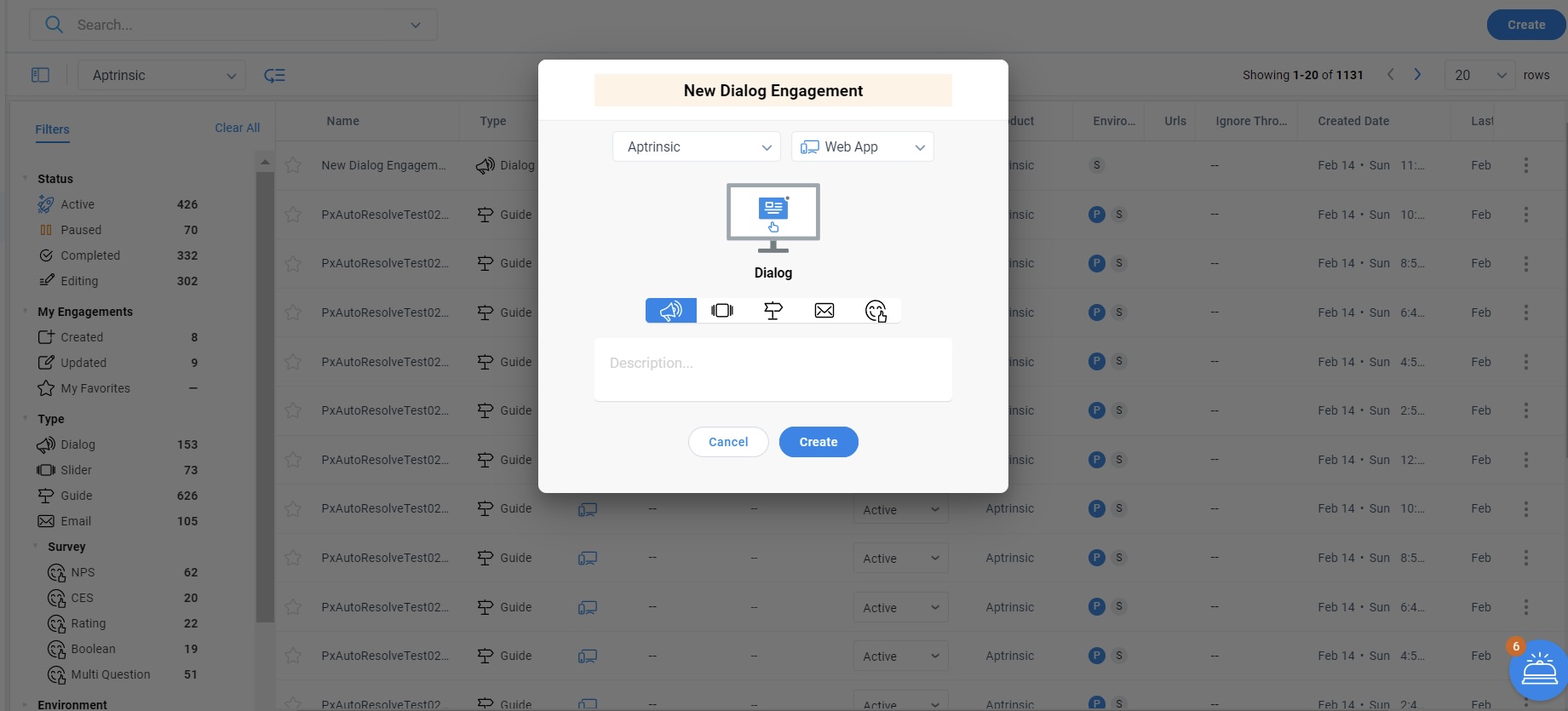
- Select an engagement type from the following options:
- Dialog
- Slider
- Guide
- Survey
- Enter the desired name for the engagement (Example: New Dialog Engagement) and Click Create.
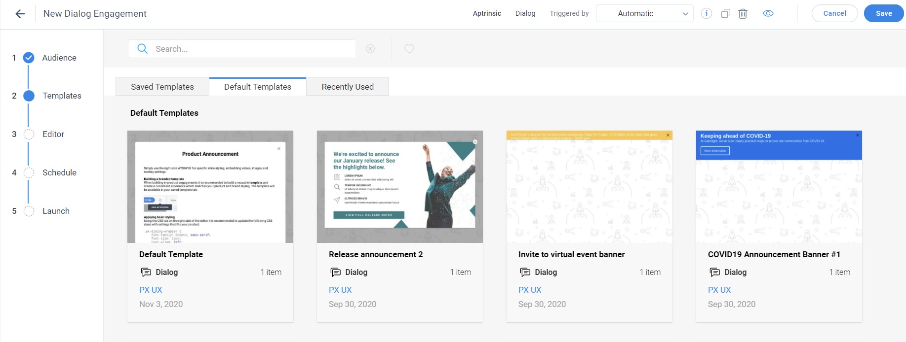
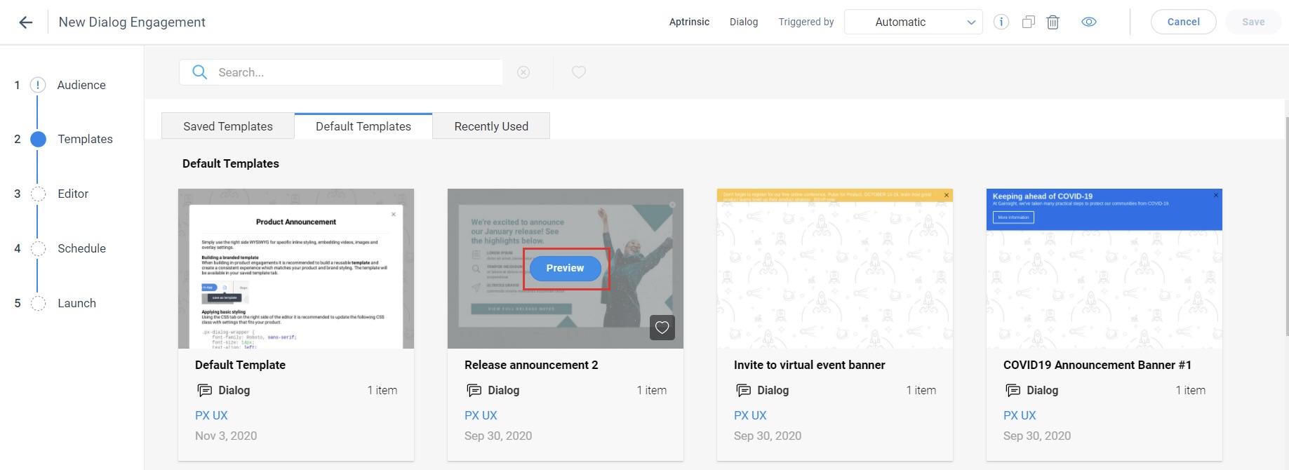
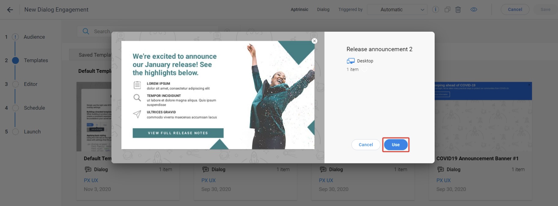
- Select the required template and click Preview.
- Select the required steps or select all the steps and then click Use to use the template in your engagement.
- Customize the template from the Editor page. Simply use the right side WYSIWYG for specific inline styling, embedding videos, images, and overlay settings.
-
From the Steps tab, click the + icon and select the required option from the drop-down menu to create responsive content for different device types (Computer/Mobile/Tablet).
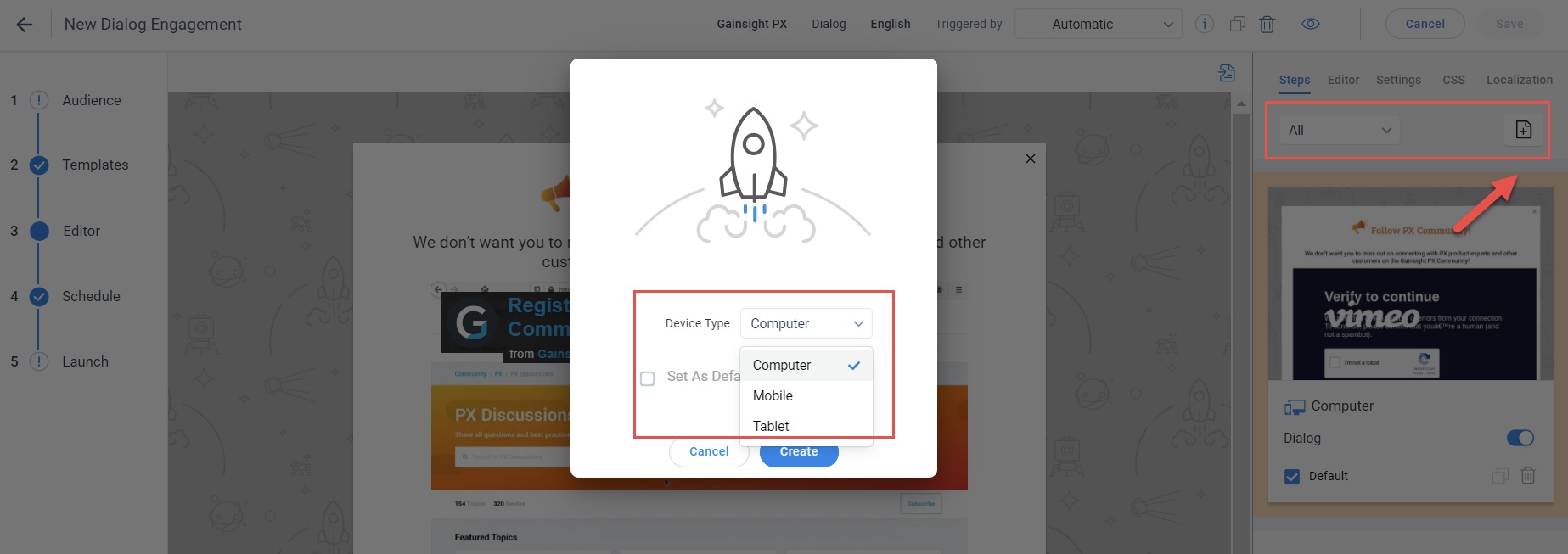
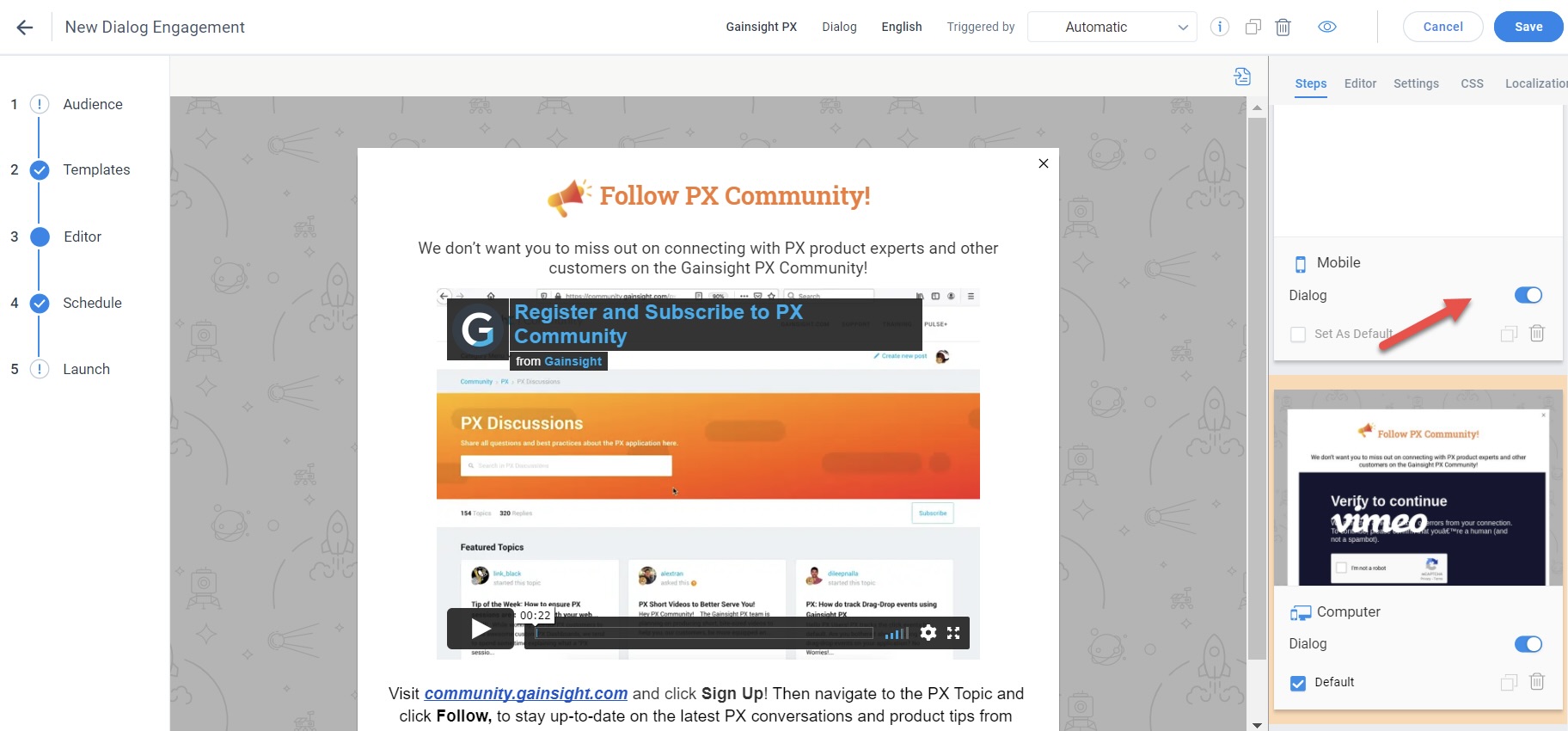
- Use the toggle button to have the control to display engagements for the required device type. For example, if you have created engagement to display both on computer and mobile but later decided to display only on the computer, you can just turn off the toggle button in the Mobile slide.
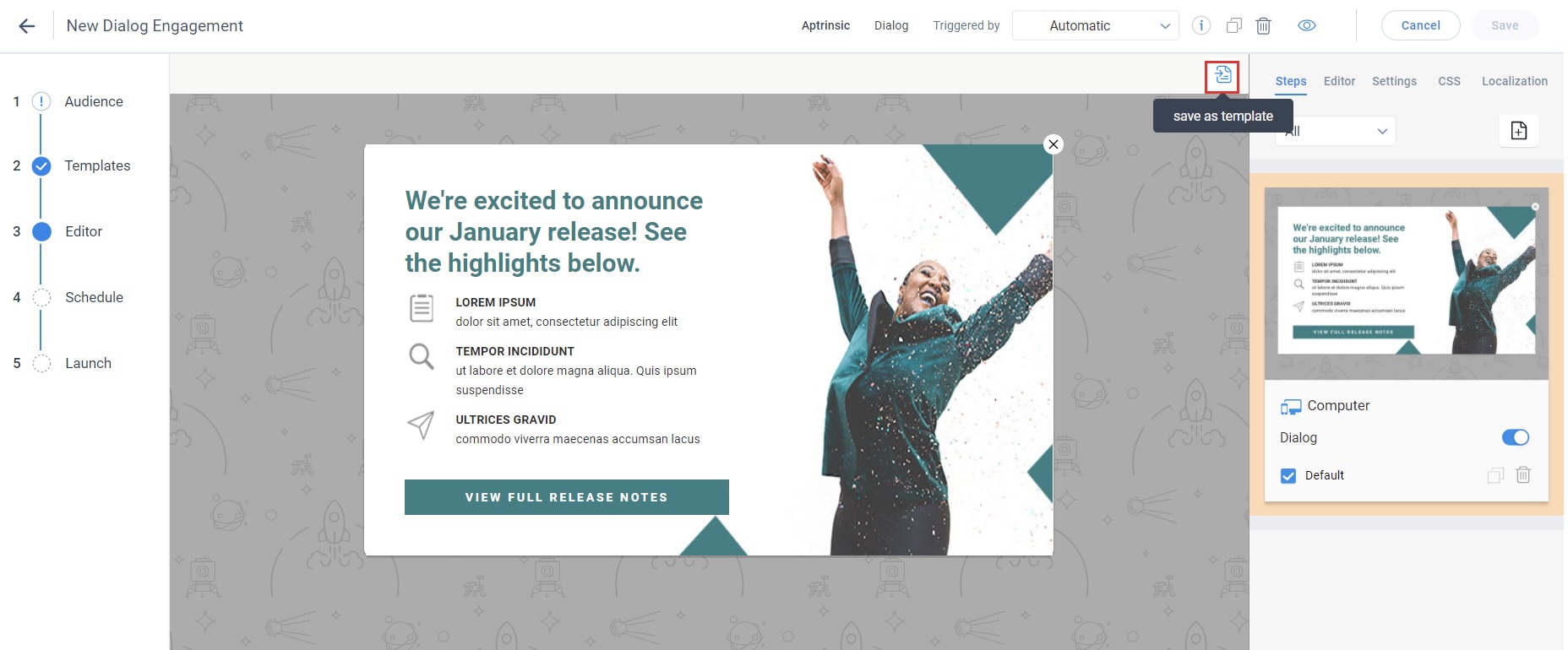
- Click the save as template button to save your personalized template to the Saved Templates tab.
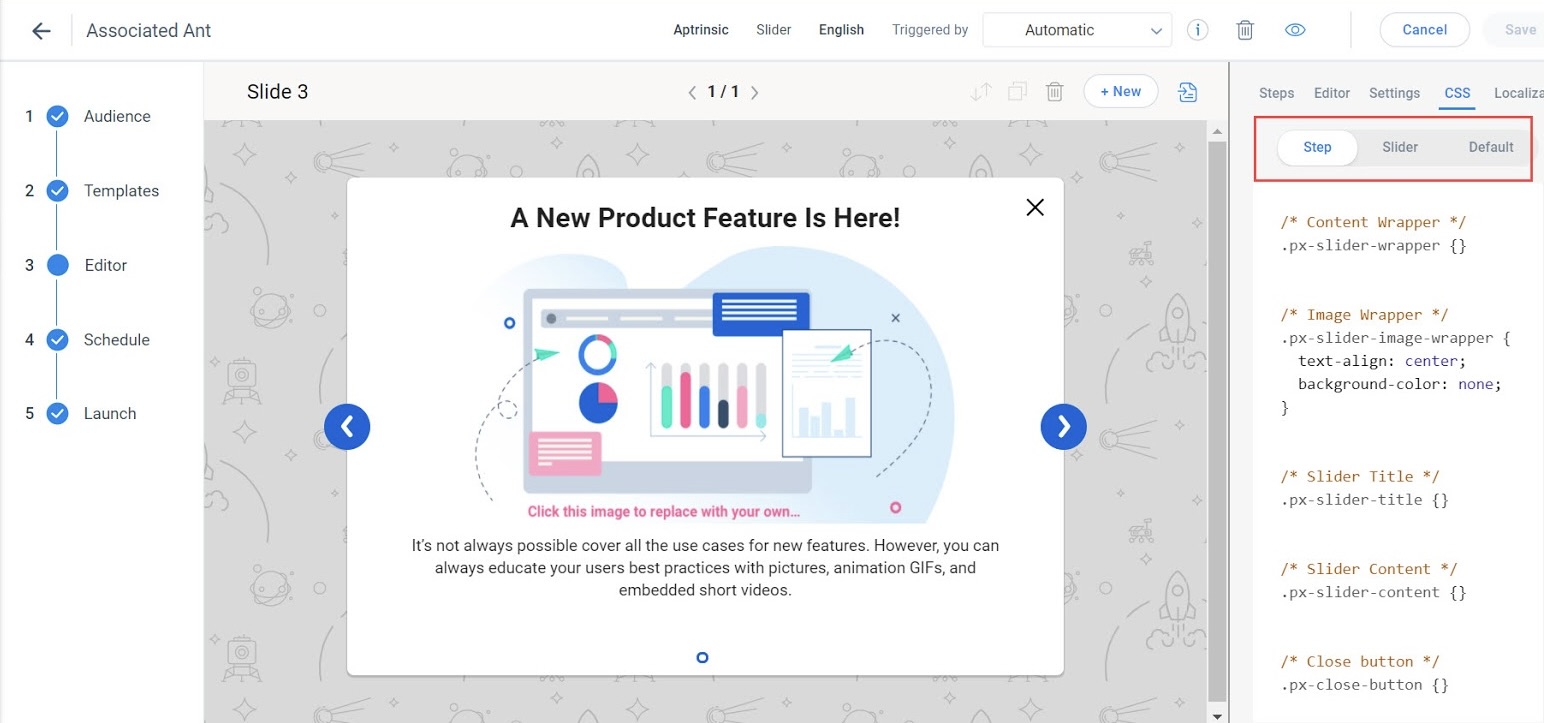
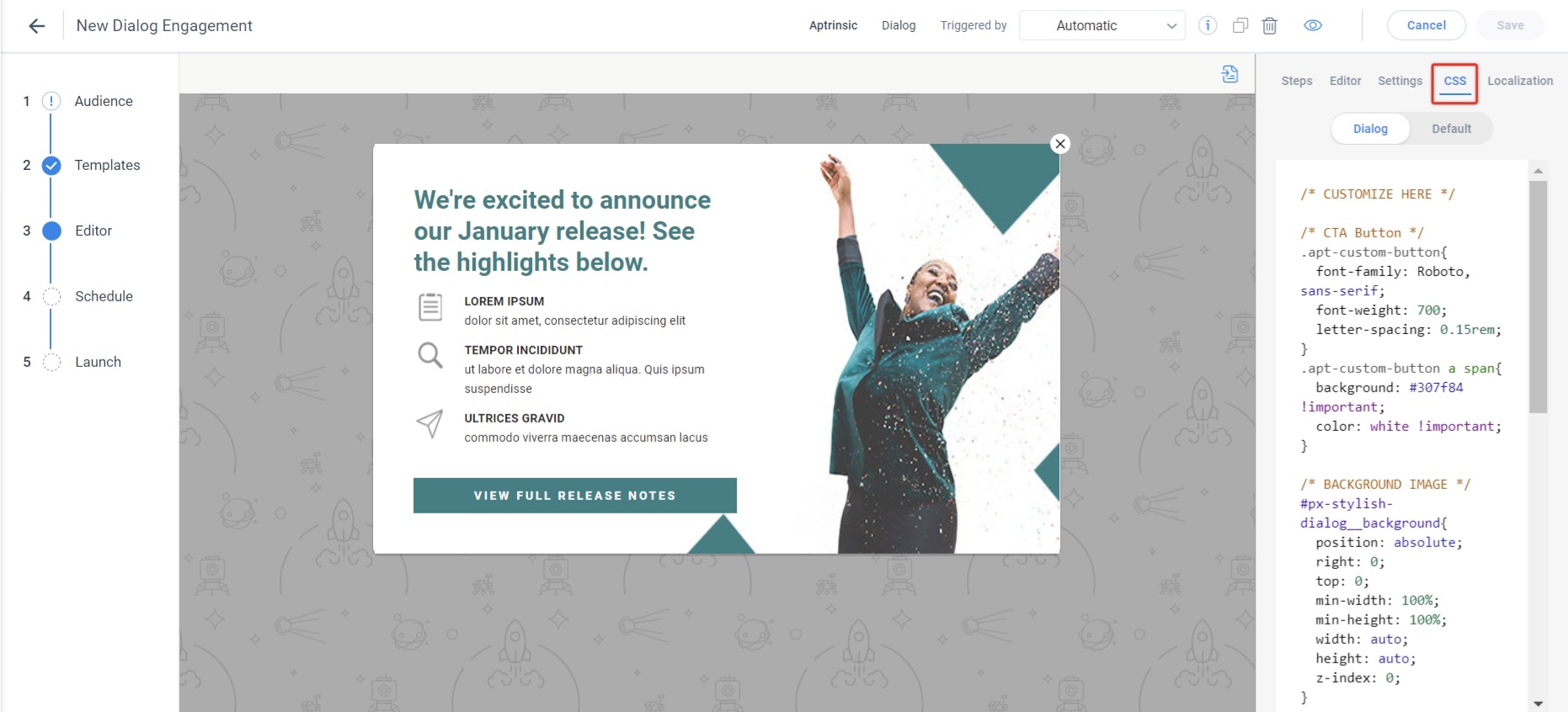
Configure CSS Styling
Using CSS is an effective way to apply default styling for an in-app engagement. CSS helps you control any UI element except in cases where the element uses an inline styling on the HTML element. Inline styling can be done via the WYSIWYG or via the HTML code. The CSS styling for an engagement can be managed through the editor. You can edit CSS content for each step of the Guide/Slider/Survey Engagements separately. This does not apply changes to the entire engagement. CSS tab allows you to visualize and edit the default CSS styling.
Following options are available for CSS styling:
- Default Styling: The default tab allows you to see a list of default rules pre-defined for the selected engagement type. Using the CSS tab on the right side of the editor it is recommended to update the following CSS class with settings that fit your product.
.px-dialog-wrapper {
    font-family: Roboto, sans-serif;
    font-size: 14px;
    text-align: left;
    color: #000;
    padding: 40px 40px 40px 40px;
    width: 100%;
}
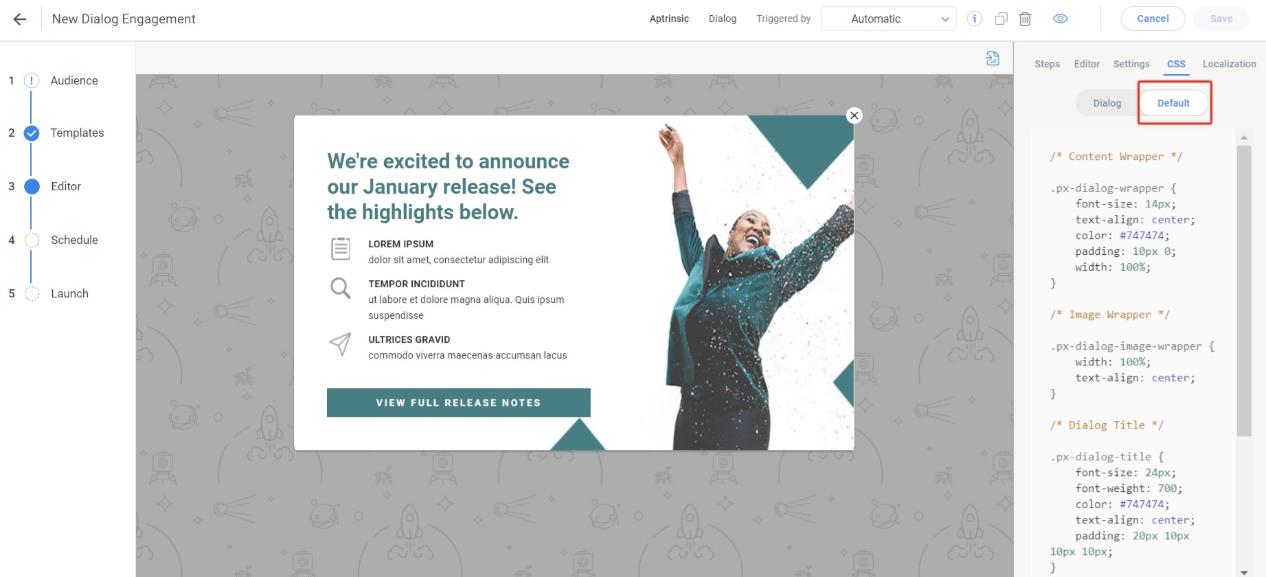
Note: The CSS in the default styling tab is not editable.
- Override Styling: using this feature, you can modify the existing default CSS style and can re-write your own CSS to customize engagements more easily to avoid a collision for different Data Object Model (DOM) elements in the engagement. The DOM elements are hidden and not visible in the user interface. You can perform the edits on Step and Engagement CSS tabs.
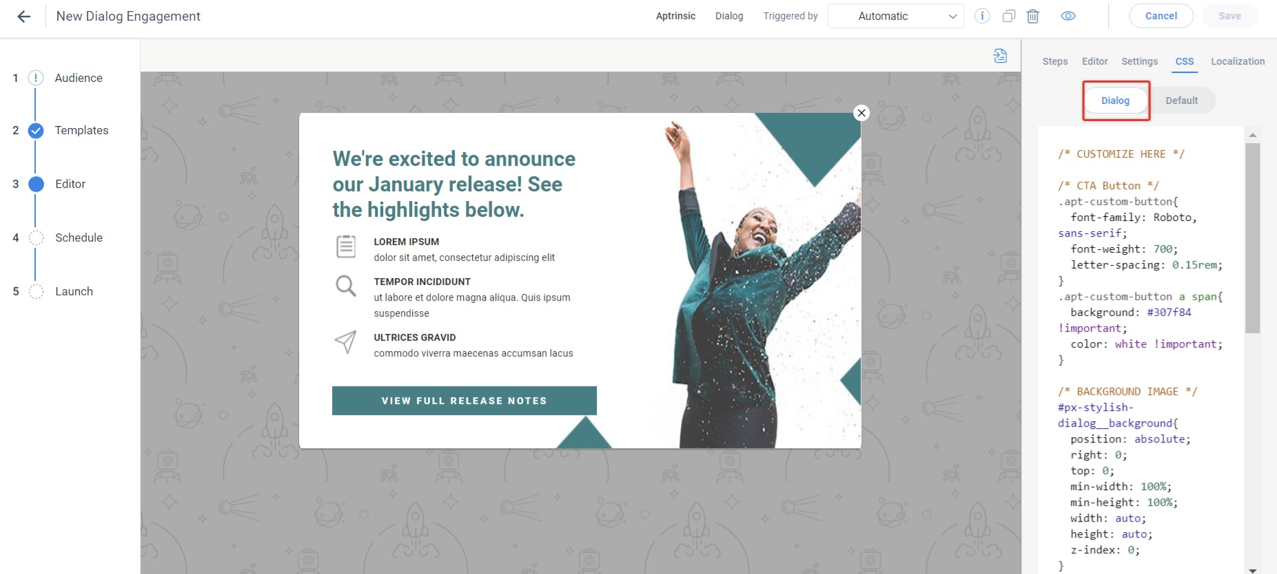
By default, engagements follow the CSS styling defined in the Default tab. Any custom CSS, detailed in the Engagement (Slider/Guide/Survey) CSS tab will override that styling. Step CSS is applicable for a particular step in an engagement guide, while the Engagement (Slider/Guide/Survey) CSS is applicable for all steps in the engagement.
IMPORTANT: The step CSS takes precedence over the engagement CSS. For example, in the engagement CSS if you set the content text color as Red, and in the step CSS you set the color as Blue, the text color is displayed in Blue.
Gainsight PX has a built-in CSS with styling class hierarchy. The following table lists the default classes available in PX Guide engagements. You can modify these classes or add your own classes in the Engagement (Guide tab) CSS editor.
| Class Name | Description |
|---|---|
| Dialog (Default Template) | |
|
.px-dialog-wrapper |
A wrapper class for any dialog, and a dialog slider in a slider. |
| .px-dialog-image-wrapper | A wrapper class for images inserted into a dialog. |
| .px-dialog-title | A class that styles the heading of a dialog. |
| .px-dialog-content | A class that styles the body content of a dialog. |
| .px-start-guide-dialog | A sub-class in case the first dialog in a guide needs to have different settings. |
| .px-end-guide-dialog | A sub-class in case the last dialog in a guide needs to have different settings. |
| Tooltip (in Guide engagement) | |
|
.px-tooltip-title-wrapper |
Tooltip title section which can also be configured show/hide via the WYSIWYG. |
| .px-tooltip-content-wrapper | Tooltip content section which is mandatory. |
| Dialog/Guide Navigation | |
|
.px-step-navigation |
The bottom part of the guide step. |
| .px-step-navigation-buttons | The buttons container (space around the buttons), not the actual buttons themselves. |
| .px-start-guide-dialog .px-step-navigation-buttons | First dialog step navigation button group. |
| .px-start-guide-dialog .px-step-navigation-next | Next/Start action button |
| .px-start-guide-dialog .px-step-navigation-next:hover | Changes the style of the next button when the user hovers over it. |
| .px-start-guide-dialog .px-step-navigation-skip | “Skip” button - which has different functionality from the “Next” button. |
| .px-end-guide-dialog .px-step-navigation-buttons | End step navigation |
| .px-end-guide-dialog .px-step-navigation-next | Next/Start action button - marks the engagement as COMPLETED. |
| .px-step-navigation-snooze | Snooze button, allows you to change the formatting of the snooze button. |
| .px-end-guide-dialog .px-step-navigation-next:hover | Changes the style of the next button when the user hovers over it. |
| Tooltip Navigation | |
|
.px-tooltip-container .px-step-navigation-next |
Changes the style of the next button in a tooltip. |
| .px-tooltip-container .px-step-navigation-next:hover | Changes the style of the next button in a tooltip when the user hovers over it. |
| .px-step-navigation-back | Changes the style of the back button in a tooltip. |
| .px-step-navigation-back:hover | Changes the style of the back button in a tooltip when the user hovers over it. |
| Global | |
|
.px-close-button |
Styles the “x” close button for dialogs, sliders, guides. |
| .px-step-numbers | Numbers that identify “1 of 5” for example, indicating the user’s progress through an engagement. |
| .px-start-guide-dialog .px-step-numbers |
To hide step numbers in the the pening step use: { display:none; visibility:hidden; height:0px; } |
| .apt-custom-button | Apply custom settings to button creation. |
| Dialog with a table (based on PX template) | Use a table to divide your dialog into equal parts. |
| .px-table | Wrapper for the entire table. |
| .px-tbody | Second wrapper for the entire table. |
| .px-table-left | Left column of your table. |
| .px-table-right | Right column of your table. |
Edit CSS
You customize default styling by editing the Step and Engagement CSS details.
- Step CSS: View and edit the CSS for each step of the Guide/Slider/Survey Engagements separately. This enhancement is particularly useful if you want the CSS edits to affect only a certain step and not the entire engagement.
- Engagement CSS: View and edit the CSS for the entire engagement within a single tab.
Note: The step CSS takes precedence over the engagement CSS. For example, in the engagement CSS if you set the content text color as Red, and in the step CSS you set the color as Blue then the step CSS overrides the engagement CSS and the text color is displayed in Blue.
To edit CSS level of an engagement, perform the following steps:
- Click CSS tab. By default, you can see the pre-defined style in this tab.
- Select the CSS you want to edit, as required. For example: if you want to modify the content text alignment or font size, you need to set it on “.apt-carousel-content” as shown below.
.apt-carousel-title {
   color: #747474;s
   text-align: *right*;
Note: CSS properties can be modified only on new slides. The properties cannot be changed on Saved/Default/Recently Used templates.
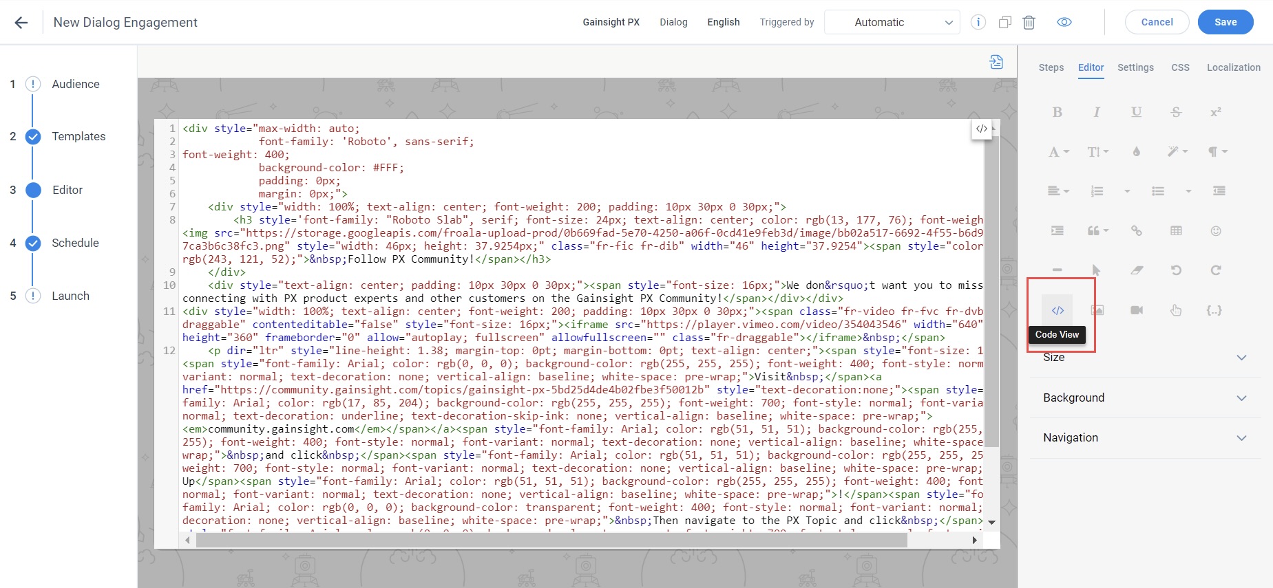
- Additionally, you can add classes in the HTML editor by clicking Code View. Click the Code View button again to exit the HTML editor.
- Click Save.