Report Settings and Advanced Options
Gainsight NXT
Overview
This article focuses on the settings and advanced options available in the Report Builder. Before you get into this document, Gainsight recommends you to see How to Build Basic Reports article to understand the overview of the reporting functionality.
Aggregation
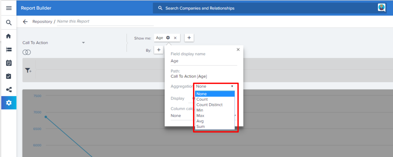
Once the fields have been added to Show Me, you will be able to choose aggregations. But, when you add a field to the By section, all the fields in Show Me are aggregated. The default aggregation is dependent on the field type. Text fields are automatically set to Count, and numeric fields are automatically set to Sum. Aggregation options for each data type include:
- String/Text: Count, Count Distinct
- Numeric: Count, Count Distinct, Min, Max, Avg, Sum
- Boolean: Count
- Date: Count, Count Distinct, Min, Max
- DateTime: Count, Count Distinct, Min, Max
Note: When you add a Date field to Show Me section and have applied a Min/Max function, with a field in By section. You can only see the tabular report, but not the other visualization types. This behavior is applicable for MDA Objects and for SFDC objects, you will not see the Min/Max function on the Date Fields added to Show Me.
Set Column Calculations for Individual Columns
Add Column Calculated Function values (column aggregates) to tabular reports. In the report builder, for any numeric field in a tabular report, admins can set aggregations (Sum, Avg, Median) for individual columns.
To set column totals:
- Click the Settings/Gear icon on the field.
- Select the required aggregation from the Column calculations dropdown list. For example, you can select Sum, Average, or Median option (function) to appear in the column totals.
![2. Sumavgmed [2].png](https://support.gainsight.com/@api/deki/files/8896/2._Sumavgmed_%255B2%255D.png?revision=1)
The column aggregate values will display in reports on the Customer360, Gainsight Dashboards, and Success Snapshots, but are not available in CSV exports.
![3. sum final [2].png](https://support.gainsight.com/@api/deki/files/8897/3._sum_final_%255B2%255D.png?revision=1)
Limitations:
- Column Calculated Function values are not supported for Pivot reports that are visualized in Tabular format or any other chart visualization. Additionally, this feature is not supported when you export such reports using a CSV or Excel sheet.
- Works only with Tabular reports.
- Column Calculations is not dynamic with respect to Column Search. This means, the Column Total value either Sum or Average or Median will not update automatically if the column search is used to filter records.
- Displays Column Calculated Function values for records up to the limit that is set in the Tenant Management.
- Column Totals don’t display Currency symbols in the exported reports.
- Column Calculations on Currency fields will not work if Multi Currency is enabled in your org.
Row Grouping
Row Grouping in Reporting allows you to visually group the rows/records in a report by a dimension type field without aggregating all the other fields.
Row Grouping feature is visible when you click the gear icon on the dimension type fields added to Show me and By.
You can enable row grouping on the following dimension data types:
- String
- Boolean
- Picklist
- Date
To enable Row Grouping:
- Click on the existing report name to edit a report (or) Click + REPORT to create a new report.
- Add the required fields to Show Me or By.
- Click the Settings/Gear icon on the required dimension type field.
- Switch ON the Enable Row Grouping toggle button.
- Click RUN. You will see the visual hierarchy of the Company and its details grouped by Stage Name.
You can minimize and maximize the records in each group by clicking Minus (-) and Plus (+) icons respectively. You can use the - and + on the top left to minimize all the groups in the table.
Notes:
- If you have enabled the Column total for any of the fields, you will see the Sum Total at the end of each group.
- You can export the row grouped tables via Excel Exports, Success Snapshots and Dashboard PPT exports.
- The number of records and the column totals displayed for each group are calculated for all the data in the group, and not just the records visible on the current page.
- Assume, your records are displayed in two pages because of pagination. Minimize action only minimizes the records on the current page. It does not bring the data forward from the next page.
- Row grouped tabular reports are enabled with Server side search, where you can search for the records on the entire dataset in the Server side and not just from the data available on the UI/browser.
Limitations:
- You can apply row grouping only on one field at a time. Assume, you have applied row grouping on Field 1, and if you try applying again on Field 2, the row grouping applied on Field 1 automatically gets disabled.
- Once you enable row grouping, the pivot gets auto-disabled.
- Row grouping is not supported in CSV exports.
- Row grouped reports are not visible in Sally and Journey Orchestrator.
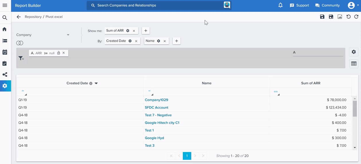
Pivot
Pivot feature is visible when you click the gear icon on the By fields, and you can see this option only when you have a minimum of two fields in the By section. You can apply pivot only on one field at a time. For more information on how to create Pivot tables within data that has been exported from Gainsight as an excel document, refer to Microsoft tutorial Create a Pivot Table to analyze worksheet data.
You can pivot reports on the entire dataset from the server-side. There is no row limit for pivoted reports.
Note: The maximum number of pivoted columns visible in a report is 53.
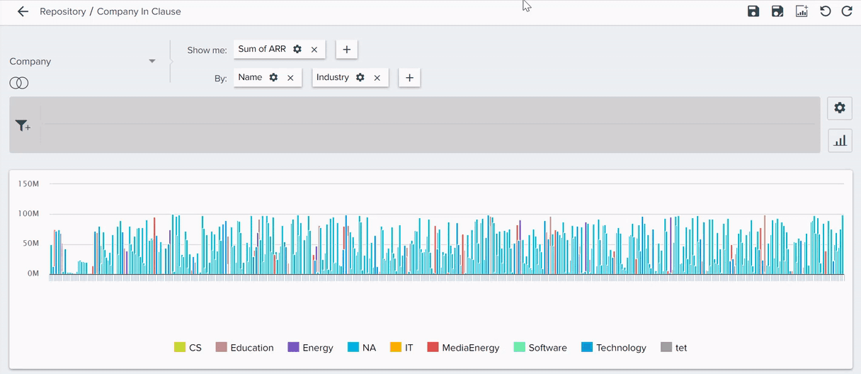
Use Case: For example, when you create a report on Company, and pivot by Created Date. You will see that Created Date changes from Rows to Columns.
Limitations:
- You cannot Pivot the reports on which ranking is applied.
- You cannot apply Ranking on pivoted reports.
- You cannot apply Pivot on Row Grouped reports.
- Column Search on the pivoted tabular reports will search for the records only from the browser, and other tabular reports will have server side.
- Pivoted reports can no longer retain the column width preferences set by the admin/user.
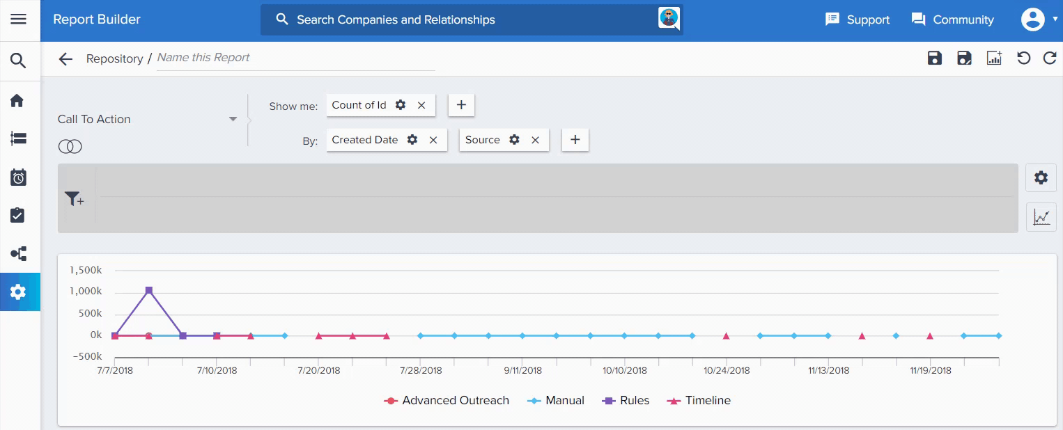
Configure Drill Downs
To Configure Drill down:
- Click on any point in a graph or widget to see a drill down of the data associated with that data point.
- Once you are in the drill down page, click the three dots on the top right to see the list of available fields.
- You can add or remove the fields from the table. Select the required fields to add.
- Click Apply after you have made your selections.
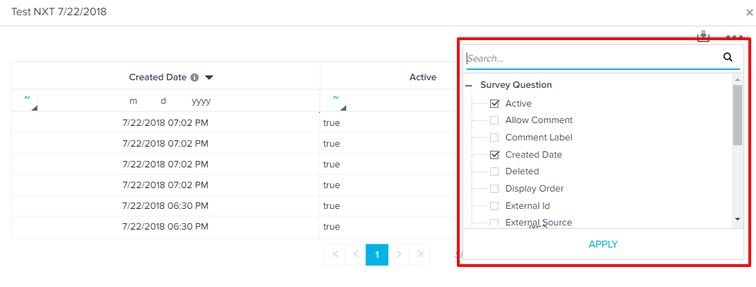
The drill down table will display your selections when users click on a data point on the graph. You can even control the order of the columns in a drill down view.
You can change the column order in the drill down reports and can persist the newly changed order, even after saving the report.
You can download an Excel sheet report using the download icon. And, if you wish to save the changes you made, click Save.
Note: Reports containing more than tenant read limit number of records, will export in CSV format.
Ranking
Ranking would be used if you only want to include Top x or Bottom x records based on a particular field in the report.
Note: You can also sort the order for Tabular reports, even after applying Ranking.
To configure Ranking:
- Click the Settings/Gear icon.
- Select Ranking.
- Select the field that you’d like to rank your report on and set Top x or Bottom x based on your requirement and click APPLY.
Click X on the upper right corner, to close the Ranking Window.
If you want to remove the previously applied “Ranking”:
- Click the Settings/Gear icon.
- Select Ranking.
- Click CLEAR.
Other Settings
Export Scorecard Mass Edit Reports
Admins can export scorecard mass edit reports as CSV files from the Report Builder and also from Dashboards.
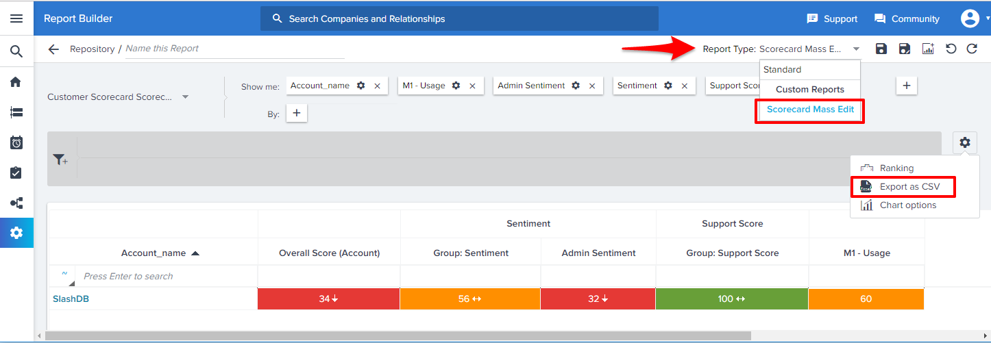
- Navigate to Administration > Report Builder.
- Select Scorecard Fact as the data source.
- Select the Scorecard Mass Edit option from the Report Type drop-down list.
- Click the Settings/Gear icon. You will see Export as CSV and Chart options.
-
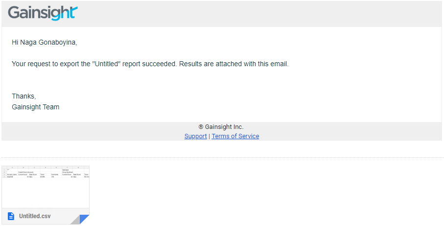
Click the Export as CSV option to export all of the selected features with/without group in the Show me section. The scorecard will be emailed to the logged-in user. Refer the following image to see a sample email with the .csv file attached.
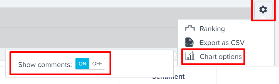
- Click Chart options and Switch ON the Show comments toggle button, as shown below.
Note: You can view the scorecard mass edit reports only in tabular visualizations.
Normalize Graph: Line Charts
For time series data represented by a line chart, you have the ability to normalize the graph.
To enable the Normalize option:
- Click the Settings/Gear icon.
- Click Chart options.
- Switch ON the Normalize toggle button, as shown below.
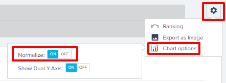
Before you turn ON the Normalize button, the line report displays the actual data points and their increases/decreases over time. After turning ON the Normalize button, the first value in the result represents the baseline or zero. Subsequent values represent the % of increase/decrease of the first value. Normalization allows you to figure out whether the values have been increasing/decreasing and by what % with reference to the first value.
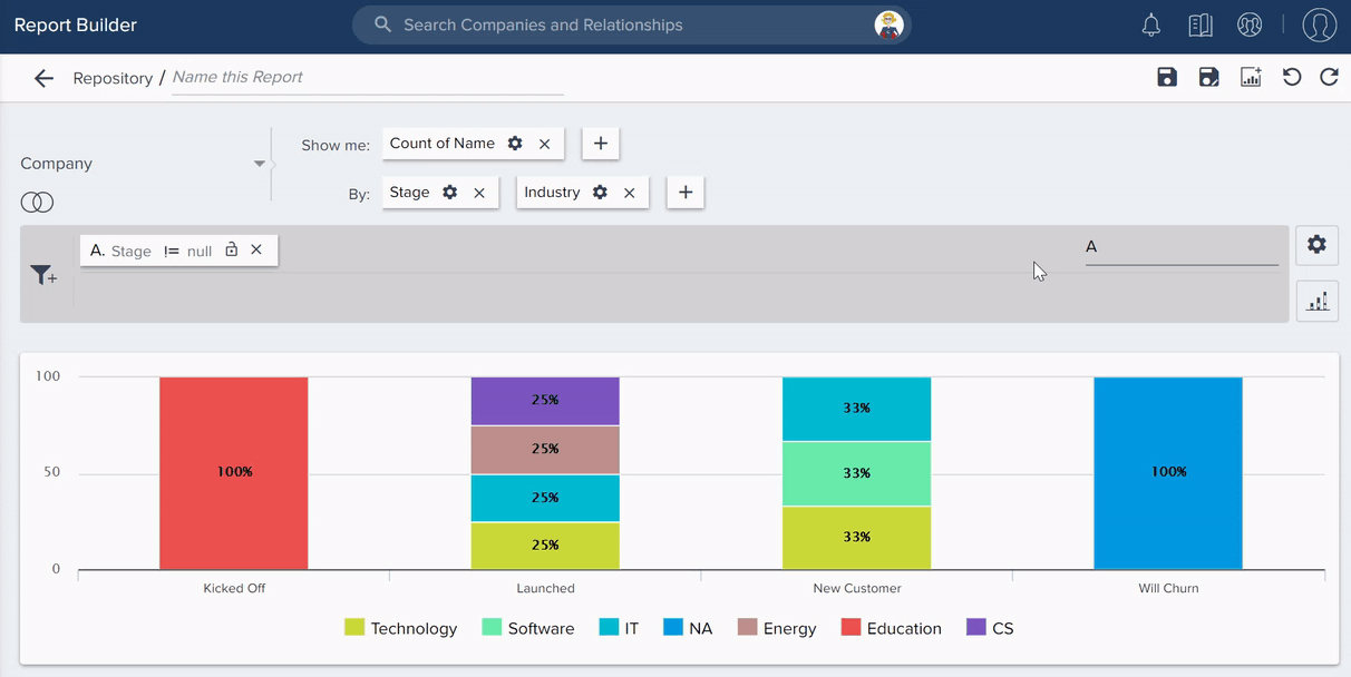
Show Percentages: Stacked Bar and Column Charts
For stacked bar and column charts with 2 fields in the By section, you have the ability to show bars/columns in percentages.
To enable the Show Percentage option:
- Click the Settings/Gear icon.
- Click Chart options.
- Switch ON the Show Percentage toggle button, as shown below.
Stacked bar/column charts are very useful when you want to compare the ratios across different segments, like CSM, Region, or Quarter, etc.
Limitation: Stacked Bar/Column charts will not display the visual data points (Numbers) on the bar/column, if the percentage is below 15.
Cumulative Data
For Line, Area, Bar and Column charts, you have the ability to Show the Cumulative data. You can switch ON the Show Cumulative toggle button, if you want to visualize the cumulative data. This functionality adds the present data to the previous data. For example, if your monthly revenue for the month of October, 2018 was $20000 and the monthly revenue for the month of December, 2018 was $40000, the visualization chart displays the December, 2018 revenue as $60000.
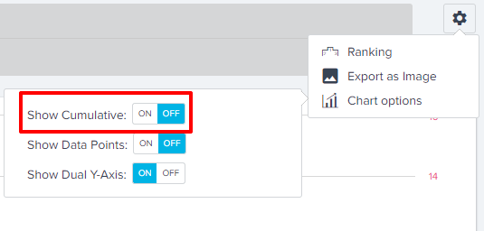
To enable the Show Cumulative option:
- Click the Settings/Gear icon.
- Click Chart options.
- Switch ON the Show Cumulative toggle button, as shown below.
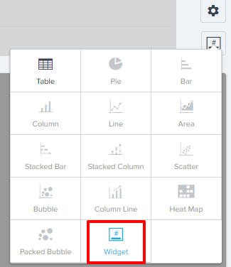
Summary Widget
Under Visualization type, there is a new Widget option. Widgets work with 1 field in Show me, no fields in By, and when an aggregation is selected on the Show me field. You can save these reports and add them to a dashboard as a widget. You may display up to four widgets per horizontal row in Dashboard containers.
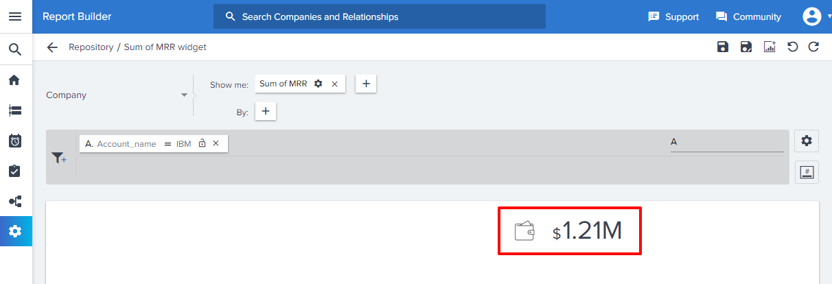
For example, you can generate a report on the Monthly Recurring Revenue for a particular company and use the Widget visualization, as shown in the below image. You can save widget reports and use them in a Dashboard as a Widget. Values in the widgets will change dynamically based on end-user filtering in Dashboards.
Notes:
- You can export a dashboard that contains a widget report.
- You cannot directly export a report that contains a widget. But, you can click the number on the widget and export the drilldown table.
Freeze First Column in Tabular Report
In Report Builder, the first column in a tabular report can be frozen, using the option Freeze First Column option. This feature is useful when you have many fields in the Show me section, and while you scroll to the right, to view all of the columns in the report and you want the first column to remain visible.
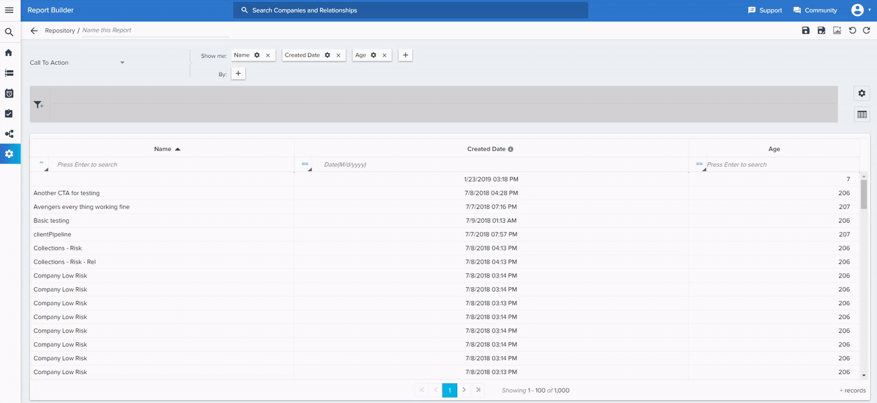
Search Tabular Reports in all Consumption Areas
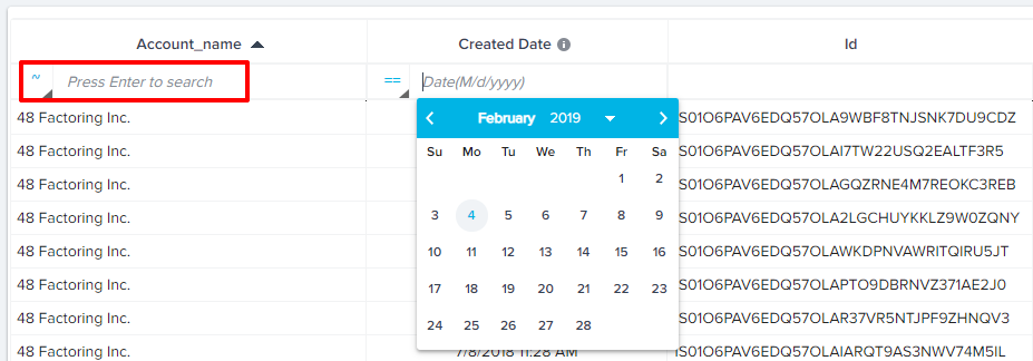
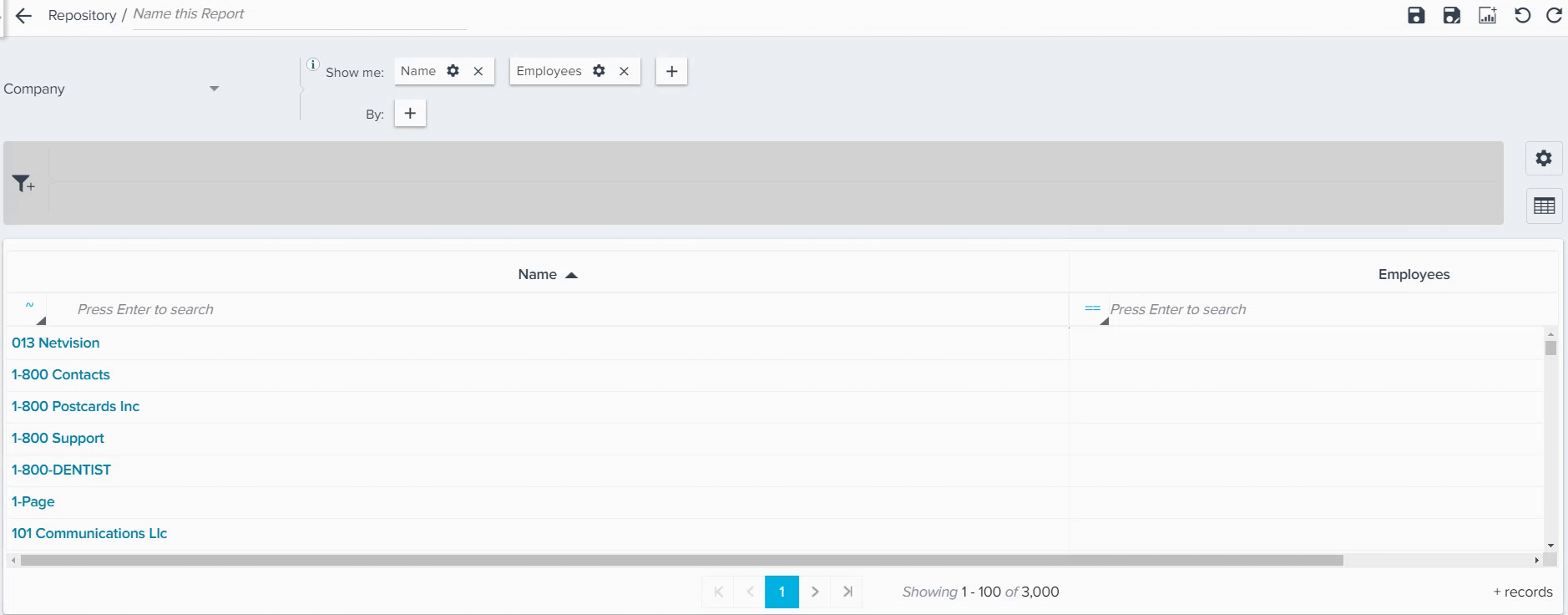
In all tabular reports, Gainsight provides support to search for any record within a report that has more than Tenant Read limit number of records. Lookup, Richtext, or Picklist will be obtained from the entire dataset and not from the data available. The search result will be displayed only upon pressing Enter after the search term is entered. (The following image shows the tooltip: ‘Press Enter to search’ on UI). If the report has fewer than 2000 rows, the search results displayed will be narrowed as you type each letter.
Note: If there are more than Tenant Read limit number of records, the date picker may be used if you selected the Date/DateTime data type fields in the Show me or By section.
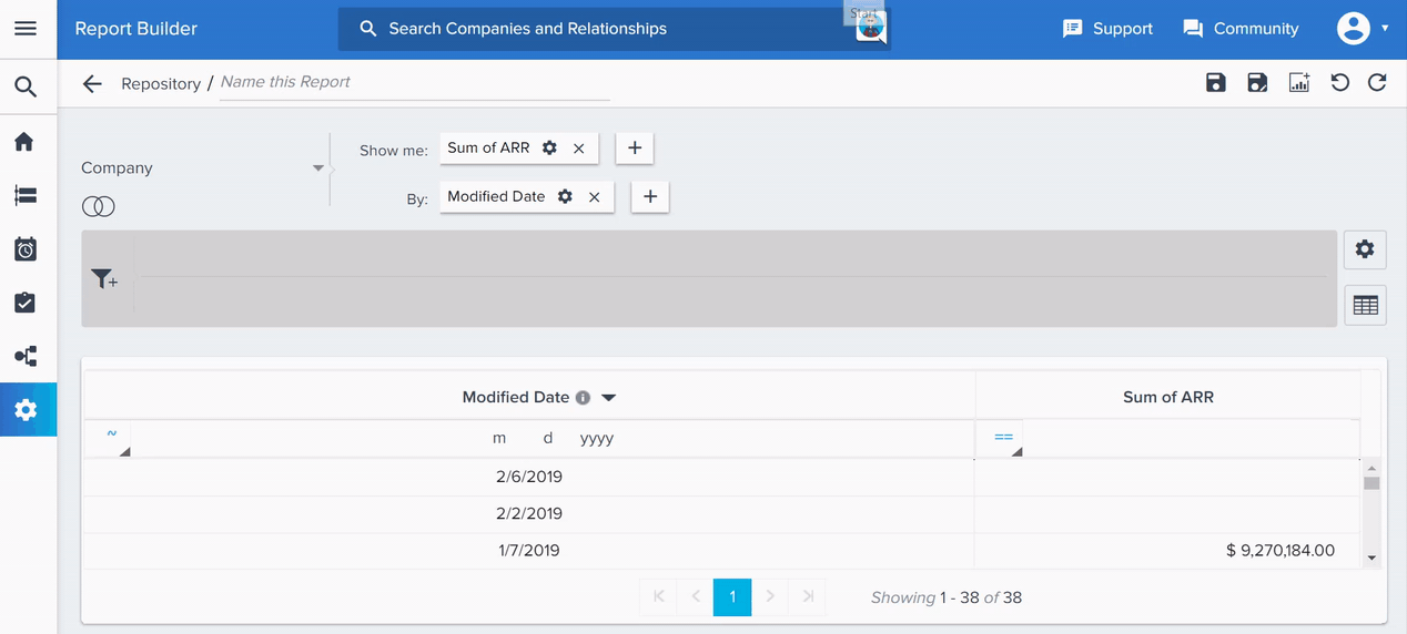
Sorting Tabular Reports in all Consumption Areas
In all tabular reports, Gainsight provides support to sort for records on the entire dataset and not just from the data available on the UI/browser.
Note: Server Side Sorting is also applicable for the reports in Drill Down view.
Limitation: Server Side Sorting is not applicable on Pivoted Reports.
Column Width Persistence for Tables and Drill Down Reports
In all the tabular and drill down reports, Gainsight provides the support to customize/set the column width, as per your preference. The reports will retain the new column width preferences set by the admin/user even after saving the report.
Limitation: For pivoted reports, column width persistence is allowed only on the non-pivoted columns.
Below are sample snapshots from Report and Drill Down pages:
Report Page View
Drill Down View