Email Template Best Practices
Gainsight NXT
Overview
This article walks you through some of the best practices to be followed while sending emails using Gainsight Email Templates. It also addresses the challenges faced while testing emails across different email platforms to ensure that your emails for customers are displayed exactly the way you intend.
Email marketing is still the most popular mode of communication to reach your customers. The most important part of successful email communication is a well-designed and attractive email template. In order to make emails look more attractive, users copy existing email templates into Journey Orchestrator and edit accordingly. This creates some issues because most email clients do not provide the same support for modern web standards as web browsers do and there are no email specific standards in place.
This discrepancy between different email clients is due to the Rendering engine. When an email client receives an email, it is a long wall of HTML code wrapped by CSS animation. A rendering engine creates a structure based on the code specified in the HTML and adds specific styling accordingly to the CSS. Any unnecessary code is stripped out and not rendered in the post-processing stage.
The following best practices must be followed while sending emails to avoid display problems:
- Always use the fonts in the email builder that is supported by the Gainsight email template. For more information on Gainsight supported fonts, refer to the Gainsight Supported Fonts section in this article.
- Avoid using background images or colors that match the font color of the text in the foreground.
- Always use inline Cascading Style Sheet (CSS).
- Code email using <table> instead of <div>.
- Test the email message in email clients before sending them.
Best Practices or Guidelines
The following are some of the best practices/guidelines to be followed while using Email Templates.
Fonts Compatibility
The fonts you choose should display as expected in the email builder and the web version of your email. But, they are displayed differently depending on the device and email client your recipients use. This is because not all devices have the same fonts, and not all email clients support web fonts.
For more information on the most commonly used fonts and their compatibility percentage with Windows and Mac platforms, refer to CSS Font Stack.
There are two types of fonts used when you build an email:
- System Fonts
- Web Fonts
System Fonts
System fonts are generally stored on the recipient's hard drive, and come with operating systems like Windows, iOS, and Android.
Web Fonts
Web fonts are generally loaded from the internet, instead of a recipient's device. So, they should display similarly everywhere as long as the recipient's email client supports them. Where a recipient's email client does not support web fonts, it depends on the available system fonts.
Note: If a recipient's device has a font with the same name as a web font, the device font is displayed instead of the web font, and may look different.
The following are some of the major email clients that support web fonts:
- Apple Mail
- iOS Mail
- Android's native email app (not Gmail)
- Outlook on Android and iOS
- Thunderbird
- Outlook for Mac
The following are some of the major email clients that do not support web fonts:
- Gmail / Gmail Mobile Apps
- Yahoo Mail
- Outlook
The following are some of the web fonts available for selection in the email builder, and the fallbacks provided if they do not load.
| Font | Fallback Order | Expected system font fallback if web fonts are not supported |
|---|---|---|
| Arvo | Museo Slab, Rockwell, Verdana, serif |
|
| Bitter | Lucida Bright, PT Serif, Georgia, serif |
|
| Cabin | Gill Sans MT, Gill Sans, Trebuchet MS, sans‑serif |
|
| Crete Round | PT Serif, Constantia, Georgia, serif |
|
| Droid Sans | Apple SD Gothic Neo, Segoe UI, DejaVu Sans, Trebuchet MS, sans‑serif |
|
| Hind | Corbel, Segoe UI, Avenir, sans‑serif |
|
| Karla | Calibri, Geneva, sans‑serif |
|
| Lato | Avenir, Adobe Heiti Std, Segoe UI, Trebuchet MS, sans‑serif |
|
| Lora | Palatino, Book Antiqua, Georgia, serif |
|
| Merriweather | DejaVu Serif, Georgia, serif |
|
| Montserrat | DejaVu Sans, Verdana, sans‑serif |
|
| Open Sans | Segoe UI, Apple SD Gothic Neo, Lucida Grande, Lucida Sans Unicode, sans‑serif |
|
| Oswald | Avenir Next Condensed, Arial Narrow, MS UI Gothic, sans‑serif |
|
| Playfair Display | Didot, Bodoni MT, Times New Roman, serif |
|
| Raleway | Trebuchet MS, Avenir, Segoe UI, sans‑serif |
|
| Roboto | Apple-system, BlinkMacSystemFont, Tahoma, sans‑serif |
|
| Roboto Condensed | Arial Narrow, Avenir Next Condensed, Roboto, sans‑serif |
|
| Source Sans Pro | Apple SD Gothic Neo, PT Sans, Trebuchet MS, sans‑serif |
|
For more information on the most commonly used fonts and their compatibility percentage with Windows and Mac platforms, refer to CSS Font Stack.
Gainsight Recommended Fonts
The following table lists the fonts that are recommended by Gainsight in the email builder, and their compatibility with different operating systems.
| Font | Fallback Order | Windows OS Compatibility | Mac OS Compatibility |
|---|---|---|---|
| Arial | sans-serif | 99.84% | 98.74% |
| Arial Black | sans-serif | 98.08% | 96.22% |
| Arial Narrow | sans-serif | 88.39% | 94.77% |
| Courier New | monospace | 99.73% | 95.68% |
| Georgia | serif | 99.4% | 97.48% |
| Tahoma | sans-serif | 99.95% | 91.71% |
| Times New Roman | serif | 99.67% | 97.48% |
| Trebuchet MS | sans-serif | 99.67% | 97.12% |
| Verdana | sans-serif | 99.84% | 99.1% |
Inline CSS
Ensure that you always keep your styles simple either by writing them inline or use a conversion tool. Gmail, in particular, does not support embedded or external CSS, and many clients only support the most basic formatting styles.
Images in Emails
Ensure that each image contains an “alt attribute” and try to avoid heavy design images to convey the message. Due to the existence of image blocking in most email clients, most recipients will see the email with images turned off.
The following are some of the checklist items to be considered while using images in email builder:
- Ensure that design for images is off.
- Always include Alt Attributes.
- Use images as GIF or JPEG files for best results.
- Set border attributes to 0.
- Add display style “block” or “inline-block” to images for preventing gaps under the images.
- Always include height and width attributes.
- Use absolute references rather than relative.
- Try to avoid background images.
- Use the align attribute for containers or images to align right, left, center.
Shorthand
In certain scenarios, unexpected results occur when developers use shorthand in HTML emails. To avoid this issue, always use the full six digits for HEX color codes instead of RGB colors and do not combine multiple CSS properties into a single shorthand.
Tables for Layout
Use tables to structure the layout of the email to avoid display issues because many email clients do not support CSS positioning, floats, and clears. Ensure that the user properly nests the tables and closes all open tags.
Test the Emails
Email clients are famous for making unannounced changes that affect the actual display of the intended email. Make a habit of testing every message in all the major clients before sending the email.
Mobile-Friendly Font Sizes
When designing a mobile email, you must ensure that it is easily readable with one eye. Using media queries to increase an email’s text size when it is viewed on a mobile device is one of the easiest things you can do to make an email better for readers. Guidelines for achieving minimum font size of 16px:
- Apple recommends 17 to 22px
- Google recommends 18 to 22px.
Gainsight Recommends
While a 14px font size is fine on a desktop, it can often be a struggle to read anything of that size on a small screen. We recommend a font size of at least 16px for main copy.
Usage of MS Word HTML files
Microsoft Word adds additional Microsoft Office specific markup tags that are not typically found in HTML files when HTML file saved using Microsoft Word. The additionally created code causes issues in many HTML editors because it cannot understand office-specific codes. Therefore, you might see only part of the HTML render properly, or you may not see anything at all.
Guidelines while using MS Word HTML
Best solution is to create HTML code using HTML editing applications such as Microsoft FrontPage or Adobe Dreamweaver. If the user-created HTML document using Microsoft Word, but have Adobe Dreamweaver installed, the user can clean out the extra HTML content using Dreamweaver's Clean Up Word HTML command after the affected HTML code has been opened in Dreamweaver.
Note: Procedure of cleaning Word HTML code may vary depending upon the Microsoft Word and Dreamweaver versions used.
Else, you can use the following filter options available while using Word while saving it as HTML:
- Microsoft Word 2000: If the document is created using Microsoft Word 2000, use Microsoft Office 2000’s filter tool for cleaning out the extra HTML code elements. This tool helps in filtering out the extra code elements added by Microsoft Word.
- Higher than Microsoft Word 2000: If the document is created using newer Microsoft Word (higher than 2000), use Web Page Filtered option from the Save as Type drop-down menu while saving the HTML file using the Save as Web Page option.
CSS Support in Email Clients
Each email client (Outlook 2007, Gmail, Yahoo, etc.) offers a different level of support for HTML and CSS. This makes designing an email template that looks good in all email across-clients is a daunting task. Fortunately, the Email Standards Project publishes reports on common clients.
Each email client renders email templates differently. Below are the details to find out the level of CSS support the most popular inbox clients support:
Browser
Styles and Links
| STYLE AND LINK | Outlook.com | Yahoo! | Gmail | AOL |
|---|---|---|---|---|
| <style> in <head> | Yes | Yes | Yes | Yes |
| <style> in <body> | Yes | Yes | No | Yes |
| <link> in <head> | No | No | No | No |
| <link> in <body> | No | No | No | No |
Element Selectors
| Element Selectors | Outlook.com | Yahoo! | Gmail | AOL |
|---|---|---|---|---|
| * | No | No | Yes | Yes |
| E | Yes | Yes | Yes | Yes |
| E[$attribute] | No | No | No | Yes |
| [$attribute="$val"] | No | No | No | Yes |
| E F | Yes | Yes | Yes | Yes |
| E > F | No | Yes | Yes | Yes |
| E + F | No | Yes | Yes | Yes |
| E - F | No | No | Yes | Yes |
| E:link | Yes | No | No | Yes |
| E:visited | Yes | Yes | No | No |
| E:active | Yes | Yes | No | No |
| E:hover | Yes | Yes | No | Only in WebMail |
| E:focus | No | No | No | No |
| E:target | No | No | No | No |
| E:nth-child(n) | No | No | No | Yes |
| E:nth-last-child(n) | No | No | No | Yes |
| E:nth-of-type(n) | No | No | No | Yes |
| E:nth-last-of-type(n) | No | No | No | Yes |
| E:first-child | No | No | No | Yes |
| E:last-child | No | No | No | Yes |
| E:first-of-type | No | No | No | Yes |
| E:last-of-type | No | No | No | Yes |
| E.classname | Yes | Yes | Yes | Yes |
| E#id | No | Yes | Yes | Yes |
| E:not(s) | No | No | No | Yes |
Box Model
| BOX MODEL | Outlook.com | Yahoo! | Gmail | AOL |
|---|---|---|---|---|
| border | Yes | Yes | Yes | Yes |
| border-radius [CSS3] | Yes | No | Yes | Yes |
| box-shadow [CSS3] | Yes | No | No | Yes |
| height | Yes | Yes | Yes | Yes |
| margin | No | Yes | Yes | Yes |
| padding | Yes | Yes | Yes | Yes |
| width | Yes | Yes | Yes | Yes |
| max-width | Partial | Yes | Partial | Partial |
| min-width | Partial | Yes | Partial | Partial |
Table
| TABLES | Outlook.com | Yahoo! | Gmail | AOL |
|---|---|---|---|---|
| border | Yes | Yes | Yes | Yes |
| border-spacing | Yes | Yes | Yes | Yes |
| caption-side | Yes | Yes | Yes | Yes |
| empty-cells | Yes | Yes | Yes | Yes |
| table-layout | Yes | Yes | Yes | Yes |
Fonts
| FONTS | Outlook.com | Yahoo! | Gmail | AOL |
|---|---|---|---|---|
| direction | Yes | Yes | Yes | Yes |
| font | Yes | Yes | Yes | Yes |
| font-family | Yes | Yes | Yes | Yes |
| font-style | Yes | Yes | Yes | Yes |
| font-variant | Yes | Yes | Yes | Yes |
| font-size | Yes | Yes | Yes | Yes |
| font-weight | Yes | Yes | Yes | Yes |
| letter-spacing | Yes | Yes | Yes | Yes |
| line-height | Yes | Yes | Yes | Yes |
| text-align | Yes | Yes | Yes | Yes |
| text-decoration | Yes | Yes | Yes | Yes |
| text-indent | Yes | Yes | Yes | Yes |
| text-overflow [CSS3] | Partial | Partial | Partial | Partial |
| text-shadow [CSS3] | Yes | Yes | No | No IE Support |
| text-transform | Yes | Yes | Yes | Yes |
| white-space | Yes | Yes | Yes | Yes |
| word-spacing | Yes | Yes | Yes | Yes |
| word-wrap [CSS3] | Yes | Yes | Yes | Yes |
| vertical-align | Yes | Yes | Yes | Yes |
Color and Background
| COLOR & BG | Outlook.com | Yahoo! | Gmail | AOL |
|---|---|---|---|---|
| color | Yes | Yes | Yes | Yes |
| background | No img Support | Yes | Yes | Yes |
| background-color | Yes | Yes | Yes | Yes |
| Background-image | Yes | Yes | Yes | Yes |
| Background-position | No | Yes | Yes | Yes |
| Background-repeat | No | Yes | Yes | Yes |
| HSLA Colors [CSS3] | No | No | No | No IE Support |
| Opacity [CSS3] | Yes | No | No | No IE Support |
| RGBA Colors [CSS3] | No | No | No | No IE Support |
Position and Display
| POSITION & DISPLAY | Outlook.com | Yahoo! | Gmail | AOL |
|---|---|---|---|---|
| bottom | Yes | No | No | Yes |
| clear | Yes | Yes | Yes | Yes |
| clip | No | No | No | Yes |
| cursor | Yes | Yes | No | Yes |
| display | Yes | Yes | Yes | Yes |
| float | No | Yes | Yes | Yes |
| left | No | No | No | Yes |
| opacity | Yes | No | Yes | Yes |
| outline [CSS3] | Partial | Partial | Partial | Partial |
| overflow | Partial | Yes | Partial | Yes |
| position | Yes | No | No | Yes |
| resize [CSS3] | Yes | Yes | No | Yes |
| right | Yes | No | No | Yes |
| top | Yes | No | No | Yes |
| visibility | Yes | Yes | No | Yes |
| z-index | Yes | Yes | Yes | Yes |
Lists
| LISTS | Outlook.com | Yahoo! | Gmail | AOL |
|---|---|---|---|---|
| list-style-image | No | Yes | No | Yes |
| list-style-position | No | Yes | Yes | Yes |
| list-style-type | Yes | Yes | Yes | Yes |
Desktop
Styles and Links
| STYLE AND LINK | Outlook '07-'13 | Outlook '00-'03 | Apple Mail | Windows Live | Outlook for Mac |
|---|---|---|---|---|---|
| <style> in <head> | Yes | Yes | Yes | Yes | Yes |
| <style> in <body> | Yes | Yes | Yes | No | Yes |
| <link> in <head> | Yes | Yes | Yes | No | Yes |
| <link> in <body> | Yes | Yes | Yes | No | Yes |
Element Selectors
| Element Selectors | Outlook '07-'13 | Outlook '00-'03 | Apple Mail | Windows Live | Outlook for Mac |
|---|---|---|---|---|---|
| * | No | Yes | Yes | Yes | Yes |
| E | Yes | Yes | Yes | Yes | Yes |
| E[$attribute] | No | No | Yes | Yes | Yes |
| [$attribute="$val"] | No | Yes | Yes | Yes | Yes |
| E F | Yes | Yes | Yes | Yes | Yes |
| E > F | No | No | Yes | Yes | Yes |
| E + F | No | Yes | Yes | Yes | Yes |
| E - F | No | Yes | Yes | Yes | Yes |
| E:link | Yes | Yes | Yes | Yes | Yes |
| E:visited | No | Yes | Yes | Yes | Yes |
| E:active | No | Yes | Yes | Yes | Yes |
| E:hover | No | Yes | Yes | Yes | Yes |
| E:focus | No | No | Yes | No | No |
| E:target | No | No | No | No | No |
| E:nth-child(n) | No | No | Yes | No | Yes |
| E:nth-last-child(n) | No | No | Yes | No | Yes |
| E:nth-of-type(n) | No | No | Yes | No | Yes |
| E:nth-last-of-type(n) | No | No | Yes | No | Yes |
| E:first-child | No | Yes | Yes | Yes | Yes |
| E:last-child | No | No | Yes | No | Yes |
| E:first-of-type | No | No | Yes | No | Yes |
| E:last-of-type | No | Yes | Yes | No | Yes |
| E:first-line | No | Yes | Yes | No | Yes |
| E:first-letter | No | No | Yes | No | Yes |
| E:before | No | No | Yes | No | Yes |
| E:after | No | Yes | Yes | No | Yes |
| E.classname | Yes | Yes | Yes | Yes | Yes |
| E#id | Yes | Yes | Yes | Yes | Yes |
| E:not(s) | No | No | Yes | No | Yes |
Box Model
| BOX MODEL | Outlook '07-'13 | Outlook '00-'03 | Apple Mail | Windows Live | Outlook for Mac |
|---|---|---|---|---|---|
| border | Yes | Yes | Yes | Yes | Yes |
| border-radius [CSS3] | No | No | No | Yes | Yes |
| box-shadow [CSS3] | No | No | Yes | No | No |
| height | No | Yes | Yes | Yes | Yes |
| margin | Yes | Yes | Yes | Yes | Yes |
| padding | Partial | Yes | Yes | Yes | Yes |
| width | Yes | Yes | Yes | Yes | Yes |
| max-width | No | No | Yes | Partial | Partial |
| min-width | No | No | Yes | Partial | Partial |
Table
| TABLES | Outlook '07-'13 | Outlook '00-'03 | Apple Mail | Windows Live | Outlook for Mac |
|---|---|---|---|---|---|
| border | Yes | Yes | Yes | Yes | Yes |
| border-spacing | No | No | Yes | Yes | Yes |
| caption-side | No | No | No | Yes | Yes |
| empty-cells | No | No | Yes | Yes | Yes |
| table-layout | Yes | Yes | Yes | Yes | Yes |
Fonts
| FONTS | Outlook '07-'13 | Outlook '00-'03 | Apple Mail | Windows Live | Outlook for Mac |
|---|---|---|---|---|---|
| direction | No | Yes | Yes | Yes | Yes |
| font | Yes | Yes | Yes | Yes | Yes |
| font-family | Yes | Yes | Yes | Yes | Yes |
| font-style | Yes | Yes | Yes | Yes | Yes |
| font-variant | Yes | Yes | Yes | Yes | Yes |
| font-size | Yes | Yes | Yes | Yes | Yes |
| font-weight | Yes | Yes | Yes | Yes | Yes |
| letter-spacing | Yes | Yes | Yes | Yes | Yes |
| line-height | Yes | Yes | Yes | Yes | Yes |
| text-align | Yes | Yes | Yes | Yes | Yes |
| text-decoration | Yes | Yes | Yes | Yes | Yes |
| text-indent | Yes | Yes | Yes | Yes | Yes |
| text-overflow [CSS3] | No | Yes | Yes | Partial | Yes |
| text-shadow [CSS3] | No | Yes | Yes | No | Yes |
| text-transform | Yes | Yes | Yes | Yes | Yes |
| white-space | Yes | No | Yes | Yes | Yes |
| word-spacing | No | Yes | Yes | Yes | Yes |
| word-wrap [CSS3] | No | Yes | Yes | Yes | Yes |
| vertical-align | No | Yes | Yes | Yes | Yes |
Color and Background
| COLOR & BG | Outlook '07-'13 | Outlook '00-'03 | Apple Mail | Windows Live | Outlook for Mac |
|---|---|---|---|---|---|
| color | Yes | Yes | Yes | Yes | Yes |
| background | No img support | Yes | Yes | Yes | Yes |
| background-color | Yes | Yes | Yes | Yes | Yes |
| Background-image | Yes | Yes | Yes | Yes | Yes |
| Background-position | Yes | Yes | Yes | Yes | Yes |
|
Background-repeat |
No | Yes | Yes | Yes | Yes |
| HSLA Colors [CSS3] | Yes | Yes | Yes | No | Yes |
| Opacity [CSS3] | Yes | Yes | Yes | No | Yes |
| RGBA Colors [CSS3] | Yes | Yes | Yes | No | Yes |
Position and Display
| POSITION & DISPLAY | Outlook '07-'13 | Outlook '00-'03 | Apple Mail | Windows Live | Outlook for Mac |
|---|---|---|---|---|---|
| bottom | No | Yes | Yes | Yes | Yes |
| clear | No | Yes | Yes | Yes | Yes |
| clip | No | Yes | Yes | Yes | Yes |
| cursor | No | Yes | Yes | Yes | Yes |
| display | No | Yes | Yes | Yes | Yes |
| float | No | Yes | Yes | Yes | Yes |
| left | No | Yes | Yes | Yes | Yes |
| opacity | No | Yes | Yes | No | Yes |
| outline [CSS3] | No | No | Yes | No | Yes |
| overflow | No | Yes | Yes | Yes | Yes |
| position | No | Yes | Yes | Yes | Yes |
| resize [CSS3] | No | Yes | Yes | No | Yes |
| right | No | Yes | Yes | Yes | Yes |
| top | No | Yes | Yes | Yes | Yes |
| visibility | No | Yes | Yes | Yes | Yes |
| z-index | Yes | Yes | Yes | Yes | Yes |
Lists
| LISTS | Outlook '07-'13 | Outlook '00-'03 | Apple Mail | Windows Live | Outlook for Mac |
|---|---|---|---|---|---|
| list-style-image | No | Yes | Yes | Yes | Yes |
| list-style-position | No | Yes | Yes | Yes | Yes |
| list-style-type | No | Yes | Yes | Yes | Yes |
Mobile
Styles and Links
| STYLE AND LINK | iOS 6 | Android 4.2 | Android 2.3 | Gmail App |
|---|---|---|---|---|
| <style> in <head> | Yes | Yes | Yes | Yes |
| <style> in <body> | Yes | Yes | Yes | Yes |
| <link> in <head> | Yes | Yes | Yes | Yes |
| <link> in <body> | Yes | Yes | Yes | Yes |
Element Selectors
| Element Selectors | iOS 6 | Android 4.2 | Android 2.3 | Gmail App |
|---|---|---|---|---|
| * | Yes | Yes | Yes | Yes |
| E | Yes | Yes | Yes | Yes |
| E[$attribute] | Yes | Yes | Yes | No |
| [$attribute="$val"] | Yes | Yes | Yes | No |
| E F | Yes | Yes | Yes | Yes |
| E > F | Yes | Yes | Yes | Yes |
| E + F | Yes | Yes | Yes | Yes |
| E - F | Yes | Yes | Yes | Yes |
| E:link | Yes | Yes | Yes | No |
| E:visited | Yes | Yes | Yes | No |
| E:active | No | No | No | No |
| E:hover | No | No | No | Only in Android |
| E:focus | Yes | No | No | No |
| E:target | No | No | No | No |
| E:nth-child(n) | Yes | Yes | Yes | No |
| E:nth-last-child(n) | Yes | Yes | Yes | No |
| E:nth-of-type(n) | Yes | Yes | Yes | No |
| E:nth-last-of-type(n) | Yes | Yes | Yes | No |
| E:first-child | Yes | Yes | Yes | No |
| E:last-child | Yes | Yes | Yes | No |
| E:first-of-type | Yes | Yes | Yes | No |
| E:last-of-type | Yes | Yes | Yes | No |
| E.classname | Yes | Yes | Yes | Yes |
| E#id | Yes | Yes | Yes | Yes |
| E:not(s) | Yes | Yes | Yes | No |
Box Model
| BOX MODEL | iOS 6 | Android 4.2 | Android 2.3 | Gmail App |
|---|---|---|---|---|
| border | Yes | Yes | Yes | Yes |
| border-radius [CSS3] | Yes | Yes | Yes | Yes |
| box-shadow [CSS3] | No | No | No | No |
| height | Yes | Yes | Yes | Yes |
| margin | Yes | Yes | Yes | Yes |
| padding | Yes | Yes | Yes | Yes |
| width | Yes | Yes | Yes | Yes |
| max-width | Yes | Yes | Yes | Yes |
| min-width | Yes | Yes | Yes | Yes |
Table
| TABLES | iOS 6 | Android 4.2 | Android 2.3 | Gmail App |
|---|---|---|---|---|
| border | Yes | Yes | Yes | Yes |
| border-spacing | Yes | Yes | Yes | Yes |
| caption-side | No | Yes | Yes | Yes |
| empty-cells | Yes | Yes | Yes | Yes |
| table-layout | Yes | Yes | Yes | Yes |
Fonts
| FONTS | Outlook.com | Yahoo! | Gmail | AOL |
|---|---|---|---|---|
| direction | Yes | Yes | Yes | Yes |
| font | Yes | Yes | Yes | Yes |
| font-family | Yes | Yes | Yes | Yes |
| font-style | Yes | Yes | Yes | Yes |
| font-variant | Yes | Yes | Yes | Yes |
| font-size | Yes | Yes | Yes | Yes |
| font-weight | Yes | Yes | Yes | Yes |
| letter-spacing | Yes | Yes | Yes | Yes |
| line-height | Yes | Yes | Yes | Yes |
| text-align | Yes | Yes | Yes | Yes |
| text-decoration | Yes | Yes | Yes | Yes |
| text-indent | Yes | Yes | Yes | Yes |
| text-overflow [CSS3] | Yes | Yes | Yes | Yes |
| text-shadow [CSS3] | Yes | Yes | Yes | Yes |
| text-transform | Yes | Yes | Yes | Yes |
| white-space | Yes | Yes | Yes | Yes |
| word-spacing | Yes | Yes | Yes | Yes |
| word-wrap [CSS3] | Yes | Yes | Yes | No |
| vertical-align | Yes | Yes | Yes | Yes |
Color and Background
| COLOR & BG | iOS 6 | Android 4.2 | Android 2.3 | Gmail App |
|---|---|---|---|---|
| color | Yes | Yes | Yes | Yes |
| background | Yes | Yes | Yes | Yes |
| background-color | Yes | Yes | Yes | Yes |
| Background-image | Yes | Yes | Yes | Yes |
| Background-position | Yes | Yes | Yes | Yes |
|
Background-repeat |
Yes | Yes | Yes | Yes |
| HSLA Colors [CSS3] | Yes | Yes | Yes | No |
| Opacity [CSS3] | Yes | Yes | Yes | No |
| RGBA Colors [CSS3] | Yes | Yes | Yes | No |
Position and Display
| POSITION & DISPLAY | iOS 6 | Android 4.2 | Android 2.3 | Gmail App |
|---|---|---|---|---|
| bottom | Yes | Yes | Yes | No |
| clear | Yes | Yes | Yes | Yes |
| clip | Yes | Yes | Yes | No |
| cursor | Yes | No | No | No |
| display | Yes | Yes | Yes | Yes |
| float | Yes | Yes | Yes | Yes |
| left | Yes | Yes | Yes | No |
| opacity | Yes | Yes | Yes | Yes |
| outline [CSS3] | Yes | Yes | Yes | No |
| overflow | Yes | Partial | Partial | Partial |
| position | Yes | Yes | Yes | No |
| resize [CSS3] | Yes | No | No | No |
| right | Yes | Yes | Yes | No |
| top | Yes | Yes | Yes | No |
| visibility | Yes | Yes | Yes | No |
| z-index | Yes | Yes | Yes | No |
Lists
| LISTS | iOS 6 | Android 4.2 | Android 2.3 | Gmail App |
|---|---|---|---|---|
| list-style-image | Yes | Yes | Yes | No |
| list-style-position | Yes | Yes | Yes | Yes |
| list-style-type | Yes | Yes | Yes | No |
Create a Button in new Email Builder
The following example snippet can be used by the users if they want to add new buttons using the Email Builder that works in all email clients:
<table bgcolor="#ffffff">
<tr><td>
<div><!--[if mso]>
<v:roundrect xmlns:v="urn:schemas-microsoft-com:vml" xmlns:w="urn:schemas-microsoft-com:office:word" href="https://example.com" style="height:45px;v-text-anchor:middle;width:300px;" arcsize="9%" stroke="f" fillcolor="#06d02b">
<w:anchorlock/>
<center>
<![endif]-->
<a href="https://example.com"
style="background-color:#06d02b;border-radius:4px;color:#2f353e;display:inline-block;font-family:sans-serif;font-size:13px;font-weight:bold;line-height:45px;text-align:center;text-decoration:none;width:300px;-webkit-text-size-adjust:none;">Show me the button!</a>
<!--[if mso]>
</center>
</v:roundrect>
<![endif]--></div>
</td>
</tr>
</table>
General Email Coding Guidelines
Following are some of the generic guidelines for using Journey Orchestrator email's HTML coding option:
- Avoid using "display:none" and "visibility:hidden" properties.
- Avoid using “white-space” property. If it is used, it might affect the way email is rendered for outlook clients.
- Use the CENTER tag to align all block-level elements.
- Keep the width within 600 pixels.
- Contents copied from external sources might impact on how it renders for outlook clients. For that reason, it is advisable to draft the content within the editor so that consistency will be maintained on how it looks to email recipients across email clients.
Dark Mode in Email Templates
Dark mode or Dark Theme or Night Mode is a color scheme that uses light-colored text, icons, and graphical user interface elements on a dark background.
The following table indicates how email clients handle dark mode email rendering:
| Email Client | Popularity | Dark UI | Auto-invert Email Colors | Supports @media (prefers color schemes) |
|---|---|---|---|---|
| Apple Mail (iPhone + iPad) |
36.1% | Yes | Yes (if transparent background) |
Yes |
| Gmail Android 10 |
27.8% | Yes | Yes (if transparent background) |
No |
| Gmail iOS 13 |
27.8% | No | No | No |
| Gmail Webmail |
27.8% | Yes | No | No |
| Outlook iOS 13 |
9.1% | Yes | Yes (forced if not already dark) |
No |
| Outlook Android 10 |
9.1% | Yes | Yes (forced if not already dark) |
No |
| Outlook Windows 10 |
9.1% | Yes | Yes (forced if not already dark) |
No |
| Outlook macOS |
9.1% | Yes | Yes (forced if not already dark) |
Yes |
| Apple Mail macOS |
7.5% | Yes | Yes (if transparent background) |
No |
| Yahoo! webmail |
6.3% | Yes | No | No |
| AOL webmail |
6.3% | No | Yes (forced if not already dark)No |
No |
| Outlook.com webmail |
2.3% | Yes | Yes (forced if not already dark) |
Yes |
| Windows 10 mail Windows 10 |
0.5% | Yes | Yes (forced if not already dark) |
No |
| Zoho Mail webmail |
less than 0.5% | Yes | Yes (forced if not already dark) |
No |
Email Clients Supporting Dark Mode
These clients and apps currently offer Dark Mode either as a setting that the user can set manually or by automatically detecting the user’s preferred color scheme:
Mobile Apps
-
Gmail App (Android)
-
Gmail App (iOS)
-
Outlook App (Android)
-
Outlook App (iOS)
Desktop Clients
-
Apple Mail
-
Outlook 2019 (Mac OS)
-
Outlook 2019 (Windows)
Web Clients
-
Outlook.com
But just because all these email clients offer a way to set their UI to a dark color scheme, that does not imply that they handle your emails the same ways. An email that looks great in one client might look broken in another. Now, Dark Mode is adding another layer of complexity. In fact, there are various ways a Dark Mode email client might deal with your code.
The following table indicates the dark mode email support chart as of November 2019:
| Email Client | HTML Treatment in Dark Mode |
|---|---|
| Gmail App (Android) | Partial color invert |
| Gmail App (iOS) | Full color invert |
| Outlook (Android) | Partial color invert |
| Outlook (iOS) | Partial color invert |
| iOS Mail | No color changes |
| Apple Mail | No color changes |
| Outlook 2019 (MacOS) | Partial color invert |
| Outlook 2019 (Windows) | Full color invert |
| Outlook.com | Partial color invert |
Target Dark Mode Users with Own Styles
Now we know how popular email clients in Dark Mode handle your regular HTML emails. But what if you would like to apply your own Dark Mode styles that could very well differ from email clients’ default color schemes. Here are two methods you can use:
- @media (prefers-color-scheme: dark)
This method works in very much the same way as applying a block of styles inside a @media query for your Mobile Responsive view, except this CSS block targets any user interface that’s set to Dark Mode. - [data-ogsc] and/or [data-ogsb]
While it seems like a pretty narrow market share, it’s relatively easy to simply duplicate the @media (prefers-color-scheme: dark) styles you already applied and simply add the appropriate [data-ogsc] and/or [data-ogsb] prefixes to each CSS rule.
The following table indicates dark mode targeting email client support table:
| Email Client | @media | [data-odsc] / [data-ogsb] |
|---|---|---|
| Gmail App (Android) | No | No |
| Gmail App (iOS) | No | No |
| Outlook (Android) | No | Yes |
| Outlook (iOS) | Yes | No |
| iOS Mail | Yes | No |
| Apple Mail | Yes | No |
| Outlook 2019 (MacOS) | Yes | No |
| Outlook 2019 (Windows) | No | No |
| Outlook.com | Yes | Partial |
When you are applying these styles to your emails for use across email clients, keep the following things in mind:
Enable Dark Mode in Email Client User Agents
By including this metadata in your <head> tag, you can ensure that Dark Mode is enabled in your email for subscribers that have Dark Mode turned on:
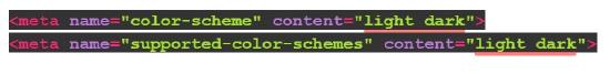
To support that metadata, you’ll need to add this CSS as well:
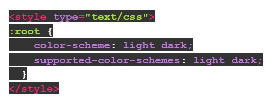
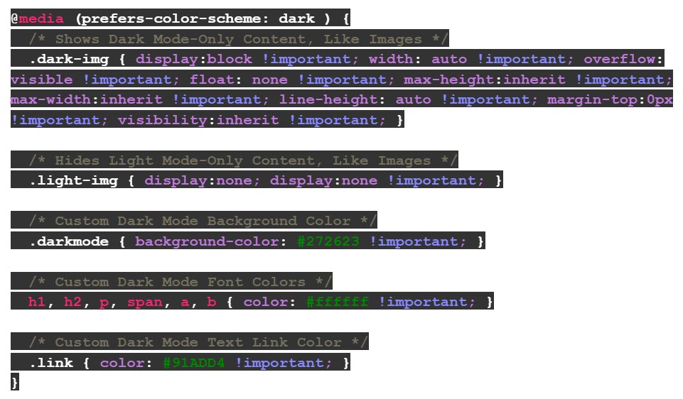
Add Dark Mode Styles for @media (prefers-color-Scheme: Dark)
Add this media query in your embedded <style></style> section for custom dark mode styles in iOS, Apple Mail, Outlook.com, Outlook 2019 (MacOS), and Outlook App (iOS).
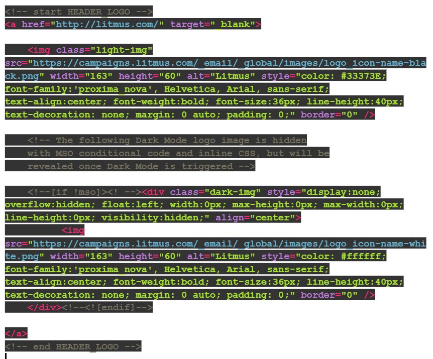
The .dark-img and .light-img classes are particularly useful for showing a dark mode-specific logo if having an outlined logo isn’t ideal.
Example CSS:
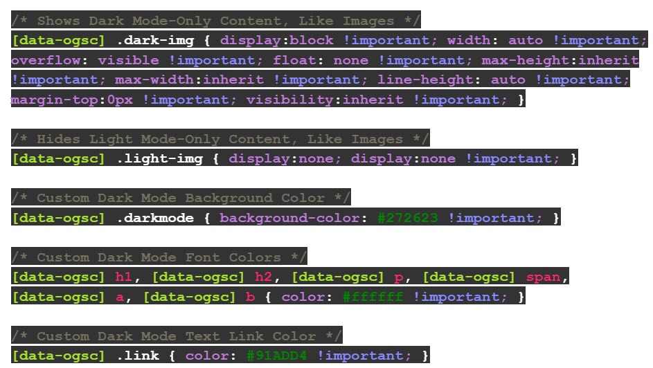
Duplicate Dark Mode Styles with [data-ogsc] / [data-ogsb] Prefix
Add this styling for support in the Outlook app (Android).
Example CSS:
Apply your Dark Mode-only Styles to your Body HTML
Make sure all of your HTML tags have the appropriate Dark Mode classes inserted. Here is an example of the .dark-img and .light-img classes as they appear in our Light Mode vs. Dark Mode logos.
Example HTML:
As we always mention, email clients are constantly changing. Especially with a new feature like Dark Mode, tweaks to rendering logic are coming quickly and frequently.