NPS Analytics Overview
Gainsight NXT
The NPS® Analytics section contains cross survey reports on the NPS® questions distributed through Surveys. This article explains the different analytical reports, based on NPS® response data, that are available for admins. The NPS® responses are broken down into three different views and arranged in the tabs: Summary, Feed, and Trends.
Depending on the NPS® survey response, three categories of people can be distinguished:
•Promoters = respondents giving a 9 or 10 score
•Passives = respondents giving a 7 or 8 score
•Detractors = respondents giving a 0 to 6 score
Navigating NPS® Analytics
To visit the NPS® Analytics page, navigate to Surveys > NPS® Analytics. You can find the following key options in the NPS® Analytics page:
- View Selection: Click Summary, Feed, and Trend to navigate to each respective view. For more information on the NPS® responses visualizations in each view, refer the subsequent sections.
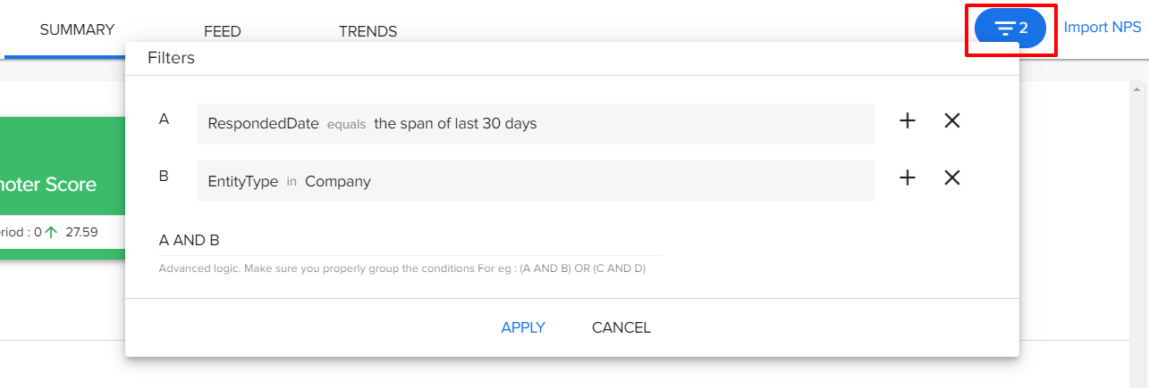
- Tab Filters: The filter option at the top-right can be used to control which Surveys data segments are displayed throughout the entire tab.
- Import NPS®: Click Import NPS® to upload CSV files to import third party NPS® responses to Gainsight Surveys and analyze the NPS® responses in NPS® Analytics tab. For more information, refer to the Import Third Party NPS® Response to Gainsight Surveys article.
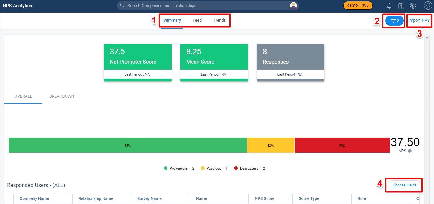
- Choose Fields: Click Choose Fields to Add/Delete the fields from Company / Relationship / Company Person / Relationship Person objects as per your business need and the selected fields are user preserved.
- To Add fields:
- Click Choose Fields. Field List window appears. You can view all the fields that are added to the Participant chart.
- Click Add Fields. Select Fields window appears.
- Select the required fields.
- Click Save.
- To Delete fields:
- Click Choose Fields. Field List window appears. You can view all the fields that are added to the Participant chart.
- Click the Delete/Trash icon of the field you want to delete.
Note: You can also rearrange the fields as per your requirement. - Click Save.
- To Add fields:
Tab Filters
The filter option at the top-right can be used to control which Survey data segments are displayed throughout the entire tab. You can apply multiple filters and Advance logic between them (AND or OR) to filter the survey responses as required.
By default, the following filters are applied:
- Responded date equals the last 30 days.
- Entity Type equals company.
These filters can be edited, and the applied filters are sticky and user preserved.
Summary View
The Summary View displays a comprehensive view of all the NPS® responses received.
Widgets
The upper half of the Summary View displays widgets for the following areas:
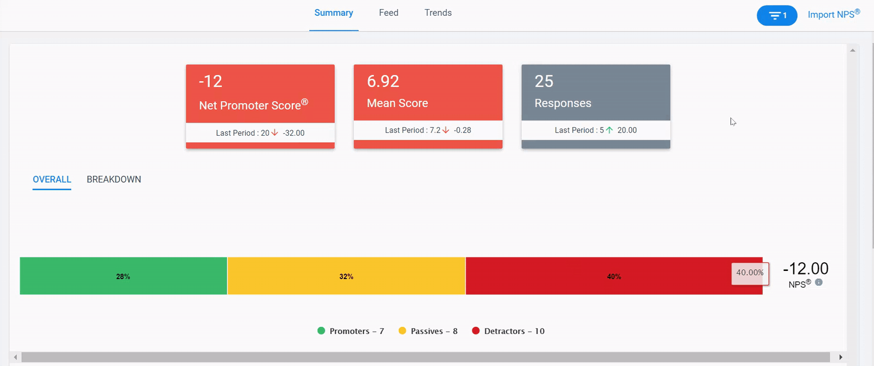
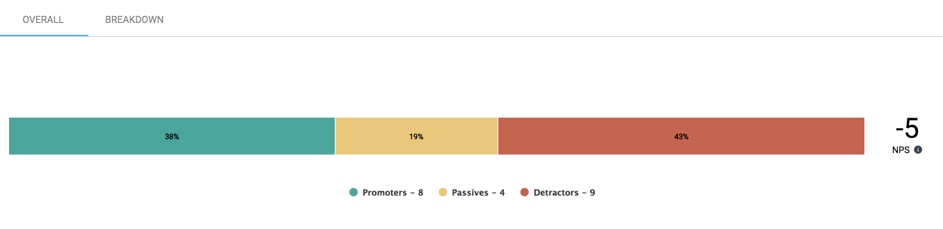
- Net Promoter Score®: This is the overall aggregated NPS and is calculated as the difference between the percentage of Promoters and Detractors. It is not expressed as a percentage but as a number lying between -100 and +100.
- Mean Score: The average score of the data selected. It is calculated by adding the scores together and dividing them by the number of scores.
- Responses: The number of responses received for the data selected.
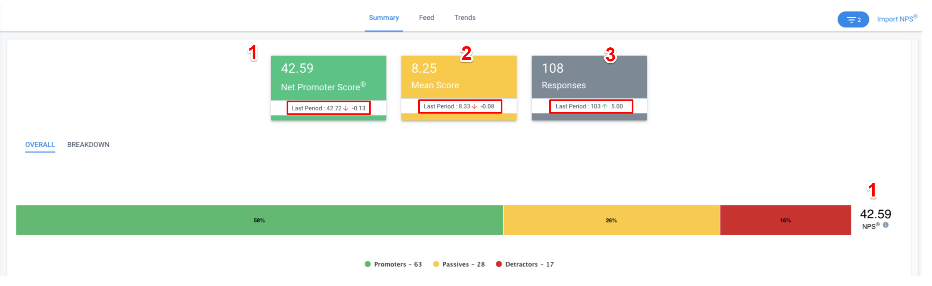
The Last Period fields display the previous scores of the respective widgets provided a date field filter is applied. For example, in the following image, a filter is applied on the Responded Date field that equals to Current Month, then the Last Period field displays the previous month's scores. The arrows in the Last Period field illustrate an increase or decrease in the value.
Note: If the survey responses for the selected period are anonymous, the Responses widget will display a value of NA.
Overall and Breakdown Tabs
The Overall section shows the percentage of Promoters, Passives, and Detractors in a stacked bar chart. You can click the labels at the bottom of the bar to hide or display each variable.
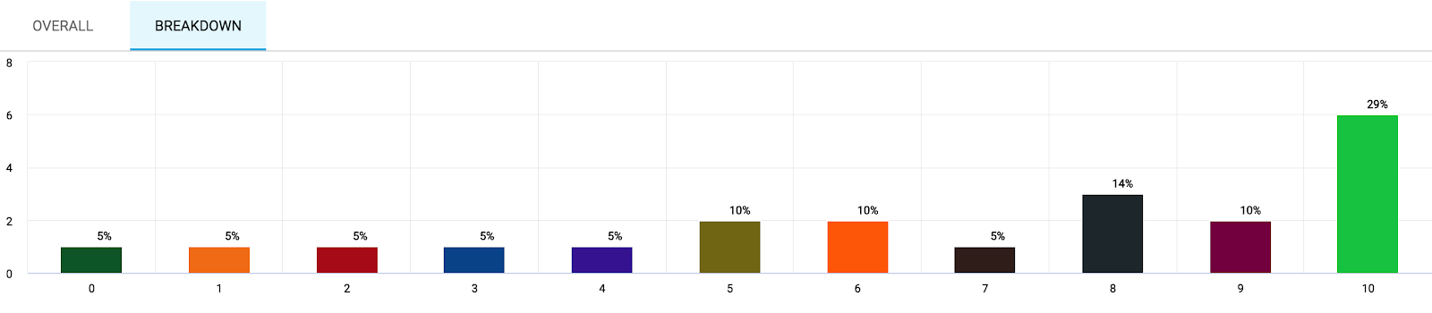
The Breakdown section displays the percentage of responses for each NPS® value in a stacked column chart.
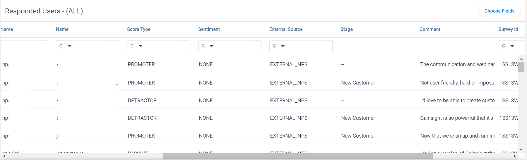
Responded Users
The Responded Users section displays a chart of responded participants information for the segment of surveys selected. On clicking labels in the Overall section or selecting a chart bar in the Breakdown section, the Responded Users list gets filtered based on the label or bar selected.
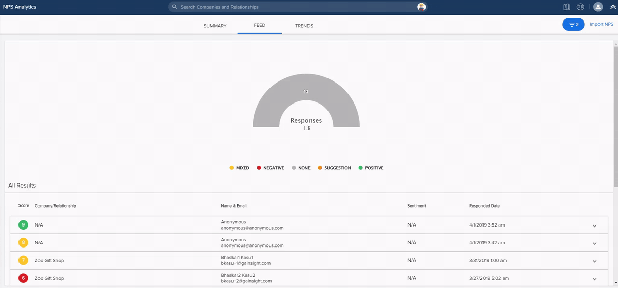
Feed View
This view categorizes NPS® responses based on the Sentiment of comments received. The Sentiment uses Text Analytics to analyze and classify the textual information in the comment.
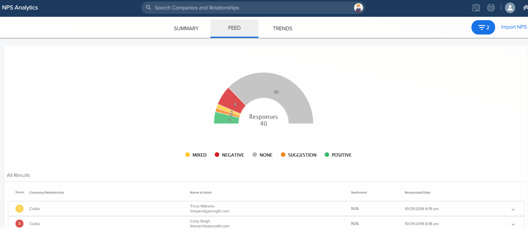
The feed includes a Responses chart divided into color-coded categories of NPS® comments, as well as a list of responses displayed below in the All Results section.
The categories of comments include None, Negative, Suggestion, Positive and Mixed:
- None: The NPS® response does not contain a comment.
- Negative: The NPS® Comment has a negative sentiment.
- Suggestion: The NPS® comment contains a suggestion for areas of improvement.
- Positive: The NPS® Comment has a positive sentiment.
- Mixed: The NPS® Comment has sentiment that is both positive and negative.
You can click the labels to hide or display each section (just as you can in the Overall section of Summary View).
All Results
On clicking a section in the Responses gauge chart, it filters the response list displayed below in the All Results list for only responses that match with the sentiment. The All Results list displays the Score, Company/Relationship, Name & Email, Sentiment, and Responded Date of each NPS® response. You can click each response to expand it and view any available comments.
Trends View
This view contains pre-built reports to display NPS® scores and responses over time in the timeline and column charts respectively. The reports include two charts, Score over time and Responses over time and can be filtered using the Group By selection at the top of the page. In both the charts, the time period and a number of NPS® responses are shown on the X and Y-axis respectively.
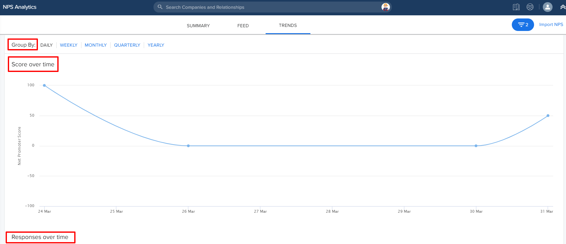
Group By
You can summarize the reports by DAILY, WEEKLY, MONTHLY, QUARTERLY, and YEARLY using this option.
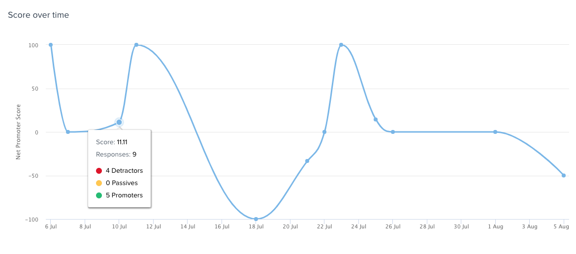
Score over time
This line graph shows the number of NPS® responses received over time. Hovering over a point on the graph displays the score, number of responses, number of detractors, number of passive responses, and the number of promoters at that point in time.
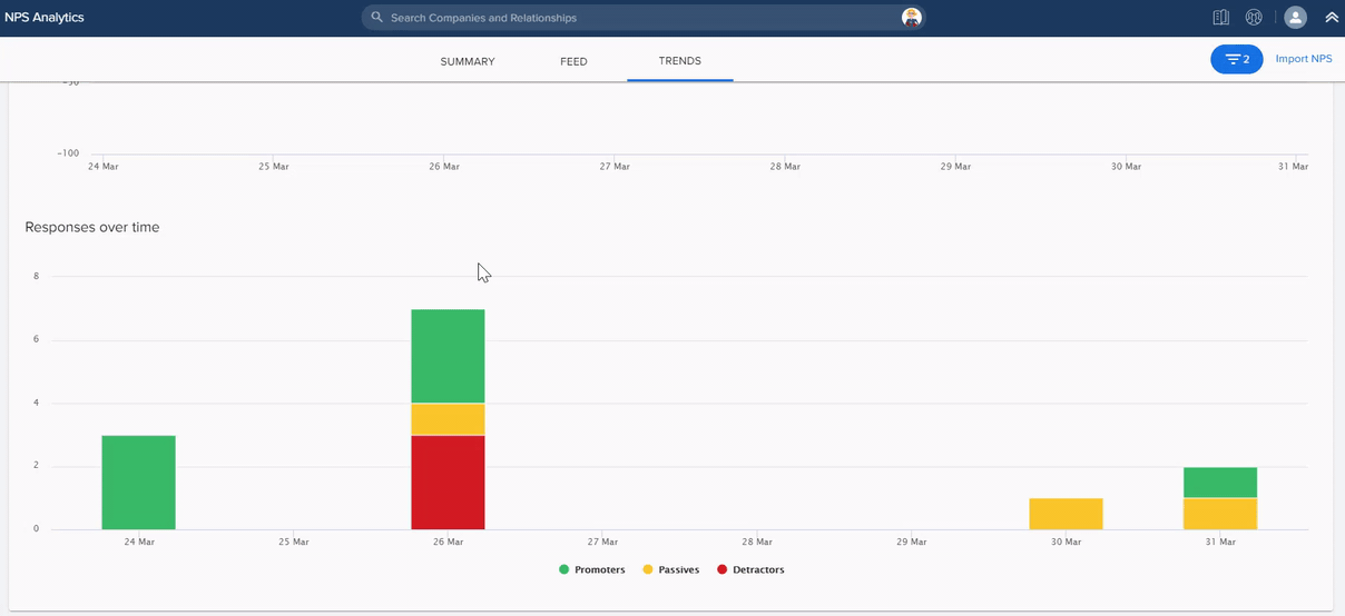
 Responses over time
This stacked column graph shows the number of Promoter, Passive, and Detractor responses received during the displayed point in time. The Promoters, Passives, and Detractors are displayed as color-coded sections. You can click these labels below the X-axis to hide or display each section. Hovering over a point on the column bar displays the time (date/month/quarter/year) as per the Group By selection and number of detractor/passive/promoter responses at that point in time.
Custom Reports
The Survey Participant object captures response data for Surveys. You can build custom Surveys NPS® reports in Report Builder using this object. For more information on building reports, refer to the How to Build Reports article.
| NPS, Net Promoter, and Net Promoter Score are registered trademarks of Satmetrix Systems, Inc., Bain & Company and Fred Reichheld. |