This article provides an overview of the Gainsight Home tab. The Gainsight Home dashboards are customized to display sets of reports for stakeholders, including individual CSMs, managers, executives, and boards of directors. Admins must configure dashboards within Administration > Dashboard Builder. For more information about the setup process, refer to the Configure Gainsight Home Dashboards (aka, Layouts) article.
Suggested Uses:
- Review dashboards in executive or team meetings. Optionally, you can export the images and insert them into presentations; or email them to internal users as PPTs.
- Use the ARR at Risk report to strategize with your team for the upcoming quarter.
Selections or actions made by a user on Gainsight Home are remembered and their most recent selection or action persists when they return to the page after navigating away. Report filters and visualization types are 'user state preserved', which enables multiple users to have their own state preserved.
When admins make any changes to the Report Filters or Visualization Types on a report that already exists in a dashboard, those changes are not automatically propagated to the dashboard, instead CSM’s state prevails on the Gainsight Home tab. For more information on how 'User State Preservation' works with Dashboards, click here.
Gainsight Home Tab
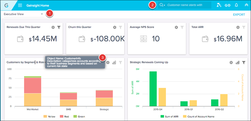
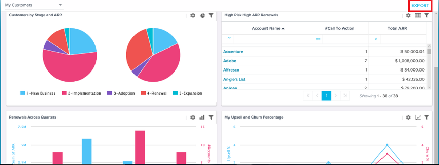
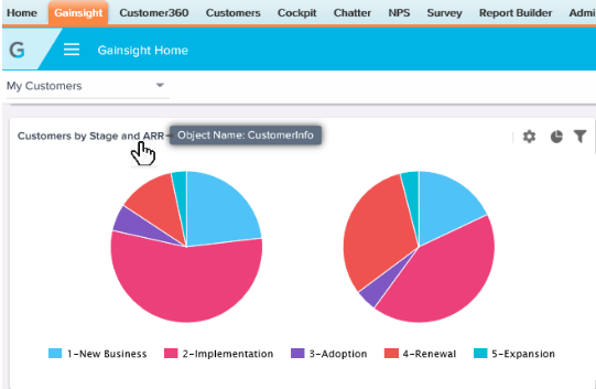
In the top ribbon, you can always see the following fields as shown in the following image:
- Dashboard menu & search: Drop-down list that contains all dashboards.
- Global Search: Drop-down list that contains Customer search starts with, Customer search contains, and Relationship contains options which enables you to search for customers. In addition, an Admin can configure customer search to include additional fields for searching a customer. For more information, refer to Configuring Customer Search Settings (C360).
- If a report description is available, it appears when you hover on the report title.
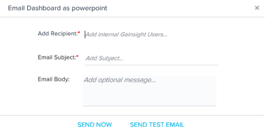
Email/Export Dashboard to Gainsight users
You can email dashboards to Gainsight users in your organization as a powerpoint presentation (PPT) using the EXPORT option available on the Gainsight Home page.
Notes:
- If the current user has configured report visualization types or local filters, they are respected in the PPT version of the dashboard. Global filters are also respected.
- If the dashboard contains tabular reports, approximately 10 rows of data will display per slide for that report.
- You can also export a report created from a Data Space to PowerPoint.
To email a Gainsight Dashboard:
- Click EXPORT. The Email Dashboard as powerpoint window appears.
- Enter the email of the internal Gainsight recipient, subject of the email, and an optional message for the recipient.
- Click SEND NOW. The email is sent to the email ID's specified.
- (Optional) Click SEND TEST EMAIL. The Gainsight Dashboard is sent to the logged-in user for verification.
Share Dashboard with Users
You can share a dashboard as a link via email with a user from the Gainsight Home tab. The dashboards must be configured for sharing by the admin. The configured dashboard can then be shared through email as a link, with optional security settings. The recipient must be added as a GS user into the GS User object (in MDA). For example, a CSM could share the Monthly Renewals dashboard with the CRO of the company, which is delivered to the CRO as a link in an email.
For information on how to configure a dashboard for sharing (admin), see the Configure Dashboard for Sharing article.
For information on how to share the dashboard (CSM/user), see the Share Dashboards article.
Note: CSMs can see the dashboards that are assigned by admins, using Dashboard Permissions.
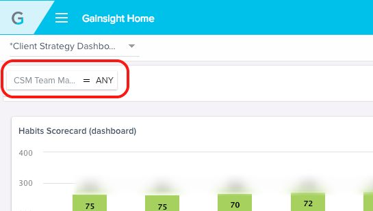
Dashboard Level Filters
If your Admin setup Dashboard Level Filters, you will see a filter underneath the dashboard menu. In this example, a filter for CSM Team Manager allows each manager to view data for only their teams in the dashboard reports. To release the dashboard filter, delete the filter text.
For Admin instructions on how to setup dashboard level filters, refer to the Configuring Gainsight Home Dashboards article. If you would like dashboard level filters enabled or more information in a report drill down, you can contact your Gainsight Admin.
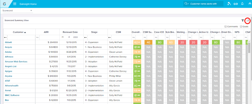
Note: Dashboard level filters cannot be used for UI Views such as the Scorecard Summary View as shown in the following image.
Tabular Report Overview
In a tabular report, you can:
- Sort ascending/descending by clicking the column header.
- Select an operator by clicking the Operator underneath the column header.
- Filter within a column by typing in the open field underneath the column header.
- Update Score by double clicking, if yo uare viewing Scorecard Summary View.
- Click on customer name to jump to the Customer 360 view for that customer.
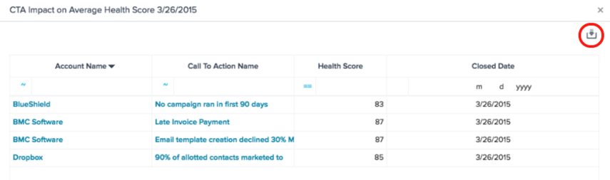
- Click Export option (circled in image below) to export an individual report.
- Wrap text in tabular reports: In Gainsight dashboards, an option to Wrap Lines in tabular reports is provided. If this option is enabled, the text will wrap based on column size when dragged or resized. This feature works in Gainsight homepage dashboards and in reports exported to Excel.
Graphical Report Overview
- Drill down: Click any data point to see a tabular list of customers who fit the filter criteria. (see the following section for more info)
- Chart options: Click the gear to access various chart options, including export.
- Notes: On the Gainsight Home page, for reports, users can switch to the visualization/settings that were configured by their Admin in Report Builder using the Clear Settings/Filters option.
- Visualization type: Click the report icon to change the visualization type (some options may not be available based on the report parameters).
- Legends: Click on a color legend to view only the selected element (hides all the other elements). The Y-axis range is re-calibrated so that the selected element is displayed properly on the chart. To toggle between the legends, press Ctrl/Cmd and click the legend. For Windows users, if you want to view multiple elements on a graph and compare, you can press and hold the “Ctrl" key while selecting multiple color legends. If you are a Mac user, press and hold the “Command" key while selecting multiple color legends. To reset the chart to its original state, click the empty space inside the chart.
Note: For Packed Bubble and Scatter type of charts, legends are displayed based on the second field in the 'By' section. If the set of values for the second field is greater than 5, legends are not displayed.
Drill-down view
The drill down view refers to when a user clicks on a data point in a dashboard report, and a new drill-down view opens with just that data. Column filtering and export options are available from the drill down view.